6,205 search results
(0.05 seconds)
- Robur by Canada Type,
$24.95It shouldn't be a surprise to anyone that these letter shapes are familiar. They have the unmistakable color and weight of Cooper Black, Oswald Cooper's most famous typeface from 1921. What should be a surprise is that these letters are actually from George Auriol's Robur Noir (or Robur Black), published in France circa 1909 by the Peignot foundry as a bolder, solid counterpart to its popular Auriol typeface (1901). This face precedes Cooper Black by a dozen of years and a whole Great War. Cooper Black has always been a bit of a strange typographical apparition to anyone who tried to explain its original purpose, instant popularity in the 1920s, and major revival in the late 1960s. BB&S and Oswald Cooper PR aside, it is quite evident that the majority of Cooper Black's forms did not evolve from Cooper Old Style, as its originators claimed. And the claim that it collected various Art Nouveau elements is of course too ambiguous to be questioned. But when compared with Robur Noir, the "elements" in question can hardly be debated. The chronology of this "machine age" ad face in metal is amusing and stands as somewhat of a general index of post-Great War global industrial competition: - 1901: Peignot releases Auriol, based on the handwriting of George Auriol (the "quintessential Art Nouveau designer," according to Steven Heller and Louise Fili), and it becomes very popular. - 1909-1912: Peignot releases the Robur family of faces. The eight styles released are Robur Noir and its italic, a condensed version called Robur Noir Allongée (Elongated) and its italic, an outline version called Clair De Lune and its condensed/elongated, a lined/striped version called Robur Tigre, and its condensed/elongated counterpart. - 1914 to 1918: World War One uses up economies on both sides of the Atlantic, claims Georges Peignot with a bullet to the forehead, and non-war industry stalls for 4 years. - 1921: BB&S releases Cooper Black with a lot of hype to hungry publishing, manufacturing and advertising industries. - 1924: Robert Middleton releases Ludlow Black. - 1924: The Stevens Shanks foundry, the British successor to the Figgins legacy, releases its own exact copies of Robur Noir and Robur Noir Allongée, alongside a lined version called Royal Lining. - 1925: Oswald Cooper releases his Cooper Black Condensed, with similar math to Robur Noir Allongée (20% reduction in width and vectical stroke). - 1925: Monotype releases Frederick Goudy's Goudy Heavy, an "answer to Cooper Black". Type historians gravely note it as the "teacher steals from his student" scandal. Goudy Heavy Condensed follows a few years later. - 1928: Linotype releases Chauncey Griffith's Pabst Extra Bold. The condensed counterpart is released in 1931. When type production technologies changed and it was time to retool the old faces for the Typositor age, Cooper Black was a frontrunning candidate, while Robur Noir was all but erased from history. This was mostly due to its commercial revival by flourishing and media-driven music and advertising industries. By the late 1960s variations and spinoffs of Cooper Black were in every typesetting catalog. In the early- to mid-1970s, VGC, wanting to capitalize on the Art Nouveau onslaught, published an uncredited exact copy of Robur Black under the name Skylark. But that also went with the dust of history and PR when digital tech came around, and Cooper Black was once again a prime retooling candidate. The "old fellows stole all of our best ideas" indeed. So almost a hundred years after its initial fizz, Robur is here in digital form, to reclaim its rightful position as the inspiration for, and the best alternative to, Cooper Black. Given that its forms date back to the turn of the century, a time when foundry output had a closer relationship to calligraphic and humanist craft, its shapes are truer to brush strokes and much more idiosyncratic than Cooper Black in their totality's construct. Robur and Robur Italic come in all popular font formats. Language support includes Western, Central and Eastern European character sets, as well as Baltic, Esperanto, Maltese, Turkish, and Celtic/Welsh languages. A range of complementary f-ligatures and a few alternates letters are included within the fonts. - Core Sans N SC by S-Core,
$15.00Core Sans N SC is the Small Caps version of the Core Sans N that is a part of the Core Sans Series (Core Sans N SC, Core Sans N Rounded, Core Sans M, and Core Sans G). Letters in the Core Sans N SC Family are designed with genuine neo-grotesque and neutral shapes without any decorative distractions. The spaces between individual letter forms are precisely adjusted to create the perfect typesetting. The Core Sans N SC Family consists of 3 widths (Condensed, Normal, Extended), 9 weights (Thin, ExtraLight, Light, Regular, Medium, Bold, ExtraBold, Heavy, Black), and Italics for each format. It also supports WGL4, which provides a wide range of character sets (CE, Greek, Cyrillic and Eastern European characters). Each font includes support for Tabular numbers, Arrows, Box drawings, Geometric shapes, Block elements, Mathematical operators, Miscellaneous symbols and Opentype Features such as Proportional Figures, Numerators, Denominators, Superscript, Scientific Inferiors, Subscript, Fractions and Standard Ligatures. The Core Sans N SC Family provides both OpenType (.OTF) and TrueType (.TTF) versions in the same package. We highly recommend it for use in books, web pages, screen displays, and so on. - Core Sans WHH Sub NR by S-Core,
$15.00The Core Sans NR Family is a part of the Core Sans Series, such as Core Sans N, Core Sans N SC, Core Sans M, and Core Sans G. This family is the rounded version of Core Sans N family. Letters in the Core Sans NR Family are designed with genuine neo-grotesque and neutral shapes without any decorative distractions. The spaces between individual letter forms are precisely adjusted to create the perfect typesetting. The Core Sans NR Family consists of 3 widths (Condensed, Normal, Extended), 9 weights (Thin, ExtraLight, Light, Regular, Medium, Bold, ExtraBold, Heavy, Black), and Italics for each format. It also supports WGL4, which provides a wide range of character sets (CE, Greek, Cyrillic and Eastern European characters). Each font includes support for Tabular numbers, Arrows, Box drawings, Geometric shapes, Block elements, Mathematical operators, Miscellaneous symbols and Opentype Features such as Proportional Figures, Numerators, Denominators, Superscript, Scientific Inferiors, Subscript, Fractions and Standard Ligatures. The Core Sans NR Family provides both OpenType (.OTF) and TrueType (.TTF) versions in the same package. We highly recommend it for use in books, web pages, screen displays, and so on. - Type Tiles JNL by Jeff Levine,
$29.00Type Tiles JNL is based on a ‘completed’ version of ‘Alpha-Blox’ by American Type Founders, circa 1944. The capitals, lower case and numerals shown in the sample sheet put out by ATF depicted type made with five-high blocks comprised of modular units spaced two points apart. These units could be combined in varying ways to create custom type of varying heights and widths and was available for purchase in both linear (multi-line) and reverse (white on black) formats. Using the 'reverse' model shown on the sample sheet, all of the characters were re-created digitally, and missing punctuation, foreign characters and other glyphs found in a basic computer font were drawn and added. The 'J' and 'T' in the type sample had truncations, so a more complete character was created for each of those letters. For those wanting an unbroken string of words or blank end caps, there is a double column space on the vertical bar key. A single column space is located on the broken bar key for shorter end caps. Type Tiles JNL is available in both regular and oblique versions - Core Sans NR by S-Core,
$15.00The Core Sans NR Family is a part of the Core Sans Series, such as Core Sans N, Core Sans N SC, Core Sans M, and Core Sans G. This family is the rounded version of Core Sans N family. Letters in the Core Sans NR Family are designed with genuine neo-grotesque and neutral shapes without any decorative distractions. The spaces between individual letter forms are precisely adjusted to create the perfect typesetting. The Core Sans NR Family consists of 3 widths (Condensed, Normal, Extended), 9 weights (Thin, ExtraLight, Light, Regular, Medium, Bold, ExtraBold, Heavy, Black), and Italics for each format. It also supports WGL4, which provides a wide range of character sets (CE, Greek, Cyrillic and Eastern European characters). Each font includes support for Tabular numbers, Arrows, Box drawings, Geometric shapes, Block elements, Mathematical operators, Miscellaneous symbols and Opentype Features such as Proportional Figures, Numerators, Denominators, Superscript, Scientific Inferiors, Subscript, Fractions and Standard Ligatures. The Core Sans NR Family provides both OpenType (.OTF) and TrueType (.TTF) versions in the same package. We highly recommend it for use in books, web pages, screen displays, and so on. - Core Sans WHH Head NR by S-Core,
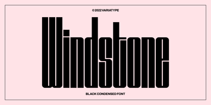
$15.00The Core Sans NR Family is a part of the Core Sans Series, such as Core Sans N, Core Sans N SC, Core Sans M, and Core Sans G. This family is the rounded version of Core Sans N family. Letters in the Core Sans NR Family are designed with genuine neo-grotesque and neutral shapes without any decorative distractions. The spaces between individual letter forms are precisely adjusted to create the perfect typesetting. The Core Sans NR Family consists of 3 widths (Condensed, Normal, Extended), 9 weights (Thin, ExtraLight, Light, Regular, Medium, Bold, ExtraBold, Heavy, Black), and Italics for each format. It also supports WGL4, which provides a wide range of character sets (CE, Greek, Cyrillic and Eastern European characters). Each font includes support for Tabular numbers, Arrows, Box drawings, Geometric shapes, Block elements, Mathematical operators, Miscellaneous symbols and Opentype Features such as Proportional Figures, Numerators, Denominators, Superscript, Scientific Inferiors, Subscript, Fractions and Standard Ligatures. The Core Sans NR Family provides both OpenType (.OTF) and TrueType (.TTF) versions in the same package. We highly recommend it for use in books, web pages, screen displays, and so on. - Windstone by Variatype,
$14.00 - Alquitran Family by RodrigoTypo,
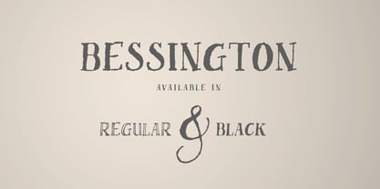
$40.00 - Bessington by wearecolt,
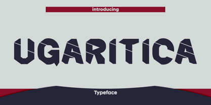
$16.00 - Ugaritica by Mouhannad Alkousa,
$14.00 - Quirky by Scholtz Fonts,
$19.95The idea for Quirky was born while I was looking at a book of etchings by British artist Graham Clarke. His signature, crawling spider-like across the page, fascinated me with its casual, almost messy, inky dark and light drama. I started scribbling the alphabet as I imagined he would write it, based on his signature, then continued, adding curls, making the characters more angular, and refining the dramatic play between dark and light. Finally, Quirky appeared. Apparently casual, Quirky is, in fact, a true connected script. Quirky is characteristic of contemporary handwriting: It appears loose, angular, unstructured, and free, while maintaining good form and legibility. Its baseline is varied, creating an impression of impatient handwriting, without losing legibility. Quirky comes in five styles: condensed -- the most dramatic form, with great drama between thick and thin condensed black -- as with condensed but allows the user to provide exceptional emphasis wide -- increased readability wide black -- increased readability and emphasis splat -- messy and ink-blotted -- a hint of grunge Use Quirky for advertising, for humorous greeting cards, for a funky fashion look or tongue-in-cheek spooky media. Quirky is a fully professional font with extensive use of OpenType Ligatures. For example: most common double letter combinations such as "ee" are rendered as two, slightly different shaped "e"s. This variation in letter shapes removes the cues by which the reader identifies that he is viewing a FONT and thus conveys a strong sense of hand-lettered text. Language support includes all European character sets and has been designed to be used with the following languages: Afrikaans, Albanian, Basque, Bemba, Cornish, Danish, Dutch, English, Estonian, Faroese, Filipino, Finnish, French, Galician, Ganda, German, Icelandic, Indonesian, Irish, Italian, Kinyarwanda, Luo, Malagasy, Malay, Manx, Morisyen, North Ndebele, Norwegian Bokmål, Norwegian Nynorsk, Nyankole, Oromo, Portuguese, Romansh, Sango, Shona, Somali, Spanish, Swahili, Swedish, Swiss German and Zulu. - URLOP by Mikołaj Grabowski,
$9.00Colour is more fun than black, but multicolour is even better. Let me introduce URLOP, a wide type family suitable for your fancy posters, headlines, covers, illustrations, websites, initials, blackmails, chronicles, signboards, poems and many others. Twelve basic styles, which make the overall construction, give a wide range of opportunities. All of them, being able to mix with each other, vary from a thin INSIDE, through a medium FILL, to a double-stem PLUS styles. And then comes a range of colour fonts, so you don’t have to waste any of your precious time for experiments, because I’ve already done it for you! URLOP is an all-caps display collection consisting of three sub-families of fonts, divided by the usage they are designed for. First of all, there is a wide range of alphabets made in the new OpenType-SVG colour fonts format. This is quite a novelty and a very promising technology at the same time. It allows designers to store colour information inside the font. Due to my experience with layered colour thinking that I explored in my first family - Epilepsja , I decided to make several preset layer combinations in this auspicious format. This sub-group is tagged RGB. Make sure that your field of usage and software support OT-SVG format. However, if you feel a need to experiment in the old-fashioned way, you may buy separate layers under the DIY tag. The last group is very similar to the DIY, but it was optimized to look better when standing without other layers. It’s called PRO*. All styles cover Latin alphabets of Europe, basic Cyrillic and Greek sets. Have fun! Before using the font, read the instructions and specimen attached to font files in the purchased package or download them from the Gallery tab on this site. This will help you avoid making unexpected mistakes when combining layers. *PRO subfamily release planned in 2019. - Arbour Soft by TypeUnion,
$35.00Arbour Soft is the cheeky version of it's big brother, Arbour. The soft version creates a smooth finish that flows perfectly across screens and print. Arbour Soft comes in 7 weights, from a delicate extra-light to a soft, strong black, with matching soft italics for each upright. The soft black weights are perfect for your new brand or article headlines, and the light weights are great for calling out text. The mid weights are perfect for longer texts. - ITC Woodland by ITC,
$29.99ITC Woodland is the work of Japanese designer Akira Kobayashi. It is based on Kobayashi's hand lettering with a flat brush or square-edged pen. I wanted to design each weight to act its own part," says the designer. "The light version tends to look almost fading in small sizes, but the heavy weight is as black as Cooper Black." The cheerful ITC Woodland is ideal for graphics, greeting cards, correspondence, and other applications requiring a light touch. - Knip by Hanoded,
$15.00Knip, in Dutch, means ‘cut’. You can tell by the glyphs that I made this font by cutting out the shapes from black paper, gluing it onto white paper and photographing the result so I could digitalise it! I don’t make too many cut out fonts, as it is a lot of work and it often leads to nothing. Besides that, I depend on the paper supply from my kids and they happened to have black paper this time! - Alphacal JNL by Jeff Levine,
$29.00Alphacal JNL and Alphacal Black JNL are variants of the same lettering style found in Jeff Levine's Juneway JNL font... all based on water-applied decals once made by the Duro Decal Company (now Duro Art Industries) of Chicago, Illinois. Alphacal JNL can be used alone as an outline font (best at 18 pt. and above) or with Alphacal Black JNL as a backfill. Note: Perfect registration is not guaranteed. Some user adjustments may be necessary. - Rutin Tutin NF by Nick's Fonts,
$10.00Schrifti Alphabeti, a delightful collection of Cyrillic typefaces for posters from the former Soviet Union, strikes again, this time with a way-out West (Vladivostok?) theme. Extrabold, extra wide and delightfully different! Both versions of the font include 1252 Latin, 1250 CE (with localization for Romanian and Moldovan). - Picaflor Soft by RodrigoTypo,
$29.00 - Loyola Pro by RodrigoTypo,
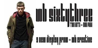
$30.00 - MB SIXTYTHREE by Ben Burford Fonts,
$20.00 - Sixties Pin Buttons JNL by Jeff Levine,
$29.00During the turbulent era of the 1960s, the youth of America found various ways to protest against "The Establishment". Whether it was campus unrest, protest songs, sit-ins or other methods, the message was the counter-culture movement. Arising from this disenchantment with traditional social standards, a small but effective means of protest arose that made no sound, yet spoke volumes - the pin button. Statements against the war in Vietnam, free love, drug use and other messages popped up on little metal discs pinned to tee shirts, suspenders, head band and hats. Sixties Pin Buttons JNL recreates twenty-six of these messages in both white on black (upper case keys) and black on white (lower case keys). Blank buttons in both white and black are found on the parenthesis keys. - Newsreel Caps JNL by Jeff Levine,
$29.00Newsreel Caps JNL is a novelty caps-only outline letter with cast shadow set inside film frames. Although the design idea itself is not new, this version is based on lettering from a vintage piece of sheet music for a song featured in the movie "Fox Movietone Follies". The font is a wink and nod to Fox's long-running newsreel series called "Fox Movietone News". The upper case keys have black letters on a white frame, while the lower case keys have white letters on a black frame. A blank white frame is on the period key; a blank black frame is on the comma key. Use this font for individual initials, set the characters loose for effect or set them tight (as provided) for a continuous film strip. - Volume by Cubo Fonts,
$29.00Volume is a 3D font, with interlocked characters, inspired by vintage wooden block capitals! Superimposed weights bring light and shadow on the structure and allows many coloured combinations. Cubo est une fonte en volume dont les lettres s'imbriquent, inspirée d'anciens caractère d'imprimerie en bois. Les diiférentes graisses se superposent, créant des effets d'ombre et de lumière, et facilitant la colorisation des caractères. - Stamped Metal JNL by Jeff Levine,
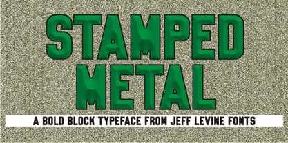
$29.00Online auctions offer a myriad of unique, vintage and novel lettering devices – all which are fertile ground for typographic inspiration. In this instance, a set of stamped metal letters for outdoor signage was the basis for Stamped Metal JNL. Some of the non-traditional letter weights makes these simple block letters a wonderful change of pace for bold, attention-getting headlines. - Rocksolid by Aah Yes,
$9.95Rocksolid's appearance is somewhere between a font resembling large, carved blocks of stone and a negative outline grunge font, and it is surprisingly responsive to simple effects in graphics programs. Mostly it is intended for titles, display and headlines. There's an extensive set of accented characters and punctuation. The zip contains both OTF and TTF versions - install either OTF or TTF, not both. - Occidental by Ryan Corey,
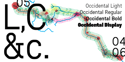
$35.00The Occidental family is a geometric, sans-serif text face marked by its angular construction. Occidental is suitable and economical enough to set large blocks of copy, but at display sizes Occidental's inherent character takes over making it useful for headline setting as well. The family includes four weights, each with corresponding italics (excepting Display) for a total of seven fonts. - Industrialist JNL by Jeff Levine,
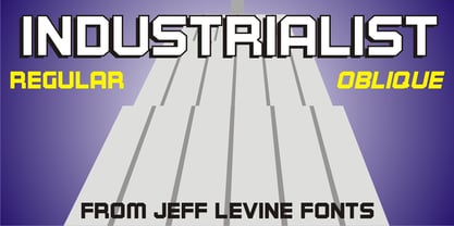
$29.00The chamfered block style of lettering has been a workhorse for years. From the early signage of the 1800s to military markings to the techno fonts of the 1980s and beyond, its clean and simple look gets the message across easily and boldly. Industrialist JNL and its oblique partner were modeled from the title on a piece of sheet music from the 1940s. - Beiko Heavy by Minor Praxis,
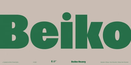
$20.00A heavy font made by Minor Praxis. Inspired by blocks toy design. Ideal use for headlines, medium and large prints format, displays, and posters. Built by a quite heavy structure and dense kern which can make a hefty and solid impression. It can be matched with basic sans serif fonts as a body copy. Available in 4 styles with multi languages support. - Local Druggist JNL by Jeff Levine,
$29.00Inspired by an image of the chamfered block lettering of a semi-faded “ghost sign” for the Thomas Drug Co. in Thomas, Oklahoma, Local Druggist JNL is available in both regular and oblique versions. “Ghost Signs” are the visible remnants of hand-painted signs on buildings where the original business had long closed or moved, yet the lettering had survived the passing years. - Chancy JNL by Jeff Levine,
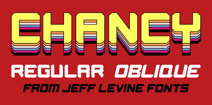
$29.00A short-lived TV game show from 1977 called “Second Chance” has its logo lettered in a bold, block type style with slightly chamfered corners. This inspired Chancy JNL, which is available in both regular and oblique versions. While “Second Chance” only lasted one season, the show was re-tooled - and debuted in 1983 as “Press Your Luck” – which ran until 1986. - Hakan by Typefactory,
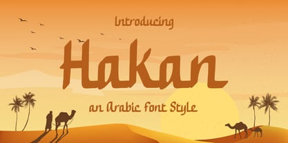
$14.00Hakan is an modern display font with an Arabian look. This font particularly for those not native to Arabic languages. Hakan try to bring back the Baghdad and Alladin memories to your design or typography. The font suits creative titling on both web and print, perfect for scroll text. Well balanced letters make for readable blocks of copy or headings. - Impact by URW Type Foundry,
$35.99Impact As its name suggests, Impact, a bold sans serif, is designed to make an impression on the reader. Obviously a display font, Impact makes use of its thick strokes and blocked style, to catch and hold the eye. Because Impact is so striking, it is best placed in plenty of white space so that it does not overwhelm any accompanying text. - Jane Plain NF by Nick's Fonts,
$10.00Here's a clean, simple architectural-blueprint style, eminently suitable for subheads and text blocks. Inspired by and named for a gentlewoman who gave up a career as an architect in Bolivia to care for the elderly in the United States. All versions of this font include the Unicode 1250 Central European character set in addition to the standard Unicode 1252 Latin set. - II Balfron by Increments,
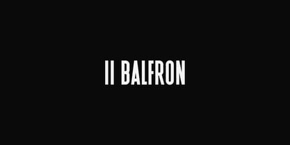
$19.00Inspired by Ernö Goldfinger's east London tower block of the same name, II Balfron is an imposing, all caps, one-weight typeface. Brutalist in form, the characters embody the principles of the distinctive 27-storey concrete profile with unexpected angles set within a rigid, structural grid. Much like Goldfinger's humanist, utopian housing ideals, the font is best viewed at large scale. - Blandit by Webhance,
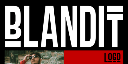
$18.00Blandit - Display & Logo Font family Blandit is a Display font family for design of minimalistic logos. The fonts are very much suitable for creating wordmarks, titles, taglines,Film Posters, headlines, Block letter, Subheading, Logo Designs, Big Banners. Classic & Decorative Typography Web Designs. Upper / lowercase glyphs Multilingual Support Webfonts included Free updates and feature additions Font Designed and Crafted by Webhance Studio. - Upstanding Pro by Multiformis,
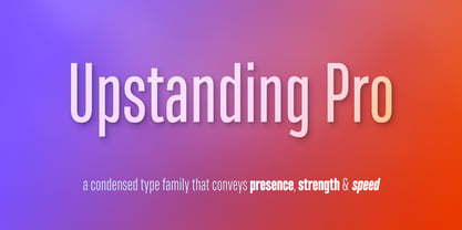
$10.99Upstanding Pro is suited for use as a display typeface, but legible enough to be used in small blocks of text (lighter weights), thus providing a lot of flexibility for all kinds of projects. Upstanding Pro conveys presence, strength and speed with the italics, yet conserving certain traces of sobriety and elegance. Want to make a statement? Use Upstanding Pro! - Raeling by Volcano Type,
$19.00Raeling is a display font inspired by a visit to Luxembourg, capturing shadows falling intricately from park railings appearing as broken-script lettering. A mixture of manmade / natural, traditional / new, ugly / beautiful reflecting the paradox and contradictions of the city. A single curve and stroke developed into a grid block from which characters emerged and broke free of their barriers and conformity. - Marins Perdus by Biroakakarati,
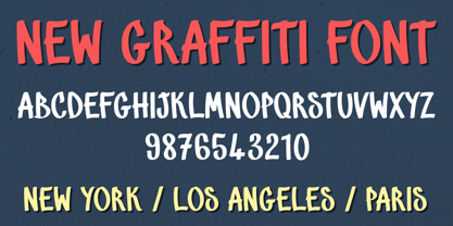
$9.00This font is inspired by graffiti calligraphy, it's only block letters in a modern style and more readable. The name "Marins Perdus" is from a novel by Jean-Claude Izzo "Les Marins Perdus", set in Marseille. The letters of "Marins Perdus" have a light inclination to the left, slim letters in a cool style, perfect for a title or a street event. - Precious Serif by G-Type,
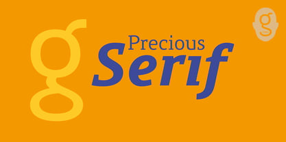
$60.00Precious Serif is a distinctive, modern slab serif typeface, first released in 2003 and now refreshed in 2017. This contemporary, chunky gem is the sister typeface to our Precious Sans family, both sets designed with similar metrics and characteristics to ensure they pair together seamlessly in print & digital applications. Mix Precious Sans & Serif together in a block of text to wonderful effect! - Town And Country JNL by Jeff Levine,
$29.00Town and Country JNL features a mix of block-style characters along with rounded ones found so often in the Art Deco fonts of the 1940s. Modeled from the hand-lettered title on a piece of sheet music from that era, this unusual coupling of two distinct design styles works despite it breaking all of the obvious rules of typography.


