9,781 search results
(0.046 seconds)
- Schwarzwald Pro by SoftMaker,
$10.99 Blackletter is the classic “German” printing type. Starting in the 16th century and lasting well into the 20th century, most works in Germany were printed using blackletter types. Today, blackletter fonts are mainly used decoratively. If you want to communicate a feeling of old-world quality or nostalgia, blackletter fonts are the preferred choice – use them on signs, in brochures or on invitation cards. “Schwarzwald Pro” is a classic blackletter font of its epoch which inspires you to create vintage-looking designs with ease.
 - Deadfrog by Ilhamtaro,
$23.00 DEADFROG is a simple classic font, the base is a super bold serif font that is given a grunge texture effect, resulting in a vintage font, which is suitable for supporting designs related to the world of motorcycle custom. But it can also be used for other designs that require a vintage, bold design style, such as magazine headlines or posters. To enable the OpenType Stylistic alternates, you need a program that supports OpenType features such as Adobe Illustrator CS, Adobe Indesign & CorelDraw X6-X7. Cheers!
 - Rotation by Linotype,
$29.99After the Second World War, the Ionic style replaced Modern Face as the favored typeface for newsprint. A couple decades later, it was in turn replaced by the next generation of newspaper fonts, a mix of Old Face, Transitional and Modern Face forms. Rotation was designed by Arthur Ritzel and presented by Stempel/Linotype in 1971 and named for the rotation newsprint machine for which is was particularly suited. The font displays the influence of Old Face design and gives newsprint a feeling of lightness and elegance. - Fraktur No2 Pro by SoftMaker,
$10.99 Blackletter is the classic “German” printing type. Starting in the 16th century and lasting well into the 20th century, most works in Germany were printed using blackletter types. Today, blackletter fonts are mainly used decoratively. If you want to communicate a feeling of old-world quality or nostalgia, blackletter fonts are the preferred choice – use them on signs, in brochures or on invitation cards. Fraktur No2 Pro is a classic blackletter font of its epoch which inspires you to create vintage-looking designs with ease.
 - Hohenstein Gotisch Pro by SoftMaker,
$10.99 Blackletter is the classic “German” printing type. Starting in the 16th century and lasting well into the 20th century, most works in Germany were printed using blackletter types. Today, blackletter fonts are mainly used decoratively. If you want to communicate a feeling of old-world quality or nostalgia, blackletter fonts are the preferred choice – use them on signs, in brochures or on invitation cards. “Hohenstein Gotisch Pro” is a classic blackletter font of its epoch which inspires you to create vintage-looking designs with ease.
 - Malevich by BBDO Studio,
$19.00 Hi! I am Black Square! Probably the most famous square in the world. Thanks to my godfather Kazimir Malevich, who created me in 1915, this year I am celebrating 100th anniversary. Let me tell you what a great gift I just got! It`s a family of almost 300 letters and symbols suprematic as suprematic can be - shapes, form attacks, booms and even hashtags! All under the name of Malevich Font. Isn`t it a great present for my anniversary? Thank You BBDO Ukraine
 - Walbaum Zierfraktur Pro by SoftMaker,
$10.99 Blackletter is the classic “German” printing type. Starting in the 16th century and lasting well into the 20th century, most works in Germany were printed using blackletter types. Today, blackletter fonts are mainly used decoratively. If you want to communicate a feeling of old-world quality or nostalgia, blackletter fonts are the preferred choice – use them on signs, in brochures or on invitation cards. “Walbaum Zierfraktur Pro” is a classic blackletter font of its epoch which inspires you to create vintage-looking designs with ease.
 - Peter Jessen Schrift Pro by SoftMaker,
$10.99 Blackletter is the classic “German” printing type. Starting in the 16th century and lasting well into the 20th century, most works in Germany were printed using blackletter types.Today, blackletter fonts are mainly used decoratively. If you want to communicate a feeling of old-world quality or nostalgia, blackletter fonts are the preferred choice – use them on signs, in brochures or on invitation cards. “Peter Jessen Schrift Pro” is a classic blackletter font of its epoch which inspires you to create vintage-looking designs with ease.
 - Breitkopf Fraktur Pro by SoftMaker,
$10.99 Blackletter is the classic “German” printing type. Starting in the 16th century and lasting well into the 20th century, most works in Germany were printed using blackletter types. Today, blackletter fonts are mainly used decoratively. If you want to communicate a feeling of old-world quality or nostalgia, blackletter fonts are the preferred choice – use them on signs, in brochures or on invitation cards. Breitkopf Fraktur Pro is a classic blackletter font of its epoch which inspires you to create vintage-looking designs with ease.
 - Zouk by 38-lineart,
$19.00 “Zouk” is the transformation of the classic blackletter font into the modern world. The blackletter character is very strong and prominent will be the choice for a new style brand. This font consists of 750 glyphs with latin plus diacritics that supports more than 200 languages. We created alternate glyphs in stylistic sets (SS) 01, 02, 03 and 04 for all lowercases including the diacritics. We believe this font style will be a new brand choice that is more prominent and stylish in a classic nostalgic diorama.
 - Hans Fraktur Pro by SoftMaker,
$10.99 Blackletter is the classic “German” printing type. Starting in the 16th century and lasting well into the 20th century, most works in Germany were printed using blackletter types. Today, blackletter fonts are mainly used decoratively. If you want to communicate a feeling of old-world quality or nostalgia, blackletter fonts are the preferred choice – use them on signs, in brochures or on invitation cards. “Hans Fraktur Pro” is a classic blackletter font of its epoch which inspires you to create vintage-looking designs with ease.
 - Coelnische Current Pro by SoftMaker,
$10.99 Blackletter is the classic “German” printing type. Starting in the 16th century and lasting well into the 20th century, most works in Germany were printed using blackletter types. Today, blackletter fonts are mainly used decoratively. If you want to communicate a feeling of old-world quality or nostalgia, blackletter fonts are the preferred choice – use them on signs, in brochures or on invitation cards. Coelnische Current Pro is a classic blackletter font of its epoch which inspires you to create vintage-looking designs with ease.
 - Theuerdank Fraktur Pro by SoftMaker,
$10.99 Blackletter is the classic “German” printing type. Starting in the 16th century and lasting well into the 20th century, most works in Germany were printed using blackletter types. Today, blackletter fonts are mainly used decoratively. If you want to communicate a feeling of old-world quality or nostalgia, blackletter fonts are the preferred choice – use them on signs, in brochures or on invitation cards. “Theuerdank Fraktur Pro” is a classic blackletter font of its epoch which inspires you to create vintage-looking designs with ease.
 - Celtic Knots by Clanbadge,
$20.00 While it is obvious that this is an ornamental style font, it is more than that: it is a Celtic Knotwork design tool! Irish, Scottish, Welsh, even Norse and Viking cultures have used knotwork designs for millenia. These ancient traditional interwoven designs are experiencing a revival as Celtic culture gains exposure in the modern world. Intricate Celtic knots are featured everywhere from jewelry to tattoos. While many enjoy them simply for their beauty and fascinating twists, they can also be used to add an air of myth, magic and mystery to any project. The interlaced lines make them perfect for wedding invitations, borders, dividers and rules, web graphics, and logos. I began using Celtic knotwork designs in my own work as part of my knifemaking and jewelry making hobbies. I read all of the books I could find about Celtic knots and at first I drew them by hand with pencil and paper. Then as I realized how nice it would be to have "undos" I switched over to using Corel Draw. Draw proved to be a natural for this type of artwork with tools like contour and the trim function. But even with these great tools, it was still tedious to create these designs. I noticed that I was able to reuse a lot of parts in repetitive sections. I developed a small library of reusable bits and chunks of Celtic designs. I found them so useful and fun to work with that I began thinking about ways to market my Celtic design kit. I thought about CDR and EPS formats, but then I thought of creating this toolset as a True Type Font. That way anyone with ANY program that uses fonts could easily create Celtic knotwork designs. Word processors, embroidery programs, engraving programs, jewelry design programs, CAD/CAM programs...almost every program can use fonts. I was also interested in CNC work and thought that this font would work well for applications such as laser etching, vinyl signs, and machining. With that in mind, I designed each character of the font with extremes of accuracy. If one character from the font is used at one inch tall, every control point will be placed to an accuracy of better than 0.0001 inch. I wanted every piece to meet exactly with the next, with no possibility for misalignment. The different styles are all very carefully created to fit accurately with each other. So the Filled Style fits exactly into the Outline Style, and the Inverse Style fits precisely around the Outline Style so as to make up the background behind the knotwork. Combining the styles allows you to have complete creative control. By assembling the nearly 200 pieces it is quite easy to produce very complex designs. It is actually a bit like playing with a puzzle and many people really enjoy putting the pieces together to make designs. In fact, I have had many customers tell me of how they love playing with this font and making knots into the wee hours of morning. If you like puzzles then you will absolutely love this font! And creating the patterns is just the beginning of the fun! If you apply your favorite Photoshop tricks on them you can make anything from dazzling chrome knotwork to carved stone. Photoshop plug-ins like SuperBladePro are great for converting knotwork text into corroded bronze or rusted iron. Use your knotwork to add texture to a virtual landscape, or add them as surface embelishments on architecture and furniture. You can also make round knotwork by using this font with "WordArt" (WordArt is included with every copy of Microsoft Word. See http://clanbadge.com/round_knots.htm for a tutorial on how to make round knotwork). For Crafters there are limitless uses for this font. It has been used for embroidery, jewelry, leatherwork, stencils, stained glass, quilting, painting, pyrography, woodcarving and lots more. We have even sold copies to monks for use in decorating handmade books!
 - Neutraface Condensed by House Industries,
$33.00 Richard J. Neutra became an icon of Modern architecture as an artistic visionary, social commentator and outspoken defender of the environment. He refined his unique approach to design, for which he coined the term biorealism, over half a century ago. Regarding humankind and its surroundings as two inseparable halves to a greater whole, Neutra created habitats with the welfare of man and nature as his utmost concern. His ideas of evolutionary growth and adaptability compelled House Industries to develop Neutraface Condensed, built upon the original typeface and driven by the enduring spirit of the revolutionary who inspired it. “I have tried to be a feeling observer of life in all its manifestations, not a cold rationalist.” House Industries adopted this precept of Neutra as the guiding principle when the foundry commissioned Christian Schwartz to draw Neutraface Condensed. Instead of being exactingly compressed, the new companion fonts were composed around a complementary structural framework in order to better reflect the sensibilities of their predecessor. The result is an individualistic design with a restrained exuberance that shuns stylistically ersatz imitation. This compact yet lively presence allows Neutraface Condensed to lend flexibility and economy to headlines without sacrificing the simplicity and charm of the original. Like all good subversives, House Industries hides in plain sight while amplifying the look, feel and style of the world’s most interesting brands, products and people. Based in Delaware, visually influencing the world.
 - FS Dillon by Fontsmith,
$80.00 Bauhaus Geometric, economical, functional... The good, wholesome, modernist values that once fired up the tutors and students of the Bauhaus became the inspiration for FS Dillon after an exploration of the work of the pre-war art and design powerhouse in the Fontsmith studio. The font combines simplicity and directness with a characteristic Fontsmith warmth. Letterforms are compact, with a generous x-height, and built for maximum clarity and impact. The Bauhaus sought beauty through function. FS Dillon achieves it. Made for TV The weights of fonts for TV sometimes have to be adjusted so as not to “blow” on-screen. FS Dillon was originally drawn for the on-screen presentation branding of Film Four, whose primary colour was red. Black type on a red background looks heavier than white, so Dillon needed two weights that would allow white and black type to be used together, looking balanced and equal. Type design is an organic process. Years after developing FS Dillon, we revisited it, redrawing elements and adding italics to maintain consistency. Olympic You don’t get a much higher confirmation of the functional fitness of a typeface than to have it selected to guide visitors around an Olympic complex. FS Dillon was selected as the font for signage at some of the key venues at the London 2012 Olympic Park, helping to get spectators, athletes and officials from all over the world to their seats and starting blocks on time.
 - Montage by House Industries,
$33.00 Montage has played a weighty role in some of the most influential and enduring typography of the past few decades, from book jackets and album covers, to posters and logos…you name it. Exhibiting an uncommon ability to wield immense power while demonstrating extraordinary finesse, Montage’s commanding profile packs a hefty punch which is softened only by its lithe yet durable serifs. Originally designed for Photo-Lettering in the mid-1960s by type legend, Ed Benguiat, the fonts were given a jump start by Jess Collins before ultimately being shaped into five compatible widths by longtime House co-conspirator, Mitja Miklavčič. Under the guidance of Ben Kiel, along with some additional chin-stroking by Ken Barber, Montage has been fully developed into a robust family ready to tackle any challenge you can throw at it. FEATURES LIGATURES: In order to ensure that Montage maintains its bold presence in tricky text settings, we’ve added a handy set of pre-drawn letter combinations. When enabled, the Ligature feature identifies problem pairs like—fl, fi, ff, ffl, and of course, fyi—and substitutes them with glyphs optimized to enhance font performance. ALTERNATES: For fickle typographers, we’ve also added a handful of alternate characters to allow Montage to suit any number of mood Like all good subversives, House Industries hides in plain sight while amplifying the look, feel and style of the world’s most interesting brands, products and people. Based in Delaware, visually influencing the world.
 - ITC Tickle by ITC,
$29.99When Patricia Lillie was growing up, she thought the coolest thing in the world would be finding her own name listed in a library catalog. The fantasy came true in 1986 when her first children's book was published. Five more followed. The thrill of seeing her work on library shelves hasn't abated, but today, Lillie is just as likely to see one of her typefaces on the cover of a book. She has created several display faces and image fonts. My first typeface designs were based on lettering I'd done while working for a library, doing graphics work for the children's section," she explains. "I currently do a lot of web design, but type is my favorite thing." The Tickles (ITC Tickle and ITC Tickle Too) are Lillie's first ITC typeface releases. "I was playing around with a Sharpie marker one day and liked the way the letters looked," she recalls. "I started redoing the letters from scratch in Fontographer to see what developed, and liked those letters too." ITC Tickle is a bi-form font (with both cap and lowercase letters of the same size) that clearly breaks a typographic rule or two. ITC Tickle Too has the same basic lettershapes, but they've grown clusters of stipples that give a three-dimensional quality to the design. The result is a friendly, offbeat display family that's guaranteed to add a giggle to your work." - Richie by Monotype,
$29.99 The Richie™ typeface grew out of a lettering experiment inspired by the work of Czech type designer Oldrich Menhart (1897-1962). Menhart’s typefaces were primarily text designs with a strong personal calligraphic influence. Monotype Studio designer, Jim Ford, wondered what a display typeface from Menhart might look like, and began drawing bold script characters with a broad-tipped chisel marker. “It was a familiar but laborious exercise,” explains Ford, “I tried to achieve an authentic – yet controlled – randomness that would serve as the foundation of a typeface.” Ford first drew a large suite of characters using the marker. All the drawings were then carefully adjusted, and scanned. Ford then pieced together a typeface from the best versions of letters, and refined those further. The result is a rugged, somewhat eccentric and playful script built on an obvious hand-drawn foundation. In a world of smooth scripts, the Richie design is heavy, chunky and rough. Its hand-made feel and vigorous rhythm put the power of raw brush lettering into the typographer’s hands. OpenType® fonts of Richie include standard, contextual and discretionary ligatures, in addition to contextual and stylistic alternates, old style, lining and superior figures, plus a large complement of swash characters. The name “Richie”? It grew out of Ford’s original premise for the design. “I wondered what it might it look like if ‘Old Richie’ had designed a heavy display face or script.”
 - Ghost Sign JNL by Jeff Levine,
$29.00 Ghost Sign JNL is a spurred serif type design based on the faded lettering of an antique brick wall sign for Homer Hardware [located in Homer, NY] and is available in both regular and oblique versions. From Wikipedia: “A ghost sign is an old hand-painted advertising sign that has been preserved on a building for an extended period of time. The sign may be kept for its nostalgic appeal, or simply indifference by the owner. Ghost signs are found across the world with the United States, the United Kingdom, France and Canada having many surviving examples. Ghost signs are also called fading ads or brickads. In many cases these are advertisements painted on brick that remained over time. Old painted advertisements are occasionally discovered upon demolition of later-built adjoining structures. Throughout rural areas, old barn advertisements continue to promote defunct brands and quaint roadside attractions. Many ghost signs from the 1890s to 1960s are still visible. Such signs were most commonly used in the decades before the Great Depression. Ghost signs were originally painted with oil-based house paints. The paint that has survived the test of time most likely contains lead, which keeps it strongly adhered to the masonry surface. Ghost signs were often preserved through repainting the entire sign since the colors often fade over time. When ownership changed, a new sign would be painted over the old one.”
 - Minadine by Essentials Studio,
$16.00 Introducing by Essentials Studio Proudly Present, minadine minadine Is a Modern monoline Font Include 50+ stylish Alternate minadine is perfect for product packaging, branding project, megazine, social media, wedding, or just used to express words above the background.
 - Equinox by ITC,
$29.99Equinox is the work of British designer Vince Whitlock. This lighthearted typeface is extremely versatile due in part to its array of alternative characters. Equinox should be set with tight letter and word spacing for maximum visual impact. - Robeaugo by Stephan Kamperman,
$18.00 Robeaugo is pronounced as “ro-bo-go”. The name is originated out of the 3 words: robo, beau (French) and go. It’s a mix of Art Deco with round shapes and is best used in headings and logos.
 - Pusttaka Katta by Essentials Studio,
$16.00 Introducing by Essentials Studio Proudly Present, Pusttaka Katta Pusttaka Katta Is a A Monoline Signature Font Pusttaka Katta is perfect for product packaging, branding project, megazine, social media, wedding, or just used to express words above the background.
 - Snowind midnight by Essentials Studio,
$16.00 Introducing by Essentials Studio Proudly Present, Snowind Midnigh Snowind Midnight Is a A Playful Handwritten Font Snowind Midnight is perfect for product packaging, branding project, megazine, social media, wedding, or just used to express words above the background.
 - American Signature by Essentials Studio,
$16.00 introducing by Essentials Studio Proudly Present, American Signature American Signature Is a A Monoline Signature Font American Signature is perfect for product packaging, branding project, megazine, social media, wedding, or just used to express words above the background.
 - Monday Feelings by Essentials Studio,
$16.00 Introducing by Essentials Studio Proudly Present, Monday Feelings Monday Feelings Is a A Friendly Handwritten Font Monday Feelings is perfect for product packaging, branding project, megazine, social media, wedding, or just used to express words above the background.
 - Noopla by Rex Face,
$20.00 Noopla is a modern sans-serif display font. Key characters are formed with sweeping and flowing lines, resulting in some really interesting word forms. With four weights, Noopla is great for branding, headlines, signage, social media and more.
 - TXT Antique Italic by Illustration Ink,
$3.00Bring your scrapbook page to life with unique journaling and titles made possible with this cool italic font. It'll add instant flavor to posters, signs, bulletin boards, and word art that call for an old-fashioned, antiqued flair. - VTC-SumiSlasherOne - Personal use only

- VTC-KomikSkans-Two - Personal use only

- Bralwood by Muksal Creatives,
$15.00 Bralwood is a font that seamlessly blends modern sensibilities with classic vintage nuances. With a commanding display style, the font exudes elegance while retaining a nostalgic touch. Its letters boast bold and creative shapes, adorned with details that evoke the alluring essence of retro eras. What sets Bralwood apart is its delicate yet robust lines and sharp angles, lending visual strength to each character. Ideal for logo branding seeking to emphasize retro or vintage vibes, Bralwood imparts an exclusive and sophisticated feel to various design ventures. From posters to product labels and packaging, Bralwood adds a distinctive touch that captivates attention. With its ability to create enticing and captivating impressions, Bralwood stands as the perfect choice for designers aiming to convey powerful messages with a classic yet modern flair.
 - Kage Pro by Balibilly Design,
$25.00 Greetings: We are introducing an advanced version of the Kage font released and received great exposure from users and worldwide font enthusiasts. The massive development puts forward experimentation on the alternate letters. We redesign each shape to make it more functional and comfortable when text size escalation occurs. In addition to rejuvenating the letterform, we also apply an oblique style to provide diverse style choices. Learn more about Kage Pro here: Graphics presentation | Type Specimen | The Inspiration: The radical exploration world of fashion inspires us. It leads our minds to the Neo-classical type style created during the age of enlightenment in the 18th century. It has a reasonably extreme contrast from the previous serif style, making the impression that it is emitted more expensive and classy. Organically, this Neo-Classical typeface is closely related to the fashion world, especially in Europe, and even spread across the globe. Fashion and this typeface reflect each other. After, we boldly observed Japanese fashion designer Rei Kawakubo. Famous for radical & deconstructive fashion, which makes the world of fashion more flexible and dynamic. The Design: As well as the typeface that we made, we started it with a cultural foundation of the Didone typeface. We tried to deconstruct the appearance. The decoration that better reflected the dynamic of fashion implemented in the fashionable alternate and calligraphical stylistic set ended with ball terminals. The versatile impression created is like taking off a scarf on the model's hair during a fashion show. The deconstructive image is combined with a legibility structure like the appearance of the Neo-Classical style. Kage Pro is designed to visualize a costly and exclusive image of a thing, product, world clothing brand, famous fashion magazine, etc. The modern transitions of each letterform are softer, so when repositioning and escalating the size of this font, it will remain beautiful without injuring other elements. So, Kage Pro is a bold choice on headlines and more prominent media with a portion of 50% even more. The Feature: Kage Pro has 11 upright and 11 oblique styles from thin to black; all family-style consist of one variable font with 2 axes. The total number of glyphs is 1,665 in each style. She comes with tons of swirly ligatures and stylistic alternates in Advance OpenType features, including: Case-sensitive forms, small caps, standard and discretionary ligatures, stylistic alternates, ordinals, fractions, numerator, denominator, superscript, subscript, circled number, slashed zero, old-style figure, tabular and lining figure. Support multi-language including Western European, Central European, Southeastern European, South American, Oceanian, Vietnamese.
 - Gather around, typography enthusiasts and history buffs, for a tale of a font that summons the spirit of centuries past with a modern twist. Plakat-Fraktur, created by the talented Dieter Steffmann, ...
- EB Bellissimo Display by Erik Bertell,
$15.95 Bellissimo Display boasts an impressive range of handsome all caps ligatures that would make even Herb Lubalin jealous. Despite its iconic features, Bellissimo works surprisingly well as a text face as well. Small capitals, alternate glyphs and both lower and upper case figures are intrinsic in the design.
 - RoyHand RP by BluHead Studio,
$25.00RoyHand RP is a new OpenType font family release by BluHead Studio, LLC from the wonderfully talented English designer and illustrator Roy Preston. RoyHand, as the name would suggest, is based upon the handwriting of Roy himself. The family has three weights and is suitable for many everyday uses. - Airwave by A New Machine,
$19.00 Airwave is suitable for display and logo work. It comes in three faces and would work well for technical designs or for giving a fresh, modern look. It is an all cap font with a few (A, E, N, R) lower cap alternates and contains West European diacritics.
 - Jingle Bells by Girinesia,
$13.00 Hello guys... We proud presenting our new font. Jingle Bells is playfull font, display bold font. Jingle Bells would perfect for kids poster, flyer , cover children book, cartoon, comic , cristmast invitation, new year party and etc. Features: Standard glyphs Uppercase and Lowercase Numerals & Punctuations Multilanguage Works on PC & Mac
 - The Night Lamp by Putracetol,
$28.00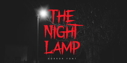 The Night Lamp is a horror style display font. Inspired from horror thriller movie. This font designed for Halloween, Horror, Thriller and Scary theme projects. The Night Lamp would be perfect for logo, quotes, apparel, comic, cover books, cards, posters, or anything that requires a horror or scarylook!
 - Stereohead by Stationjack,
$13.00 Stereohead is a retro sans serif display typeface inspired by old eighties video cassette cover designs. This font would work perfectly in magazine headlines, t-shirt design, posters, packaging, advertising purposes. Uppercase and lowercase characters, numbers, punctuation and extended latin characters included. 2 font styles available, regular and italic.

