10,000 search results
(0.059 seconds)
- STP Display by Sete Std,
$30.00 Its inspiration comes from the types without serifs, with features ranging from architecture to modernist design products. With generous shapes and counterforms, the type becomes showy wherever it is, masterfully fulfilling the purpose for which it was designed. Initially designed for a signaling project in the Brazilian city of Jaraguá do Sul, Santa Catarina, the STP Display was expanded to include the largest number of characters in the Latin alphabet. This helps to find solutions in cases where a large number of languages to communicate something is needed, such as to inform a specific place for a tourist or also a direction to follow for an employee in a company. The STP Display is a modular feature, developed with rounded corners and a design based on geometric elements, ideal for use in large sizes. Forms and counterforms, its main characteristics, bring prominence to any signaling project. The STP Display also has another version, the STP Stencil, and in addition to wayfinding projects, both can be used in architectural projects, advertising, packaging, posters, and others. With a complete Latin alphabet, STP Display covers over 90% of the supported languages, covering the whole American continent, East and West Europe and most of the countries of Africa, Asia and Oceania.
 - Lido STF by Storm Type Foundry,
$39.00Times with a Human Face: In my article of the same name which appeared in the magazine Font, volume 2000 I described the long and trying story of an order for a typeface for the Czech periodical Lidové noviny (People’s Newspaper). My task was to design a modification of the existing Times. The work, however, finally resulted in the complete re-drawing of the typeface. The assignment, which was on the whole wisely formulated, was to design a typeface which would enable “a smooth flow of information in the reader’s eye”, therefore a typeface without any artistic ambitions, from which everything which obstructs legibility would be eliminated. A year later Lidové noviny had a different manager who in the spring of 2001 decided to resume the cooperation. The typeface itself definitely profited from this; I simplified everything which could be simplified, but it still was not “it”, because the other, and obviously more important, requirement of the investor held: “the typeface must look like Times”. And that is why the above-mentioned daily will continue to be printed by a system version of Times, negligently adjusted to local conditions, which is unfortunately a far cry from the original Times New Roman of Stanley Morison. When I was designing Lido, the cooperation with the head of production of Lidové noviny was of great use to me. Many tests were carried out directly on the newspaper rotary press during which numerous weak points of the earliest versions were revealed. The printing tests have proved that the basic design of this typeface is even more legible and economical than that of Times. The final appearance of Lido STF was, however, tuned up without regard to the original assignment – the merrier-looking italics and the more daring modelling of bold lower case letters have been retained. The typeface is suitable for all periodicals wishing to abandon inconspicuously the hideous system typefaces with their even more hideous accents and to change over to the contemporary level of graphic design. It is also most convenient for everyday work in text editors and office applications. It has a fairly large x-height of lower case letters, shortened serifs and simplified endings of rounded strokes. This is typical of the typefaces designed for use in small sizes. Our typeface, however, can sustain enlargement even to the size appropriate for a poster, an information table or a billboard, as it is not trite and at the same time is moderate in expression. Its three supplementary condensed designs correspond to approximately 80% compression and have been, of course, drawn quite separately. The intention to create condensed italics was abandoned; in the case of serif typefaces they always seem to be slightly strained. I named the typeface dutifully "Lido" (after the name of the newspaper) and included it in the retail catalog of my type foundry. In order to prevent being suspected of additionally turning a rejected work into cash, Lido STF in six designs is available free of charge. I should not like it if the issuing of this typeface were understood as an “act out of spite” aimed against the venerable Times. It is rather meant as a reminder that there really are now alternatives to all fonts in all price categories. - Axion STN by Type Innovations,
$39.00 Axion STN is an original design by Alex Kaczun and is a stencil interpretation of his Axion RX-14 font. It is but one of several alternate designs based on his original Axion family of fonts. The wide gap within this stencil treatment works well with and compliments the spacing in the font, creating a tension within this modern grotesque and adding a class of destinction and interest. This display font is not intended for text use. It was designed specifically for display headlines, logotype, branding and similar applications. The entire font has an original look which is strong, dynamic, machine generated and can be widely used in publications and advertising. Axion STN is a futuristic, techno-looking and expressive typeface with an appearance of machined parts with sharp and rounded edges. This attractive display comes in roman with lower case and lining figures. The large Pro font character set supports most Central European and many Eastern European languages.
 - BaselSans ITD by Isaco Type,
$30.00 BaselSans is a discrete, legible typeface, inspired by the international typographic style, with a humanistic touch. It is suitable for many uses, from small size texts to large titles.
 - Fan Script by Sudtipos,
$99.00 A friend of mine says that sports are the ultimate popular drug. One of his favorite things to say is, “The sun’s always shining on a game somewhere.” It’s hard to argue with that. But that perspective is now the privilege of a society where technology is so high and mighty that it all but shapes such perspectives. These days I can, if I so choose, subscribe to nothing but sports on over a hundred TV channels and a thousand browser bookmarks. But it wasn't always like that. When I was growing up, long before the super-commercialization of the sport, I and other kids spent more than every spare minute of our time memorizing the names and positions of players, collecting team shirts and paraphernalia, making up game scenarios, and just being our generation’s entirely devoted fans. Argentina is one of the nations most obsessed with sports, especially "fútbol" (or soccer to North Americans). The running American joke was that we're all born with a football. When the national team is playing a game, stores actually close their doors, and Buenos Aires looks like a ghost town. Even on the local level, River Plate, my favorite team where I grew up, didn't normally have to worry about empty seats in its home stadium, even though attendance is charged at a high premium. There are things our senses absorb when we are children, yet we don't notice them until much later on in life. A sport’s collage of aesthetics is one of those things. When I was a kid I loved the teams and players that I loved, but I never really stopped to think what solidified them in my memory and made them instantly recognizable to me. Now, thirty-some years later, and after having had the fortune to experience many cultures other than my own, I can safely deduce that a sport’s aesthetic depends on the local or national culture as much as it depends on the sport itself. And the way all that gets molded in a single team’s identity becomes so intricate it is difficult to see where each part comes from to shape the whole. Although “futbol” is still in my blood as an Argentinean, I'm old enough to afford a little cynicism about how extremely corporate most popular sports are. Of course, nothing can now take away the joy I got from football in my childhood and early teens. But over the past few years I've been trying to perceive the sport itself in a global context, even alongside other popular sports in different areas of the world. Being a type designer, I naturally focus in my comparisons on the alphabets used in designing different sports experiences. And from that I've come to a few conclusions about my own taste in sports aesthetic, some of which surprised me. I think I like the baseball and basketball aesthetic better than football, hockey, volleyball, tennis, golf, cricket, rugby, and other sports. This of course is a biased opinion. I'm a lettering guy, and hand lettering is seen much more in baseball and basketball. But there’s a bit more to it than that. Even though all sports can be reduced to a bare-bones series of purposes and goals to reach, the rules and arrangements of baseball and basketball, in spite of their obvious tempo differences, are more suited for overall artistic motion than other sports. So when an application of swashed handlettering is used as part of a team’s identity in baseball or basketball, it becomes a natural fit. The swashes can almost be visual representation of a basketball curving in the air on its way to the hoop, or a baseball on its way out of the park. This expression is invariably backed by and connected to bold, sleak lettering, representing the driving force and precision (arms, bat) behind the artistic motion. It’s a simple and natural connective analysis to a designer, but the normal naked eye still marvels inexplicably at the beauty of such logos and wordmarks. That analytical simplicity was the divining rod behind Fan Script. My own ambitious brief was to build a readable yet very artistic sports script that can be a perfect fit for baseball or basketball identities, but which can also be implemented for other sports. The result turned out to be quite beautiful to my eyes, and I hope you find it satisfactory in your own work. Sports scripts like this one are rooted in showcard lettering models from the late 19th and early 20th century, like Detroit’s lettering teacher C. Strong’s — the same models that continue to influence book designers and sign painters for more than a century now. So as you can see, American turn-of-the-century calligraphy and its long-term influences still remain a subject of fascination to me. This fascination has been the engine of most of my work, and it shows clearly in Fan Script. Fan Script is a lively heavy brush face suitable for sports identities. It includes a variety of swashes of different shapes, both connective and non-connective, and contains a whole range of letter alternates. Users of this font will find a lot of casual freedom in playing with different combinations - a freedom backed by a solid technological undercurrent, where OpenType features provide immediate and logical solutions to problems common to this kind of script. One final thing bears mentioning: After the font design and production were completed, it was surprisingly delightful for me to notice, in the testing stage, that my background as a packaging designer seems to have left a mark on the way the font works overall. The modern improvements I applied to the letter forms have managed to induce a somewhat retro packaging appearance to the totality of the typeface. So I expect Fan Script will be just as useful in packaging as it would be in sports identity, logotype and merchandizing. Ale Paul
 - Romeo Fans by Haksen,
$17.00 Romeo Fans is a natural brush script with texture and similar to hand written. I designed it by hand and I really hope you will enjoy using this font. I love using this one with layer masks in Photoshop, it really looks natural written. Romeo Fans Script includes a couple ligatures to make everything look totally hand-done, it also contains other additional features like swashes and spots. What's Included: - Ligatures - Numbers + Punctuation - Non-English support - Swashes - Spots Please contact me if anything question, I'm glad to help. Happy Designing!
 - Pirates Gold - Unknown license

- Yukon Gold - Unknown license

- Ionic bond - Unknown license

- Top Bond - Unknown license

- Stone Cold - Unknown license

- Mold Papa - Unknown license

- Yold Anglican - Unknown license

- Really Gold by Yumna Type,
$12.00 If you have a dream to create an awesome designs or projects? Whatever your project it is-then we've got what you want. Really Gold, the gold combination between script and uppercase display font. The display font is fun, playful, readable and has a youthful touch that make it up to date while the script shows the simple but yet elegant style. As extras you will get 15 illustrations to maximize your design. Features: Ligatures Stylistic Sets Swashes Multilingual Supports Uppercase and lowercase PUA Encoded Numerals and Punctuation It is best to be apply on your branding, logos, social media quotes, stickers, posters, wall art, merchandise, social media, and many more. Get more inspiration about how to use it by seeing the font preview. Thank you for purchasing our fonts. If you have any further questions, don't hesitate to contact us. Happy Designing.
 - Bolda Display by The Infamous Foundry,
$29.00 Bolda Display is a a-z lowercase display font in two styles; regular and outline. Lowercase is regular and uppercase is outline. Inspired by the 1970’s tennis, dart and ping pong fashion. Perfect for headlines, logos and everything above the body.
 - Retro Boldy by Nirmana Visual,
$24.00 Retro Boldy, a Bold, classy, contemporary of script font, inspired by 90s Era. Retro Boldy offers beautiful typographic harmony for a diversity of design projects, including logos & branding, social media posts, advertisements & product designs.
 - Cold Army by Typefactory,
$14.00 Cold Army is a stencil display font. Strong and delicate it makes a statement when used. Use this font for your designs and explore its endless possibilities.
 - Cold Brew by Fenotype,
$29.00 Cold Brew is a swift brush script family of three weights and a set of extras. Cold Brew is based on hand drawn letters polished with care to retain the vivid appearance of ink brush. Cold Brew is equipped with OpenType features to give you tools for custom-looking design: turn on Stylistic Alternates or Swash in any OpenType savvy program for flashier letters or manually select from even more Alternates from Glyph Palette. Cold Brew Extras is a set of brush strokes and swashes designed to support the font. You can for example easily create custom letters by combining the swash shapes from Extras with the letters. Combine Extras with uppercase letters or use them as underline or just plain extra strokes to emphasise your words.
 - Cold Daylight by Nathatype,
$25.00 Do you want to enhance your branding? Do you dream of getting playfu;, stylish, modern, and adventure font? What if we told you, you only need to change one element to engage and convert your clients? Cold Daylight-A Display Font Cold Daylight is a display font designed to bring your branding to life and add a touch of playfulness, cheerful, and style. We are hoping that through this font, you can maximize your designs! In turn, you’ll communicate the perfect idea to your audiences or clients. The best choice for branding projects, book/magazine cover, fashion designs, quotes, packaging, or even as a stylish text overlay to any background image. Our font always includes Multilingual Support to make your branding reach a global audience. Features: - Ligatures - Stylistic Sets - Swashes - PUA Encoded - Numerals and Punctuation Thank you for downloading premium fonts from Nathatype
 - Graffiti Boldy by Nirmana Visual,
$19.00 Inspired by Graffiti style Design, with 2 Style : Regular & Shadow Graffiti Boldy offers beautiful typographic harmony for a diversity of design projects, including logos & branding, social media posts, advertisements & product designs.
 - Bond 4F by 4th february,
$25.00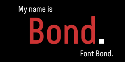
- Cold Mountain by Arthur Baker,
$12.00 - Cold Outside by Sronstudio,
$18.00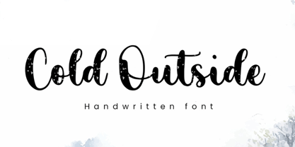 Cold Outside is a Lovely Script font perfect for crafting, branding, invitation, stationery, wedding designs, social media posts, advertisements, product packaging, product designs, label, photography, watermark, special events, or anything. Cold Outside comes with a full set of uppercase and lowercase letters, swash alternates, ligatures, multilingual symbols, numerals, and punctuation. If you have any questions don't hesitate to drop me a message ;) Happy Creation !!
 - Boldy Vintage by Din Studio,
$29.00 Looking for a fun and bold font to captivate your audience, clients, or party guests? If you need to create invitations, have a t-shirt branding company, or need to create a new menu - then this is the perfect font for you. Boldy Vintage-Bold Script Font Boldy Vintage is a bold, fun, and modern font. Every hand-drawn stroke and curve will delight and add brightness, modernity, and fun to wherever it’s placed. This bubble font is the best to maximize the amount of street vibe and playfulness. Ideal to create amazing headings, logos, menus, and social media graphics. Our font always includes Multilingual Support to make your branding reach a global audience. Features: Ligatures Stylistic Sets PUA Encoded Numerals and Punctuation Thank you for downloading premium fonts from Din Studio
 - MV Boli by Microsoft Corporation,
$49.00MV Boli™ was first introduced with Windows XP to support Thaana script, which is used for the Dhivehi language of the Maldives. Thaana font is similar to the Arabic script and is written right to left. Thaana font uses vowel signs and spaces between words. Character Set: Latin-1, Thaana - Cold Snowflake by Putracetol,
$16.00 Cold Snowflake - Quirky Ice Cream And Candy Theme Font is a delightful typeface designed to capture the essence of ice cream and candy in a playful and fun manner. The font features quirky, bold, and chubby letterforms, mirroring the sweet and indulgent theme it represents. It can be effectively used alone or in combination with its twelve charming variations. With twelve distinctive variations inspired by ice cream, candy, cones, sprinkles, sticks, melting treats, and chocolate, Cold Snowflake is the perfect choice for children's projects, crafting, and any design that seeks to evoke a sense of fun, playfulness, and a vibrant, colorful aesthetic. This font suits a wide range of applications, including logos, crafting projects, invitations, packaging, posters, titles, businesses, greeting cards, stickers, children's books, magazines, and any design related to the delightful world of ice cream and candy. With its sweet and cheerful theme, Cold Snowflake adds a touch of whimsy to your creative work, making it perfect for all things sweet and playful.
 - Gold Fever by FontMesa,
$25.00Gold Fever is a revival of the old classic Caxtonian font originaly designed in the mid to late 1800s. Along with the original engraved shadow version new styles have been created making this decorative font set more complete. The new styles include a solid black, open faced, condensed and fill versions. - Gold Giggers by Inumocca,
$16.00 Gold Diggers, inspired from Victorian Era with the ornamental and decorative font With Variant for the Capital Letters and alternates for changes the unique glyphs for design needs like Poster, logos, badges product, magazine with vintage taste and more your project design. - Unique glyphs - Multilingual Characters - UPPERCASE - Lowercase - Numeric - Symbol - Punctuation Character - Alternates inumocca type
 - Misty Gold by ErlosDesign,
$15.00 Misty Gold is a delicate, elegant and flowing signature font. It has beautiful and well balanced characters and as a result, it matches a wide pool of designs.Misty Gold features a varying baseline, smooth lines, gorgeous glyphs and stunning alternates. Add it to your most creative ideas and notice how it makes them come alive!
 - Golding Signature by Letterfreshstudio,
$20.00 Golding is a unique, elegant and modern Signature font. that looks like a signature, this font is intentionally made with unique and alternating ligatures. This style of hand display makes it perfect for use in all your design projects whether it's logo, label, packaging design, blog title, poster, wedding designs, social media posts, Instagram design, etc. Multiple Language Support: ŠÀÁÂÃÄÅÆÇÈÉÊËÌÍÎÏŸŽÐÑÒÓÔÕÖØÙÚÛÜÝßàáâãäåæçèéêëìíîïñòóôõöøùúûêýÿŒœšž I hope you enjoy this font. If you have questions, don't hesitate to give me a message :) Thank you for your purchase!
 - Hold On by Seemly Fonts,
$12.00Hold on is a chunky and bold display font featuring subtle brush-strokes for a friendly feel. This gorgeous typeface is perfectly suited for stationery, logos, t-shirt, paper, print design, website header, photo frame, flyer, music cover, poster, image slider, and much more! - ITC Bolt by ITC,
$29.99 - Gold Night by Subectype,
$15.00 Gold Night Is A Natural Brush font. This is stylish brush font with a modern touch. With swift strokes and authentic dry textures, it's an irresistibly charismatic & confident font choice for a range of design projects. Gold Night is perfect for branding projects, homeware designs, product packaging, Signature, Clothing - or simply as a stylish text overlay to any background image. Ligatures are also available for several lowercase characters (double-letters which flow more naturally). These are only accessible via software with opentype capability or a glyphs panel, e.g. Photoshop/Illustrator.
 - Stay Gold by Decade Typefoundry,
$35.00 Stay Gold Script is a highly usable, powerful typeface. Perfect for everything from street wear brand to wedding invitations, sports team logos to band logos. Use it however you see fit. Just one thing - it’s not designed for all-caps settings.
 - Marry Gold by Inumocca,
$16.00 MARRY GOLD is A Retro Display Typeface, Come from 70s Style. The Typeface comes with Stylistic Set and Ligature Combinations Exellent typeface to use for covering your Project, like Branding, Movie Title, Headline Letter, Bookcover or Book Content, Magazine cover, Poster, Quotes Lettering, Logos, and more your project design. - Unique glyphs - Multilingual Characters Support - UPPERCASE - Lowercase - Numeric - Symbol - Punctuation Character - Ligature - Stylistic Set (ss01 - ss06) inumocca type
 - Cold Mountain by Monotype,
$49.00 - Gold Diggin by Open Window,
$19.95 Gold Diggin is an authentic hand-drawn original. It harkens back to posters from the Gold Rush Era. Add some humor and moonshine to your designs with Gold Diggin.
 - Bolt Display by SilverStag,
$19.00 Introducing Bolt Display – picture this: uppercase letters with rounded corners, inviting you in with a warm, approachable embrace. Or, if you're feeling adventurous, the outlined uppercase stylistic set that adds that contemporary edge to your work. On the flip side, lowercase letters with sharp corners confidently declare their presence, while the lowercase outlined stylistic set strikes the perfect balance between structure and artistic freedom.
 - Fools Gold by BA Graphics,
$45.00 A throwback to the 70s, a graphic design with a lot of different applications. You can use this font with a normal setting or a very tight setting even over lap it, it has such great flexibility. Experiment with the possibilities and you will be pleasantly surprised.
 - Giordano Gold by Larin Type Co,
$15.00 Giordano Gold this is a beautiful font duo that includes: script and serif font. Capital Serif is sophisticated and elegant, perfect for headlines, logos, branding, short display texts. The fine brush script includes many alternatives that make it more expressive and playful, also included in the script are love letters that will perfectly complement wedding invitations, decorations holidays and much more. These fonts are harmoniously combined with each other and perfectly complement each other, easy to use and has OpenType features.


