10,000 search results
(0.072 seconds)
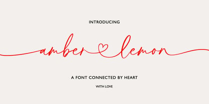
- Amber Lemon by Supfonts,
$18.00Amber Lemon is a cute handwritten signature font with heart and regular swashes. Perfect for greeting cards, wedding stationery, photographer watermarks logos, modern websites, apparel design and more. Amber Lemon features handwritten ligatures, beginning and end swashes for lowercase letters and heart connections Thanks so much for checking out my shop, and please get in touch if you have any questions! Amber Lemon Font Features: Full Set of standard alphabet and punctuation Extra set of beginning and ending swashed lowercase Extra set of heart connections handwritten ligatures PUA Encoded - no special software needed to access extra characters Multilingual Characters AÁĂÂÄÀĀĄÅÃÆBCĆČÇĊDÐĎĐEÉĚÊËĖÈĒĘẼFGĞĢĠḠHĦIIJÍÎÏİÌĪĮĨJKĶLĹĽĻŁMNŃŇŅÑ OÓÔÖÒŐŌØÕŒPÞQRŔŘŖSŚŠŞȘẞTŤŢȚUÚÛÜÙŰŪŲŮŨVWẂŴẄẀXYÝŶŸỲỸZŹŽŻ aáăâäàāąåãæbcćčçċdðďđeéěêëėèēęẽfgğģġḡhħiıíîïìijīįĩjȷkķlĺľļłmnńňņñoóôöòőōøõœpþ qrŕřŗsśšşșßtťţțuúûüùűūųůũvwẃŵẅẁxyýŷÿỳỹzźžż - Linotype Killer by Linotype,
$29.99Linotype Killer is part of the Take Type Library, selected from the contestants of Linotype’s International Digital Type Design Contests from 1994 and 1997. Designed by German artist Andre Nossek, the font seems to describe the Technosound of the 1990s with its electronically produced sights and sounds. It represents repetition, mass production and conformity. The alphabet consists exclusively of capital letters, all based on a rectangular form, all of the same height, and, with the exception of the I’, all of the same width. The cool and distant Linotype Killer is best suited to short headlines. - Minimalist by Ingrimayne Type,
$12.95PostScript fonts are constructed by connecting dots, dots that have special attributes that control the shape of the connecting lines. In designing Minimalist, I wanted to see how few dots could be used to construct each letter. This is the source of the name--it is (or was) a minimum-point alphabet. I did not expect much from it, and was surprised that it turned out as well as it did. Since I originally drew it, I have added some points to some of the letters to get them to generate proper bitmaps, so it no longer has minimum points. - Linotype Sketch by Linotype,
$29.99Linotype Sketch is part of the Take Type Library, chosen from the contestants of Linotype’s International Digital Type Design Contests of 1994 and 1997. German designer Dieter Kurz gave his display font a calligraphic character. The forms lean slightly to the right and have a spontaneous and individual look. This light, cheerful font also displays a harmony among the forms and gives text a personal touch. Linotype Sketch combines well with modern text fonts which have the same narrow proportions. This font is well-suited for headlines and short and middle length texts with point size 12 or larger. - Handelson by Melvastype,
$29.00Handelson is a collection of 6 handmade typefaces with authentic and organic feel. It contains three scripts, one non-connected script and two all caps geometric sans serifs (Block letters). Textures and rough edges are simulating handwritten and printed looks. By combining these fonts you can make diverse typographic solutions and elements with unified style. All the non-connected fonts; Handelson Two, Handelson Four, Handelson Five and Handelson Six has two sets of characters. By enabling Contextual Alternates from the OpenType panel you can make these letters vary randomly to make your text look more like real handwriting. - Linotype Not Painted by Linotype,
$29.99Linotype Not Painted is part of the Take Type Library, chosen from the contestants of Linotype’s International Digital Type Design Contests of 1994 and 1997. This fun font from German designer Robert Bucan grabs attention immediately. The forms are made up of multiple layers. The upper case’ alphabet forms, numerals and punctuation are two different styles of the same character, one over the other, and the lower case’ letters are composed of the lower case and upper case of the same letter superimposed. Linotype Not Painted is particularly good as a headline font in larger point sizes. - Stupid War by PizzaDude.dk,
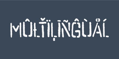
$17.00This font is not a rebel or a political font, but a simple and grungy stencil font. Use it for anything that needs a clear and catchy headline. The font is even suitable for massive text - perhaps for that skateboarding poster you have plans to do? Maybe a heavy metal concert flyer? Please don't use it for any war business, because war is stupid! - Reloaded by Almarkha Type,
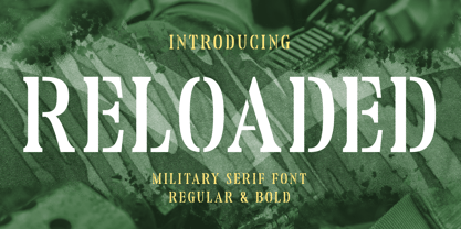
$25.00Reloaded - Military Serif Font, first conceptualize was inspired by the classic vintage military stencil design . I wanted a typeface that could be a solid base for any military inspired project Reloaded Fonts can be used for wallpaper, pattern fills, web page background, surface textures. Perfect for making army posters , scrapbooking,invitation cards, stationary, gift wrap, packaging, buttons, pendants, holiday gifts, print on fabrics and so much more. - Scary Scrimshaw NF by Nick's Fonts,
$10.00Fire up the incense and break out the love beads! A 1968 poster for a Doors concert by legendary artist Gary Grimshaw provided the inspiration for this wild, far-out and funky romp through the alphabet. Use it liberally to add a little trippy hippie charm to your next project. Both versions of the font include 1252 Latin, 1250 CE (with localization for Romanian and Moldovan). - Lovelace by Zetafonts,
$39.00Designed by Cosimo Lorenzo Pancini and Andrea Tartarelli with Maria Chiara Fantini, Lovelace is Zetafonts homage to the tradition of nineteenth century “Old Style” typography - a revival of Renaissance hand-lettered shapes driven by the desire to create a less formal and more friendly alternative to Bodonian serifs. While taking inspiration from the letter shapes created by Pheimester or Alexander Kay - with their calligraphic curves and heavy angled serifs that influenced Benguiat and Goudy’s typefaces in the 70s - we also tried to add elegance and contrast by following another 19th century revival style: the Elzevir. This digital homage to victorian typography, aptly named after the algorist daughter of lord Byron, is developed in two optical sizes, both in a six weights range from extralight to extrabold. The text variant offers maximum readability thanks to the generous x-height and screen-friendly design, while the display variant excels in the sharp contrast and thin details needed for editorial and large-size titling use. The italics, strongly influenced by calligraphy, have been complemented with a display script family, including luscious swashes and connected lowercase letters, lovingly designed by Zetafont in-house calligrapher. All the thirty weights of Lovelace cover over 200 languages that use latin, cyrillic and greek alphabets, and include advanced Open Type features as Stylistic Alternates, Standard and Discretionary Ligatures, Positional Numerals, Small Caps and Case Sensitive Forms. - EFCO Colburn by Ilham Herry,
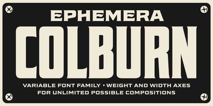
$15.00Colburn is a squarish typeface inspired by lettering found on vintage tins, Colburn is a display typeface that captures the essence of nostalgia while offering modern versatility. Colburn's variable font technology ensures seamless transitions between different styles, empowering you to create dynamic and harmonious compositions. From packaging and posters to websites and branding materials. PDF SPECIMEN - Nuance by Xelo,
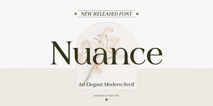
$32.00Introducing Nuance Font: An Elegant Modern Serif Typeface Discover Nuance Font: Where Elegance Meets Modernity. This versatile serif offers complete glyphs, multilingual support, and a variable font option for unmatched creative freedom. Elevate luxury branding, editorial design, and more with its timeless charm. Perfect pairings and modern elegance make Nuance Font a must-have. Craft sophistication effortlessly. #NuanceFont - Concasse by Lillan Team,
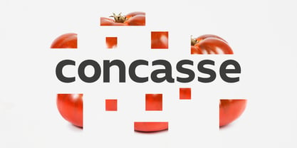
$9.90The family comes in five weights from Thin to Black, all with true italics; and a variable file in weight and slant. Concasse is multi-purpose and reads well in body copy, the open shapes ensure excellent legibility in even the smallest text sizes, while the lightest and boldest weights deliver impact to headlines and other display uses. - Kingkey by TypeClassHeroes,
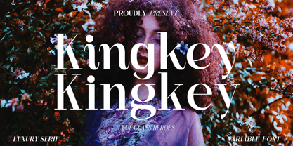
$17.00Kingkey and Kingkey Neue is a serif family comes with Classic and Modern. It's clean and smooth with 9 variable much ligature inside. Suitable to create any branding, product packaging, invitation, quotes, t-shirt, label, poster, logo etc. Feature Uppercase & Lowercase Number & Symbol International Glyphs Multilingual support Alternative Ligature If you need anything else just shoot me message. - SF Sultan by Sultan Fonts,
$19.99Sultan is a font family for print and web. It includes four coordinated weights: Light, Regular, Medium, and Bold. Sultan supports Arabic, Latin, Persian, Urdu, and Kurdish. Graphic designers can use the variable Sultan font to reach wider options in working with the text, such as changing the weight, width, and slant of the font to create different effects. - SF Liberty VF by Sultan Fonts,
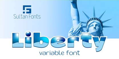
$180.00Liberty is an active contemporary variable font, complete with a flexible range of cases tailored to responsive layouts. The font is clear and legible in small sizes, suitable for printing for large texts, web pages, and other visual uses. Language: Latin default Latin Azerbaijani Latin Catalan Latin Crimean Tatar Latin Kazakh Latin Marshallese Latin Dutch Latin Tatar Latin Turkish - Game Paused by Ahmad Jamaludin,
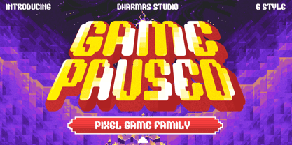
$17.00Dive into the world of retro nostalgia with the GAME PAUSED font. With its 6 unique styles in each type - Regular, Slant, Outline, Extrude, Outline Slant, and Extrude Slant Features: Game Paused Main File Has 6 Variable: Regular, Slant, Outline, Extrude, Outline Slant, and Extrude Slant Instructions (Access special characters, even in Cricut Design) Enjoy Designing! Dharmas Studio - Quam by Typogama,
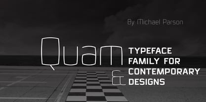
$29.00Quam is a contemporary sans serif typeface, designed to be used as either a display or text font. With a range of alternates, true small capitals and variable numerals, this design aims to be versatile and functional. An added function is the inclusion of the full Cyrillic encoding to allow the application of a wide range of scripts. - Spirrevip by Bogstav,
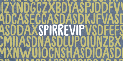
$18.00Spirrevip is for that moment when you need something legible, organic and obviously handmade at the same time. The letters are straightforward, yet variable in thickness of strokes, height and width. Spirrevip is definitely playful and serious at the same time. I have added 5 slightly different versions of each letter, and they automatically changes as you type! - Monospaceland by Pepper Type,
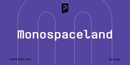
$25.00Monospaceland is a round monospaced typeface in 7 weights with rich language support (Cyrillic included), small capitals, and some double-width alternatives for added fun. It includes obliques and reverse obliques, making a total of 21 fonts. Plus, the family pack comes with a two-axis variable font to allow setting arbitrary weight and slant angle. - Rothek Stencil by Groteskly Yours,
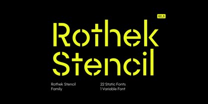
$25.00Rothek Stencil is a stencil type family based on our bestselling Rothek family. Rothek Stencil is highly legible, versatile and multilingual. • Ideal for graphic design, packaging, branding and signage • Unique stencilled letterforms • 23 Styles (11 Uprights, 11 Italics, 1 Variable Font) • 1000+ Characters per font • Extended Latin, Extended Cyrillic, and Vietnamese support • Versatile OpenType Features • Legible, versatile, and multifunctional - Codeworld by Par Défaut,
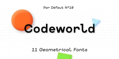
$49.00Codeworld is a geometrical sans serif font family (5 weight, italic and variable) It contains more than 800 characters including the Latin, Cyrillic and Greek alphabet. There are also 13 OpenType features (Superior; Inferior; Numerator; Denominator; Fraction ; Small Capital; Small Capitals from Capitals; Contextual Alternate; Case Sensitive; Access All Alternates; Stylistic Set; Standard Ligature; Discretionary Ligature). - Malena by Tipo,
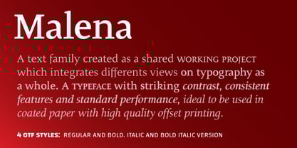
$69.00Malena is a typographic family created by Lentino and Muhafara like a shared working project which integrates both views on typography as a whole. Malena is intended to be used in lengthy texts with a wide range of variables, having a striking contrast, with consistent features and standard performance, Ideal to be used in paper with very good finish. - Rodest by Graptail,
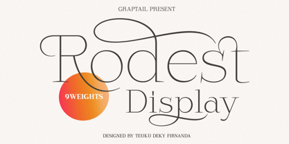
$19.00Rodest is a very soft serif typeface that adds a touch of curvature to certain letters to reflect the feminine value of the shape. The contrast between thick and thin strokes gives Rodest a harmonious and stylish look. It comes in 9 variables plus an alternative version making it perfect for editorial designs, branding, magazines, logos, headers, and more. - Zolina by Creativemedialab,
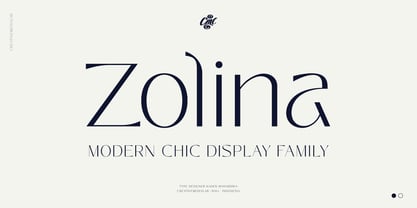
$20.00Unique and fashionable font, the straight lines combined with a slight curve that makes Zolina looks modern and pretty. Try uppercase for clean and elegant look. Zolina is perfect for website header, logo, instagram story, or fashion related branding. This versatile family consists of 9 weights, variable styles as well as multilingual support, numbers, and currency symbols. - Codeworld Mono by Par Défaut,
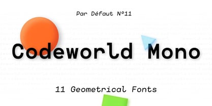
$49.00Codeworld Mono is geometrical and monospaced sans serif font family (include 5 weight, italic and variable) It contains more than 800 characters including the Latin, Cyrillic and Greek alphabet There are also 11 OpenType features (Superior; Inferior; Numerator; Denominator; Fraction; Small Capital; Small Capitals from Capitals; Contextual Alternate; Case Sensitive; Access All Alternates; Stylistic Set; Standard Ligature; Discretionary Ligature). - Lonie by Par Défaut,
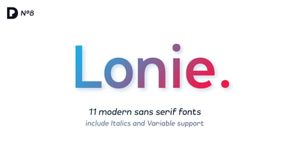
$35.00Lonie is sans serif font family (include 5 weight, italic and variable) It contains more than 1200 characters including the Latin, Cyrillic and Greek alphabet There are also 15 OpenType features (Superior; Inferior; Numerator; Denominator; Fraction; Tabular Lining; ;OldStyle Figure; Small Capital; Small Capitals from Capitals; Contextual Alternate; Case Sensitive; Ordinals; Access All Alternates; Stylistic Set). - Polanix by Outerend,
$25.00This unique geometric design will make your projects stand out from the crowd! If you're looking for a futuristic but with an edgy twist, "Polanix" could be the one. The interesting deformation of its variable version also works great with animation, game design and film/TV credits & titles as well as interface, app and web designs. - Macklin by Monotype,
$50.99Designed by Malou Verlomme of the Monotype Studio, Macklin is a superfamily, which brings together several attention-grabbing styles. Macklin is an elegant, high contrast typeface that demands its own attention and has been designed purposely to enable brands to appeal more emotionally to modern consumers. Macklin comprises four sub-families —Sans, Slab, Text and Display— as well as a variable. The full superfamily includes 54 fonts with 9 weights ranging from hairline to black. The concept for Macklin began with research on historical material from Britain and Europe in the beginning of the 19th century, specifically the work of Vincent Figgins. This was a period of intense social change--the beginning of the industrial revolution. A time when manufacturers and advertisers were suddenly replacing traditional handwriting or calligraphy models and demanding bold, attention-grabbing typography. Typographers experimented with innovative new styles, like fat faces and Italians, and developed many styles that brands and designers continue to use today, such as slabs, serifs, and sans serifs. Verlomme pays respect to Figgins’s work with Macklin, but pushes the family to a more contemporary place. Each sub family has been designed from the same skeleton, giving designers a broad palette for visual representation and the ability to create with contrast without worrying about awkward pairings. With Macklin, Verlomme shows us it’s possible to create a superfamily that allows for complete visual expression without compromising fluidity. Macklin™ font field guide including best practices, font pairings and alternatives. Featured in: Best Fonts for Websites - Lust Sans by Positype,
$39.00Lust Sans is the penultimate exploration of producing a high-contrast sans wholly influenced by its bracketed ancestor. The aspect of this endeavor I enjoyed the most was finding sneaky ways to infuse warmth and whimsy into the letterforms when you least expect it. The result, however, is subtle and uniquely balances against Lust and Lust Didone without becoming cold and overbearing. To accomplish this, Lust Sans has 6 weights. What I found during development was, based on any setting where Lust or Lust Didone were in the same layout, the amount of contrast shown with Lust Sans needed to be adjusted. Expanding the weight offering, produces opportunities for Lust Sans to modulate the rhythm of the layout comfortably while keeping contrast—this is even more obvious with the Italics. I love those. You will too. If you don’t, you do not have a soul. Not sorry. The Lust Collection is the culmination of 5 years of exploration and development, and I am very excited to share it with everyone. When the original Lust was first conceived in 2010 and released a year and half later, I had planned for a Script and a Sans to accompany it. The Script was released about a year later, but I paused the Sans. The primary reason was the amount of feedback and requests I was receiving for alternate versions, expansions, and ‘hey, have you considered making?’ and so on. I listen to my customers and what they are needing… and besides, I was stalling with the Sans. Like Optima and other earlier high-contrast sans, they are difficult to deliver responsibly without suffering from ill-conceived excess or timidity. The new Lust Collection aggregates all of that past customer feedback and distills it into 6 separate families, each adhering to the original Lust precept of exercises in indulgence and each based in large part on the original 2010 exemplars produced for Lust. I just hate that it took so long to deliver, but better right, than rushed, I imagine. - BoomBox - Unknown license
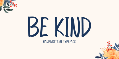
- Be Kind by Seemly Fonts,
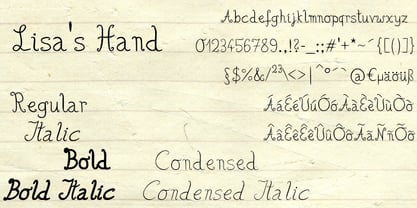
$12.00 - Lisa's Hand by Matthias Luh,
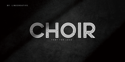
$15.00 - Choir by Linecreative,
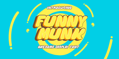
$16.00 - Funny munk by Sipanji21,
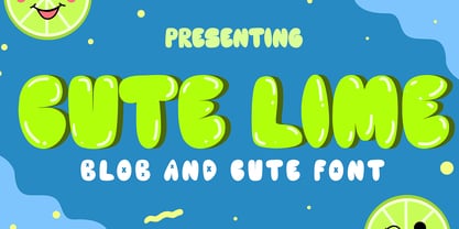
$15.00 - Cute Lime by Sipanji21,
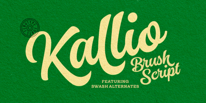
$10.00 - Kallio Brush by Fenotype,
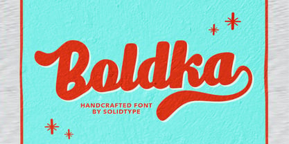
$19.00 - Boldka Script by Solidtype,
$14.00 - Sabtine by PizzaDude.dk,
$20.00Sabtine is a somewhat grungy connecting handwriting font - Watch it bounce up and down! I've included a good handful of autoligatures and swashes. You will need to use OpenType supporting applications to use the autoligatures and swashes. - Super Kids by Stringlabs Creative Studio,
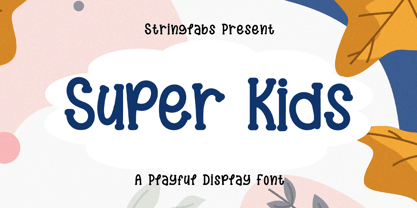
$29.00
