10,000 search results
(0.069 seconds)
- Kaizena by MaxnorType,
$12.00 Kaizena is a modern script font with alternates, final form, stylistic sets, including front and back swashes. It can be used for various purposes, and suitable for logo design, branding, greeting cards, stationery, wedding invitations and much more. The design of Kaizena nuanced Japanese style, but it is very feasible to use in modern themed designs. Kaizena uses OpenType Features, so designers can access alternate glyphs easily with graphic design softwares. Besides that, these alternate glyphs are located in Private Use Area, so they can be accessed easily with Character Map, Babel Map, or font manager softwares.
 - Leather by Canada Type,
$24.95 Over the past few years, every designer has seen the surprising outbreak of blackletter types in marketing campaigns for major sports clothing manufacturers, a few phone companies, soft drink makers, and more recently on entertainment and music products. In such campaigns, blackletter type combined with photos of usual daily activity simply adds a level of strength and mystique to things we see and do on a regular basis. But we couldn't help noticing that the typography was very odd in such campaigns, where the type overpowers all the other design elements. This is because almost all blackletter fonts ever made express too much strength and time-stamp themselves in a definite manner, thereby eliminating themselves as possible type choices for a variety of common contemporary design approaches, such as minimal, geometric, modular, etc. So extending the idea of using blackletter in modern design was a bit of a wild goose chase for us. But we finally found the face that completes the equation no other blackletter could fit into: Leather is a digitization and major expansion of Imre Reiner's forgotten but excellent 1933 Gotika design, which was very much ahead of its time. In its own time this design saw very little use because it caused problems to printers, where the thin serifs and inner bars were too fragile and broke off too easily when used in metal. But now, more than seventy years later, it seems like it was made for current technologies, and it is nothing short of being the perfect candidate for using blackletter in grid-based settings. Leather has three features usually not found in other blackletter fonts: - Grid-based geometric strokes and curves: In the early 1930s, blackletter design had already begun interacting back with the modern sans serif it birthed at the turn of the century. This design is one of the very few manifestations of such interaction. - Fragile, Boboni-like serifs, sprout from mostly expected places in the minuscules, but are sprinkled very aesthetically on some of the majuscules. The overall result is magnificently modern. - The usual complexity of blackletter uppercase's inner bars is rendered simple, geometric and very visually appealing. The contrast between the inner bars and thick outer strokes creates a surprising circuitry-like effect on some of the letters (D, O, Q), wonderfully plays with the idea of fragile balances on some others (M, N and P), and boldly introduces new concepts on others (B, F, K, L, R). Our research seems to suggest that the original numerals used with this design in the 1930s were adopted from a previous Imre Reiner typeface. They didn't really fit with the idea of this font, so we created brand new numerals for Leather. We also expanded the character set to cover all Western Latin-based languages, and scattered plenty of alternates and ligatures throughout the map. The name, Leather, was derived from a humorous attempt at naming a font. Initially we wanted to call it Black Leather (blackletter...blackleather), but the closer we came to finishing it, the more respect we developed for its attempt to introduce a plausible convergence between two entirely different type categories. Sadly for the art, this idea of convergence didn't go much further back then, due to technological limitations and the eventual war a few years later. We're hoping this revival would encourage people to look at blackletter under a new light in these modern times of multiple design influences.
 - Romantico by Kustomtype,
$25.00 Kustomtype's "Romantico" font is a sans serif font family with a regular & oblique version. It contains all upper & lower cases. The "Romantico" family is coordinated into letterforms, metrics, and weights to work better together. Why still looking for old school types for your posters, advertising, text, design, artwork, headtext, editoral design, magazines, etc.? "The true genius shudders at incompleteness - imperfection - and usually prefers silence to saying the something which is not everything that should be said." Edgar Allan Poe
 - Didot Headline by Canada Type,
$24.95 In spite of its name, this font family embodies the ultimate classic modern advertising typeface, rather than concern itself with revivalism or Didone authenticity. Naturally the spirit of the original Didot faces still exists in this family, but over twelve years of work on it have made it more fitting to the luxurious expression of our day and age, rather than nineteenth century Europe. Upscale and stylish, Didot Headline is an essential tool for any designer involved in magazines, books, tasteful music, or overall luxury packaging that requires clean and large classic typography with an unmistakable modern spin. We recommend the use of Didot Headline between 12 and 48 points. For larger display use, check out its sister family, Didot Display.
 - Didot Display by Canada Type,
$24.95 In spite of its name, this font family embodies the ultimate classic modern advertising typeface, rather than concern itself with revivalism or Didone authenticity. Naturally the spirit of the original Didot faces still exists in this family, but over twelve years of work on it have made it more fitting to the luxurious expression of our day and age, rather than nineteenth century Europe. Upscale and stylish, Didot Display is an essential tool for any designer involved in magazines, books, tasteful music, or overall luxury packaging that requires clean and large classic typography with an unmistakable modern spin. We recommend the use of Didot Display at 48 points and over. For 12-48 pt. use, check out its sister family, Didot Headline.
 - Marc Anthony by Zang-O-Fonts,
$25.00An imperfect mix between a Roman and a Modern font, Marc Anthony can be used easily for display or body text. - Overland by Yock Mercado,
$9.99 Introducing OVERLAND, a modern and minimalist Sans Serif typeface with a touch of daring exploration. With slightly rounded corners, it has a strong and distinctive personality that makes it perfect for branding, editorial design, web, and mobile applications. OVERLAND is a versatile typeface that adapts to any environment. Its simplicity makes it highly legible, ideal for communicating clear and direct messages. But its imposing presence makes it stand out in any context, making it an ideal font for those looking to create designs with a touch of originality and style. With six different weights and designed in both uppercase and lowercase, it's a complete typeface family. Its minimalist style is elegant and refined, with its Super and Bold weights ideal for branding or headlines, while its lighter weights allow you to use it for medium or long texts. OVERLAND is a versatile and stylish choice for any project. Thank you for visiting our store, and please don't hesitate to contact us if you have any questions. We're here to help you create stunning designs.
 - Stoilen by Mercurial,
$22.00 Stoilen is font duo family serif typeface made with the desire for a quality, elegant, classy font that can still be used for all design needs. Wrapped with a modern yet unique character with a style. with so many alternate variations that are so unique but still elegant, it will add to the impression that this font is so luxurious for your design. Stoilen is ideal for design, logo design, blog graphics, style quotes, wedding stationery, art prints, additional design, packaging, social media, magazines, fashion, creative branding, editorial design and web designing. Features a Latin character set of more than 500 glyphs covering various languages, and includes advanced open type features such as standard and discretionary ligatures, positional numbers, style alternatives, and so on. The Open Type features can be accessed by using Open Type savvy programs such as Adobe Illustrator, Adobe InDesign, Adobe Photoshop Corel Draw X version, and Microsoft Word. And this has given PUA Unicode Fonts (specially coded fonts). so that all the alternate characters can easily be accessed in full by a craftsman or designer. Features : Lowercase and Uppercase Stylistic Alternates & Discretionary Ligatures Numerals & Punctuations Accented characters Multilingual support Don't forget to check out other cool fonts in our store and wait for new fonts. Follow our shop for upcoming updates including additional glyphs and language support. feel free to send me a message, comment, like and share. Thanks
 - Chili by FontMesa,
$29.00 Chili is a version of our Texas Chili font with the spurs removed. The Chili font family also includes a Unicase i that's balanced to the weight of the uppercase. You'll need an application such as Adobe Creative Suite or any other Opentype aware program to access the alternate Unicase i in the Chili font family. Chili is a trademark of Fontmesa LLC
 - Solitas by insigne,
$- You request perfection--that ideal equilibrium of compact dimensions and geometric underpinnings that leaves you with pure, clean lines of a highly legible sans. We give you Solitas, a 7-weight sans-serif from Jeremy Dooley. Made of 42 fonts, from the slender thin to the powerful bold and their matching italics, this typeface family features typographic options including ligatures, fractions, alternate unicase, upright italics, and titling caps. Coupled with its pure design and style, this makes Solitas a successful workhorse typeface. The result of simplification and reduction, Solitas is well-suited for the headlines and shorter texts of promotions, packaging, editorials and branding, both in print and on your website. That's it. It's that clean, that simple, and possibly that perfect for your next layout. Get it today.
 - Bellis by Nine Font,
$25.00 Bellis is a hand painted brush font. Painted on absorbent paper with a chinese brush to make the ink spreading texture. The original texture was a little bit messy but we translated into a more clean textured font. Bellis is a very easy to read brush font and it can be used for posters, magazines or graphic artworks.
 - Braton Composer by Alit Design,
$14.00 After releasing the Rumble Brave font with a vintage elegant style successful in the market. Now we are launching a vintage font that is plump, looks fat, strong, heavy but still elegant and unique. "Braton Composer typeface" falls into the bold serif font category, but it also has italic options. This impression is perfect for design that has a firm and elegant concept. Braton Composer typeface is very worthy of your collection, because Braton Composer is very unique when combined with swash and alternative of the character options. In addition to "Braton Composer Regular" also has 2 other styles, namely "Braton Composer Rough"and "Braton Composor Stamp Rough". Braton Composer Typeface is perfect for beverage label design project. coffee label. logotype design, badges, classic wedding concept. victorian design concept and so on. gig poster, letterhead, droop cap, titles, and any artworks.
 - Fibra by Los Andes,
$26.00 The font is actually not a revival of ‘Avant Garde’—by Herb Lubalin—but it takes its spirit. Fibra is a geometric sans serif, yet without the typical structural strictness of these kind of fonts, that represents experimental type design. This can be seen in the contrast between curves and straight lines in some characters such as ’n’ and ‘h’ unlike rounded ones such as ‘a’ and ‘d’; details of some display characters (e.g. three upper terminals in ‘W’ and projection off the stem in ‘A’); and exaggerated terminal in ‘R’. All these features give Fibra a strong personality—a sans serif typeface that ‘gives you the chills’. Fibra was specially designed for display use. The font has a very generous x-height that allows for use in corporate text, thanks to its good readability. Fibra comes with 2 subfamilies—a more ’normal’ Basic family, with a smaller amount of stylistic features, for use in subheadings or any other type of text that requires formality, and an Alt family that shows off the true potential of the font, making it the perfect choice for magazine headlines, posters and logotypes.
 - Aldo Pro by Sacha Rein,
$21.17 Aldo Pro is a contemporary sans serif OpenType font family designed by Sacha Rein. With 8 weights from hairline to black and an extended latin character set of 690 glyphs it is suitable for all typesetting needs, from advertising and branding to web and screen. Aldo Pro is the evolution of the free Aldo semi-bold font published on dafont.com in 2007, and which has been downloaded over 700.000 times. « I have gotten quite a lot of feedback on the original Aldo over the years and tried to integrate most of it into Aldo Pro. The x-height has been reduced to make for a less condensed, more legible font, which makes it more useful for body text than before. By popular demand the X glyphs have been changed to a more ‘classic’ shape. The font also contains some useful ligatures now. »
 - Mr Orange by Hipopotam Studio,
$28.00 Mr Orange is a typeface based on our handwritten letters which we used in some of our books H.O.U.S.E, D.E.S.I.G.N and Who Eats Whom. It has up to three alternate glyphs for each character, even for every diacritic letter. We do use our fonts in our books so we know that switching alternate glyphs can be a pain in the ass. Thats why we’ve created a very cool Contextual Alternates feature. It automatically sets alternate glyphs depending on frequency of appearance of the same character. The script doesn’t throw random glyphs. It’s checks if lets say letter “A” appears more then once in a sequence of characters. For example in the word “ANAKONDA”, the third “A” and the second “N” would be changed to glyphs from first stylistic set, the second “A” would also be changed but to glyph from second stylistic set. We’ve designed different rules for basic characters and different for diacritics and punctation. It really works great but of course you can always fine tune it by hand. This option has one obvious advantage for web fonts. Browsers that support OpenType calt feature will be able to display alternate characters. And since you can’t put by hand alternate glyphs on your website this is the only way to use them.
 - Cumhuriyet Pro by Fontuma,
$28.00 Cumhuriyet is an Arabic concept that means "the form of government in which the nation holds the sovereignty and uses it through the deputies elected for certain periods". The reason why I gave this name to the font is that 2023 is the centennial anniversary of the Republic of Turkey, which was founded by Atatürk. This typeface, which is sans serif, consists of three families: ▪ Cumhuriyet: Font family with Latin letters ▪ Cumhuriyet Pro: Font family including Latin, Arabic and Hebrew alphabets ▪ Cumhuriyet World: Font family including Latin, Cyrillic, Greek, Arabic and Hebrew alphabets Cumhuriyet Pro is a family of multi-purpose typefaces designed in a geometric style. This font is an extremely useful font for media and digital media as well as for printed products. In this respect, the Cumhuriyet font can be used as a text and title font in publishing and printing areas, magazines, newspapers, books, banner and poster designs, and websites.
 - Primitivus by PizzaDude.dk,
$18.00 It all started with making of a simple all-caps font. I drew the whole alphabet, numbers all else needed - but something wasn't quite right...the lettershapes were fine, but quite boring. Then I took a drastic decision: I started all over again ... meaning, I printed the whole thing, messed it up using a wet cloth and wrinkled the paper - then scanned it all again, and imported all the graphics yet again. A lot of work, yes - but personally I think it was worth it! But anyway, that's the story of how Primitivus was made ... well, almost, but not quite ... but that's another story! Use Primitivus for anything that needs that special kind of look were handdrawn letters meets grunge! Play around with the 4 different versions of each letter to make your text look even more random and natural!
 - Wasty Pudding by PizzaDude.dk,
$15.00 Wasty Pudding was made by drawing a lot of letters, over and over again - and not caring so much about the looks, but focusing more on the speed of drawing, because I wanted a font that represented the way I write, when I am taking notes for myself. It’s not pretty, but it’s legible and scribbeliciously beautiful! :) Anyway, I think the purpose of this font is massive amounts of text. Song lyrics, novels, stories, diaries, manuscripts, books, etc. I bet you can fool someone with them thinking that this is not a font, because I have added 6 different versions of each lowercase letter!!!
 - Standard Shaded Sans by Yes Please,
$35.00 The Standard Shaded family is an homage to the grandiose Woodtypes of yesteryear. Standard blends a contemporary sense of craft and proportion with a dash of Woodtype-era personality to keep things interesting. The Standard Shaded family features OpenType conventional ligatures, discretionary ligatures and stylistic alternates as well as a standard set of accents and symbols to provide a versatile end-user experience. The Standard Shaded family has seen action in the print, web and motion arenas for clients such as IFC, Showtime, Nike Women's Training, Nike Sportswear, Target and Starbucks.
 - Standard Shaded Slab by Yes Please,
$35.00 The Standard Shaded family is an homage to the grandiose Woodtypes of yesteryear. Standard blends a contemporary sense of craft and proportion with a dash of Woodtype-era personality to keep things interesting. The Standard Shaded family features OpenType conventional ligatures, discretionary ligatures and stylistic alternates as well as a standard set of accents and symbols to provide a versatile end-user experience. The Standard Shaded family has seen action in the print, web and motion arenas for clients such as IFC, Showtime, Nike Women's Training, Nike Sportswear, Target and Starbucks.
 - Jumbox by Tour De Force,
$25.00 Jumbox is display family containing five weights that are actually layers. Combining them with different colours, Jumbox will bring strong sense of graphicism in your titles, product names, signage, billboards, packaging, web page headings – for wide range of uses. Comes with pack of ligatures.
 - Sun by LucasFonts,
$49.00 Sun is a family of compact typefaces closer to old industrial-style American newspaper headlines than to Luc(as)’s other designs. The fonts also work in text, and have been used for corporate identity and editorial projects for more than two decades now.
 - Bravura Pro by RMU,
$40.00 Inspired by Karl-Heinz Lange’s Publica, Bravura Pro is a versatile humanist sans font family with a slight calligraphic touch which makes it ideal for private correspondence as well as for body texts in magazines and books. All styles contain small caps and oldstyle figures.
 - Hogira V2 by Owl king project,
$29.00 Hogira Inspired by technological developments, Hogira is a future-looking display font, Hogira is very suitable for use in writing titles, making text-based logos, websites, and modern design types that are related to emerging technology themes. Hogira also supports 20 families and multiple languages.
 - Contribute by Fontscafe,
$39.00 The Contribute font is one that takes you back to the days of the fountain pen. To those who are old enough to remember, fountain pens were tiresome to fill and use – but also a pleasure to own, something to cherish that became so much a part of your daily life, a symbol of etiquette and sometimes even a style statement! Our Contribute fonts will definitely remind you of that, and everything else to do with a touch of vintage class. This 30s-like font is sure to become one of your favorite cursive fonts, be it for use on a poster or a web page. This font is ideal for those situations where you need your viewer to connect on a more personal level than formal. Think ‘writing a letter rather than typing it out’, and you will know what we mean!
 - Dewave by Luxfont,
$12.00 Introducing a distorted wavy Sans Serif font family. Interesting combination of elongation and distortion is embodied in the Dewave typeface. This font family is best suited for headlines and short text as an eye-catching accent. Due to its appearance, the font is well suited for the entertainment industry and everything connected with it both in offline life and in online projects. Dewave family has two types of tilt in different directions and 2 types of distortion - calm and strong, and all this is done in 3 types of thickness - this gives a lot of freedom of choice for the use of the font in the design. Features: Distorted letters in waveform 12 fonts in family: - 2 types of tilt - 3 thicknesses - 2 types of distortion Kerning ld.luxfont@gmail.com
 - Bicyclette by Kostic,
$40.00 The name “Bicyclette” was chosen because this typeface is all about balance and elegance. The idea was to create a highly contrasted sans-serif family carefully balanced between gentle curves and sharp angles, with large capitals opposing uncommonly short lower case, through six distinctive weights. The letters are wide, and the capitals pop up in headlines while the lower case leaves a lot of white space between the text lines because of its small x-height. The edges are rounded (but not so much for the family to be called rounded), just enough to make the text feel slightly softer, gentler, while retaining some of that technical sans sharpness. The Bicyclette character set supports Western and Central European languages, and includes an extended set of monetary symbols. Each weight includes small caps, ligatures, proportional lining and oldstyle numbers, tabular figures, fractions and scientific superior/inferior figures.
 - SK Merih by Salih Kizilkaya,
$9.99 SK Merih is a geometric sans serif and semi-condensed font family. Produced with a clean and modern design approach, SK Merih can be easily used in titles, body texts and many points you may need in design. SK Merih takes its name from Mars. Although Merih is not used today, it is the Turkish equivalent of Mars. SK Merih consists of 12 fonts and 5244 glyphs in total and has multilingual support. In this way, it contains all the typographic elements you will need in your designs. You can visit my Behance account to examine the project images in more detail.
 - Rundigsburg by Ingrimayne Type,
$9.95 Is Rundigsburg a calligraphic face morphing into sans serif or sans serif reverting back to a medieval, calligraphic face? The letters are angular and some retain traces of older letter forms, but the ornamentation is gone. Rundigsburg is decorative but also very legible, suitable for both display and some text purposes. The family has four weights, each with an italics style. There are two shadowed versions and each has an "inside" style designed for uses in layers with its shadowed style to add color. These "inside" style are similar to the light style but the spacing matches its shadowed complement. Among Rundigburgs OpenType features are a few basic fractions and some alternative letter forms.
 - Puntodewa by Twinletter,
$12.00 Puntodewa Sans serif font. The font design is influenced by the Serif family-style and geometric shapes, which makes it easy for us to create compositions in designs that are modern and unique. This font is our best effort to make your project nice and special, and hope you enjoy it. of course, your various design projects will be perfect and extraordinary if you use this font because this font is equipped with a font family, both for titles and subtitles and sentence text, start using our fonts for your extraordinary projects.
 - Cream Opera by Factory738,
$10.00 Cream Opera is a bold sans-serif font family. The combination of simple and geometric elements renders a bold design. It can be used to create almost all types of design projects like print materials and web design. Just use your imagination and your project will become more alive and vivid than ever with one of the Opera fonts. You want to make a greeting card or a package design, or even a brand identity? Feel free to play with all font styles, that will lead you to your next successful project. 10 styles (Thin, Light, Regular, Medium, Bold, Black, Outline, Inline, Stencil, and Western) Oblique font is available Numbers & Punctuation Extensive Language Support Thanks for looking, and I hope you enjoy it.
 - Arta Machine by Wacaksara co,
$12.00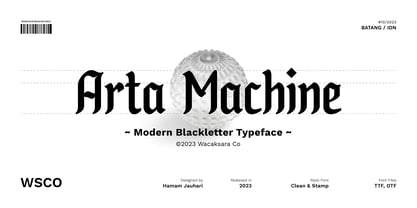 Introducing "Arta Machine" font, a modern blackletter typeface that skillfully combines classic elegance with contemporary flair. This versatile font family offers two unique styles: 'clean' for a sleek and refined appearance, and 'stamp' for a bold and rugged aesthetic. This font is perfect for use as poster designs, branding, logos, apparel, cards, packaging, quote, web, headline, tattoo, or other design needs. Features : Multilanguage Alternates PUA Encoded Ligatures Thank you.
 - Tool by Suomi,
$30.00 A classic, narrow and clean sans serif family with seven weights, Roman and Italic, all with Old Style Numerals and Small Caps, for both headlines and body text use.
 - Pattheda - Personal use only

- Blantick Script - Personal use only

- Roughwell by Invasi Studio,
$16.00 Roughwell Family is a rough hand-drawn display font with a retro stamp character. As a result, carefully crafted styles develop. The imperfections keep it casual but it is still legible. It can be easily matched to an incredibly wide range of projects, so give it a try and see how it boosts your creative ideas! It's ideal for headlines, flyers, posters, greeting cards, product packaging, book covers, printed quotes, logotype, and album covers, among other applications.
 - Moho by John Moore Type Foundry,
$40.00 Moho is a broad family of types inspired by the burgeoning modernism of the early twentieth century. Moho introduces an unconventional style in the form of his glyphs which aims to impregnate the text compounds thus a distinctive aesthetic sobriety and elegance while creating a flow of practical reading. The Moho family consists of a wide range of various weights. Thought for innovative text composition, Moho covers all shades of Medium, Regular, Light, ExtraLight to delicate Thin. Moho has a square shape letter style, provided with a competent OpenType programming for Moho OT family and basic functions for Moho Std family. Among the family characteristics OT has features such as small caps for letters and numbers, stylistics alternates, swash letters where "t" is extend over others, giving the typeface that particular style ideal for headlines, ligatures for pairs and triplets of letters, fractions and ordinals. In addition, each comes with its weight set italics. Moho has a character set to compose texts in European languages of east and west with over 600 glyphs. Moho is a letter in resonance for general topics like sports, art. technology trends, fashion, tourism and transport. There exist two groups of Moho Family OT = Full OpenType Features and full set of glyphs Std= Basic OpenType Features and less glyphs
 - Psychofun by Alit Design,
$15.00 Introducing Psychofun Typeface Psychofun Typeface is designed with a retro style concept that has a unique and cool shape. It is suitable for header text fonts, book covers and designs that have a retro and groovy concept, besides that Psychofun Typeface is also very good when used for body text. Psychofun Typeface has 5 families from Regular to Heavy. Display Serif typefaces such as “Psychofun Typeface” are very easy to apply to any design, especially those with an retro, groovy and classic concept, besides that this font is very easy to use both in design and non-design programs because everything changes and glyphs are supported by Unicode (PUA). The Psychofun Typeface contains 530 glyphs with many unique and interesting alternative options. Plus, there's a cool display serif font family for header and description text from regular to heavy. In the poster preview all the letters are in the Psychofun Typeface.
 - Informative by Latinotype,
$39.00 Informative is a typeface consisting of a whole family of sans fonts and a collection of thematic pictograms. This combination of two different types of communication reflects the current need for using text and images as means of conveying information in a complementary way. The family comes with a text version of 7 weights (with matching italics)—Thin, Light, Regular, Medium, SemiBold, Bold and Black, and includes 7 thematic icons sets which allude to elements related to alimentation, city, energy, people, politics, sports and work. Each set contains 88 glyphs and includes both outline and black versions. The text font contains a set of 423 glyphs that support 207 different languages. Informative is a clean, simple and versatile typeface well-suited for a wide range of graphic design and visual communication projects. This font has especially been designed for infographics, maps and digital applications.
 - Stifin by Maulana Creative,
$22.00 Stifin handwritten display font. Bold stroke, fun character with a bit of ligatures and alternates. To give you an extra creative work. Stifin font support multilingual more than 100+ language. This font is good for logo design, Social media, Movie Titles, Books Titles, a short text even a long text letter and good for your secondary text font with script or serif. Make a stunning work with Stifin handwritten display font. Cheers, Maulana Creative

