10,000 search results
(0.057 seconds)
- Kettering 105 by Talbot Type,
$12.99 Kettering 105 is inspired by the classic, geometric slab-serifs such as Lubalin, but has shallower ascenders and descenders for a more compact look. It's a versatile, modern slab-serif, highly legible as a text font and with a clean, elegant look as a display font at larger sizes. It includes old style non-aligning (lower case) numbers, both proportional and tabular, as well as accented characters for Central European languages. The Kettering 105 family comprises of six weights and is closely related to Kettering 205, its more intensely Deco flavoured cousin.
 - Monodia by Posterizer KG,
$19.00 In few words, Monodia is a small but widely applicable slab serif (nearly monoweight) font family with only two weight and one cut effect version. To those who agree with the fact that less is actually more, three fonts should be sufficient for branding, headlines and other display uses. With that reason regular and bold weights are designed with huge contrast. In order to avoid clogging of certain (especially Cyrillic) letters in the text, some serifs are atypically modified or allowed. Unlike uppercase letters and numbers, lowercase letters don’t have forked serifs. Еnjoy!
 - Sunday Girl by Typesthetic Studio,
$13.00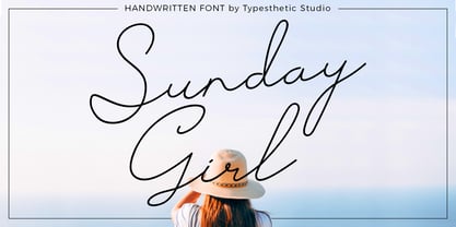 Sunday Girl is clean & fresh script with a stylish handwritten and script style make this font looks natural, classy and perfect for any awesome projects that need handwriting taste. Sunday Girl font is perfect for creating authentic hand-lettered text quickly & easily. This font also perfect for many different project such as logos & branding, invitation, stationery, wedding designs, social media posts, advertisements, product packaging, product designs, label, photography, watermark, special events or anything.
 - Nosegrind by Scriptorium,
$24.00Nosegrind is a bit of a departure from our usual more traditional font offerings. It's based on skate-culture graffiti gleaned from various samples of similar style found on walls in Austin and online. The font includes two character sets, one which is plain and one which is enhanced with outlines. In normal usage the characters should nest, with slight overlap from one character to the next as shown in the sample to the right, but the lower case characters in the font are spaced evenly but not pre-nested, leaving the degree of overlap up to the user - nesting is easily adjusted with the tracking option in programs like Photoshop, Quark or InDesign. Ultimately Nosegrind will be added to our Modern Fonts collection, where it ought to fit in nicely. - Ginuk by Twinletter,
$15.00 Take your message to the next level with this Ginuk font. With its versatile style, this font can be used in a variety of ways in your projects so you can demonstrate your ideas in a captivating way. This font is equipped with the Latin ISO standard so you don’t have to worry about the completeness of the character. of course, your various design projects will be perfect and extraordinary if you use this font because this font is equipped with a font family, both for titles and subtitles and sentence text, start using our fonts for your extraordinary projects.
 - 1514 Paris Verand by GLC,
$20.00 This set of initial decorated letters was inspired by a font in use in the beginning of 1500s in Paris. Exactly, we have used the set that Barthélémy Verand employed for the printing of Triumphus translatez de langage Tuscan en François, (from “Triumph” of Petrarque) in the year 1514. Some letters, lacked, have been reconstructed to propose a complete alphabet. It appears that the printer used some letters to replace others, as V, turned over to make a A, or D to make a Q. The original font’s letters were drawn in white on a black background only, but it was tempting to propose a negative version in black on white. It is used as variously as web-site titles, posters and flyers design, publishing texts looking like ancient ones, or greeting cards, all various sorts of presentations, as a very decorative, elegant and luxurious additional font. This font supports strong enlargements remaining very smart and fine. It’s original medieval hight is about one inch equivalent to about four lines of characters. This font may be used with all blackletter fonts, but works particularly well with 1543 Humane Jenson, 1557 Italic and 1742 Civilite, without any anachronism.
 - Mondera by Twinletter,
$17.00 Introducing MONDERA, our newest san serif font. We created this font by paying close attention to the harmony between each letter, resulting in a lovely blend of words when viewed or read. If you use this font for all of your projects, both official and informal, everything will look the same. of course, your various design projects will be perfect and extraordinary if you use this font because this font is equipped with a font family, both for titles and subtitles and sentence text, start using our fonts for your extraordinary projects.
 - Peskia by Valentino Vergan,
$17.00 Peskia is a modern variable font family with lots of elegance and originality. The tall and slim nature of the typeface, give it a sophisticated yet contemporary nostalgic look. Peskia comes in 5 weights, each weight has an oblique and reversed version. The font family contains 15 fonts and 1 variable font, the variable version makes it easy to manually adjust the weight and slant. The Peskia font family has multilingual support for languages such as: Danish, English, Finnish, French, German, German (Switzerland), Norwegian Bokmål, Norwegian Nynorsk, Portuguese, Spanish, Swedish, Swiss German. Peskia is designed with unique and chic letters, this makes it perfect for a wide range of projects such as: branding, magazines, logos, wedding invitations, editorials, product packaging, advertisements and much more. If you a looking for something modern, nostalgic and chic for you next project, Peskia is the font for you.
 - Umberland Slab by Sharkshock,
$115.00 Umberland Slab is an attractive family available in 3 different weights with italics. There’s a particular emphasis on simple geometric shapes and the way they interact with tall vertical strokes. Smooth curves and sharp angles blend together in a pleasing symmetry. Stroke widths are given variable degrees of contrast but serifs are consistent and heavy handed. Spacing is on the tight side with some lowercase pairs quite snug against each other. Umberland Slab would work well in small blocks of text, corporate logos, menus, or signage. This family is equipped with European accents/diacritics for international support, fractions, alternates, and ligatures.
 - Anteb by Typesketchbook,
$55.00 Anteb font family is one of those large and useful families that you really can’t miss if you are looking for typeface combining originality and legibility. Anteb is one of these – a sans serif with modern look designed very smart with rounded corners. It is developed in 10 separate weights ranging from Thin to ExtraBlack, each coming with Alternate version, which is well suited for a variety of typographic applications such as headlines and small texts. The Anteb font family supports multiple languages and is available as both webfont and desktop font.
 - Nora Slab by vve.type,
$34.99 Nora Slab blends a geometric inspiration with warm humanist elements, making it the perfect choice for when you need a fresh, contemporary slab serif typeface. The companion Nora Grotesque makes the Nora family a real workhorse for any use, including web, digital, print, branding and signage. Nora Slab has a large x-height and open counterforms, making it easily readable. It supports multiple languages: Central and Eastern European as well as Western European languages. It has eight weights with related obliques.
 - Schnipsl by Dominik Krotscheck,
$6.50 Schnipsl is a playful font based on handicraft letterforms. It comes with a bunch of features to give it that extra organic look. Those features include alternates for the letters A-Z and a-z, ligatures, and filled letterforms. All the features are easily activated via Opentype. The four styles of the Schnipsl family can be layered to create colorful designs that always maintain a handmade and personal look. The Schnipsl works well for logos, headlines, illustrations, or short texts.
 - Opificium Sans by Unio Creative Solutions,
$5.00 Opificium is a visual contemporary sans serif typeface composed of three weights plus their matching obliques. The industrial design creates and develops concepts and specifications that optimize the function, value, and appearance of products. Indeed, this is reflected in the concept behind each glyph of our font family which geometry has required particular attention for the purpose to preserve optical exactness, along with proportions continuity. The whole design of this typeface is in fact ruled by versatility and legibility and makes it functional for any text in small and large sizes. "Opificium" typeface includes over 450 characters with coverage for several languages using the Latin alphabet as well as the Greek alphabet. The font family provides advanced typographical support such as a significant number of neat standard and discretionary ligatures and broad support of OpenType features (OTF). Recommended for headlines, logos, and any destination of use such as corporate identity, typography, posters, web design, and social feeds.
 - Ravioli by Arendxstudio,
$12.00 Ravioli combines fun fonts that will easily turn any design idea into a stand out! Fall in love with this adorable and versatile font family!
 - Manchester Condensed by Vástago Studio,
$23.90 Every day we are faced with designing on small screens and new formats; This is where condensed fonts have great potential, as they make the most of tight spaces in big headlines. Manchester Condensed is a typeface family designed by Vástago to be applied in large headlines in different formats, such as web, editorial or packaging. Just to mention a few. Different Manchester weights enhance performance at large type sizes, providing hierarchy and imposing style with its elongated shapes. Its use in capital letters is remarkable and fits perfectly into very precise diagramming spaces.
 - Belynos by Typomancer,
$24.00 Belynos, a simple and elegant didone. Plus a bit of triangular! Font family contains from Light to Black and suitable italic for various designs.
 - Coreopsis by Andrew Harper Fonts,
$19.00 Coreopsis is a family of fonts that combines mathematical precision with a hand-drawn feel. Versatile enough to be applied to an attention-grabbing headline, or to blocks of paragraph text. Coreopsis is available in three weights.
 - Kostanalliet by Gassstype,
$23.00 Introducing Kostanalliet is Authentic Brush Font. font is a Signature Style and classy style,with a clear style and dramatic movement this font is great for your next creative project such as logos, printed quotes, invitations, cards, product packaging, headers, Logotype, Letterhead, Poster, Design this font is great for your creative projects such as watermark on photography, and perfect for logos & branding, invitation,advertisements,product designs, stationery, wedding designs,label ,product packaging, special events or anything that need handwritting taste. That is why Kostanalliet has charming, authentic and relaxed characteristic more natural look to your text with a more natural look to your text. You can activate Ligature OpenType panel.
 - Azbuka by Monotype,
$29.99 The Azbuka™ typeface family has its roots in a fairly pedestrian source. “The idea came in part from an old sign in London that read ‘SPRINKLER STOP VALVE’,” says Dave Farey, designer of the typeface. Like all good sign spotters, Farey took a photograph of the sign and filed it away for possible use in a lettering or typeface design project. In Prague a number of years later, the street signs reminded Farey of the London signage - and his camera came out again. Comparing the two back in his studio, he realized that the signs from London and Prague were not as similar as he initially thought. However, they were enough alike to serve as the foundation for a no-frills, 21st century sans serif typeface family. “I wanted to draw a wide range of weights, italic and condensed designs all in one go,” recalls Farey, “rather than add on to the family later.” His goal was to create a family that could be used for text and display copy, with sufficient weights to provide a broad typographic palette. Indeed, the completed design, created in collaboration with fellow type designer Richard Dawson, consists of twenty typefaces in eight weights ranging from extra light to extra black. The five mid-range designs have complementary italics. Seven condensed designs round out the family. Azbuka’s lighter weights perform remarkably well in blocks of text composition. “They’re clean and legible - and perhaps a little boring,” says Farey, “but they are perfect for copy with a down-to-earth, yet contemporary flavor.” The heavier weights are equally well suited for a variety of display uses. The designs are authoritative but not overbearing and will readily make a strong statement without calling attention to themselves. The condensed weights of Azbuka are ideal for those instances where you have a lot to say - and not much room to say it. The name Azbuka? It’s Russian for “alphabet.” And what more appropriate name could there be for this utilitarian, industrial-strength type family than alphabet? The Azbuka family is available as a suite of OpenType Pro fonts. Graphic communicators can now work with this versatile design while taking advantage of OpenType’s capabilities. The Azbuka Pro fonts also offer an extended character set that supports most Central European and many Eastern European languages
 - Haverj by ParaType,
$30.00 An original typeface designed for ParaType in 2004 by Armenian designer Manvel Shmavonyan. Based on the lettering created in 1970s by outstanding Armenian type designer Henrik Mnatsakanyan (1923-2001) of the same name. In Armenian ‘Haverj’ means ‘Eternally’. The face resembles many regular text serif fonts but elements like serifs and terminals make it eccentric and a little bit funny. The shape of diagonal legs in capital K and R resembles book lettering of the 1950s—60s. Using it in text, advertising and display typography may lead to surprising effects.
 - Plakato Pro by Underware,
$50.00 Plakato, a stencil love affair Plakato is a family of display fonts, consisting of various eye-catching styles, each of them very bold. Plakato is an identity toolkit, a heavyweight building block in case you need a strong personality, a small stencil font family to cut out your best ideas and grab all the attention. But just as with many other creations, its outcome is as divers as its multiple origins. Plakato comes in 16 eye-catching styles. The default stencil style comes in Regular & Italic. They both have 2 variations: one version, named Plakato Stencil, automatically creates borders around the text, putting any text into a graphic stencil in this way. Another version, the extruded three-dimensional version, guarantees even more attention for your message. Next to this there is also the Inline version, which is an optical play with a lot of lines. Plakato Inline has a supportive background layer, a separate font in case you want to add a background in a different colour. Then there is Plakato Paper, a manually teared version of Plakato offering a more physical look. This small family of eye-catching display fonts also contains a Neon font, an independent design in Plakato style, which can actually be used for making neon signs due to its construction. Plakato Neon comes with its own Dingbat font for that extra flush-flush. Plakato has also been redrawn on a C64, and with all its accompanying limitations been ported back and turned into a font: Plakato Game. Also this font comes with its own Dingbat font, full of emoji’s and icons for oldskool pleasure. Last but not least there is Plakato Build, constructed out of blocks. As if that wasn’t enough, there are various dynamic versions in the Plakato Play package, which offer a whole new range of possibilities for typographic expression, with new animation and interaction opportunities.
 - Quan Slim by Typesketchbook,
$40.00 The typeface of Quan Slim is based on the successful Quan font family by font foundry Typesketchbook. Font designer Chatnarong Jingsuphatada created Quan Slim as a condensed version to Quan. Both type families consist of eight weights plus obliques and additional rounded versions. Quan Slim’s typeface has a clean and modern sans serif appearance. This modern geometric font is very legible and can be used for headlines as well as small and long text.
 - Bondtique by PojolType,
$12.00 Bondtique is inspired by the writing of books or plain text with the same thickness and the standard typeface can be used for magazines, logos, branding, web, posters, movies and films.
 - Quan by Typesketchbook,
$40.00 The complete Quan font family designed by Chatnarong Jingsuphatada of Bangkok-based Typesketchbook consists of a very usable, clean and modern sans typeface and a rounded sub-family. The font looks clean and geometric but it’s designed with unusual stylistic features to give the Quan font a special and unique touch. The complete Quan type family includes eight weights with obliques and rounded versions for each of them all in all 32 fonts.
 - Camelin by Gian Studio,
$15.00 Introducing Camelin sant display is a complete typeface that is modern, simple and clean. As a typographic display it is useful for posters, logotypes, titles and short text in general. This font is easy to read and bold, easy to play. the embellished serif of the hat is slightly different from the usual hat to create an alternative glyph. We also designed an attractive uppercase set inside, to enhance your design. Enjoy!
 - Caster by Gian Studio,
$16.00 The newest Caster Serif is a complete serif typeface that is modern, simple and clean. As a typographic display it is useful for posters, logotypes, titles and short text in general. This font is easy to read and bold, easy to play. the embellished serif of the hat is slightly different from the usual hat to create an alternative glyph. We also designed an attractive uppercase set inside, to enhance your design. Enjoy!
 - Core Mellow by S-Core,
$20.00 Core Mellow is a condensed geometric sans-serif typeface family that can be used in various applications especially for short texts. The letterforms in roman style are mild, minimal, simple, and clean in appearance. The Core Mellow Family consists of 3 widths (Compressed, Condensed, Normal), 7 weights (Thin, Extra Light, Light, Regular, Medium, Bold, Extra Bold) and Italic for each format. The Core Mellow provides a wide range of character sets to support Cyrillic, Central and Eastern European characters and advanced typographical support with features such as proportional Figures, tabular Figures, numerators, denominators, superscript, scientific Inferiors, subscript, fractions, standard ligatures, discretionary ligatures and stylistic alternates. Core Mellow looks smooth in any layout with its sleek rounded lines, use it for your magazines, brochures, web pages, screens, and so on.
 - Arpona Sans by Floodfonts,
$49.00 Arpona Sans is a contemporary sans serif family inspired by the work of Edward Johnston and Eric Gill for London Underground. As well as its serif companion Arpona it is a symbiosis of different design concepts. Arpona Sans combines the esthetics of a geometric Sans with the usefulness of the humanist concept and the calm of the modernist proportions. Arpona Sans is a good choice for editorial design, branding, app design and web design – a workhorse well readable even in running text on screen. The family has nine weights, ranging from Thin to Black plus corresponding italics. Each style includes 590 glyphs supporting all western-, eastern- and central-european languages including four sets of figures and various currency symbols. If you want to go into details visit the microsite: https://www.floodfonts.com/arponasans
 - FF Basic Gothic by FontFont,
$68.99 German type designers Hannes von Döhren and Livius Dietzel created this sans FontFont in 2010. The family has 16 weights, ranging from Extra Light to Black (including italics) and is ideally suited for advertising and packaging, editorial and publishing, logo, branding and creative industries, small text as well as web and screen design. FF Basic Gothic provides advanced typographical support with features such as ligatures, small capitals, alternate characters, case-sensitive forms, fractions, and super- and subscript characters. It comes with a complete range of figure set options – oldstyle and lining figures, each in tabular and proportional widths.
 - FF Olsen by FontFont,
$65.99 Danish type designer Morten Olsen created this serif and slab FontFont in 2001. The family has 6 weights, ranging from Light to Bold (including italics) and is ideally suited for advertising and packaging, book text, editorial and publishing, logo, branding and creative industries, poster and billboards as well as web and screen design. FF Olsen provides advanced typographical support with features such as ligatures, small capitals, alternate characters, case-sensitive forms, fractions, and super- and subscript characters. It comes with a complete range of figure set options – oldstyle and lining figures, each in tabular and proportional widths.
 - June Pro by Schriftlabor,
$33.99 June was first published in 2019 but it got a redesign and upgrade in the character set. It now supports Latin Extended and Vietnamese. It also has OpenType features such as stylistic alternates, case sensitive punctuation, small figures, arrows, superscript, subscript, fractions, and many more. June Pro was inspired by the work of Adrian Frutiger and his exploration into font design and legibility. June Pro is a modern sans-serif family in 10 weights ranging from Thin to Heavy with true italics. It was designed with legibility in mind. It is a versatile and distinctive font that makes it useful for various applications like editorial, web design, or branding.
 - Clonoid by Dharma Type,
$19.99 Inspired by and tribute to arcade game logos in 80s and 90s. Clonoid can give futuristic, sci-fi and mechanical impression by its geometric framework but its rounded bowls and semi-rounded edges can make natural and soft impression too. And its orthodox letterform make it possible to use this font for all uses. Clonoid family consists of 12 styles, 6 weights (ExtraLight, Light, Regular, SemiBold, Bold and Black) & italics and it’s available in OpenType format. We released 4 big Sci-Fi families in 2013. Check it out! Clonoid Controller Geom Graphic Space Colony
 - Handasi by Arabetics,
$39.00 The Handasi type family follows the guidelines of the Mutamathil Taqlidi type style. It has one glyph for every basic Arabic Unicode character or letter and one additional, final-position, glyph for each Arabic letter that is normally connected with other letters from both sides in traditional cursive Arabic strings. Handasi employs variable x-height values. Its design uses straight lines only but with variable distributed weight. Handasi fonts include all required Lam-Alif ligatures and use ligature substitutions and selected marks positioning but they do not use any other glyph substitutions or forming. Text strings composed using types of this family are non-cursive with stand-alone isolated glyphs. It employs our "natural Arabic input" method where first glyph is displayed in its non-isolated form. Tatweel (or Kashida) glyph is a zero width space. Keying it before any glyph will display that glyph isolated form. Keying it before Alif Lam Lam Ha will display the Allah ligature. Handasi family includes both Arabic and Arabic-Indic numerals, all required diacritic marks, Allah ligature, in addition to all standard English keyboard punctuations and major currency symbols. The fonts in this family support the following scripts: Arabic, Persian, Urdu, Pashtu, Kurdish, Baluchi, Kashmiri, Kazakh, Sindhi, Uyghur, Turkic, and all extended Arabic scripts.
 - Euffrat - Personal use only

- FF Dax by FontFont,
$83.99 German type designer Hans Reichel created this sans FontFont between 1995 and 2000. The family has 36 weights, ranging from Light to Black in Condensed, Normal, and Wide (including italics) and is ideally suited for advertising and packaging, book text, editorial and publishing, logo, branding and creative industries, poster and billboards, wayfinding and signage as well as web and screen design. FF Dax provides advanced typographical support with features such as ligatures, small capitals, alternate characters, case-sensitive forms, fractions, and super- and subscript characters. It comes with a complete range of figure set options – oldstyle and lining figures, each in tabular and proportional widths. As well as Latin-based languages, the typeface family also supports the Cyrillic and Greek writing systems. In 1998, FF Dax received the The Big Crit award. This FontFont is a member of the FF Dax super family, which also includes FF Dax Compact and FF Daxline.
 - Neosande by XdCreative,
$29.00 Introducing New Neosande Neosande is a contemporary typeface family that belongs to the neo-grotesque sans serif category. It was designed by Faldykudo and released in 2023. The typeface family includes a range of weights, from Thin to Black. The design of Neosande is characterized by a clean with straight lines. It has a modern, sleek look that makes it suitable for a wide range of applications, including branding, advertising, editorial design, and web design. The typeface has a high degree of legibility, making it ideal for use in body text, headings, and titles. In terms of language support, Neosande covers a wide range of Latin-based languages, including Western, Central, and Eastern European languages, as well as Turkish, Baltic, and Celtic languages. Overall, Neosande is a versatile and modern typeface family that offers designers a range of weights and styles, as well as OpenType alternates, making it a popular choice for a wide range of design applications.
 - Eirene Sans by Tomtype,
$4.90 Eirene Sans is a sans serif type family inspired by grotesque typefaces with some humanistic characteristics. Simple, modern, and functional are the principal features of this type family; the uppercase glyphs present a sophisticated personality. There are 5 weights available and matching italics. It is a bit more condensed than normal width and the difference between thin and thick stems and the unique terminals make the type family have this humanistic personality. It has rounded forms in some letterforms and special characters (i, j, ., :, etc.), humanistic terminals, and very thin ink traps. Eirene Sans is perfect for digital and non-digital designs; it can be used in magazine titles, logo designs, packaging designs, and web designs. Features: 5 weights and matching italics Opentype features Arrow set Stylistic alternates (ft) Stylistic changes in italics Fractions Subscripts Inferior and superior numbers Language support (Latin extended)
 - Bona Nova by Borutta Group,
$- ☞ Bona Nova is a collective revival project of Bona typeface designed in 1971 by the author of polish banknotes Andrzej Heidrich. Besides giving the project a digital font form the aim was to expand the base character set: preparation of small caps, designing the alternative glyphs and multiple opentype features. Working together with the author we designed two new text versions: regular and bold – to give the family a form of a classic script triad. ☞ It is accompanied by three title versions and three contour styles under the name of Bona Sforza. All styles contains over 1200 glyphs. ☞ Bona Nova is an unprecedented typographic adventure for our team. We hope that our work will allow the cultural heritage of Bona and the work of Andrzeja Heidricha to gain new followers and fans. This project connected three generations of graphic designers who graduated the same school – the Academy of Fine Arts in Warsaw. ☞ Bona Nova isn’t only a typeface. We have also prepared a book about the project (including an interview with Andrzej Heidrich, my text about the digitalisation and a font specimen). The Bona Nova release party was a big exhibition (over 1000 guests). I’ve invited 26 graphic designers to prepare their own initials of Bona Nova – they were presented as posters on exhibition too. LINKS Bona Nova WEB Bona Nova FP Bona-Nova-(FREE-FONT) Bona Nova Book BONA NOVA IN THE MEDIA Typeroom Typography Guru Slanted Designalley Stgu Typografie Info Wikipedia Bona Nova is a non-profit project, all founds that we raise we reinvest to develop the Bona Nova project (new styles, Cyrillic & Greek, extend character set).
 - Sliced Open by ArtyType,
$29.00 This type family is the lighter, more open companion to the eye-catching Sliced volume, a masculine display face with boldly sliced terminals and angles, available in 3 widths. The complete Sliced volume numbers 14 styles, a versatile modern suite of fonts with extended European language coverage, available in OpenType, TrueType & web formats.
 - Oxonia Roman by Greater Albion Typefounders,
$10.00 Oxonia Roman is a text family, offered in two weights and two widths, deriving it’s inspiration from classic Roman typefaces. It is intended for the setting of text legibly in quantity, and compliments our Anavio and Vectis faces particularly well.
