10,000 search results
(0.021 seconds)
- Ply by chicken,
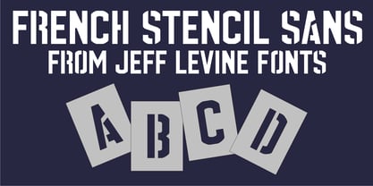
$17.00So the lumber was cheap - just a pile of offcuts - and so was the carpenter… And you couldn't say he was exactly lazy, but he was certainly efficient… mostly he would just cut a couple of planks to size, slice off a corner now and then, once in a blue moon hash up a curve… I guess he didn't have a drill, cos there are no holes… and he sure as hell didn't have a ruler… But he did have some kind of an eye, and until it falls off the wall it'll look pretty OK… Ply comes in six styles, offering differing degrees of neatness and adorned or not with fixings… There are money-saving packages too… It’s uppercase only, with variations between upper and lower case, and OpenType types can switch on Stylistic Set 1 to take the effort out of keeping things varied… - French Stencil Sans JNL by Jeff Levine,
$29.00 - Bouncer by Ingrimayne Type,
$6.95The letters in Bouncer are round because they all begin as a ball and then have parts of the ball cut away. Bouncer was one of the earliest typefaces from Ingrimayne Type. Lower-case letters are smaller versions of the upper-case letters. BouncerTwo, designed twenty years after the original Bouncer, continues playing with the idea of making letters by cutting out parts of a circle, but in this case the circles are interlocking. All letters are upper-case but some of those on the lower-case keys differ from those on the upper-case keys. BouncerTwo is eye-catching but not highly legible. - Chinoise by CastleType,
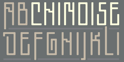
$49.00Chinoise, a CastleType original, is based on hand lettering that is reminiscent of a style of ancient Chinese square-cut ideograms (perhaps cut in wood), and therefore the suggestive name "Chinoise" for this new design. There are alternate forms for each letter in the lowercase. Although square-cut, all corners of the letters are slightly rounded to give a more organic, weather-worn look. Uppercase only with support for most European languages, including modern Greek, and languages that use the Cyrillic alphabet. - HK Modular by Hanken Design Co.,
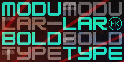
$45.00HK Modular stands out as a versatile and adaptable typeface that finds its strength in serving as an impactful display, title, or poster font. Its design allows for effective use in spanning entire pages, highlighting article titles, and designing logos. With a regular cut and rounded-corner design, HK Modular strikes a harmonious balance between sleekness and approachability. This dual nature of the typeface allows it to seamlessly blend sharp, defined edges with a touch of softness, making it suitable for a wide range of design contexts. - Hermaphrodite by Volcano Type,
$29.00Hermaphrodite was developed for the Bastard Project and had its origin in the idea of applying the process of an Antiqua on a Grotesque. In other words, a Grotesque font was drawn calligraphically and then digitized. Some inconvenient corners were simply cut off. - Electroz by 4RM Font,
$30.00 - IxD by The Ampersand Forest,
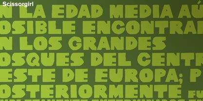
$20.00 - Scissorgirl by Type-Ø-Tones,
$40.00 - MM Indento by MM Fonts,
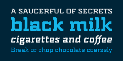
$19.00Indento is a multi-purpose modern geometric slab serif for headlines, posters, branding but fairly legible to be used as longer text. The straight and rounded corners combined with deep cuts and asymmetric serifs gives it a distinctive look while still keeping its rigorousness and legibility. The family consist of three weights, each with a companying italic. The extensive character set—513 glyphs in each font—includes support for Central and Eastern European languages and OpenType features like small caps, ligatures, fractions, slashed zero, stylistic alternates and more. - Little Cupcakes - Unknown license
- Charming Font - Unknown license
- PANDA - Unknown license
- KR Strawberry - Unknown license
- i-hearts - Unknown license
- Jabbie Junior - Personal use only
- Snippity Snap by Hanoded,
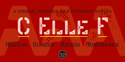
$15.00Snippity Snap is a font made up of glyphs I cut out from black paper with some household scissors, then pasted onto white paper. When I was cutting out the shapes, my children asked me what I was doing, and when I told them, they thought it was pretty cool and started cutting out shapes from paper themselves. The result is a house filled with paper cuttings, which I keep finding everywhere - even in my bed. Snippity Snap is a very nice font for ads, book covers, packaging and children's books. Enjoy! - C Elle F by TeGeType,
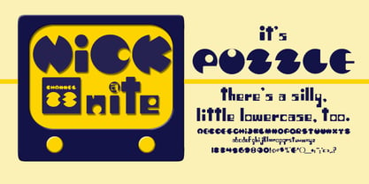
$19.00The "C Elle F" is a typographic family, as a stencil letter, originally intended for cutting and engraving to carry out marking and signaling work. But of course, the very characteristic shape of these letters evokes much more. This typographic family can therefore be used for communication in various fields, commercial, import-export, military, etc. - Puzzle by Just My Type,
$25.00Call me some kind of weird, but I find designing fonts about the most fun you can have out of bed. Legible-scmedgible, sometimes you just have follow the font muse regardless of where she takes you. She threw me a circle, a triangle, a rounded stroke and a rounded-cornered square; “Make glyphs,” she sang. Okay! Is it legible? Yes. Is it readable? Kinda. For the right project, though, that’s enough! - Snuggle Punk by PizzaDude.dk,
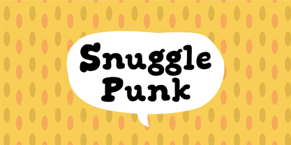
$17.00To snuggle is "settle or move into a warm, comfortable position" - that is exactly what I did with making this chunky seriffed font. Well, maybe not a position, but a comfortable mood! I tried to mix some gentle grafitti moves and comic letters, and then a touch of the classic goofy pizzadude style - and the result is this cheeky font called Snuggle Punk. Full of round corners and fat lines - sounds like a nice cup of coffee! :) - Dangerfield by Solotype,
$19.95The Barnhart Bros. & Spindler foundry put out a caps-only face called Dante. We liked it, but felt it needed a lowercase. The result here is a rather nice square design, which has become a personal favorite. - Pastelheart - Personal use only
- Baby Coffee - Personal use only
- 101 Puppies SW - Unknown license
- BooBooKitty - Personal use only
- KR Hunnybee - Unknown license
- Lutfey by NamelaType,
$17.00 - Child Rainy by Sipanji21,
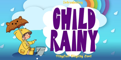
$18.00Child Rainy" is a charming and whimsical display font characterized by its cute and quirky nature, featuring sharp corners in every letterform. Fonts with sharp corners often exhibit a playful yet edgy design, adding a unique and distinctive touch to the characters. This font can be an excellent choice for various creative projects, especially those targeting children's themes, playful designs, or any context where a combination of cuteness and a touch of edge is desired. Its blend of adorable and sharp elements can lend a distinctive visual appeal to your designs. - Knip by Hanoded,
$15.00Knip, in Dutch, means ‘cut’. You can tell by the glyphs that I made this font by cutting out the shapes from black paper, gluing it onto white paper and photographing the result so I could digitalise it! I don’t make too many cut out fonts, as it is a lot of work and it often leads to nothing. Besides that, I depend on the paper supply from my kids and they happened to have black paper this time! - Digital tech - Personal use only
- Trocadero Pro by RMU,
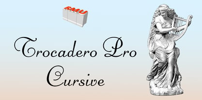
$35.00In 1927 Albert Auspurg cut Trocadero for the Trennert foundry in Hamburg. This new version is not a mere digitalization, but many letterforms were altered and updated, and missing links in the complete alphabet had been drawn afresh. Out came a beautiful cursive font with a certain charm of its own which covers beside the West European languages also those of Central Europe and Turkish. - Dassitzt by Linotype,
$29.99Dassitzt is a family of two typefaces, Dassitzt LT Typos and Dassitzt LT Pictos. Dassitzt LT Typos is a heavy industrial-grunge display face, with dark, even letters that appear cut out of black paper or iron. Dassitzt LT Pictos is a whimsical collection of pictograms. The figures in this font are black silhouettes that show a minimum amount of detail, but a maximum amount of expression. - Afrikana by Mina Arko,
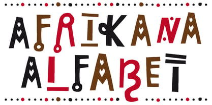
$18.00Afrikana is based on various African letters and signs. The main inspiration for making this typeface was the book by Saki Mafundikwa, Afrikan Alphabets. Letters were designed based on signs and characters from African alphabets. They were than cut out of cardboard, scanned, traced and put in a font. You are free to modify the font in any way and have fun with it. - Scotch by Positype,
$29.00Clean, crisp, rational, familiar, modern… serifed. Positype Scotch reaches back to history just enough to produce something warm and easy on the eyes. No corners were cut, no quick tricks… this type suite was drawn for specificity: Text, Display, and Deck… ALL in 3 widths that now include Condensed and Compressed. Each unique, each inter-connected, each part of the whole. Scotch Text is offered in 6 weights with matching true italics. Drawn for economy and an easy read, the family is a workhorse for long-passage text settings. 4 sets of numerals, well-proportioned small caps, and a plethora of extras round out each font. Scotch Display is not just a thinner version of Scotch Text wrapped in a higher contrast. Display sports shorter ascenders and descenders, a unique footprint, great contrast, and a more folded, calligraphic italics. Display subtly oozes sophistication and provides an attractive, exhuberant companion to Scotch Text. Scotch Deck rounds out the offering by choosing to be specific to its offering. Deck utlitizes traits and proportions shared between Text and Display, but alters its overall mass to balance out the needs for settings that require subheadlines, callouts and other similar uses. Essentially, something not so high-contrast and not so stress dense that works great for middle-sizes. - Benz Grotesk by Sign Studio,
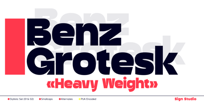
$24.00Benz Grotesk can be used to style text that requires attention in a sentence but still has subtlety. We try to keep every corner well proportioned. With more than 400 characters, we hope that Benz Grotesk can support a fairly complete language. Has a fairly high detail with inktrap on some corners of the body. This font will help you when designing posters, headlines, product branding, logotypes, minimalist typography and more. - Ckornoments by Ingrimayne Type,
$5.00Ckornoments is a two-font family of corner ornaments that was inspired by decorative grave ornaments. Similar ornaments can be found on old furniture and woodwork. Almost all ornaments come in sets of four for placement top right and left and bottom right and left. The two fonts, solid and outline, are designed to be used in layers but can be used separately. In addition, ornaments that include flowers have one part of the design separated out so the original and separated characters can be layered to give bi-colored images (or tri-colored with an outline). These ornaments are suitable for posters, newsletters, personal notes, and on other types of documents that benefit from framing. In addition to serving as corners, the ornaments can also be used as dividers between sections of text. - HWT Artz by Hamilton Wood Type Collection,
$24.95HWT Artz is the newest wood type to be cut at Hamilton Wood Type and Printing Museum. It was designed by venerable type designer Erik Spiekermann exclusively for his own print studio (P98a in Berlin), specifically to be cut into large size wood type. The digital version is being offered to the general public with proceeds of sales to benefit the museum's ongoing operations. HWT Artz evokes bold early 20th century European poster lettering. The design itself is intended to minimize hand-finishing and thus production time with rounded corners rather than sharp interior corners that would normally have to be hand-finished. In keeping with the tradition of naming new Hamilton designs after key figures from the living history of Hamilton (and following Spiekermann's tradition of four letter font names), Artz is named after Dave Artz- Hamilton Manufacturing retiree and master type trimmer. - Cica by Alive Fonts,
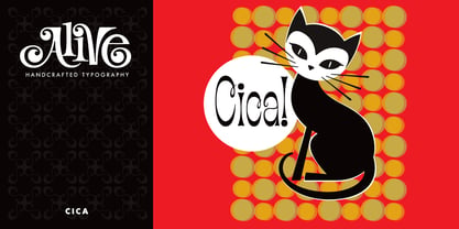
$40.00Ok, I'm allergic to cats and have never had one, but I can still create a typeface that embodies feline character! Cica combines the careful nature of cunning cats with the playfulness of kittens. It's simply fun to use and expresses multiple personalities depending on your choice of all upper case, lower case or mixing the two. Take Cica home with you today! - Scriptissimo Forte by Wiescher Design,
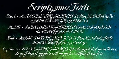
$39.50Scriptissimo-Forte is the bold version of Scriptissimo. When using the normal cut of Scriptissimo I sometimes had the feeling that I could well use a bolder cut to make a bigger impression, so I simply made that cut for myself. I think you can use it too; try it out. Yours very bold scriptissimo, Gert Wiescher - CUTCUT by Fontop,
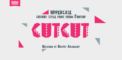
$11.00CUTCUT is a cute cut-out font with funny alternates that give an individual look to your cards, logos, souvenirs and so on. It also works perfectly when used in branding for some funky or hipster style products and services, as well as for kids products and designs. The font consists of Latin multilingual support as well as uppercase letters, numbers and basic punctuations and includes OTF, TTF.

