330 search results
(0.024 seconds)
- SUNSET - Unknown license
- Mortbats - Unknown license
- Psychedelic - Unknown license
- Zirkle - Unknown license
- Notetaker - Unknown license
- CoiledUncial - Unknown license
- CarolesChunk - Unknown license
- BrightonBold - Unknown license
- Xevius - Unknown license
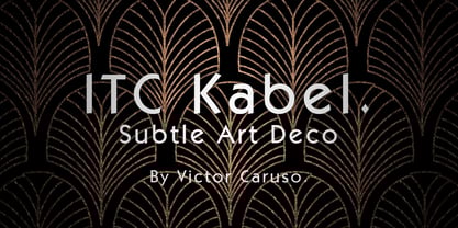
- Kabel by Linotype,
$40.99 - Blippo by Bitstream,
$29.99 - Pentaprism NF by Nick's Fonts,
$10.00 - Reross by Adobe,
$29.00 - Alfarn by Adobe,
$29.00 - KAHorrible - Unknown license
- ThreadFun - Unknown license
- FanciHand - Unknown license
- MKristall - 100% free
- KAMonster - Unknown license
- KAPastaAldente - Unknown license
- KADinoSob - Unknown license
- Rhythm - Unknown license
- Mackintosh SF - Unknown license
- Potsdam - Unknown license
- KAStormRain - Unknown license
- Dreidels - Unknown license
- Enya - Unknown license
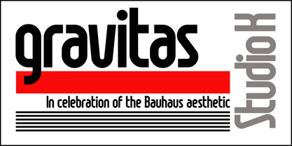
- Gravitas by Studio K,
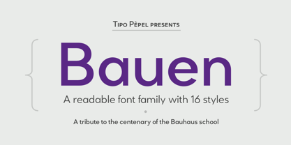
$45.00 - Bauen by Tipo Pèpel,
$22.00 - LainieDaySH - Unknown license
- CHRISTMAS - Unknown license
- CarrieCattSH - Unknown license
- NEWYEARS - Unknown license
- Slumgullion - Unknown license
- Cue - Unknown license
- Ariosto - Unknown license
- Weimar - Unknown license
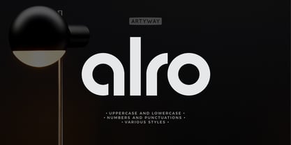
- Alro by Artyway,
$12.00 - Stonehenge - Unknown license
- Mariah - Unknown license


