10,000 search results
(0.302 seconds)
- DrumagStudioNF - 100% free
- Dot Your Eyes - Personal use only
- Zamolxis I - Unknown license
- Boneribbon Tall - Unknown license
- SF Espresso Shack - Unknown license
- Shoplifter - Unknown license
- KR Snowman - Unknown license
- Arcanum - Personal use only
- Spat Crumb - Unknown license
- Tiffy - Unknown license
- HOUSEPIPES - Unknown license
- Quixotic - Unknown license
- CochinArchaic - Unknown license
- Archive Hands by Archive Type,
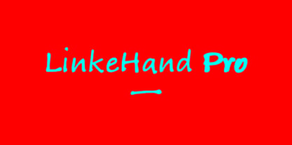
$19.95 - LinkeHand Pro by Oliver Linke Type Foundry,
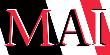
$12.50 - P22 Mai Pro by IHOF,
$39.95 - Archive Woodchild by Archive Type,
$19.95 - Natural Born Designer by Fonts of Chaos,
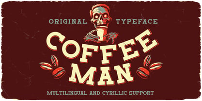
$10.00 - Coffee Man by Vozzy,
$10.00 - Victorian Initials One - Personal use only
- Syl by Intellecta Design,
$28.90 - Archive Modern II by Archive Type,
$19.95 - Veneto by Scriptorium,
$18.00 - Antipol VF by phospho,
$75.00 - Parisine Plus Std by Typofonderie,
$59.00 - 26 Flowers by Celebrity Fontz,
$24.99 - Annifont - Unknown license
- derail - Personal use only
- GauFontExpositionR - Unknown license
- KG Empire of Dirt - Personal use only
- WolfsRain - Unknown license
- Lady Copra - Unknown license
- MoneyGoRound - Personal use only
- Kingthings Slipperylip - 100% free
- MissingLinks - 100% free
- Delirium - Unknown license
- Gravitate Segments BRK - 100% free
- DingMaps - Personal use only
- Desyrel - Unknown license
- Crystal Radio Kit - Unknown license


