942 search results
(0.016 seconds)
- FF Berlage Burcht by FontFont,
$58.99 FF Berlage started as a research project about the typography of the prominent Dutch architect Hendrik Pieter Berlage (1856 1935). Donald Beekman based the design on a great number of sources, but mainly lettering found in two of Berlage s most quintessential buildings, the Amsterdam Commodities Exchange building (called Beurs van Berlage), and the ANDB building for the Amsterdam diamond cutters union (called De Burcht). Berlage is considered the father of modern architecture in The Netherlands due to his revolutionary theories on architecture and design, that would greatly influence many Dutch architect groups, like the Amsterdam School and De Stijl.
 - OTC New York by OTC,
$39.00 OTC New York is a geometric sans serif font family with support for Latin, Cyrillic and Greek. The display font comes in 18 styles, 9 weights (including italics) and as a variable font which supports two axis variability: weight and italic. It’s ideal for branding, logos, headlines, editorial design, packaging, web and television use. The font family is inspired by the Bauhaus school with its simplified geometric form, balanced layout, harmonious geometric shapes that are simple but strong. OpenType features contain stylistic alternates (for A, a, e & g); old style figures; fraction figures; subscript, superscript, numerator and denominator figure position and tabular figures.
 - Sweetest by Supersemarletter,
$11.00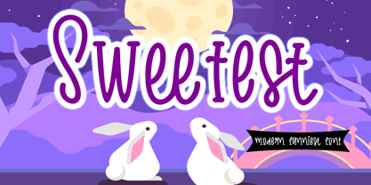 Sweetest is a cute and friendly handwritten font. It embodies playfulness and authenticity and is the perfect choice for any children activity or school project. Provide Ligatures with special character make the design letters looks incredible. Honestly it works perfectly for headlines, logos, posters, packaging, T-shirt and much more. Font Features : . Regular Version . Character set A-Z in Uppercase and Lowercase . Ligatures in lowercase and special . Numerals and Punctuation . Accented Characters . Multiple Languange Supported Recomended to use in Adobe Illustrator or Adobe Photoshop with opentype feature. If you have any questions, just send me a message and I'm glad to help.
 - EmBauhaus by Emboss,
$25.00 EmBauhaus is a display typeface, geometric in style, inspired by the face named after the world changing Bauhaus School. To aid readability I rethought the original typeface and closed all of the voids cut out of the strokes. We also modified the upper case to make it a more traditional design. An example of this is the upper case L, where a 90 degree angle was added. This typeface was designed to be used judiciously in a layout, to draw focus to words and headlines, using stark angles, radii and geometry to create visual rhythm and gestalt.
 - Propisi by ParaType,
$25.00The typeface was designed at ParaType (ParaGraph) in 1997 by Manvel Shmavonyan for Russian primary school sample writing schoolbooks. The typeface is based on script fonts presented in the book 'Rodnoy Mir' by. L.I.Tikunova. The first version of the font included just letters of Russian alphabet and basic set of figures and signs. The second version with extended set of alphabetic letterforms was developed in 2004 by Gennady Fridman. Current third version that covers full Cyrillic and Western code pages was prepared by Gennady Fridman and released in 2009. Medium style also was added by him in 2009. - Authority by RetroSupply Co.,
$19.00 Inspired by public fonts in New York in the 1970s. Authority pays tribute to the almost unnoticed but powerful effect type have on our lives. From waiting on a cold morning to catch the 307 to Morton West High School, to the rain and snow worn stencil on a postal box. Public typography is a part of the little spaces in your lives where life actually happens. Government designed fonts were chosen to communicate authority and help grease the gears of the day-to-day grind. Authority beckons back to these days with it's mildly condensed feel, squared corners and weight presence.
 - Timernis by Aga Silva,
$19.99 Timernis is humanist multilingual contrast sans serif available in eight weights from thin to black. All caps have this super elegant, classic proportions old school look and is based on 1940 stone engraving commemorative plaque. The engraving itself boasted sophisticated clean look and was a joy to look at. All caps: Would suit display usage such as: signage, titles, headers, engravings, high end packaging. Do try putting space between the letters in your selected word for suave and chic feel. Expanded round shapes are prevalent in lowercase, which is legible in small sizes and pleasant to the eye.
 - Talent Stencil by Jeff Levine,
$29.00 Stencils have played a number of roles over the years, from decorative patterns to military markings; from labeling shipping containers to a student’s school project. One unusual application of a stencil alphabet was some metal letters spotted for sale at an online auction site. These antique letters were used for promoting the current show on a theater marquee just as plastic ones are used nowadays. Following the auction images as a guide, the Roman stencil font from those marquee letters is now preserved digitally as Talent Stencil JNL; which is available in both regular and oblique versions.
 - Albertson by Arterfak Project,
$16.00 Albertson is strong retro font. Made with vintage references like an old school automotive, signage, cowboy, lumberjack, woodwork, and DIY handicraft. The modern western font that you can apply for your classic design such as the logo, logotype, label, packaging, signage, and more! Albertson is an all-caps font with a strong design, equipped with 4 sets of alternates characters that you can mix and match to get the more solid typographic looks! Also complete with multilingual, packed in total 350+ glyphs. Fonts featured : Uppercase Smallcaps Numbers & Punctuation Stylistic set 01-04 Accented characters Thank you for your support!
 - Kallifa by Keristyper Studio,
$14.00 Introducing Kallifa script font is classy calligraphy inspired by old-school classic vintage handwritten. This font is good for logo design, Social media, Movie Titles, Books Titles, short text even long text letters, and good for your secondary text font with the script, sans, or serif. Featured: Standard Uppercase & Lowercase Numeral & Punctuation Multilingual : ä ö ü Ä Ö Ü ß ¿ ¡ Alternate & Ligature PUA encoded We recommend programs that support the OpenType feature and the Glyphs panel such as Adobe applications or Corel Draw. so you can use all the variations of the glyphs. Hope you enjoy our fonts!
 - Teenage Tropics by Teenage Foundry,
$19.00 Teenage Tropics is a vintage typeface display font that exudes a unique blend of retro style and tropical vibes. This font is designed to capture the essence of the 1950s and 1960s, with its bold and playful letterforms that are reminiscent of old-school signages and advertisements. The characters have an artistic touch, featuring curved lines and ornate flourishes that add a sense of whimsy and nostalgia. Teenage Tropics is perfect for projects that aim to evoke a sense of fun, adventure, and a retro aesthetic, such as retro-themed designs, vintage-inspired logos, posters, and packaging.
 - Rogmans by Letterhend,
$19.00 Rogmans is a display font which looks great for modern theme but still has classy feel. Very suitable for for headline, logotype, apparel, invitation, branding, packaging, advertising etc with old school / vintage as well as modern theme. It comes in uppercase, lowercase, punctuations, symbols & numerals, stylistic set alternate, ligatures, etc also support multilingual and already PUA encoded. Features : - uppercase and lowercase - numbers and punctuation - multilingual - alternates and ligatures - PUA encoded We highly recommend using a program that supports OpenType features and Glyphs panels like many of Adobe apps and Corel Draw, so you can see and access all Glyph variations.
 - FF Berlage Beurs by FontFont,
$58.99 FF Berlage started as a research project about the typography of the prominent Dutch architect Hendrik Pieter Berlage (1856 1935). Donald Beekman based the design on a great number of sources, but mainly lettering found in two of Berlage s most quintessential buildings, the Amsterdam Commodities Exchange building (called Beurs van Berlage), and the ANDB building for the Amsterdam diamond cutters union (called De Burcht). Berlage is considered the father of modern architecture in The Netherlands due to his revolutionary theories on architecture and design, that would greatly influence many Dutch architect groups, like the Amsterdam School and De Stijl.
 - Alkeno by Keristyper Studio,
$14.00 Alkeno is a rounded bold display font with an elegant old-school look. This font is good for logo design, Social media, Movie Titles, Books Titles, short text even long text letters, and good for your secondary text font with the script, sans, or serif. Featured: Standard Uppercase & Lowercase Numeral & Punctuation Multilingual : ä ö ü Ä Ö Ü ß ¿ ¡ Alternate & Ligature PUA encoded We recommend programs that support the OpenType feature and the Glyphs panel such as Adobe applications or Corel Draw. so you can use all the variations of the glyphs. Hope you enjoy our fonts!
 - Dear Penpal Script by Giaimefontz,
$6.00 This is a fully connected script font, not calligraphic, but entirely designed to follow handwritten cursive ligatures rules as teached in schools. In order to correctly visualize it, you have to enable OpenType features (Contextual Alternates, Discretionary Ligatures, Standard Ligatues and Kerning). Trying to write All Capitals will generate Block Letters writings, since cursive style doesn't allow more than the first uppercase per word, however this font is not meant to be a Block Letters font. Using specific type combinations will generate special glyphs. All of these features are intended to reproduce a classic schoolboy or schoolgirl notebook.
 - Mildistance by Letterhend,
$17.00 Introducing, Mildistance Script - an old and classic style script font. The look of the font will give you nostalgic feel, very suitable for old school theme design and the other various formal forms such as invitations, labels, logos, magazines, books, greeting / wedding cards, packaging, fashion, make up, stationery, novels, labels or any type of advertising purpose. Features : uppercase & lowercase numbers and punctuation multilingual alternates and ligatures swashes PUA encoded We highly recommend using a program that supports OpenType features and Glyphs panels like many of Adobe apps and Corel Draw, so you can see and access all Glyph variations.
 - Gibbons Gazette by Comicraft,
$39.00HOLD THE FRONT PAGE! STOP THE PRESSES! We have a new Headline for our Cover Story! DAVE GIBBONS is all over the tabloids, the trades AND the quality papers today. Yes, it's the opening of the WATCHMEN movie, but we have a much BIGGER story; the REAL scoop -- and we're announcing it in 72 point type... yes, there's a new addition to the Dave Gibbons family, and our editorial staff have the baby's name and our paparazzi have the pictures! Dave's new little sprog is called... GAZETTE. Man, that kid is gonna get teased at school, Dave. - Wayfinding Sans Symbols by FDI,
$29.00 Placing pictograms as single vector images makes designing signage a time-consuming task. But with Wayfinding Sans Symbols and its built-in OpenType intelligence using pictograms becomes as easy as typing words. With Wayfinding Sans Symbols you don’t need to scroll through endless glyph palettes to look for one symbol among hundreds of symbols. Just active ligatures and type in the mnemonic codes like #wheelchair, #parking, #toilet and so on. An overview of these codes can be found in the type specimen PDF. Each pictogram is available in 4 different versions and you can easily assign an additional background color or turn the symbol into a prohibition sign. Wayfinding Sans Symbols has a full coverage of the Unicode range “Transport & Map symbols” and a lot of additional signs that are missing in the typical wayfinding symbol sets. Beside the pictograms, Wayfinding Sans Symbols also has a huge set of arrows for every possible situation and you can easily switch between the different sets using OpenType feature controls. The enclosed letters and figures make it easy to set transport line numbers, room & storey numbers and much more. Wayfinding Sans Symbols is the perfect addition to Ralf Herrmann’s signage typeface Wayfinding Sans Pro, but it can also be used with any other typeface.
 - JulesLove - Unknown license

- VVDS Ginsburg by Vintage Voyage Design Supply,
$10.00 Ginsburg it's a modern display all-caps font-family based on geometric forms and abstract wavy lines with an old school constructivism look. Inspired by Moses Ginsburg architecture projects. Playful, modern, suitable for many typography projects as headers, logos, block texts, etc. You may be more strict in your typography or you may be more groovy or playful with alternates characters. Use this family in vintage spirit for TV series, Podcasts titles, exhibition posters or design a modern extreme sport brochure, . Flexible, Catchy and Brazen — it's all about Ginsburg! Six widths: Thin / Light / Normal / Medium / Semi Bold / Bold. Opentype Features as Stylistic alternates, Oldstyle figures / Fractions. Multilingual
 - Bella Copia by Vincenzo Crisafulli,
$29.00 Bella Copia is a font dedicated to the world of childhood, to the writing of primary school children, but can also be used to compose texts or express essential concepts. It can be used for food, fashion, logos and much more. The clarity in the sign wants to express simplicity and immediacy. As far as possible, what is "not needed" has been taken away from individual glyphs. In the illustrations an attempt has been made, by combining images with fonts, to express the concept of cleanliness, simplicity and clarity. It is composed of 314 glyphs to try to embrace as many languages as possible.
 - Hermona by Arterfak Project,
$15.00 A new experimental vintage font called Hermona. The combination of retro and old fashioned era. Inspired by old school badges and labels. Hermona is an all-caps font that perfect for a headline. A great choice to use in label, poster, signage, t-shirt, storefront, greeting cards and logotype. Hermona is also complete with a lot of special characters such as stylistic alternates or swashes which are possible to combine and get more calligraphic looks. The ornaments and pre-made also include in a pack. Typeface features: - Uppercase - Smallcaps - Numbers - Punctuation & symbols - Accents - Custom ligatures - Stylistic Alternates - Contextual Alternates - Swashes - Stylistic set 01-05 Best Regards, Ramz.
 - Mathias by Bisou,
$15.00 Except doodling on your notebook, what a better occupation would you have while the teacher tries to explain physics on the blackboard ? Create an awesome font ? Mathias is a font created in class by a lazy designer named Mathias. The result is one of the most complete font made by Bisou. Mathias font is retro. It will catch the attention of the reader in a blink of an eye. Exclusively recommended for titles, this bold font will suite perfectly your company name on a big truck, your old school car spare parts sign, the logo for a brand of cigarettes, alcoholics or shoe polish.
 - Rivervale by Letterhend,
$19.00 Rivervale font a typeface which is inspired by vintage lettering sign and art. Very suitable for for headline, logotype, apparel, invitation, branding, packaging, advertising etc with old school / vintage as well as modern theme. It comes in uppercase, lowercase, punctuations, symbols & numerals, stylistic set alternate, ligatures, etc also support multilingual and already PUA encoded. Features : uppercase and lowercase numbers and punctuation multilingual alternates and ligatures PUA encoded We highly recommend using a program that supports OpenType features and Glyphs panels like many of Adobe apps and Corel Draw, so you can see and access all Glyph variations. How to access opentype feature : letterhend.com/tutorials/using-opentype-feature-in-any-software/
 - Minspire by Mehras Types,
$25.00 Minspire, inspired by my own handwriting. Originally started as part of my "Inspire" project during the pandemic. what was originally a personal challenge to keep my creativity level in difficult times, became a passion to learn making Typefaces professionally. (I don't think there is any school in the world that teaches you that properly). The name is a combination of my initials Mehras Irani, combined with the word inspire. Unicodes included in this family: Basic Latin Latin-1 Supplement Latin Extended-A *This is my first font/typeface design. If there are any mistakes you notice. please contact me and I will make an update to the family.
 - Broken Console by Arterfak Project,
$14.00 Proudly present "Broken Console", the geometric pixel font inspired by the old school game console which displaying pixel art in the game view. Broken Console created in 3 styles: Regular (one pixel), Bold (double pixels), and Shadow. This font is an all-caps font that is suitable for the contemporary era of graphic design nowadays. This font has a distinctive look in letterforms that makes it so unique, and suitable for specific themes like Techno, Digital, Retro, New Wave, Cyberpunk, Night, Gaming, Sporty, and much more! Font featured : All-caps alphabet Numbers Symbols & punctuation Multilingual support Thank you for visiting. Hope you like it!
 - Pinkhoff Caps by TypeFaith Fonts,
$10.00 This fantastic beautiful Amsterdam School fonts brings alive the roaring twenties and crashing thirties. An art deco typeface from the Netherlands that summons a thirties vibe for a nostalgic twist on chic lines. It's the work of designer Leon Hulst, and you can see from the layout examples here that nostalgia means ruin, and it has become super cool to use a ruin vibe in retro aesthetics. Yep, there's a touch of class to that worn out look and feel, and the beautiful lines of the typography and numerals show how the barely restrained charisma of art deco can be coupled with the new obsession with all things vintage.
 - Weights And Measures by melifonts,
$5.00 Weights and Measures is a great title font that is simple and elegant. It is bold without being overpowering. This style was a favorite for me as I made posters for school projects, wrote notes to friends, and made decorative labels. This font fully supports the following languages: Bulgarian, Danish, Dutch, English, Estonian, Finnish, French, German, Icelandic, Italian, Norwegian, Portuguese, Russian, Spanish, Swedish. If your language is not listed, or if I've missed a character in a language I claim to support, please contact me! I will be happy to add characters as needed, and will consider supporting more languages if there is interest.
 - Durazno de Chile by Ocha Puyaber,
$10.00 Durazno de Chile are cursive fonts based on Chilean school script. It can be written in Aymara, Mapuche and Rapa Nui from Chile. It can also be written in Dutch, Maltese, and other languages. This font family is cute. The style is wide and rounded. It has wide and open loops. The strokes are drawn with a round cap tool, with no contrast. It is cursive and connected. The form is upright because upright is the Chilean script standard. It is easy to read in Chile. Parts A have capitals with high starts. Parts B have capitals with low starts. Parts F are Final forms.
 - Mateo by Linotype,
$29.99 Linotype Mateo is part of the Take Type Library, which features the winners of Linotype’s International Digital Type Design Contest from 1994 to 1997. Jürgen Ellenberger included three styles in his font, roman, bold and outline. The characters of Mateo consist exclusively of lines, giving the font an extremely angular look. However, Mateo retains a certain handwritten style somewhat reminiscent of the graffiti left on wooden grade school desks by previous classes. The bold and outline styles have emphasized stroke contrasts but keep the angular, consciously irregular look. The roman style is best for smaller texts and the bold and outlines styles for headlines.
 - Salient by Device,
$39.00 Elegant, classic yet contemporary. Salient is a updated interpretation of the Didot school of type design, typified by Giambattista Bodoni in Italy and the “modern” French styles of high-contrast fonts cut by Fermin Didot in Paris the early 19th century. Salient is not a historical revival but a contemporary reworking, using fewer pen-derived forms especially in the lower case. This gives it a cleaner edge. Instead of ball serifs, it uses lightly flicked stroke terminals. It is suitable for both text and headline, and the wide range of weights make it a versatile choice for books, magazines, reports, posers, packaging and corporate identities.
 - Ristaga Script by Gatype,
$10.00 Ristaga Script is an old-school inspired script typeface that pairs perfectly with bold and tough type. Very awesome for labels & logos. I'm starting to create typefaces to use in a branding project and I think Gibson is the missing font from my Type Collection. Perfect for use in everything from Branding, Web, Packaging, Etc. The Ristaga script features OpenType style alternatives, International binders, and support for most Western Languages included. To enable the OpenType Stylistic alternative, you need a program that supports OpenType features such as Adobe Illustrator CS, Adobe Indesign & CorelDraw X6-X7, Microsoft Word 2010 or later. Thank you very much for viewing and Enjoying it.
 - Back To Teacher Outline by NJ Studio,
$19.00 Hi...Thank for your visit :) Back to school (Outline & Inline) a simple handwritten font. It features fun characters that will take your projects to the next level! This font is PUA code which means you can easily access all the glyphs that are full of simple! It also features many special features including glyphs. font designs that are made for various vector designs, printing such as digital wedding blogs, online shops, social media, while printing can be used in the field of product clothing, accessories, bags, pins, logos, business cards, watermarks and many others ... so it can make your product look simple and attractive, and also Multilingual support!!! Happy design ...
 - Enotria by Aspro Type,
$39.99 Enotria is a contemporary neo-grotesk typefaces inspired by the Swiss school but with a Calabrian’s soul (south Italy region). It is composed by 8 weights and 7 widths for 112 styles with also 4 stylistic set for the letters, 2 stylistic set for numbers, 1 more stylistic set for symbols and punctuations, for three languages scripts. Enotria sports elegant 8° italic angle and a lot of adjustment between the letters for a better legibility as well as true fractions, ordinals, tabular and old style figures, numerators and denominators. Enotria typefamily is more then a typeface, it is a huge design and typographic system, flexible and suitable for any occasion.
 - Show Card Stencil JNL by Jeff Levine,
$29.00 For decades, the National Show Card Writer Company of Minneapolis, MN produced sign making kits used by shopkeepers, schools, churches and many other types of organizations. The standard sets were comprised of two part stencils that when overlaid, produced finished lettering, or a buyer could choose the same type style designs with a standard stencil letter. From one of these templates comes Show Card Stencil JNL, in both regular and oblique versions. Take note that the U, V and W have the heavier vertical strokes reversed. As this was the way the original stencil design was manufactured, it has been retained for this digital type as well.
 - Dequindre by Alex Jacque,
$30.00 Dequindre is a monolinear blackletter typeface, and was drawn as if grade school handwriting practice sheets came in a blackletter variety. Dropping the thin/thick calligraphic contrast of traditional blackletter glyph construction and instead sticking to the bare skeleton of the typeface, Dequindre manages to bring forth a delicate, contemporary aesthetic that plays off of a core blackletter form. Overall portrayed with a softer, more friendly take on the angular, severe forms of 16th century blackletter style, and through pulling some of the curvier, smoother stroke qualities of Antiqua while still maintaining the overall construction and flourish of Fraktur, Dequindre sits in a unique space in the pantheon of blackletter typefaces.
 - Browess Sovar by Ronny Studio,
$19.00 Hundreds of handwritten custom letter combinations make this font look like it was scrawled with a pen, not typed with a computer. These characters belong next to each other... that's how the natural flow and messy style is achieved. You won't see many duplicate letter styles here. Add it with confidence to your projects, and you'll love the results. This typeface is perfect for logos, branding, promotions, book covers, magazine layouts, or simply as a stylish text overlay onto any background image. Features : Lowercase & Uppercase ( All Caps ) numbers and punctuation multilingual alternates PUA encoded Please contact us if you have any questions. Enjoy Crafting and thanks for supporting us! :) Thank you
 - Boldiva by Graphicfresh,
$9.00 Looking for a way to add a touch of bold, retro charm to your designs that evoke the fun and creativity of the 70s, 80s, and 90s? Look no further than our collection of classic and modern fonts that are perfect for logos, posters, and all kinds of design projects, whether you're going for an old-school vibe or a fresh new twist on retro design. With our carefully curated selection of fonts, you'll have everything you need to create eye-catching and memorable designs that capture the essence of classic design from the past. Whether you're looking to add some vintage flair to a modern design, or you want to create a throwback look that's right at home in the 90s, our fonts are the perfect tool for the job. From bold, geometric designs that harken back to the 80s, to playful, colorful fonts that embody the fun-loving spirit of the 70s, our collection has something for everyone. And with our easy-to-use design tools and resources, you'll have everything you need to bring your creative vision to life in no time. So why wait? Start exploring our collection of classic and modern fonts today, and discover how easy it can be to create stunning logos, posters, and designs that are truly one-of-a-kind. Whether you're a seasoned designer or just starting out, our fonts are the perfect way to add a touch of old-school charm to any project.
 - Tambau by Tipogra Fio,
$30.00 Tambau is a display typeface crafted by Matheus “Fio” Gonçalves, a Brazilian design student, still in college, inspired by Brazilian concert urban posters and wood type that I saw at the Oficina Tipográfica São Paulo. The font was first made for a magazine project in design school, making it beautiful on giant pages headlines, billboards, signs, etc. There’s no lowercase, the character set is dramatic and objective. The uppercase is actually expanded letterforms causing some eyes and breathing paths to the very condensed and very modular glyphs, which creates a quite interesting striped texture between form, counterform and spacing. The lots of ligatures come to give it more closure between the letters, when they try to form blank spaces. So do the diacritics, fitting in the space given to them by the dynamic letterforms, making dense rectangular blocks. You may use Tambau as big as you can or do a high tracking to it and still it will be pretty. The titles can be dynamic, just condensed or just large. It’s on your own. Don’t be afraid to play with Tambau, it’s an alive typography. Curiosity: For the magazine in design school, the pilot project of Tambau was cut in a MDF board, to print it with texture and paint. Later was added more characters, languages and special glyphs to it. Set: Tambau is a singular font typeface, with extended and condensed characters, numbers, ligatures, punctuation and symbols for Basic, Western, Central and South Eastern Latin languages.
 - Pedrita by PintassilgoPrints,
$24.00 Sometimes you want to go unnoticed, sometimes you don't. This font is definitely for the second option. Pedrita is a generous type, a bit bold, somewhat showy, quite authentic. When you need that extra-something, go with caps and turn on the stylish interlocking pairs: added eye-catchingness guaranteed. And let the good times roll!
