10,000 search results
(0.061 seconds)
- Kustina by Youngtype,
$18.00 Kustina Script is a hand brush font made with brushes and ink. This typeface is ideal for use in thick watercolor designs or handwriting styles, such as blog titles, posters, wedding elements, t-shirts, clothing, book covers, business cards, greeting cards, branding, merchandise etc. How to access all alternative characters, using Windows Character Map with Photoshop: https://www.youtube.com/watch?v=Go9vacoYmBw How to access all alternative characters using Adobe Illustrator: https://www.youtube.com/watch?v=XzwjMkbB-wQ Thank you!
 - Delikat by Scholtz Fonts,
$22.00 Delikat is a graceful, finely crafted, slinky, slightly retro, somewhat quirky script font. Perfect for advertising material, clothing tags, restaurant and cafe menus, food labels, music videos, magazine pages, cosmetic branding and so many other uses we lose count! The font contains all upper and lower case characters, punctuation, numerals and mathematical operators, as well as all accented characters used in European languages. Delikat makes use of Opentype features, which enhance the fluidity and legibility of the script.
 - Fortunella by HIRO.std,
$15.00 Fortunella is a modern elegant serif font This font describes about elegant, luxury, modern, stylish, exclusive and very easy to use. Fortunella inspired from the modern era and simple life style. FEATURES - Uppercase and Lowercase letters - Support Opentype Features - Numbering and Punctuations - PUA Encoded Characters - 37 Uppercase Ligatures - Multilingual Support - Works on PC or Mac USE Fortunella works great in logotype, magazines, fashion, craft, packaging, books, novels and any type of advertising purpose. Enjoy using! Thanks. HIRO.std
 - AT Move Artu by André Toet Design,
$39.95 Artù ! Strano ma vero, strange but true. A beautiful, intelligent and lively Italian dog and a great friend, unfortunately no longer among us ... but his memory lingers. A typeface designed in Rosennano (Tuscany), its Italian, but executed in Amsterdam. This monospace typeface might prove to be extremely useful for household products like washing powder or any anything like that. Just use it in your designs, let it live! Concept/Art Direction/Design: André Toet © 2017
 - Avelia by Fatih Güneş,
$16.00 Avelia is a high contrast typeface with multilingual applications. Slender lines and great legibility make it perfect as a display font. With curves in all the right places, it is great for editorials and other commercial use. Avelia decorative font consists of 426 characters, including uppercase, lowercase, numbers, small caps, ligatures and accents. With its condense character, Avelia is very effective and useful for uses in works such as Packaging, Logo design, Headlines and derivatives of modern Art Deco.
 - Al Boulevard Signature by Aluyeah Studio,
$125.00 Hello Aluyeaholics! Boulevard Signature, an exclusive handwritten signature font. Coming with 100+ stunning and super easy to use alternates and ligatures. Very suitable for your wedding invitation, packaging, apps, magazine, headline, website, ads and all type of design project you have. Super Easy to Use alternates - You can easily call alternates using special combination like a.2 k.3 b.4 t.h c.c etc. To get results like the preview just type Boul.4evard.3 Sig.4nature
 - Monkey Rhumble by WingBuk Studio,
$27.00 Monkey Rhumble is an exclusive piece made with a touch of darkness, featuring a heavy and death metal feel to compliment your design. Monkey Rhumble is very easy to use in any variation or writing combination with extra custom bracket, also perfect for metal band logos, merchandise, clothing, apparel, or anything else that calls for a metal feel. Here is tutorial how to use it : https://youtu.be/ezNu7hCqV-w Recomended Software to use: Corel Draw Adobe Photoshop Adobe Illustrator
 - Contamination by Kenn Munk,
$42.00Vowels produce 'end-characters'. These are used whenever a string of symbols start or end. Consonants make 'middle-characters'. Numerals are zero-width characters. these can be used whenever you feel like it, they will float above and below the string of symbols. Puncuation adds extra spice. Hold down 'shift' and you get the individual symbols mirrored. (very useful with the vowels.) Check my website for a more graphic representation and play, for gods sake, play! - LiebeMenuLettering by LiebeFonts,
$19.90 LiebeMenuLettering is a collection of commonly used words and phrases found in restaurant signage and menus. Every phrase has been hand-lettered to give your menus or dinner invitations the handmade but professional look they deserve. The most frequently used restaurant terms from four different languages (English, Italian, French, and German) are included in this single font and can be used in any text or graphics application. Combine LiebeMenuLettering with our popular LiebeMenu and LiebeCook fonts.
 - John Sans by Storm Type Foundry,
$49.00 The idea of a brand-new grotesk is certainly rather foolish – there are already lots of these typefaces in the world and, quite simply, nothing is more beautiful than the original Gill. The sans-serif chapter of typography is now closed by hundreds of technically perfect imitations of Syntax and Frutiger, which are, however, for the most part based on the cool din-aesthetics. The only chance, when looking for inspiration, is to go very far... A grotesk does not afford such a variety as a serif typeface, it is dull and can soon tire the eye. This is why books are not set in sans serif faces. A grotesk is, however, always welcome for expressing different degrees of emphasis, for headings, marginal notes, captions, registers, in short for any service accompaniment of a book, including its titlings. We also often come across a text in which we want to distinguish the individual speaking or writing persons by the use of different typefaces. The condition is that such grotesk should blend in perfectly with the proportions, colour and above all with the expression of the basic, serif typeface. In the area of non-fiction typography, what we appreciate in sans-serif typefaces is that they are clamorous in inscriptions and economic in the setting. John Sans is to be a modest servant and at the same time an original loudspeaker; it wishes to inhabit libraries of educated persons and to shout from billboards. A year ago we completed the transcription of the typefaces of John Baskerville, whose heritage still stands out vividly in our memory. Baskerville cleverly incorporated certain constructional elements in the design of the individual letters of his typeface. These elements include above all the alternation of softand sharp stroke endings. The frequency of these endings in the text and their rhythm produce a balanced impression. The anchoring of the letters on the surface varies and they do not look monotonous when they are read. We attempted to use these tricks also in the creation of a sans-serif typeface. Except that, if we wished to create a genuine “Baroque grotesk”, all the decorativeness of the original would have to be repeated, which would result in a parody. On the contrary, to achieve a mere contrast with the soft Baskerville it is sufficient to choose any other hard grotesk and not to take a great deal of time over designing a new one. Between these two extremes, we chose a path starting with the construction of an almost monolinear skeleton, to which the elements of Baskerville were carefully attached. After many tests of the text, however, some of the flourishes had to be removed again. Anything that is superfluous or ornamental is against the substance of a grotesk typeface. The monolinear character can be impinged upon in those places where any consistency would become a burden. The fine shading and softening is for the benefit of both legibility and aesthetics. The more marked incisions of all crotches are a characteristic feature of this typeface, especially in the bold designs. The colour of the Text, Medium and Bold designs is commensurate with their serif counterparts. The White and X-Black designs already exceed the framework of book graphics and are suitable for use in advertisements and magazines. The original concept of the italics copying faithfully Baskerville’s morphology turned out to be a blind alley. This design would restrict the independent use of the grotesk typeface. We, therefore, began to model the new italics only after the completion of the upright designs. The features which these new italics and Baskerville have in common are the angle of the slope and the softened sloped strokes of the lower case letters. There are also certain reminiscences in the details (K, k). More complicated are the signs & and @, in the case of which regard is paid to distinguishing, in the design, the upright, sloped @ small caps forms. The one-storey lower-case g and the absence of a descender in the lower-case f contributes to the open and simple expression of the design. Also the inclusion of non-aligning figures in the basic designs and of aligning figures in small caps serves the purpose of harmonization of the sans-serif families with the serif families. Non-aligning figures link up better with lower-case letters in the text. If John Sans looks like many other modern typefaces, it is just as well. It certainly is not to the detriment of a Latin typeface as a means of communication, if different typographers in different places of the world arrive in different ways at a similar result.
 - Domotika Pro by Zetafonts,
$39.00 Domotika was first designed for Zetafonts by Cosimo Lorenzo Pancini in 2018, trying to translate the modernist and humanist ideals into typographic form, looking for a conversation between the classical and the contemporary, the hand-made and the technological. Following the motto of Mies Van Der Roe and Gustave Flaubert ("God is in the details"), Domotika takes inspiration from architectural practice, with a pragmatic attention to functionality that doesn't forget aesthetics. Its design juxtaposes the open humanist letterforms to slight calligraphic curve endings that marries perfect readability to expressive design. The name itself of the typeface is an homage to the science of living comfortably, with its reference to "domotics", robotic technology for use in the home. In 2021 Andrea Tartarelli, who originally designed Domotika italics, completely reworked the original type family adding over five hundred glyphs to the original set and extending the language coverage to include over two hundred languages using latin, Cyrillic and greek alphabets. Open type features have been also expanded, including positional numbers, small caps, ligatures, contextual alternates and stylistic sets, as well as tabular, lining and old-style numerals. • Suggested uses: conceived as a great tool for editorial use, great for display usage too, where readability and personality must match design space needs; • 18 styles: 8 weights + 8 italics + 2 variable fonts; • 1075 glyphs in each weight; • Useful OpenType features: Access All Alternates, Small Capitals From Capitals, Contextual Alternates, Case-Sensitive Forms, Glyph Composition / Decomposition, Denominators, Fractions, Kerning, Lining Figures, Localized Forms, Mark Positioning, Mark to Mark Positioning, Alternate Annotation Forms, Numerators, Oldstyle Figures, Ordinals, Proportional Figures, Stylistic Alternates, Scientific Inferiors, Small Capitals, Stylistic Set 1, Subscript, Superscript, Tabular Figures, Slashed Zero; • 219 languages supported (extended Latin, Cyrillic, Greek alphabets): English, Spanish, Portuguese, French, Russian, German, Javanese (Latin), Vietnamese, Turkish, Italian, Polish, Afaan Oromo, Azeri, Tagalog, Sundanese (Latin), Filipino, Moldovan, Romanian, Indonesian, Dutch, Cebuano, Igbo, Malay, Uzbek (Latin), Kurdish (Latin), Swahili, Greek, Hungarian, Czech, Haitian Creole, Hiligaynon, Afrikaans, Somali, Zulu, Serbian, Swedish, Bulgarian, Shona, Quechua, Albanian, Catalan, Chichewa, Ilocano, Kikongo, Kinyarwanda, Neapolitan, Xhosa, Tshiluba, Slovak, Danish, Gikuyu, Finnish, Norwegian, Sicilian, Sotho (Southern), Kirundi, Tswana, Sotho (Northern), Belarusian (Latin), Turkmen (Latin), Bemba, Lombard, Lithuanian, Tsonga, Wolof, Jamaican, Dholuo, Galician, Ganda, Low Saxon, Waray-Waray, Makhuwa, Bikol, Kapampangan (Latin), Aymara, Zarma, Ndebele, Slovenian, Tumbuka, Venetian, Genoese, Piedmontese, Swazi, Zazaki, Latvian, Nahuatl, Silesian, Bashkir (Latin), Sardinian, Estonian, Afar, Cape Verdean Creole, Maasai, Occitan, Tetum, Oshiwambo, Basque, Welsh, Chavacano, Dawan, Montenegrin, Walloon, Asturian, Kaqchikel, Ossetian (Latin), Zapotec, Frisian, Guadeloupean Creole, Q’eqchi’, Karakalpak (Latin), Crimean Tatar (Latin), Sango, Luxembourgish, Samoan, Maltese, Tzotzil, Fijian, Friulian, Icelandic, Sranan, Wayuu, Papiamento, Aromanian, Corsican, Breton, Amis, Gagauz (Latin), Māori, Tok Pisin, Tongan, Alsatian, Atayal, Kiribati, Seychellois Creole, Võro, Tahitian, Scottish Gaelic, Chamorro, Greenlandic (Kalaallisut), Kashubian, Faroese, Rarotongan, Sorbian (Upper Sorbian), Karelian (Latin), Romansh, Chickasaw, Arvanitic (Latin), Nagamese Creole, Saramaccan, Ladin, Kaingang, Palauan, Sami (Northern Sami), Sorbian (Lower Sorbian), Drehu, Wallisian, Aragonese, Mirandese, Tuvaluan, Xavante, Zuni, Montagnais, Hawaiian, Marquesan, Niuean, Yapese, Vepsian, Bislama, Hopi, Megleno-Romanian, Creek, Aranese, Rotokas, Tokelauan, Mohawk, Onĕipŏt, Warlpiri, Cimbrian, Sami (Lule Sami), Jèrriais, Arrernte, Murrinh-Patha, Kala Lagaw Ya, Cofán, Gwich’in, Seri, Sami (Southern Sami), Istro-Romanian, Wik-Mungkan, Anuta, Cornish, Sami (Inari Sami), Yindjibarndi, Noongar, Hotcąk (Latin), Meriam Mir, Manx, Shawnee, Gooniyandi, Ido, Wiradjuri, Hän, Ngiyambaa, Delaware, Potawatomi, Abenaki, Esperanto, Folkspraak, Interglossa, Interlingua, Latin, Latino sine Flexione, Lojban, Novial, Occidental, Old Icelandic, Old Norse, Slovio (Latin), Volapük
 - Posterama by Monotype,
$40.99 The Posterama™ typeface family contains 63 fonts and is a true journey through space and time. Designed by Jim Ford, each Posterama family contains 7 weights from Thin to Ultra Black, in 9 distinct families. What makes Posterama so unique and versatile are the eight alternative display families. By making use of a collection of alternative glyphs, Posterama sets an evocative flavor to visualize an entire century of futuristic reference points from art, architecture, poster design and science fiction into one family. Posterama Text is the base family. It has the most robust character set including upper and lowercase glyphs and pan-European language support (including Greek and Cyrillic). Note: all the other Posterama variants described below do not have lowercase letters or Greek and Cyrillic support. Posterama 1901 recalls the decoratively geometric style of Art Nouveau from the turn of the 20th century. Letterforms such as the slender, snaking ‘S’, the high-waisted ‘E’ and the underlined ‘O’ revive the spirit of Charles Rennie Mackintosh and the designers of the Viennese Secession. Posterama 1913 pays homage to the Armory Show, or 1913 Exhibition of Modern Art, which brought the revolutionary work of European artists such as Picasso, Duchamp and Kandinsky to the US for the first time to the shock and astonishment of press and public. Near-abstract, angular characters such as the ‘A’, ‘E’ and ‘N’ hint at cubism’s jagged and clashing planes. Posterama 1919 uses a small, but important, variation to set a tone when the Bauhaus was founded, and the surge in radical European typography that followed. The straight-sided, roundheaded ‘A’ adds a flavor of 1919 – this style of ‘A’ can still be seen in the Braun logo, designed in 1934. Posterama 1927 captures the year of Metropolis, The Jazz Singer and Paul Renner’s pioneering, geometric Futura typeface from 1927, which had a profound influence on design in the US and Europe. Posterama 1933 – With its low-waisted, sinuous designs, the Posterama 1933 typeface family echoes lettering of the Art Deco period, which in turn had its roots in Art Nouveau, the key influence on Posterama 1901. The two fonts make a great team and can be used interchangeably. Posterama 1945 features a few Cyrillic characters to conjure up an era when Russian art and political posters made their mark in cold war propaganda, espionage and also giant aliens and monsters. Posterama 1984 takes its typographic influences from George Orwell’s classic novel, publicity for the dystopian action and sci-fi movies (Blade Runner, Videodrome and Terminator) and games like Space Invaders and Pac-Man that made an impact at that time. Posterama 2001 was inspired by Stanley Kubrick’s science fiction masterpiece, which made extensive use of the Futura typeface. Posterama 2001 finds its cosmic orbit with its nosecone-style ‘A’ from NASA’s much-missed ‘worm’ logotype. There’s an echo, too, in Bauhaus designs from as early as 1920, whose minimalist, geometric lettering also featured a crossbar-less ‘A’.
 - VanishInTheHeat - Unknown license

- Madcut by Sebastian Cabaj,
$20.00 Perfect font to use in posters or books for kids!
 - World War Warplanes by Intellecta Design,
$29.95 Fighter planes in use during World War I and II.
 - Hebrew Torah Sans by Samtype,
$39.00 Beautiful caligraphic font and can be used with long texts.
 - Bernhard Gothic Medium by Wooden Type Fonts,
$15.00 A version of Bernhard Gothic Medium. Quite useful for advertising.
 - Homer by Autographis,
$39.50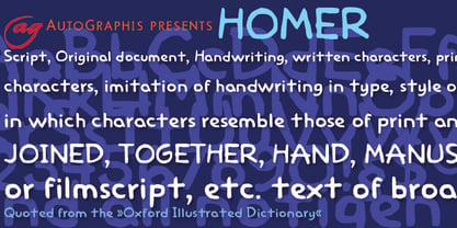 Homer is a very useful handwritten set of comic characters.
 - Munster Gotische by Intellecta Design,
$24.90a gothic font with variations of style ready to use - Affable by Scholtz Fonts,
$21.00 An elegant, contemporary and quirky handwriting font inspired by fonts such as Satisfaction and Nothing. There are many handwriting fonts out there, almost all of them tending to highlight the individuality of a particular person's handwriting. I wanted to go beyond this. What I've always wanted was to write in an elegant, casual yet legible style: something which my own hand often refuses to do. So I set out to produce the handwriting of my dreams - this font. While it doesn't match my dreams 100%, it certainly comes close! Affable comes in three styles, Affable Regular, Affable Blak and Affable Lite. The Affable family is fully professional, carefully letterspaced and kerned. All upper and lower case characters, punctuation, numerals and accented characters are present.
 - Deathstroke by Letterhend,
$18.00 Death Stroke is a organic slab serif typeface which is purposely made for headline, display or logotype. It comes with illustration & logo extras. This type of font perfectly made to be applied especially in logo, and the other various formal forms such as invitations, labels, logos, magazines, books, greeting / wedding cards, packaging, fashion, make up, stationery, novels, labels or any type of advertising purpose. Features : Uppercase & lowercase Numbers and punctuation Illustration extras Alternates & ligatures Multilingual PUA encoded We highly recommend using a program that supports OpenType features and Glyphs panels like many of Adobe apps and Corel Draw, so you can see and access all Glyph variations. PLEASE READ THIS: To use alternate charactter/swash you have to use opentype. For accessing opentype feature, kindly check this link letterhend.com/tutorials/using-opentype-feature-in-any-software/ Email us to letterhend@gmail.com if you need something! Happy Designing!
 - Sutray by Alit Design,
$12.00 Introducing Sutray Typeface Sutray Typeface has a script style with a retro theme that is unique and cool. This font when used for making poster designs, logotypes, text headers and magazine covers is very attractive because of its uniqueness. Sutray Typeface also have 7 families from Thin to Bold. So designers or non-designers if using the Sutray Typeface can be very easy to use and choose a family that is suitable for the design to be made. Apart from that this font is very easy to use in both design and non-design programs because all alternates and glyphs are supported by Unicode (PUA). In order to use the beautiful swashes, you need a program that supports OpenType features such as Adobe Illustrator CS, Adobe Photoshop CC, Adobe Indesign and Corel Draw. but if your software doesn't have Glyphs panel, you can install additional swashes font files.
 - Vinetters by Ingrimayne Type,
$6.50 Vinetters has letters on the alternating leaves of a vine. It is monospaced and uses the OpenType contextual alternatives (calt) feature to alternate leaves as the vine snakes its way across the page, putting leaves with the base down between leaves with the base up. The family has two styles, one with transparent leaves and the other with solid leaves, and these two styles can be used in layers to add color. The family has a large set of accented characters but omits some symbols that are used primarily in technical text. Spaces between words can be left blank or filled with connecting vine using the brackets, trademark-infinity, doubledagger-summation, radical-approximatelyequal, or fi-fl characters. The characters on the leaves are derived from the typeface IngrianaCasual. Topics for which using Vinetters may be appropriate include trees, plants, leaves, nature, changing seasons, and outdoor life.
 - Juliette Michel by Asd Studio,
$15.00 Juliette Michel is a script font created with love, sincerity, and patience. Can be used to make invitation writing, lettering, and all graphic design needs. This font is equipped with 10 stylistic sets that will make your design look more attractive and beautiful. I highly recommend using a program that supports OpenType features and Glyphs panels such as Adobe Illustrator, Adobe Photoshop CC, Adobe InDesign, or CorelDraw, so you can see and access all Glyph variations. This font is encoded with Unicode PUA, which allows full access to all additional characters without having special design software. Mac users can use Font Book, and Windows users can use Character Map to view and copy one of the extra characters to paste into your favorite text editor / application. Thank you if you are interested in purchase and using my font. I hope you enjoy the font, thank you.
 - Qimberly by Asd Studio,
$12.00 Qimberly is a modern calligraphy font created with love, sincerity, and patience. Can be used to make invitation writing, lettering, and all graphic design needs. This font is equipped with 8 stylistic sets that will make your design look more attractive and beautiful. I highly recommend using a program that supports OpenType featuresand Glyphs panels such as Adobe Illustrator, Adobe Photoshop CC, Adobe InDesign, or CorelDraw, so you can see and access all Glyph variations. This font is encoded with Unicode PUA, which allows full access toall additional characters without having special design software. Mac users can use Font Book, and Windows users can use Character Map to view and copy one of the extra characters to paste into your favorite text editor / application. Thank you if you are interested in purchase and using my font. I hope you enjoy the font, thank you.
 - Brownies Cake by Asd Studio,
$10.00 Brownies Cake Brownies Cake is a script font created with love, sincerity, and patience. Can be used to make invitation writing, lettering, and all graphic design needs. This font is equipped with 4 stylistic sets that will make your design look more attractive and beautiful. I highly recommend using a program that supports OpenType featuresand Glyphs panels such as Adobe Illustrator, Adobe Photoshop CC, Adobe InDesign, or CorelDraw, so you can see and access all Glyph variations. This font is encoded with Unicode PUA, which allows full access toall additional characters without having special design software. Mac users can use Font Book, and Windows users can use Character Map to view and copy one of the extra characters to paste into your favorite text editor / application. Thank you if you are interested in purchase and using my font. I hope you enjoy the font, thank you.
 - Gracious Bowing by Nathatype,
$29.00 Gracious Bowing is a meticulously designed display serif font to meet your design needs. It expresses formal yet simple nuances in modern, elegant designs. Its main characteristic is the consistent geometry, proportion, and line thickness on each letter to be legible. For this reason, you can use this font for any text sizes. In addition, you can improve your designs with the available features. Features: Stylistic Sets Ligatures Multilingual Supports PUA Encoded Numerals and Punctuations Gracious Bowing fits for various design projects, such as posters, banners, logos, magazine covers, quotes, headings, printed products, invitations, merchandise, social media, etc. Find out more ways to use this font by taking a look at the font preview. Thanks for purchasing our fonts. Hopefully, you have a great experience using our font. Feel free to contact us for further information when you have a problem using the font. Thank you. Happy designing.
 - Italiko by Luca Bolognese,
$11.00 Italiko is a calligraphic font. The letters have been hand-drawn individually to extract the common strokes. The strokes have then been re-composed to give the font a more unified appearance. It comes in Black, Bold, Regular, and Thin. The Thin version is different as the extreme contrast in the font makes the thinner lines disappear. It is likely best used as a display font. There are ligatures for the combination of letters that can be written more quickly by using a single stroke and letters that are slightly different from the ‘Italic canon.’ You can select which one to use in your application (i.e., Word) using combinations of italic/bold: No selection -> Regular Bold -> Bold Italic -> Thin Bold Italic -> Black If you end up using the font, get in touch at https://github.com/lucabol/Italiko. Feel free to suggest improvements or let me know if you encounter problems.
 - TG Glifko by Tegami Type,
$30.00 TG Glifko is a new contemporary sans-serif grotesque typeface with a combination of large and small aperture, make Glifko feel quirky, dynamic, and unusual. TG Glifko works excellent for display applications and still looks gorgeous in small size. It comes in seven different weights, from ultra-light to extra black, and matches with italic. They also supported various OpenType features, like stylistic alternates, case-sensitive forms, numerators, denominators, superscripts, subscripts, fraction, and multilingual support, coverage more than 200 languages. We are pleased to see our typefaces used by many people. If you are one of them who use our typefaces in your project, feel free to send some in-use sample images to us at info@tegamitype.com. We may upload them on our social media and our website www.tegamitype.com If you have any question or concerns regarding our products, please send us an email at info@tegamitype.com
 - Amiela by Asd Studio,
$15.00 Amiela is a script font created with love, sincerity, and patience. Can be used to make invitation writing, lettering, and all graphic design needs. This font is equipped with 7 stylistic sets and 1 stylistic alternate set that will make your design look more attractive and beautiful. I highly recommend using a program that supports OpenType features and Glyphs panels such as Adobe Illustrator, Adobe Photoshop CC, Adobe InDesign, or CorelDraw, so you can see and access all Glyph variations. This font is encoded with Unicode PUA, which allows full access to all additional characters without having special design software. Mac users can use Font Book, and Windows users can use Character Map to view and copy one of the extra characters to paste into your favorite text editor / application. Thank you if you are interested in purchase and using Amiela. I hope you enjoy the font, thank you.
 - Kaoly by Creativemedialab,
$18.00 Kaoly Regular A unique bold serif with lots of beautiful alternate characters that you can combine to get an attractive final lettering with nice and dynamic shapes just in seconds! Thanks for the unique alternates! This font is suitable for use in many design form, for example Magazines, postcards, logos, Wedding projects and many more. We recommend using Adobe Illustrator or photoshop. Kaoly Lite This is the lite version of Kaoly Regular, recommend to use as a web font. For this style, changes only on uppercase, we also removed the alternative letters to reduce the file size. It will load your website faster when you're using this font for website heading text, products title or using applications that do not support OpenType features. It's very easy to make beautiful words just by typing and tada... you're done. Kaoly will make your work easy and fun.
 - Christmas Reign by Mans Greback,
$59.00 Christmas Reign is a very decorative festive typeface. It is a professional typeface, containing advanced but easy-to-use. OpenType functions, such as contextual alternates and ligatures. Try it and see how each letter pair behaves differently, magically creating new ways to connect as the text goes on. Use it for a stand-alone logotype, or for a longer text which requires that extra touch of magic and mystery. Each letter has more than 10 alternate variations, making it truly adaptable with hundreds of possible ways to write any word. Very easy to use functions! Use characters + < > * # to create Christmas symbols. Example: +Merry Christmas+ Use ( ) [ ] to make a decorative border around any word. Underline _ makes a space with borders. Example: (Santa_Claus) The typeface has very extensive lingual support, and works for all European languages, including Cyrillic and Greek. It also contains numbers and all characters you will ever need.
 - Thought by Scholtz Fonts,
$15.00 Thought, with its versatile five styles, is ideal for contemporary display work. It has style, flair, legibility, and interesting, flowing letter shapes. The Family: -- REGULAR - of medium weight - clear and legible; -- BLACK - for bolder statements and best readabilty; -- LINEAR 25 - light weight, mono width line -- LINEAR 45 - medium weight, mono width line -- ZEST - variable line, casual, exaggerated appearance Use a combination of styles for product branding, book covers, invitations, greeting cards. Thought has not been designed to be used in "ALL CAPS". The best effects for headings and subheads are obtained with an initial upper case letter followed by lower case characters. If you are using upper and lower case then it is not necessary to use kerning. Thought contains over 250 characters - (upper and lower case characters, punctuation, numerals, symbols and accented characters are present). It has all the accented characters used in most European languages.
 - Mattius Rossy by Zamjump,
$17.00 Mattius Rossy is a handwritten font suitable for branding, signatures, wedding invitations, promotions, product packaging and other necessities. This font is modern, simple, but still authentic. You will get a full set of lowercase and uppercase letters, numbers and punctuation marks, multilingual symbols, ligatures, dashes, and swashes. This is tutorial to use ligature and swash : To use swash you can type a + underscore + underscore ( a_ _ ) without space. this only applies up to ( j_ _ ) for ligatures available only ( ee, ff, ll, oo, rr, ss, tt ). "To generate all ligatures, go to Adobe Illustrator - Type - Glyphs." Please send me a message if you are having trouble either installing or using this font. We want to hear your feedback to further improve our product. If you're using this product and come across a problem or come across something we might have missed, feel free to drop us a message.
 - Monkton Book Condensed by Club Type,
$36.99 Packing more copy in a narrow space is the main reason for using a condensed type. Characters with a more ovular shape tend to be less wide than their circular counterparts and will allow for more letters per line. In narrow columns for example, this typeface can provide up to 25% more copy than the regular typeface in the same space. Another reason is when a larger type size is called for — used sparingly it is useful for headings or headlines. For emphasis, narrower letters can provide a stark contrast in the flow of reading, creating impact while retaining typographic character. Condensed types can specially useful in tables and charts because typically both use few words in each block. If space now allows, you may think about the luxury of a larger point size. This optimizes space while keeping your typography more easily legible.
 - Kilau by Majestype,
$25.00 Introductory offer 50% Off for a limited time. A collaboration between Coldiac (a four-piece pop band from Indonesia) & Majestype (typefoundry from Makassar Indonesia) with the help of Erwin Indrawan (lettering artist from Bandung) as the font designer. Kilau font is the official font that we’ve been using for Coldiac the newest single artwork (kilau) & branding material. Kilau comes with 250+ Glyphs and has a kerning feature to make it legible and OpenType (Alternative Character), which is very useful for today's design software as it provides a lot of options. One of the most frequently used is to change certain characters according to your taste. Now you can get the font including the commercial usage for your works. We'd be happy if you guys can use it & feel the experience while listen to Coldiac’s song. *it would be much appreciated if you could credit us.
 - Disco Inferno NF by Nick's Fonts,
$10.00Set the mirrored ball spinning, and get down to Funky Town. Based on a period piece appropriately named Disco 79, this version shifts the concentric elements so that they appear to be lit from below, adding impact and, perhaps, even a sinister touch. You'll also find special treats at the dagger, double dagger and section mark positions. This font contains the complete Latin language character set (Unicode 1252) plus support for Central European (Unicode 1250) languages as well. - MFC Arkena Monogram by Monogram Fonts Co.,
$19.95 The source of inspiration for MFC Arkena Monogram is a specimen from the 1917 “Strong’s Book of Designs”. This popular lettering style has been incorporated into numerous film type foundries of the past, but lacked digital permanence. We’ve expanded the original All Capitals glyphset to include smallcaps to make monograms, have added numerals and included unique ornamentation for basic titling typesetting. Download and view the MFC Arkena Monogram Guidebook if you would like to learn a little more.
 - Coliseum Pro by Red Rooster Collection,
$60.00 Coliseum Pro is a five-weight compressed spur serif font family. ITF’s original Coliseum family, released in 1992, was designed by Julie Hopwood and Pat Hickson. Steve Jackaman completely redesigned, redrew, and improved the Coliseum family over a two-year period, and two additional lighter weights have emerged: Light and Book. Coliseum Pro is inspired by Roman display typefaces, and is powerful and eye-catching at any size. Two sister typefaces, Clydesdale and Torpedo, were born from Coliseum’s redesign.
 - Chift by Alexandra Korolkova,
$20.00Chift is a quite narrow serif font for both body text and headlines in periodicals, where economy of space is needed. The type family consists of ten faces: five styles of low contrast for body text sizes and five styles of high contrast, including Hairline and Black, for display purposes. One of the main features of the typeface is its professionally-designed Cyrillic, which won one of the special prizes at Modern Cyrillic 2009 competition in Text category.
