10,000 search results
(0.033 seconds)
- TWA Assembly Sans by Work Type,
$30.00 TWA Assembly Sans is not your standard workhorse sans. Although it sports the same geometric shapes, grotesk characteristics, and comes in many weights, its unique qualities and slight diagonal curves give Assembly Sans a friendlier appearance. As the weight increase, the contrast becomes more extreme, adding to its approachability.
 - Kigelio by Ivan Rosenberg,
$15.00 KIGELIA is a stylish display serif font inspired by fashion magazines and romance. It is great for short headlines and titles, but it looks great in advertising, vintage mood board, branding, logotypes, packaging, titles, editorial design and modern and vintage design.
 - Ginko by Monotype,
$29.99Ginko is a capitals only display font with an obvious Asian influence. The characters are formed with short tapered strokes, reminiscent of those produced by a broad pen. An ideal face for signage, menus, advertising, wherever an Asian feel is required. - Adipura by Just Lett,
$15.00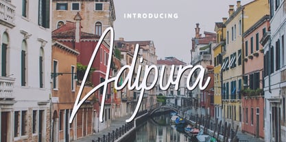 Adipura is a script and handwritten font, and is perfect for your all design project such as wedding invitation design, book cover design, banners, logos, short quotes, flyer designs, typography, signatures, and more. Features: ~ UPPERCASE ~ lowercase ~ Numeral and Punctuation ~ Multilingual Accent
 - Kaufmann by URW Type Foundry,
$35.99 Kaufmann is a joining script designed for American Type Founders by Max R Kaufmann, a letterer, typographer and art director of McCalls magazine. Monotone in weight and with short descenders, the Kaufmann font family is useful for advertising and display work.
 - Cachiyuyo by MendozaVergara,
$9.99 Cachiyuyo is a bitmap font designed for screen titles and to be printed, has a large x height, is very tight and orthogonal. Cachiyuyo is meant for short texts and simple layouts. Is optimized for screen at 8px, 16px, 32px etc.
 - Flomic by Sergey Melnikov,
$24.00 Ukrainian type designer Melnikov Sergey created Flomic font between 2015 and 2016. Flomic is a geometric sans built from a folded lines. Most effective when used in short words or phrases at larger sizes, where the details can be appreciated.
 - Maricava by Monotype,
$29.99The Maricava font was designed for a lady, who received her first computer on her 60th birthday. Maricava is loosely based on her own handwriting and now used intensely by herself in her short stories, writings, recipes and so on. - TC Broadway by Monotype,
$29.99 Modeled after a 1928-1928 design by M.F. Benton -- Broadway --, TC Broadway is ideal for show posters and signs for restaurants and boutiques. The TC Broadway font has strong contrasting strokes, and as such is only suitable for short lines.
 - Pasquale by Monotype,
$39.00Pasquale was designed by Tony Stan. The Pasquale font family has short ascenders, and the lowercase and caps A, B, D, E and Q are open. This versatile warm design is suitable for advertising, magazines, brochures, letterheads and text work. - Liberty Script by Monotype,
$29.99The Liberty font was designed by William T. Sniffin and released in 1927. This script is very fine, with a light color. Liberty can be used on stationery and packaging and is also suitable for short pieces of copy in brochures. - April Rain by Scrowleyfonts,
$16.00 April rain is a delicate, elegant font with teardrop line endings. It is designed to be interesting and a little unusual while remaining robust enough to be used in a variety of contexts from titling and lists to short paragraphs.
 - Crimsons by Piñata,
$8.00 Fontfamily Crimsons unique and very unusual. It combines modern grotesque, medieval motifs and serif proportions. These fonts will be a useful part of a collection designers. Crimsons is ideal for short and emotional inscriptions. Titles, names, logotypes - this is his element.
 - Sevoya by Jonahfonts,
$42.00 Sevoya a captivating robust script font designed with fat strokes for those strong brands and logos. Featuring short ascenders and descenders making it a bit more legible. Sevoya is perfect to create outstanding headings, logos, menus, graphics, and many more applications.
 - County Clerk JNL by Jeff Levine,
$29.00 County Clerk JNL was modeled after the vintage Hamilton wood type design Gothic Special, and is available in both regular and oblique versions. An early grotesk font, this condensed sans serif lends itself well to short headlines and brief body copy.
 - Mabed by Twinletter,
$18.00 Mabed is a psychedelic font, but it’s not just a retro font. This is a special font inspired by the classic 60’s style. Your projects will be both vintage and fun using this font, create your coolest designs with a super psychedelic vibe with a style that stands out from the crowd. What’s Included : - File font - All glyphs Iso Latin 1 - Alternate, Ligature - Simple installations - We highly recommend using a program that supports OpenType features and Glyphs panels like many Adobe apps and Corel Draw so that you can see and access all Glyph variations. - PUA Encoded Characters – Fully accessible without additional design software. - Fonts include Multilingual support
 - Hatchway by Rômulo Gobira,
$15.00 Hatchway is a monospaced display typeface with rounded corners, suitable for headlines and short passages of text. Hatchway has a tall x-height and unusually short ascenders and descenders. The family contains seven weights from Thin to Black and five widths from Ultra Condensed to Ultra Extended. This version (1.0) comes with Multiple Language Support, including Extended Cyrillic, and Opentype Features.
 - FS Maja by Fontsmith,
$50.00 Youthful Fontsmith received a brief to develop a font that would form part of the broadcast identity for the UK’s first digital Freeview channel – E4. It needed to work seamlessly in text and display, both in print and on-screen, and please the eye of the target audience, 18-34-year-olds. So, young, fresh and informal. No problem. Except for one thing: the timing. Daughter As he worked on FS Maja, Jason Smith was occupied by another imminent deadline: the birth of his third child. The pressure was mounting, but rather than let it get to him, Jason embraced the challenge and made light of the tension, fashioning a bright, bubbly, entertaining type with a personality made for memorable headlines. Beautifully random FS Maja’s soft, rounded shapes and assured, fluent lines encompass lots of notable features that contribute to its warm, fun-loving personality, including: a very large x-height; a short, rounded serif to allow for close spacing and give texture to body text; a slight convexity, or bulge, in the stroke terminals; a calligraphic fluidity in the entry to the down-stroke of most lowercase letters; open, generous curves, especially in the “B”, “P” and “R”; and a “w” made of two “u”s.
 - Royal Bavarian by Wiescher Design,
$39.50 RoyalBavarian was comissioned by King Ludwig the First of Bavaria about 1834. He was probably the greatest king Bavaria ever had, but he fell in disgrace for a short affair with the infamous Lola Montez and subsequently had to resign. He died in 1868, peaceful and happy in Nice on the French Riviera. I happened on an original etching of his type-guidelines for official writers of those days about 20 years ago. I always thought it was a very nice Fraktur (Blackletter), not a sturdy militaristic one as most of them are. Being me, I started with first tests immediately and then just forgot the font on my computer. When I was sorting out old stuff a couple of months ago I happened on the etchings once again and kept on working intermittently on the letters. The Plain cut is pretty much like the king wanted it. The Fancy cut is more to my liking and very decorative. Yours in a royal mood, Gert Wiescher.
 - Safford by MysticalType,
$12.00 Safford is a family font with a sports style. I made it with a very mature calculation so as to produce the best visual view. This font is suitable for you to use for making flyers, advertisements, books, magazines, and others. Safford has 18 styles with different thickness sizes, each curve is dynamic and I will show you how serious I am in making it, you can see in the font presentation, how do I input designer values. Safford has 385 Glyphs with ligatures having 24.
 - 1669 Elzevir by GLC,
$42.00 This family was inspired from the set of font faces used in Amsterdam by Daniel Elzevir to print the famous “Tractatus de corde...” the study on earth anatomy by Richard Lower, in 1669. The punch cutter was the famous Dutch Kristoffel Van Dijk. In our two styles (Normal & Italic), font faces, kernings and spaces are scrupulously the same as in the original. This Pro font covers Western, Eastern and Central European languages (including Celtic), Baltic and Turkish, with standard and “long s” ligatures in each of the two styles. The Roman (Normal) style contains a U stylistic alternate, and the Italique style A.
 - Karolinus Fraktur by Cercurius,
$19.95 A slightly regularized digital version of a late Baroque Fraktur type, probably from the beginning of the 18th century, issued by the Norstedts type foundry in Stockholm in 56 point size as "Sju petit fraktur nr 2". This digital font is designed for rather large sizes, at least 30 points. The font includes accented letters for all Western languages, as well as a long s and the usual Fraktur ligatures, e.g. ch, ck, st, tz. The font can be used for logos, packaging, posters, restaurant menus, beer and wine labels etc. associated with traditional German and Scandinavian culture.
 - Zentenar Fraktur by RMU,
$25.00 The name of this blackletter font was chosen due to the centennial of the Bauer Foundry, Frankfurt am Mai, in 1937. Ernst Schneidler probably created then the most beautiful of all fraktur fonts. They are the fruit of countless calligraphic drawings and of many years of professional experiences. Zentenar Fraktur became in its time the workhorse among German blackletter fonts. To access all ligatures in both styles, it is recommended to activate Standard and Discretionary Ligatures. The round s can be reached by typing the # key, and the combination N-o-period plus the OT feature Ordinals gives you the Numero sign.
 - Farrerons Serif by Tipo Pèpel,
$39.00 Specially designed for text size, Farrerons is a full-working Open-type Font. Looking superbly readible but providing a distinctive formal character for immediate impact due to its sudden strokes, mixing delightfully the ancient Roman Trajan inspired uppercase characters with lowercase characters inspired in XV´s humanistic types. A contemporary design that evokes the past but also embraces the future. The font features a full set of small caps, aligning, proportional, oldstyle and proportional oldstyle figures, plus stylistic sets for initial and finishing decorative characters. The font also contains an extended character set supporting Central Europe and Cyrillic languages.
 - Publicity Headline by HiH,
$8.00 Publicity Headline is an allcaps advertising font. Its heavy weight and robust strength allows it to be used against complex backgrounds or reversed out on dark backgrounds without getting lost. It also has a warm, friendly feeling for the conventional headlines indicated by the name. Publicity Headline is a distinctive and appealing font for creating bold and unusual headlines. This font includes the alternate R & S and the CO, LY & ST ligatures that were part of Gaunt’s original design. In addition, the ligatures AV, AW, WA, WO & YO are provided; along with AT, OF, AND & THE in the form of underlined small caps.
 - Miklos by George Tulloch,
$21.00 The gifted Hungarian punch-cutter and printer Miklós Kis was active in Amsterdam in the 1680s. Among the many fonts that he cut during those years were a ‘mediaen’ (pica-sized) roman and italic, and the digital Miklós fonts are an interpretation of these ‘mediaen’ types. The character set has been extended to cover all the European languages that use the Latin alphabet, and the fonts offer OpenType features such as small capitals; old-style and lining figures, both proportional and tabular; fractions; superior and inferior numbers; superior alphabet; contextual and stylistic alternates; and intelligent application of long ‘s’.
 - Brass Stencil JNL by Jeff Levine,
$29.00 Brass Stencil JNL takes its place amongst the many retro stencil fonts designed by Jeff Levine, and was inspired by a set of vintage brass stencils spotted for sale in an online auction.
 - Distance Rider by B1 Industries,
$4.50 This font is useful for all sorts of things (Sites, Gaming, Signage, Electronics, Logos, etc.) I wanted to create a Type Face like this, so I did, making sure to check for errors…
 - Cabana Club JNL by Jeff Levine,
$29.00Bring back the glory of winters in Miami Beach, exotic summer vacations or Deco-era night spots with Cabana Club JNL - a retro-Deco font, complete with contour outline and solid black characters. - Thunder by Rockboys Studio,
$21.00 Thunder is a new modern brush font, incredibly adaptable to all sorts of designs. It is suitable for any branding, product packaging, quote, t-shirt, label, poster, logo that you wish to create.
 - Stonetype by Kustomtype,
$20.00 Stonetype is a typeface that was used by stonemasons in the 70s & 80s of the last century. When I was starting as a stonemason, these were the first characters I had to draw, by hand, back then on grave monuments and memorial plaques. The idea was born to digitize all the material, to be saved for eternity. By digitizing all and fine tuning, plus the addition of some main characters, Stonetype has now grown into a user-friendly typeface that can, now still, be used by stonemasons, to improve their creation process times. But Stonetype can also easily be used in modern and contemporary designs. Stonetype is the perfect fit for graphic design, editorial design, magazines, posters, logotypes, brands and corporate design. Stonetype is designed by Coert De Decker in 2019 and published by Kustomtype Font Foundry.
 - Old Man Eloquent by Three Islands Press,
$29.00 John Quincy Adams, sixth President of the United States, didn't hit his stride until he'd left that lofty office. It was during his many years in Congress that he assured his legacy, not least because of his long, masterful oratory opposing slavery. His speeches, in fact, won him the nickname "Old Man Eloquent." So when I decided to simulate Adams's penmanship in his legendary diary (which he kept for nearly 70 years), it seemed fitting to call the font by that name. I focused on his handwriting from about 1810, when he was Ambassador to Russia, but also consulted pages from later years. Old Man Eloquent has both regular and bold weights. The OpenType version has more than 450 glyphs, including alternate uppercase characters, old-style and lining figures, and numerous ligatures; all formats contain several common (English) words.
 - Yes Script by Fenotype,
$50.00 Yes Script says Yes! Yes Script is a bold connected brush script inspired by the typography of the late 60s and 70s. Yes Script is not an anachronistic vintage type -due to it’s clean features and straight edges it’s more of a contemporary design suitable for branding, packaging, magazines and so on from digital to print. Yes Script is equipped with Contextual Alternates and Standard Ligatures that are automatically on and help to keep the flow of the font natural and connections between letters smooth. In addition there’s Swash, Titling Alternates and two packs of Stylistic Sets. Access the alternates in any OpenType savvy software or seek the Character Palette for even more alternates. Stylistic Set 3 is packed with 24 swooshes and ornaments set in letters a-x. Yes Script is PUA encoded so you can access the alternates in any software.
 - Walls by Piñata,
$8.00 What do you use to write a price tag at a store or to design a wall menu in a cafe? What to choose – a marker or chalk? Now it makes no more sense to be torn apart by the choice – use both techniques for your design. Walls fontfamily allows to perfectly combine an eco-friendly style with contemporary motives. Walls fontfamily supports over 70 languages and consists of 10 typefaces in 5 popular weights (Thin, Light, Regular, Bold, Black). Initially we wanted to create a font that would imitate an inscription made by a square tip marker which is usually used to write price tags at supermarkets, shops and cafes. During the working process we've decided to extend the conceptual boundaries of the Walls fontfamily and added 5 rough typefaces that imitate the style of ecologic chalk writing
 - Hesse Antiqua by Monotype,
$21.99 Hesse Antiqua is the very first typeface designed by Gudrun Zapf von Hesse. It was a pioneering project originally created by her over 70 years ago as a set of brass punches to stamp into leather book covers and spines at the Bauer Type Foundry in Germany. In celebration of her 100th birthday on 2 January 2018, Ferdinand Ulrich and the Monotype Studio team collaborated with her to bring her brass punches to live as a digital font. Hesse Antiqua was developed with careful considerations and decisions to capture the nuance of the beautiful letterforms as they originally appeared in gold and blind stampings. We are pleased to introduce this modern OpenType typeface featuring a proper set of capitals and small capitals, figures, punctuation and some ornaments as well. Hesse Antiqua is best used at 36 points and above, as the designer intended.
 - Pacific Classic by Holland Fonts,
$30.00The Pacific Standard Bold was originally designed as a - capital only - poster typeface for a poster for the 30th International Film Festival Rotterdam in 2001 in the Netherlands. Theme of the festival was 'ports'. The design is inspired by the unpretentious typography often seen in ports. - Pacific Standard by Holland Fonts,
$30.00The Pacific Standard Bold was originally designed as a - capital only - poster typeface for a poster for the 30th International Film Festival Rotterdam in 2001 in the Netherlands. Theme of the festival was 'ports'. The design is inspired by the unpretentious typography often seen in ports. - Goodrich by Hendra Pratama,
$15.00 WARNING! Roughed version is quite heavy to open. Highly recommended to install the font without previewing it first. GOODRICH come in 2 different styles, with same character; Bold & Strong, and can evoke a different emotions. It comes in both clean and rough styles in only Uppercase Latin characters. When choosing a font, it’s important to consider the visual theme of your design. A clean bold fonts can lend a more stronger tone to your design, making it a great choice for Logo or Title. On the other hand, a textured fonts can lend a more natural printed-looks, making them perfect for designing 70s-80s themed parties. It can be used for various design purposes ; Posters, Logos, Packaging, Books or Movie Titles. In summary, these fonts are versatile and can add a unique look to any design project. If you want to add a touch of nostalgia and elegance to your designs, these fonts were timeless asset. With plenty of vintage and retro design resources available, it’s easy to find the perfect ideas for your next project.
 - Banknote 1948 by Ingo,
$39.00 A very expanded sans serif font in capital letters inspired by the inscription on a bank note Old bank notes tend to have a very typical typography. Usually they carry decorative and elaborately designed markings. For one thing, they must be practically impossible to forge and for another, they should make a respectable and legitimate impression. And in the days of copper and steel engravings, that meant nothing less than creating ornate, shaded or otherwise complicated scripts. Designing the appropriate script was literally in the hands of the engraver. That’s why I noticed this bank note from 1948. It is the first 20 mark bill in the then newly created currency ”Deutsche Mark.“ All other bank notes of the 1948 series show daintier forms of typography with an obvious tendency toward modern face. The 1949 series which followed shortly thereafter reveals the more complicated script as well. For whatever reason, only this 20 mark bill displays this extremely expanded sans serif variation of the otherwise Roman form applied. This peculiarity led me in the year 2010 to create a complete font from the single word ”Banknote.“ Back to those days in the 40’s, the initial edition of DM bank notes was carried out by a special US-American printer who was under pressure of completing on time and whose engravers not only engraved but also designed. So that’s why the bank notes resemble dollars and don’t even look like European currency. That also explains some of the uniquely designed characters when looked at in detail. Especially the almost serif type form on the letters C, G, S and Z, but also L and T owe their look to the ”American touch.“ The ingoFont Banknote 1948 comprises all characters of the Latin typeface according to ISO 8859 for all European languages including Turkish and Baltic languages. In order to maintain the character of the original, the ”creation“ of lower case letters was waived. This factor doesn’t contribute to legibility, but this kind of type is not intended for long texts anyway; rather, it unfolds its entire attraction when used as a display font, for example on posters. Banknote 1948 is also very suitable for distortion and other alien techniques, without too much harm being done to the characteristic forms. With Banknote 1948 ingoFonts discloses a font like scripts which were used in advertising of the 1940’s and 50’s and were popular around the world. But even today the use of this kind of font can be expedient, especially considering how Banknote 1948, for its time of origin, impresses with amazingly modern detail.
 - Roman X by Wooden Type Fonts,
$15.00 One of the first and best of the Roman styles, this a condensed, narrow version, with very short descenders.