10,000 search results
(0.09 seconds)
- Beyond Babylon by URW Type Foundry,
$35.99 Babylon was a civilisation that stretched from Bagdad to the Persian Gulf. There is an Old and new Babylonia, the era of Babylon civilization and the biblical Babylon. The oldest scriptures to be found since the rise of civilisation are Babylonic. The Christian, the Jewish and the Arabic culture find its origin in the Middle East. And share more or less the same history, the same roots and DNA. One people, but in reality a melting pot of close related cultures whom could not be more far apart, hostile and suspicious towards each other. An eye for an eye, tooth for a tooth. One could say this disagreement is still alive today and has deeply infected all of our systems. Beyond Babylon is sculpted after Hebrew, Arabic character style elements in a European writing. It questions what happened after the great Babylonic confusion. Did the words finally come across? Did they realize the distant and gap was maybe smaller than expected. This typeface is related to my former character Eurabia. As an artist I like to play with contradictions. Use opposite elements and mould them in to one understandable piece and in addition a thought to chew on. Otherwise the experimental ore shape lovin' typeface user could be very happy with an addition feature to the existing characters. One option more to express your selves in writing. Also this typeface is really suitable for theme writing or advertising. ----------- Babylon war eine Zivilisation die sich von Bagdad bis zum Persischen Golf erstreckte. Es gibt das alte und das neue Babylon, die Ära der Babylon Zivilisation und das biblische Babylon. Die ältesten Schriften, welche seit dem Aufstieg der Zivilisation gefunden wurden, sind babylonisch. Die Christen, die Juden und die arabische Kultur finden ihren Ursprung im Mittleren Osten. Sie teilen mehr oder weniger die gleiche Geschichte, die gleichen Wurzeln und DNA: Ein Volk. Aber in Wirklichkeit waren sie ein Schmelztiegel aus eng verwandten Kulturen, welche sich nicht ferner sein könnten: feindselig und misstrauisch zueinander. Auge um Auge, Zahn um Zahn. Man könnte behaupten, diese Unstimmigkeit bestehe noch heute und hätte all unsere Systeme stark infiziert. Beyond Babylon ist eine europäische Schrift, geformt nach hebräischen und arabischen Stilelementen der Zeichen. Sie hinterfragt die Geschehnisse nach der der Babylonischen Sprachverwirrung. Kamen die Worte endlich an? Haben sie realisiert, dass die Weite des Spalts zwischen ihnen vielleicht geringer war als erwartet. Diese Schrift ist verwandt mit meinen vorigen Zeichen der Eurabia. Als Künstlerin mag ich es mit Widersprüchen zu spielen, gegensätzliche Elemente zu einem vernehmbaren Ganzen zu verschmelzen und einen kniffligen Gedanken zu erzeugen. Andererseits könnte der experimentelle oder formenverliebte Nutzer sehr glücklich über eine zusätzliche Funktion der bestehenden Zeichen sein. Eine weite Möglichkeit sich im Schreiben auszudrücken. Diese Schrift ist auch für Werbung sehr geeignet.
 - Invitation Script by Intellecta Design,
$69.00 Iza W and Intellecta Design are proud to announce Invitation Script, a modern and clean revival of the classic work of the Portuguese master penman Manuel de Andrade de Figueiredo, whose work can be seen in “Nova Escola para aprender a ler, escrever, e contar (...)'' (1722). Invitation Script is the third script superfamily published by Intellecta Design, after Penabico and Van den Velde Script. Invitation Script has original letters designed by Iza W. Creative direction and core programming were provided by Paulo W. Chyrllene K assisted with some work on unusual and archaic styles, resulting in a special font - Invitation Script Archaic (soon available). Invitation started out from Andrade’s script style and evolved into a voluptuous script font family. The result is a typeface ideal for beautiful headings, signatures, art work typography, titles and short pieces of hand-lettered text. Invitation family includes two multi-table Opentype fonts, three supplementary fonts for ornaments and fleurons, and the Archaic font with some of the Andrade’s original characters. Embedded in the regular fonts are additional sets of letters. Over 40 variations are available for certain letters via the Special Sets Opentype table. The two regular versions of Invitation Script contains the following: (i) An extensive set of ligatures providing letterform variations that make eye-popping designs or simulate real handwriting. These are accessible via contextual alternates and other open-type features. (ii) Many stylistic alternates for each letter (upper and lowercase, accessed via the glyph palette, encoded in the ranges of the Special Set Opentype feature). Since there are over 1100 glyphs in each font, we suggest using the glyph palette. (iii) A set of ornaments and fleurons accessed with the glyph palette or using the Ornaments feature. Additional ornaments can be found in the two Invitation Script Ornaments fonts. (iv) Initial and final letters with artistic variations accessible using the initial and final form open-type features. (v) Major kerning work: over 6000 kerning pairs, hand-set to avoid collisions and to create intricate combinations of letters, using swashes and other resources. These powerful features are all accessible in InDesign, Illustrator, QuarkXpress and similar software. We recommend exploring the magic of this font using the glyph palette. Our sample illustrations and PDF brochures showcase the power and pizzazz of this calligraphic script. Let your imagination go wild and use Invitation Script in ways that Andrade could not have foreseen. In non-OpenType-savvy applications, Invitation Script is still an exceptionally beautiful calligraphic typeface that stands up to the competition. The regular fonts contains the complete Latin alphabet, including Central European, Vietnamese, Baltic and Turkish, with a full set of diacritics and punctuation marks. --- 1 FIGUEIREDO, Manuel de Andrade de, 1670-1735 Nova Escola para aprender a ler, escrever, e contar. Offerecida á Augusta Magestade do Senhor Dom Joaõ V. Rey de Portugal. Primeira parte / por Manoel de Andrade de Figueiredo, Mestre desta Arte nas cidades de Lisboa Occidental, e Oriental. - Lisboa Occidental: na Officina de Bernardo da Costa de Carvalho, Impressor do Serenissimo Senhor Infante, 1722. - [18], 156 p., 44 f. grav. a buril : il., ; 2º (31 cm)Engraved royal coat of arms supported by angels over the city of Lisbon, engraved portrait of the author (both of the foregoing by Bernard Picart), (12)ff., 156pp., engraved calligraphic section title, 44 engraved plates. Wood-engraved culs-de-lampe and lettrines. Sm. folio. “Andrade de Figueiredo was born in Espirito Santo, where his father was Governor of the ‘Capitania.’ The fine portrait is dated 1721 and is showing Figueiredo at the age of 48. He was an eminent calligrapher and a creator of the Portuguese handwriting until the reign of Don José I (ca. 1755). His work follows the style of the great Italian masters in its use of clubbed ascenders and descenders, and of Diaz Morante, the famous Spanish writing master, in its very elaborate show of command of hand. By his contemporaries, he was known as the ‘Morante portugues’” (Ekström). “Ce livre est un manuel, composé de quatre parties, destiné à apprendre à lire, à écrire, à conter ainsi que l’orthographe. Les planches comportent des examples d’écritures, d’alphabets et de textes ornés de remarquables traits de plume exécutés d’une main sûre et enjouée” (Jammes).
 - Vernacular Sans by jpFonts,
$19.95 The Vernacular trilogy was designed by Swiss designer Hans-Jürg Hunziker, who had worked for Adrian Frutiger in Paris for many years. Based on the concept of a transitional Linear Antiqua, he has developed a colorful bouquet of typefaces that contain the entire spectrum of typefaces for book design and corporate identity. Thanks to his "Swiss school" and his outstanding skills, he has succeeded in giving the typefaces a particularly noble and sympathetic expression. In addition to the Sans family, there is a Serif family and a Clarendon family, each of which, including the separately drawn italics, is equipped with 12 font weights that are finely tuned to one another. Each of the 3 font styles develops its own character, but thanks to a concept that brings the different font styles closer together, they also work well together and complement each other perfectly. Sans and Clarendon have a vertical axis and similar endings in contrast to the Serif, which has a traditional diagonal axis and horizontal endings. The straight stems and the proportions are used as an element to stress the closeness of the typeface-trilogy. They thus share a comon feature. All fonts contain tabular and proportional figures as well as old style figures. Small caps and small cap figures are also available in all fonts. In addition, some fonts have alternative characters available via style set, such as «g», which can be used to further vary the typeface. Vernacular offers all the options for well-kept typesetting for print and web - for small and large orders.
 - Mono Spec by Halbfett,
$30.00 Mono-Spec is a monospaced family of sans-serif type. At least in default settings, all characters across the typeface share a common width. That fixed setting is condensed, and the aesthetic style of Mono-Spec’s letterforms is very industrial. A sister family, called Mono-Spec Stencil, is also available. Its design strays away from the mechanical nature of Mono-Spec, and it channels the spirit of resistance and street culture. Mono-Spec ships in two different formats. Depending on your preference, you can install the typeface as a single Variable Font or use the family’s five static OpenType font files instead. Those weights run from Light through Bold. While the static-format fonts offer a good intermediary-step selection, users who install the Variable Font have vastly greater control over their text’s stroke width. The Mono-Spec Variable Font’s weight axis allows users to differentiate between almost 1,000 possible font weights. That enables you to fine-tune your text’s exact appearance on-screen or in print. Whatever format you choose, the Mono-Spec fonts are equipped with several OpenType features. The most striking of these can be activated via a Stylistic Set. That will replace several letters – like “B”, “E”, “F”, “H”, and “I” with double-width alternates. Those alternates take up as much space as two characters placed next to each other otherwise word. The effect of Mono-Spec’s double-width alternates is striking, and their use strikes a strong chord in any display typography applying them.
 - Grafical by Halbfett,
$30.00 Grafical is a contemporary take on 19th-century sans serifs. In this family, the amount of geometry inherent within the letterforms has been amped up. Many shapes have received further streamlining, too. All the geometric forms you see have been optically corrected, ensuring their delivery of better legibility. Grafical ships in two different formats: depending on your preference, you can install the typeface as two Variable Fonts or use the family’s 16 static OpenType font files instead. The static fonts offer eight weights, running from Extralight through Black. Each weight has an upright and an italic font available. While the static-format fonts offer a good intermediary-step selection, users who install the Variable Fonts have vastly greater control over their text’s stroke width. The Grafical Variable and Grafical Variable Italic font’s weight axes allow users to differentiate between almost 1,000 possible font weights. That enables you to fine-tune your text’s exact appearance on-screen or in print. Grafical is the perfect tool for a range of design uses, including text on the web, text in print, and text in motion graphics. Its fonts are typographic workhorses – not just from their legibility perspective but also because of the amount of OpenType features they include. There are ligatures, for instance, as well as proportional and tabular lining and oldstyle figures, fractions, numbers placed inside circles, and even Roman numerals. Users can also substitute alternate versions of the “a”, “g”, “i”, “j”, “y”, “G”, and “Q” into their work.
 - Distinct Style by Set Sail Studios,
$14.00 Get stylish with Distinct Style, a fashionable and contemporary pair of signature & sans fonts designed to perfectly compliment one another. With a fast-flowing script font and a two-weight modern sans serif, the Distinct Style duo offers typographic harmony for your professional design projects, including; logos, branding, magazines, blog posts, social media, advertisements & product designs. Distinct Style includes 4 font files, designed to work as perfect companions or simply as strong standalone typefaces; 1. Distinct Style Script • A classy fast-flowing signature font containing upper & lowercase characters, numerals and a large range of punctuation. 2. Distinct Style Script Alt • This is a second version of Distinct Style Script, with a completely new set of upper & lowercase characters. If you wanted to avoid letters looking the same each time to recreate a custom-made style, or try a different word shape, simply switch to this font for an additional layout option. 3. Distinct Style Sans Light • A stylish, modern sans-serif font containing uppercase only characters, numerals and a large range of punctuation. Creates a perfect pairing contrast with the Disticnt Style Script fonts. 3. Distinct Style Sans Bold • A bolder version of the Distinct Style Sans font. Add some contrast to your text by pairing this with the Sans Light version, or use at smaller sizes. Distinct Style Script contains 64 Ligatures, accessible by turning on 'Discretionary Ligatures' with any software supporting OpenType features. Fonts include multilingual support for; English, French, Italian, Spanish, Portuguese, German, Swedish, Norweigen, Danish, Dutch, Finnish, Indonesian, Filipino, Malay.
 - Vernacular Serif by jpFonts,
$19.95 The Vernacular trilogy was designed by Swiss designer Hans-Jürg Hunziker, who had worked for Adrian Frutiger in Paris for many years. Based on the concept of a transitional Linear Antiqua, he has developed a colorful bouquet of typefaces that contain the entire spectrum of typefaces for book design and corporate identity. Thanks to his "Swiss school" and his outstanding skills, he has succeeded in giving the typefaces a particularly noble and sympathetic expression. In addition to the Sans family, there is a Serif family and a Clarendon family, each of which, including the separately drawn italics, is equipped with 12 font weights that are finely tuned to one another. Each of the 3 font styles develops its own character, but thanks to a concept that brings the different font styles closer together, they also work well together and complement each other perfectly. Sans and Clarendon have a vertical axis and similar endings in contrast to the Serif, which has a traditional diagonal axis and horizontal endings. The straight stems and the proportions are used as an element to stress the closeness of the typeface-trilogy. They thus share a comon feature. All fonts contain tabular and proportional figures as well as old style figures. Small caps and small cap figures are also available in all fonts. In addition, some fonts have alternative characters available via style set, such as «g», which can be used to further vary the typeface. Vernacular offers all the options for well-kept typesetting for print and web - for small and large orders.
 - Vernacular Clarendon by jpFonts,
$19.95 The Vernacular trilogy was designed by Swiss designer Hans-Jürg Hunziker, who had worked for Adrian Frutiger in Paris for many years. Based on the concept of a transitional Linear Antiqua, he has developed a colorful bouquet of typefaces that contain the entire spectrum of typefaces for book design and corporate identity. Thanks to his "Swiss school" and his outstanding skills, he has succeeded in giving the typefaces a particularly noble and sympathetic expression. In addition to the Sans family, there is a Serif family and a Clarendon family, each of which, including the separately drawn italics, is equipped with 12 font weights that are finely tuned to one another. Each of the 3 font styles develops its own character, but thanks to a concept that brings the different font styles closer together, they also work well together and complement each other perfectly. Sans and Clarendon have a vertical axis and similar endings in contrast to the Serif, which has a traditional diagonal axis and horizontal endings. The straight stems and the proportions are used as an element to stress the closeness of the typeface-trilogy. They thus share a comon feature. All fonts contain tabular and proportional figures as well as old style figures. Small caps and small cap figures are also available in all fonts. In addition, some fonts have alternative characters available via style set, such as «g», which can be used to further vary the typeface. Vernacular offers all the options for well-kept typesetting for print and web - for small and large orders.
 - Ultra System by Set Sail Studios,
$14.00 Introducing Ultra System; A modern exploration of 8 fonts, each carefully designed to naturally compliment one another. With 6 clean sans fonts and 2 textured script fonts, Ultra System gives you a variety of ways to combine and arrange each font, allowing you to create striking & modern typographic designs. This typeface collection consists of 8 fonts; Ultra System Script • A textured, bouncy & flowing marker script font containing upper & lowercase characters, numerals, and a large range of punctuation. Ultra System Script Alt • This is a second version of Ultra System Script, with a completely new set of both upper and lowercase characters. If you wanted to avoid letters looking the same each time to recreate a custom-made style, or try a different word shape, simply switch to this font for an additional layout option. Ultra System Sans • A wide, bold sans font containing uppercase only characters, numerals, and a large range of punctuation. Ultra System Sans Line One • A thick outlined version of Ultra System Sans, pair this with other Ultra System Sans fonts to add emphasis to words or phrases. Ultra System Sans Line Two • A thin outlined version of Ultra System Sans, pair this with other Ultra System Sans fonts to add emphasis to words or phrases. Ultra System Sans Italic • Italic variations are included for all 3 Ultra System Sans fonts. FAQs; Accessing Ligatures • Ligatures are supported by most desktop graphics & text software (not just the fancy ones!), including Photoshop, Illustrator, InDesign, Word, Pages & Keynote. Many programs will automatically have this feature switched on for you, but if you need any help accessing then please feel free to drop me a message. Language Support • All Ultra System fonts support the following languages; English, French, Italian, Spanish, Portuguese, German, Swedish, Norwegian, Danish, Dutch, Finnish, Indonesian, Malay, Hungarian, Polish, Croatian, Turkish, Romanian, Czech, Latvian, Lithuanian, Slovak, Slovenian
 - Cholla by Emigre,
$49.00 The Cholla typeface family was designed by Sibylle Hagmann in 1998-99 and named after a species of cactus she encountered in the Mojave Desert. Cholla was originally developed for the Art Center College of Design in Pasadena, California. There, art director Denise Gonzales Crisp and associate designer, Carla Figueroa, collaborated with Hagmann to create a series of fonts that would offer a great deal of variation. The variety was needed to echo the school's nine different departments, yet together the fonts had to exude a unified feel. It was first used in the radically designed 1999/2000 Art Center catalog which won a honorable mention in I.D. magazine and was featured in Eye No. 31. Originally Hagmann set out to design a typeface that, as she recalls, "I could feel comfortable making, first of all, and one that would serve a purpose and had a clear idea behind it, and something that I would want to use myself." Stylistically Hagmann set out to create "12 cuts with slightly different personalities, with different ideas applied. For example the bold weight isn't simply the Regular with weight gain, but has bold letterforms with their own peculiar details. What all weights share and what is the necessary unifying detail is the tapered curve - marked out, for example, in the lowercase b's left top and bottom of the bowl." Gonzales adds: "The forms seemed classical as well. This combination could have a long life, and be timely. I also saw - at least in the beginnings of Cholla - forms that connoted hybrid, of inter-connection, of human and machine growing together. These notions seem appropriate for a school that teaches design and art." Greek version by Panos Haratzopoulos.
 - Navaja by Andinistas,
$39.95 Very few letter types with the context of grunge style fonts offer hierarchies to differentiate words in sentences or paragraphs. With Navaja I developed a font family that meets this need. This family is useful to organize the information into a hierarchy with an eroded look. Its central idea mixes grotesque, geometric and humanistic letter conventions. This way, Navaja is a grunge-sans with dense proportions to make graphic design with eroded character. Its main purpose appeared when one of my customers asked me for a t-shirt design for a fan club of an important football player. For this reason its starting point were stained and muddy letters characterizing the toughness and coldness of the sport. Over time their glyphs began to imitate the robustness of "wood type & Tuscan Type" widely used in posters in the late nineteenth century. Its purpose was strengthened in a family with 6 members that when mixed they produce mind catching contrast levels ideal for designing T-shirts, stickers, flyers, brochures, posters, billboards, cinema or TV. Therefore its variants are short up and down height X combined with different widths that by working together produce information that radiates outstanding apparently destroyed controlled violence. Navaja Dingbats consists of 52 illustrations useful for frames and textures. In that vein, the origin of each member comes from skeletons of Roman and Italic calligraphy. The low amount of contrast between thick and thin lines matching the contours apparently gnawed but strictly regulated by optical adjustments equating the sum between full and empty areas. Factors such as finishes, shapes and counter internal and external forms are meticulously planned although its scruffy look which strategic arrangements are offset to provide color typographical homogeneous. And in conclusion, I have plans to continue expanding the family with more complete versions in the future.
 - ÉconoSans Pro by Ingo,
$41.00 The most space-saving sans serif This font saves more space than any of its kind! Slim proportions, but not “condensed” Characters which nearly touch Sparse ascenders and descenders Distinct forms How close to each other can the characters of a font get? Theoretically, as close as you want. But obviously, the words should still be legible. And as any designer knows, body clearance of characters also depends on other parameters such as point size and line spacing. In practice, there are always situations in which as much information as possible has to be positioned in as little space as possible. The ingoFont ÉconoSans is made for exactly this purpose. Even the name of the font implies its function: French for the infinitive “to save” is “économiser.” Now if that doesn’t sound good… The shapes of the upper and lower case letters are completely matter-of-fact, the way a modern font has got to be. The letters c e, and s are wide open to their neighbors. An especially distinguished trait of this font is the design of the “triangular” characters v w y x k z and A V W Y Z K X M N. And the open form of B R and P is also not typical in a sans serif. The distance between letters is kept tight and often the characters nearly touch, but only nearly. With ÉconoSans you gain approximately 20% more text in a line than with »Tahoma«, and even still more than 10% compared to »Helvetica«. ÉconoSans also includes tabular figures as well as ligatures. Among the ligatures, the double mm is especially unusual and is hardly familiar, but can contribute greatly to saving space without catching the reader’s eye.
 - Celtic Monograms by Kaer,
$24.00 Here is my next Celtic Monograms font family. I used a lot of authentic knots and curves to imitate Insular art style. The term derives from insula, the Latin term for “island” in this period Britain and Ireland shared a largely common style different from that of the rest of Europe. I've drawn sketches set, manually vectorized it and assemble the font family. In an attempt to replicate the intricate patterns found in Celtic art, I endeavored to create a design that embodied the essence of true Celtic knot work. The interweaving lines, which were prominent motifs in Celtic art prior to the arrival of Christian influence around 450, served as the foundation for my creation. Over time, these designs seamlessly integrated into early Christian manuscripts and artwork, incorporating depictions of various elements from everyday life, including animals, plants, and even human figures. In the beginning, the patterns were intricate interwoven cords, called plaits. This particular style is often linked to the Celtic regions, but it was also widely embraced in England and spread throughout Europe through the efforts of Irish and Northumbrian monks. The utilization of the Celtic knot as a tattoo design gained popularity during the 1970s and 1980s in the United States. Consequently, it has proven to be a highly advantageous font choice for various applications such as posters, banners, and sportswear. You can also create a vintage color shift effect. Please note, you should use graphic applications such as Adobe Illustrator or Photoshop, but not Microsoft Word. All you need is put Two or Three lines style initial on the top of Back style. I’m happy to present you the Rough, Two lines, Three lines, and Back styles for your design. You’ll get uppercase and numbers set. Thank you!
 - P22 Glaser Babyfat by P22 Type Foundry,
$24.95 Milton Glaser on designing Babyfat: “This is the first alphabet I ever designed. For some inexplicable reason I called it Babyfat. Because I’m not a type designer, most of my alphabets are actually novelties or graphic ideas expressed typographically. Here the idea was to take a gothic letter and view it simultaneously from two sides. It started out as a rather esoteric letterform; it ended up being used in supermarkets for ‘Sale’ signs.” This forced perspective 3-D font has appeared on many LP covers and posters from the mid 1960s onward. This revival includes the original lowercase for the first time in digital form. Besides the three original styles (Outline, Shaded, and Black) made for photo typesetting, the new P22 Glaser Babyfat introduces six additional variations to allow the user to easily colorize the type as Glaser envisioned. The Keyline, Fill, Glyph, Left, Right, and Down font styles give the user nearly infinite options to create dynamic chromatic effects. P22 Glaser Babyfat was based on original drawings and phototype proofs from the Milton Glaser Studios archives. Typographic punctuation and sorts were imagined by James Grieshaber to work with Glaser’s design, as well as diacritics to accommodate most European languages. Over the years there have been many typefaces that borrowed heavily from the Glaser designs, but these are the only official fonts approved by Milton Glaser Studio and the Estate of Milton Glaser.
 - Aldero by R9 Type+Design,
$48.00 Aldero™ strives to be as useful to any design environment as Alder trees are to the forest. Wildlife and insects feed on Alder leaves and seeds. The tree also provides shelter for animals in winter while its shades keep streams from getting too hot in summer. The trunks and branches are excellent habitats for lichens and mosses. The nitrogen-rich leaves help fertilize the soil where they landed. Alder’s utilitarian nature inspires us to create Aldero™, a handy, versatile, go-to type family for all professional designers. To achieve what we set out to do, we gave Aldero™ the two-in-one looks, doubled the sets of ligatures, and loaded it with plenty more of Opentype features. We put in long hours, months after months, until we are proud of the outcome. And we truly believe that you will enjoy working with this typeface as much as we do. With five weights, ten styles, and 1,100+ glyphs per style, this versatile typeface comes with virtually two looks. The standard glyph set is perfect for formal, corporate design, while the stylistic alternate set elicits a fun, friendly, and casual feel. You can use each style separately or mix and match them to achieve your design aesthetic. Thanks to these options, a wide range of design possibilities are at your fingertips. In addition to the two large sets of ligatures (for both the standard and the stylistic glyph sets), we also pack tons of Opentype features into Aldero™ to improve your user experience while working with this typeface. To activate the case-sensitive features, for example, highlight the phrase with the type tool, then hit the “All Caps” button; or select each mark, punctuations, or symbols with the type tool, then choose the case-sensitive option from the Opentype popup window. Hope you enjoy working with Aldero™ as much as we do! To find out more about Aldero™ Opentype features and type specimen, please visit https://r9typedesign.com/aldero-features
 - Phone Pro by Tamar Fonts,
$50.00 "Relation Between Typology and Type Design" 'PRISTINE'; this font is—neither beautiful nor ugly, neither vigorous nor weak, neither traditional nor modern, neither serif nor sans serif, neither script nor printable, neither a text font nor a display font—it is rather all of the above, which makes it a more versatile typographic tool—[handwritten] characters that are well-suited for a wide variety of applications—from editorial design, [friendly] greeting cards... to branding, advertising, publicity and digital. Each glyph design combines its unique shapes and stylish ink-traps with parabolic curves. Each glyph design has been treated as an 'individual character'—the way I would treat a breathing, living, vulnerable and courteous human being; looking after each and every character as if it was my only child — bringing to light the authenticity and uniqueness of each individual, as well as my objective to bring about peace and harmony between them all as a whole. Designed with the intention of harmonizing between four scripts — Latin, Cyrillic, Greek and Hebrew; the whole family has a comprehensive set of characters—in addition to the Latin letters, the Phone typeface also has a full set of characters for Vietnamese, partially extended Cyrillic, Greek and Hebrew (sold separately). The t_t ligature is something unique to Phone, as well as the t_z ligature, among others and extras. A distinctive trait of the Phone typeface, is a high x-height combined with relatively short ascenders. The Phone typeface is in a way evoking the feeling of some Gaelic font and of the [Egyptian] Papyrus font (by Chris Costello, though, not being based on neither of those), having an exotic and an exquisite look, under the category of "Soft Fonts & Friendly Faces". Copyright Tamar Fonts/Hillel Glueck 2021 ALL RIGHTS RESERVED Any unauthorized distribution of my work is strictly prohibited, and will be prosecuted; do the right thing, and do not participate in the piracy of my typefaces; if you appreciate my work, then please pay for it and help me prosper — thank you!
 - Dynatype by Alphabet Soup,
$60.00 Suddenly...it’s the World of Tomorrow! With the push of a button Dynatype automates your typesetting experience. Dynatype is actually Two fonts in One–without switching fonts you can instantly change from Dynatype’s “regular” style to its alternate connecting version with the simple push of a button. For more details download “The Dynatype Manual” from the Gallery Section. What is Dynatype? Dynatype is the upright, slightly more formal cousin of Dynascript. It shares many of the characteristics of it’s slightly older relation, but is drawn entirely from scratch and has it’s own unique character. Dynatype may be reminiscent of various mid-century neon signage, and of sign writing, Speedball alphabets and even baseball scripts. Its design also takes some cues from a historical typographic curiosity that began in Germany in the ‘20s and which lasted into the ‘60s—when Photo-Lettering gave it the name "Zip-Top". Basically it was believed to be the wave of the future—that by weighting an alphabet heavier in its top half, one could increase legibility and reading speed. The jury’s still out on whether or not there’s any validity to this notion, but I think you’ll agree that in the context of this design, the heavier weighting at the top of the letters helps to create some uniquely pleasing forms, and a font unlike any other. Typesetters across the planet will also be able to set copy in their language of choice. Dynatype’s 677 glyphs can be used to set copy in: Albanian, Basque, Catalan, Cornish, Croatian, Czech, Danish, Dutch, Esperanto, Estonian, Faroese, Finnish, French, Galician, German, Hungarian, Icelandic, Indonesian, Irish, Italian, Kalaallisut, Latvian, Lithuanian, Malay, Maltese, Manx, Norwegian Bokmål, Norwegian Nynorsk, Oromo, Polish, Portuguese, Slovak, Slovenian, Somali, Spanish, Swahili, Swedish, Turkish, and Welsh—and of course English. Sorry! Off-world languages not yet supported. PLEASE NOTE: When setting Dynatype one should ALWAYS select the “Standard Ligatures” and “Contextual Alternates” buttons in your OpenType palette. See the “Read Me First!” file in the Gallery section.
 - Dynascript by Alphabet Soup,
$60.00 Typography enters the Space Age! Dynascript brings the ease of “Pushbutton Automatic” to your typesetting experience. Dynascript is actually Two fonts in One–without switching fonts you can instantly change from Dynascript’s connecting font to the non-connecting italic with the simple push of a button. For more details download “The Dynascript Manual” from the Gallery Section. What is Dynascript? Dynascript is the slanted script cousin of Dynatype. It shares many of the characteristics of it’s sibling, but is drawn entirely from scratch and has it’s own unique character. To some it may be reminiscent of various mid-century neon signage, and of sign writing, Speedball alphabets and even baseball scripts. The design of Dynascript also takes some cues from a historical typographic curiosity that began in Germany in the ‘20s and which lasted into the ‘60s—when Photo-Lettering gave it the name "Zip-Top". Basically it was believed to be the wave of the future—that by weighting an alphabet heavier in its top half, one could increase legibility and reading speed. The jury’s still out on whether or not there’s any validity to this claim, but I think you’ll agree that in the context of this design, the heavier weighting at the top of the letters helps to create some uniquely pleasing forms, and a script unlike any other. Typesetters across the planet will also be able to set copy in their language of choice. Dynascript’s 694 glyphs can be used to set copy in: Albanian, Basque, Catalan, Cornish, Croatian, Czech, Danish, Dutch, Esperanto, Estonian, Faroese, Finnish, French, Galician, German, Hungarian, Icelandic, Indonesian, Irish, Italian, Kalaallisut, Latvian, Lithuanian, Malay, Maltese, Manx, Norwegian Bokmål, Norwegian Nynorsk, Oromo, Polish, Portuguese, Slovak, Slovenian, Somali, Spanish, Swahili, Swedish, Turkish, and Welsh—and of course English. Sorry! Off-world languages not yet supported. PLEASE NOTE: When setting Dynascript one should ALWAYS select the “Standard Ligatures" and “Contextual Alternates” buttons in your OpenType palette. See the “Read Me First!” file in the Gallery section.
 - Stylish Serif by Sensatype Studio,
$15.00 Stylish Serif is a Modern Retro Vintage Serif Font that we created special for Display, Logo and Branding A new Serif font that is nice to leverage designer or product owner that need solutions to make their design look more gorgeous and vintage. And specially for this font, We prepared any characters to help you create gorgeous for your creative needs specially for headline, and typography needs. Stylish Serif font ready with: Stylish Shape to get creative Preview as a inspirations that you can do with this font Ready with All Uppercase characters Wish you enjoy our font. :)
 - Blushed by Supfonts,
$17.00 Hello, friends. I keep experimenting with handwritten fonts, shapes and lines. I want the font to set the tone, the atmosphere, and look like an inscription made in a hurry, but it is well read. Blushed combines all these qualities. Simple and clear, looks at ease. It is perfect for signatures or design, where you do not need a strict style. Test it out below to see how it could look for your next project! Includes: Uppercase and lowercase Numbers and punctuation Foreign language support Ligatures Check out my blog: https://www.instagram.com/zloillev pinterest.com/dmitriychirkov7 Enjoy
 - Lavamora by Mchcrafter,
$16.00 La Vamora is a Modern Stylistic Serif typeface A new serif that we created specially for branding needs, with extra ligatures and alternates in a unique shape just to add value to your brand. It so nice to leverage designer or product owner that need solutions to make their design look more stylish and modern. And specially for La Vamora font, We prepared all the ligatures, and the alternates characters to help you create unlimited variations for your creative needs. La Vamora includes: All uppercase & lowercase letters All numbers 0-9 & Punctuation Ligatures & Alternates Symbols Multiligual Letters
 - Uranos by Paweł Burgiel,
$38.00 Uranos is a serif type family with uncomplicated appearance and modern, geometric glyphs shapes. Available in three styles, include many stylistic alternates and automatic ligature creation. Character set contain the complete Unicode Latin 1252 (Western European; ANSI), 1250 Latin 2 (Central European), 1254 Turkish, 1257 Baltic. Supported OpenType features: Acces All Alternates, Capital Spacing, Case-Sensitive Forms, Contextual Alternates, Fractions, Kerning, Localized Forms, Ordinals, Proportional Figures, Slashed Zero, Small Capitals, Small Capitals From Capitals, Stylistic Alternates, Stylistic Set (1-20), Superscript, Tabular Figures, Titling. Kerning is prepared as single ('flat') table for maximum possible compatibility with older software.
 - Fregan by Seniors Studio,
$15.00 Fregan Typeface is sharp serif font with an elegant feel. Unique character by combining geometric shapes with organic curvy details. It is a unique typeface for your individual personality. Inspired by old-style serif and contemporary fonts. And additional Fregan Sans, working in harmony with Fregan Serif to create typography awesome creations. Perfectly for elegant branding, magazine design, logo design, headlines, posters, packaging, cards or your wedding invitation and more. 4 styles: Regular and Bold Latin based languages. OpenType features, including ligatures. OTF files. If you need help or advice, please contact me by e-mail "seniorsstudio@gmail.com" Thank you!
 - Boudoir by Juraj Chrastina,
$29.00 Come into the boudoir. This simple hand-drawn sans tries to invoke the same feelings as its name - and not to be overluscious. Boudoir is sweet and sensual like women, but it’s at the same time uncluttered and masculinely straightforward. The font borrows some playful capital shapes from the all caps Baronessa and draws inspiration for others from old classics. Thanks to the bolder weights, it can also be used in smaller sizes, you can combine different weights for different sizes to obtain a more balanced look, or you can just give emphasis using different weights.
 - Furious Night by Hatftype,
$17.00 Furious Night - Blackletter Display Font is a display font that is inspired by gothic and horror style because its shape is very unique and is perfect for any project that you will use with this theme. Furious Night with opentype features such stylistic alternates, stylistic sets & ligatures good for logotype, poster, badge, book cover, tshirt design, packaging and any more. Features : 1.Uppercase & Lowercase 2.Multilingual support 3.Number 4.Symbol 5.Punctuation. 6.Extra Dingbat 7.Support in Mac and Windows OS -Support in design application (photoshop, illustrator, and more) There it is! I really hope you enjoy it
 - Bakira by Mchcrafter,
$18.00 Bakira font is a Modern Stylistic Slab Serif typeface A new slab serif that we created specially for branding needs, with extra ligatures and alternates in a unique shape just to add value to your brand. It so nice to leverage designer or product owner that need solutions to make their design look more stylish and modern. And specially for Bakira, We prepared all the ligatures, and the alternates characters to help you create unlimited variations for your creative needs. Bakira includes: All uppercase & lowercase letters All numbers 0-9 & Punctuation Ligatures & Alternates Symbols Multiligual Letters
 - Yuki by Thinkdust,
$10.00 Yuki is a full and rounded font that also manages to be compact, so when you need to make a big impact in a small space and still maintain a friendly feel, Yuki is here to do the job. In two different styles, each with bold alternatives, Yuki’s best function is to grab attention without taking up too much space. The lined form allows it to look even more streamlined in this performance, cutting shapes into more easily digestible pieces, while the bold forms create even more smoothness. Use Yuki for quick, impactful statements without being aggressive.
 - Raqilla Kids by Zamjump,
$15.00 Introducing Raqilla Kids - Playful Display Font Raqilla Kids is a display font with a cute character. This is a kids themed font look, inspired by children's writing in general, with a shape that looks irregular but is very distinctive, these characters will add a warm touch to any look. Add this beautiful display font to your every creative idea and see how it makes them stand out! FEATURES - Uppercase - Lowercase - Numbering - Punctuations - Ligature - Alternate - Swash - Multilingual Support - Works on PC or Mac - Simple Installation - Support Adobe Illustrator, Adobe Photoshop, Corel Draw, also works on Microsoft Word Thanks
 - Higamlo by Mchcrafter,
$18.00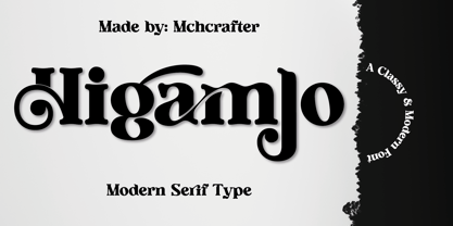 Higamlo font is a Modern Stylistic Serif typeface A new serif that we created specially for branding needs, with extra ligatures and alternates in a unique shape just to add value to your brand. It so nice to leverage designer or product owner that need solutions to make their design look more stylish and modern. And specially for Higamlo font, We prepared all the ligatures, and the alternates characters to help you create unlimited variations for your creative needs. Higamlo font includes: All uppercase & lowercase letters All numbers 0-9 & Punctuation Ligatures & Alternates Symbols Multiligual Letters
 - Sethasso by Twinletter,
$15.00 Introducing our newest font called Sethasso, clean simple, and elegant themed signature font, which is written in natural hand strokes making this font more charismatic natural, This font in addition to having a charming and unique shape is also equipped with various alternative options that make it easier for you to create beautiful and extraordinary designs This font is perfect for business cards, photography studios, autographs, interior designs, model names, coffee late, travel, weddings, cosmetics, jewelry, social media posts, product packaging, watermarks, special events, or anything else. Start using this font to add an authentic and heartfelt vibe to any design project.
 - Japanese Emperor by Putracetol,
$28.00 Japanese Emperor is a font inspired Japanese style and the only fonts with shapes and styles that exactly resemble the Japanese characters & this font is easy to read and can be applied to all media and all can use this font without exception This font is suitable for your projects such as logos, wedding invitations, branding, landing pages, apparel, posters, headlines, greeting cards, invitation cards, social media, crafting, quote and more. This font can be used and supported in various programs and OS, such as procreate, cricut, windows, macOS and others. This font is also support multi language.
 - Campaign Serif by Sensatype Studio,
$15.00 Campaign is a Modern Stylish Serif Font that we created special for Display, Modern logo and Branding needs A new Serif font that is nice to leverage designer or product owner that need solutions to make their design look more gorgeous and modern. And specially for Campaign font, We prepared any characters to help you create gorgeous for your creative needs specially for headline, and typography needs. Campaign Modern Stylish Serif font ready with: Stylish Shape to get creative Preview as a inspirations that you can do with Campaign font Ready with Lowercase and Uppercase characters Wish you enjoy our font. :)
 - Ghost Place by Hatftype,
$15.00 Ghost Place - Halloween Display Font is a display font that is inspired by horror and gothic style because its shape is very unique and is perfect for any project that you will use with this theme. Ghost Place came with opentype features such stylistic alternates, stylistic sets & ligatures good for logotype, poster, badge, book cover, tshirt design, packaging and any more. Features : 1.Uppercase & Lowercase 2.Multilingual support 3.Number 4.Symbol 5.Punctuation. 6.Extra Dingbat 7.Support in Mac and Windows OS -Support in design application (photoshop, illustrator, and more). There it is. I really hope you enjoy it.
 - Coralis Elegant by Gatype,
$14.00 Coralis Elegant serif with a creative atmosphere and perfect shape, inspired by today's beautiful Display serifs. thick, balanced and varied, born for luxury and beauty. In my example I show how this script can be used. It's great for logotypes, branding, wedding invitations, romantic cards, retro labels, packaging, name spelling and more. Coralis Elegant comes with beautiful uppercase and lowercase letters, numbers, and punctuation. In addition to the main character set, there are many alternative characters, start and end sweeps. . Multilingual. . SWASH. . Ligature. . Style Set. If you have any questions please feel free to contact me! Thank You,
 - Otamendi by Pen Culture,
$19.00 Proudly present "Otamendi Signature Font" Otamendi is beautiful signature font which has a beautiful and natural arch shape, this font is very suitable for various types, such as logos / brands, posters, magazines, Instagram templates, and many more. I really hope you enjoy it - please do let me know what you think, comments & likes are always hugely welcomed and appreciated. More importantly, please don't hesitate to drop me a message if you have any issues or queries. Guides to access all alternates glyphs : http://adobe.ly/1m1fn4Y Please fell free to contact me if you have any question Thank you
 - Psyche Lover by Sarid Ezra,
$15.00 Introducing, A NEW RETRO BOLD FONTS WITH STYLISH AND ICON ALTERNATES, Psyche lover! Psyche lover is a retro font serif based that contains stylish alternates! You can make a unique branding retro and psychedelic designs with this fonts. This stylish bold fonts also included extrude and outline style that will compliments the regular style for more retro looks! This fonts suitable to use for poster, branding, merchandise, and any retro style! The "Love" shape also included in this font as an alternates for character "o". You can see all the alternates from preview above!! Also support multilingual and already PUA Encoded! Thank You!
 - Demoise by Maculinc,
$14.00 Demoise is a sans serif font family with 2 versions, a display version (Demoise Play) and a sans serif version (Demoise) containing 14 for each version and complete with italics. This font is styled unique enough to collaborate with the retro style, when you stick it on your designs such as posters, brochures, magazines, business cards or any other shape you will find something interesting and unique. This font is equipped with a multilingual system and various languages such as: Baltic, Basic Latin, Central European, Dutch, Euro, Romanian, Turkish, Western European and others. al European, Dutch, Euro, Romanian, Turkish, Western European and others.
 - Sankor by Twinletter,
$18.00 Introducing the Sankor display font. This font is perfect for any project that needs a modern twist on a classic design. It’s unique, stylish, and fun. Having a bold anatomical shape makes it beautiful and visually unique from most other fonts. Your project can be made more stunning by adding this font. What’s Included : Standard glyphs Iso Latin 1 Simple installations We highly recommend using a program that supports OpenType features and Glyphs panels like many Adobe apps and Corel Draw, so you can see and access all Glyph variations. PUA Encoded Characters – Fully accessible without additional design software. Fonts include Multilingual support
 - Rachele by Resistenza,
$39.00 Rachele is a mono line based script thin font. Inspired on the cute “Italian Bella Scrittura” handwriting but influenced by Spencerian. Ornaments and ligatures make this hand more expressive offering round stroke endings and a flowing shape. Rachele is a big family, its stroke expand into extra light till medium and passing through a calligraphic/ribbon effect. At the same time the width varies, that’s make this script even more flexible, from Ultra Condensed to Super Extended. Enjoy it. Check out also Check out also ‘Mentha’ based on Rachele’s skeleton. We recommend to combine Rachele with: Turquoise
 - Boldies by Illushvara,
$14.00 Boldies is a serif font, mixed the modern with the classic concept line serif. The Alternate shape will make your design look like Modern. But don't worry if you need the Design like Classic and Bold Serif, you just put the normal Uppercase and Lowercase. With many ligatures will make your design projects stand out! Add this font to your most creative ideas for Application, Art Gallery Poster or postcard, Architectural Logo Project, Classic Magazine, Product Skincare or Logotype you want to used! Support the Multilingual Language! If you have any question, don’t hesitate to contact me. Happy Designing !!! Thank You, Illushvara Design