7,338 search results
(0.042 seconds)
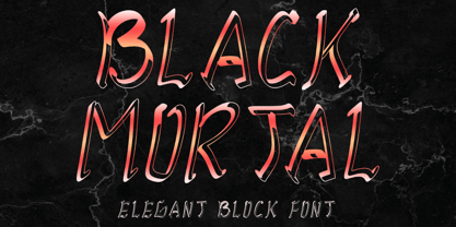
- Black Mortal by Yoga Letter,
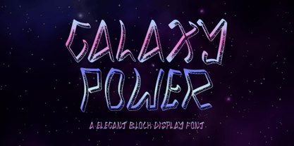
$30.00 - Galaxy Power by Yoga Letter,
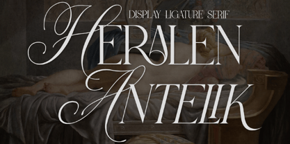
$30.00 - Heralen Antelik by Letterena Studios,
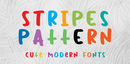
$17.00 - Stripes Pattern by Crumphand,
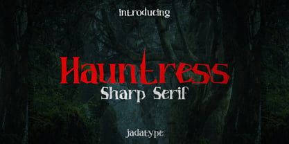
$20.00 - Hauntress by Jadatype,
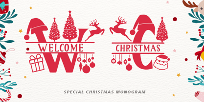
$15.00 - Welcome Christmas by Yoga Letter,
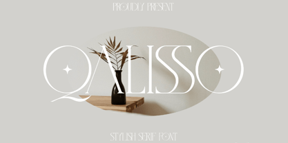
$14.00 - Qalisso by Letterena Studios,
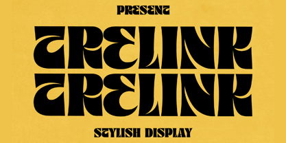
$9.00 - Trelink by Letterena Studios,
$17.00 - Noobia by Scholtz Fonts,
$19.95Noobia is a casual, energetic handwritten font, with plenty of movement. Its moving baseline creates a funky, busy, dramatic impression. With its informal, immediate style, Noobia is like a swift swash of text handwritten with a slightly overfilled ink pen. This impression is exaggerated by blobs at the beginning and end of pen strokes. Noobia makes a simple, direct statement, bypassing complexity and superficiality. It's just an in-your-face, immediate font. It 's the font you'd use for a quick, hand drawn note or notice. Noobia comes in three great styles: Noobia Smooth - use it for ad media for anything from sports equipment to slinky lingerie, wine labels to washing powder packaging. Noobia Black - use it anywhere to emphasise Noobia Smooth, and on posters and children's book covers. Noobia Rough - use it for graffiti, music videos, funky clothing hang tags and event posters. Noobia has all the features usually included in a fully professional font. Language support includes all European character sets. - Verve by Altered Ego,
$65.00Called by some the "Archetype of the millennium", Verve is a seven-weight typeface family. It features a complete Adobe character set with kerning and fit to match. The alternate characters offer some variations on s,f,h,j,k,S,T,Y and others, plus this font has the Euro symbol. Verve is the fourth in an on-going series of condensed typefaces that I’ve been designing since 1989. My concept was to create an elegant condensed typeface that would be a "typeface for the millennium," in style and functionality. At the very core of all my designs is a typographic problem I wanted to solve, or a market niche that I think needs filled. Verve addresses both of those concerns, without copying or borrowing from its predecessors. There’s the challenge of creating a rich and interesting typeface with an austerity of line and elegance of form. I’m a minimalist by nature – but I wanted Verve to have a sensuous feel in certain respects – yet have that sensuality balanced by the uniformity of the uniform character widths. Gottfried Pott always stresses "theme and variation," and "point and counterpoint," and that’s what I’m doing in Verve. What one finds in musical composition is evident in Verve. Perfect for book covers, CD packaging, club flyers, retail packaging (especially bottles!), identity design and multimedia. The adventurous can try it in text, but it will give you a headache. The beauty of Verve is in thesize and weight variations which create a rich typographic texture in this font. - Bisaya 1880 - Unknown license
- sfd004 - Unknown license
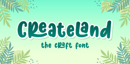
- Createland by Awan Senja,
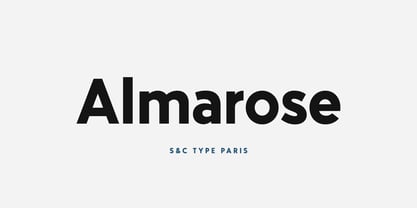
$14.00Createland is a bold display font, carefully handcrafted to become a true favorite. Its casual charm makes it appear wonderfully down-to-earth, readable and, ultimately, incredibly versatile. Createland will look outstanding in any context, whether it�s being used on busy backgrounds or as a standalone headline! - Almarose by S&C Type,
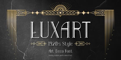
$22.00 - Luxart by Fontiko,
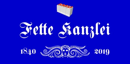
$14.00Luxart is a modern Serif Decorative font inspired by the 1920's, Art Deco and Gatsby styles. This font looks luxury, stylish, elegant and neat. This font is great for logo branding & invitations, photography, quotes, wedding design, business cards, posters, watermark, holiday cards, special events and much more. - Fette Kanzlei by RMU,
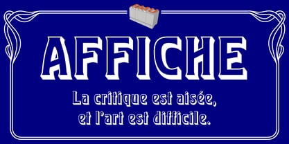
$30.00 - Affiche by RMU,
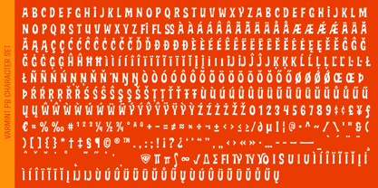
$35.00Based on the fin-de-siècle Helios Reklameschrift of the Klinkhardt foundry, Leipzig, Affiche preserves the beautiful art nouveau character of its hot-metal forerunner and was carefully extended to make it multilingual. For more historical authenticity, you can use the long s by typing [alt] and [b]. - Varmint PB by Pink Broccoli,
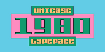
$14.00 - SK 1980 Unicase by Salih Kizilkaya,
$2.50 - Mares by Alex Camacho Studio,
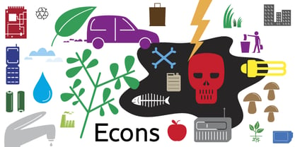
$24.00 - Econs by Tour De Force,
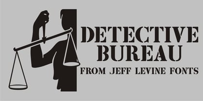
$20.00 - Detective Bureau JNL by Jeff Levine,
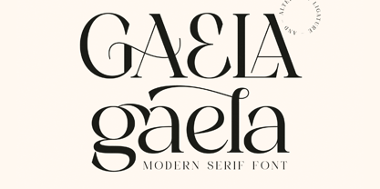
$29.00Traditional stencil type faces have always projected images of strength, power, police, military or industry. The hand-lettered title card for 1951's "Detective Story" (directed by William Wyler) is a perfect example of this. A bold Roman letter style, it was the perfect inspiration for Detective Bureau JNL. - Gaela by Letterena Studios,
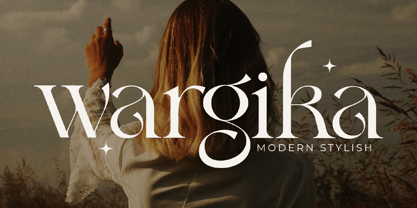
$17.00 - Wargika by Letterena Studios,
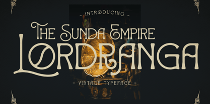
$17.00 - Lordranga by Letterena Studios,
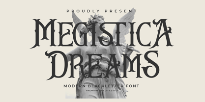
$10.00 - Megistica Dreams by Letterena Studios,
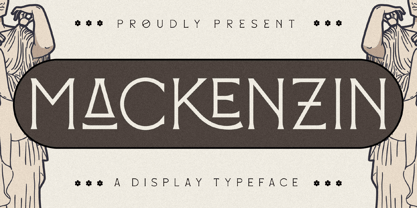
$9.00 - Mackenzin by Letterena Studios,
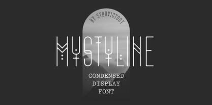
$17.00 - Mystyline Decorative by Struvictory.art,
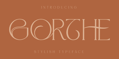
$14.00 - Gorthe by Letterena Studios,
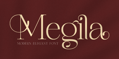
$17.00 - Megila by Letterena Studios,
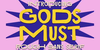
$17.00 - Gods Must by Letterena Studios,
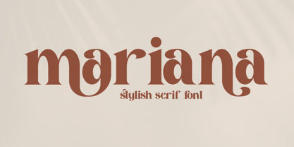
$17.00 - Mariana by Letterena Studios,
$9.00 - Lawbreaker JNL by Jeff Levine,
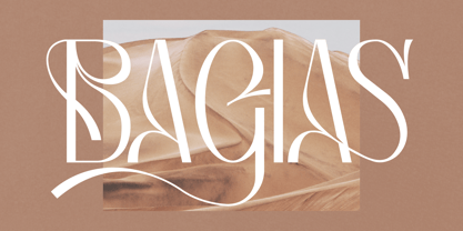
$29.00 - Bagias by Letterena Studios,
$9.00 - Occidental Tourist JNL by Jeff Levine,
$29.00Occidental Tourist JNL is based on a set of die-cut cardboard letters used by teachers. They were primarily found on classroom bulletin boards or felt boards. The font's name is a pun on the movie The Accidental Tourist. - Longhorn by Belldorado,
$20.00I saw a cool UT-Ligature on an old (maybe 70's or 80's) Texas Longhorns fan-shirt - it was in 3D and I wanted something like that with my own initials A and B to print it on a baseball hat. I started drawing it and when I was finished, I thought it might be nice to do the same for my officemates. I needed another G, T and K. After finishing that I thought it might be cool to do this for other people as well. Since the source of all the 3D glyphs is found in the regular ones which get moved by a 45 degree angle and then connected with lines , I first draw all the uppercase regular glyphs. The thing that followed was kind of an addiction: after finishing the uppercase letters, I wanted to add lowercase letters, after finishing the 3D letters, I thought it would be nice to have a fill version to layer with the 3D letters. Having a rough, woodcut version of the regular style would be cool, too. And the font is also pretty much suited to make a stencil version. When all this was done, I was interested on how the font would look like without the serifs and curves instead of the 45 degree angles, so I did the Longhorn Sans. Good to use for all sports-related designs, especially retro-style soccer/football shirts. Uppercase characters can be combined to form ligatures or logotypes. - Sepulcra - Personal use only
- Goudy Initialen - Personal use only
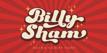
- Billy Sham by Putracetol,
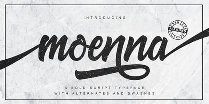
$15.00Introducing a new retro font called “Billy Sham“. Inspired from retro typography and lettering in the 70’s and 80’s combine with bold typography style. With a total of 534 glyphs with 359 alternate, you can make letter combinations for lettering with a lot of options. Come with open type feature ( a lot of alternates and end swash), its help you to make great lettering. Billy Sham best uses for Logotype, heading,cover, poster, logos, quotes, product packaging, header, merchandise, social media & greeting cards and many more. This font is also support multi language. To access the alternate glyphs, you need a program that supports OpenType features such as Adobe Illustrator CS, Adobe Photoshop CC, Adobe Indesign and Corel Draw. - Moenna by Cooldesignlab,
$15.00Moenna is a handwritten piece in bold style. This well-designed font is inspired by classic typographic designs from the 60's to 80's. Moenna is packed with lots of alternatives and swashes (see preview image), it will give you more options to customize your words with this OpenType feature. Moenna is best used for Logo Types, titles, covers, posters, logos, quotes, product packaging, headers, merchandise, social media & greeting cards, and more. This font also has multilingual support for standard latin characters. To access alternative glyphs, you'll need a program that supports OpenType features such as Adobe Illustrator CS, Adobe Photoshop CC, Adobe Indesign, and Corel Draw. If you have any questions, feel free to send me a message. Thank you!
