10,000 search results
(0.037 seconds)
- Elephant man - Unknown license

- Elephant man - Unknown license

- Elephant man - Unknown license

- Action Man - Personal use only

- Action Man - Unknown license

- Glutton man - Unknown license

- Elephant man - Unknown license

- Jungle Man by PleasureFonts,
$14.00 Looking for a typeface with a unique appearance? Jungle Man is the right choice for advertising, graphic design and webdesign to make a personal statement. And when it comes to readability, you are on a safe side by using Jungle Man. There are numerous occasions where a handwritten font makes a great impression.
 - Umbrella Man by Hanoded,
$15.00 Some time ago, I read an article about the Kennedy assassination. In that article, a person dubbed ‘the umbrella man’ played a rather bizarre role: apparently an innocent bystander with an opened umbrella was thought to be in cahoots with Kennedy’s killer. I immediately thought that the name ‘Umbrella Man’ was a good title for a horror movie, so when I created this rough brush font, I named it Umbrella Man.
 - Plastic Man by T-26,
$39.00 - Coffee Man by Vozzy,
$10.00 Infuse a vintage elegance into your projects with the "Coffee Man" font. This unique typeface carries the ambiance of old cafes and coffee shops, adding a special charm and character to your work. Inspired by mid-20th-century design, "Coffee Man" exudes an antique charm and sophistication, perfect for giving your projects a nostalgic touch. The font supports multiple languages, ensuring its suitability for projects with a global audience.
 - Rocket Man by Comicraft,
$19.00 Don your Flying Suit and tighten up your Atomic Powered Jet Pack buckle! Pencil in your pencil-thin moustache and stick your head into that Rocketeering Helmet! It's Zero Hour, 9am, 1949! Five Days a Week, you ARE the King of the Rocket Men, ready to Burn out your Fuse on a Timeless Flight into Outer Space Alone! Mission Control has advised our Space Race Typeface that Mars is not the kind of place to raise your kids and, furthermore, it's gonna be a long, long time until touchdown brings you round again to find you're not the man they think you are at home. You are in fact a ROCKET MAN; not a postman or a milkman, you're a modern man, a higher-than-a kite flying masked hero on your first manned flight to Infinity and Beyond!
 - Dead Mans by Comicraft,
$19.00 Shiver me Timbers and Splice me Mainbrace! There's strange goings on in Smugglers' Cove... A gathering of thieves, brigands, piratefolk and back-stabbing blackguards the likes of which have not been seen since the days of Redbeard! Someone'll be swinging from the yardarm or walking the plank if the map identifying the location of the fonts created for Grim Todd McFarlane's SPAWN: THE DARK AGES doesn't turn up soon!
 - Man Ray by Andinistas,
$29.00 ManRay is a photogenic typefamily of 6 fonts designed by @andinistas, with more than 2600 glyphs distributed in 3 Scripts and 3 Caps. Its shapes are ideal for attention-grabbing and for its eloquent character set, each style is presented with three levels of erosion planned with meticulous dotted texture bézier drawing, diagonal texture, and vertical texture pattern. ManRay Script, Script2, Script3 is based on calligraphy made with a fine tip brush and therefore communicates pleasant and attractive ideas. Its capital letters measure three times the height of the lower case and stand out for its artistic curved lines ideal for writing on photos, logos, labels, packaging, posters, covers of food products, spirits, organic teas, etc. In that order, it also offers other expressive alternate letters that activate spontaneously, and each of the three styles is case-infinite with and without Swash, Stylistic, and Titling Alternates. ManRay Caps, Caps2, Caps3 are inspired by calligraphic Roman letters drawn with a brush with a square tip and are equipped with descending flourishes for word start and end. The core of ManRay mixes the ideas of Ed Benguiat and Ross F. George and its name is a tribute to the Dada hero who changed history a century ago by working against the conventions of art and photography.
 - Shay Man by Fonts of Chaos,
$10.00 Shay Man is a font design for poster and title tag line. The font is only uppercase in two weights. Shay man is a typicaly straight angular font taking inspiration from the old post brutal design. Use it for making awesome artworks. Enjoy.
 - Charm Man by Putracetol,
$18.00 Charm Man - Retro Serif Font. Charm Man is a bold retro style serif font with strong character and soft features. Charm Man is a stylish font that is both bold and retro font. Charm Man is equipped with Swash, Stylistic and Titling alternates as well as with Standard and Discretionary Ligatures. Charm Man's thick curves give a 70s groovy vibe with the serif bringing it slightly back to traditional. Comes with alternatives and ligatures, helps to create stunning logos, quotes, posts, blog posts. branding projects, magazine imagery, wedding invitations, and much more. The alternative characters were divided into several Open Type features such as Swash, Stylistic Sets, Stylistic Alternates, Contextual Alternates, and Ligature. The Open Type features can be accessed by using Open Type savvy programs such as Adobe Illustrator, Adobe InDesign, Adobe Photoshop Corel Draw X version, And Microsoft Word. This font is also support multi language.
 - Mana Mana - Unknown license

- Regulators Outline - Unknown license

- Regulators Italic - Unknown license

- Regulators Condensed - Personal use only

- Militta Reguler by Four Lines Std,
$12.00 Personalize your designs and make them stand out from the crowd with our collection of handwritten fonts! From quirky to elegant, we’ve got something for everyone!
 - Regulation Signature by Shape Studio,
$9.00 Regulation Signature is a new modern script Handwritten font with an irregular baseline. Trendy and feminine style.Regulation Signature Script looks lovely on wedding invitations, thank you cards, quotes, greeting cards, logos, business cards and more. Perfect for using in ink or watercolour. Including initial and terminal letters, alternates, ligatures and multiple language support. To enable the OpenType Stylistic alternates, you need a program that supports OpenType features such as Adobe Illustrator CS, Adobe Indesign & CorelDraw X6-X7, Microsoft Word 2010 or later versions. There are additional ways to access alternates/swashes, using Character Map (Windows), Nexus Font (Windows), Font Book (Mac) or a software program such as PopChar (for Windows and Mac).Thanks so much for looking and please let me know if you have any questions
 - Regulator Nova by Device,
$39.00 A high lower-case x-height geometric sans with open counters, Regulator Nova is extremely legible at text sizes and in extended settings while the range of weights also make it suitable for headlines. The stoke terminals are all cut at close to 90 degrees, lending a sharp precision to the characters. Alternate versions of the g, j, r, w, K, R, W, # and ampersand are available in both upright and italic, and can be toggled on and off in the Opentype panel or the Glyphs palette. Clean, elegant and legible, Regulator Nova has a classical proportions based on a circumscribed circle and square, and shares structural similarities to early sans serifs such as Rudolf Koch’s Kabel, while adopting more British forms for the M and R. Regulator Nova is an extension and reworking of Regulator, now with extra weights, reweighed italics, Opentype-savvy alternates and a full European character set.
 - Geometron Pro Angular by Marius Mitran,
$39.00 Geometron has its origin in a custom typeface that I was commissioned to design for an architectural project. The concept was a "back to basics", minimalist typeface constructed mainly with straight lines and circles or circular arcs, but without departing from the classical style of Roman & Greek lettering. Notable requirements were: an extensive character set needed for multi-language documentation, as well as a full collection of symbols and alternate glyph forms (e.g. superiors & inferiors) for scientific use. Special care was taken to obviate the almost identical similarities that were prone to appear between letters like uppercase "i" and lowercase "L" or between Latin and Greek letters such as "a" and "alpha". This was also a prerequisite for scientific notation where ambiguity is not acceptable. All in all, the font would have to blend a modern design with a wealth of functional features. Consequently, all of these were made possible by choosing the OpenType format for development, resulting in a comprehensive and feature-rich font family specifically targeted for use in high-end design/typesetting applications.
 - Maus - Personal use only

- manu - Unknown license

- Max - Unknown license

- kan - Unknown license

- Ian - Unknown license

- Mak by Tkachenko design,
$21.00 Mak is a display font with a Ukrainian feeling inspired by Ukrainian music. This is a big update of the first free two styles of Mak (SemiBold High & Black High) that were created in 2019 and become widespread among free display fonts. The big update wasn't been only adding more weights and contrasts but also changing a lot of glyphs and adding new ones. Now Mak supports all Latin-based languages and European Cyrillic. Experiments with historical forms, contrasts, and daring shapes to create a new image of Ukrainian Cyrillic and Latin based on it.
 - RAN by URW Type Foundry,
$35.99 RAN Reformed Typeface for Beginners by Georg Salden - a headstrong and courageous approach to an improved handling of handwriting. Diverse and sometimes irreconcilable theories exist about how beginners are supposed to learn writing and reading. This has led to fierce discussions among experts already. We don’t want to pour more oil on the fire, but hope to create a new awareness for this topic, which is important to everyone of us. For beginners the combination of single characters (sounds) to whole words is essential during the acquirement of reading and writing. In this process they develop the skill to recall entire terms from memory. Therefore, after current practice, every word shall be written in a single stroke without lifting the pen in between. Georg Salden contradicts this postulate and warns, that coercively holding the pen down within a word can easily lead to exaggerated loop formations and a general meandering of the written text. The intellectual process in connecting single sounds to words while writing would happen anyway and the prohibition to lift the pen would often lead to tensions. To still support the necessary connections in general and to simplify the connecting, he teaches to write all round letters like a, e, g, o with inclusion of the connecting stroke, so that the spacing and combining with the next character arise by themselves. By settling the stroke at certain points and with a clear and logical writing method, a conscious and careful contact with the various strokes arises. All this automatically leads, together with a certain deceleration, to an increase of beauty and readability in the handwriting. The repeatedly discussed topic »connected or unconnected« appears to be solved in the most comfortable way as, depending on the particular character combination, both solutions are possible.
 - Maus by Sentinel Type,
$10.00A heavy duty block-shadow font derived from Sentinel Sten Type, Maus' inflexible, near-featureless block-like shapes give the impression of great mass and solidity. Maus is an example of minimalism in type design, using a minimum of sculpting to elicit the essence of familiar Latin forms. Two sets of complimentary letters allow designers to pick and choose combinations for letter fit, for their symmetric values, or to create a particular look or feel to suit the subject. Obviously Maus has great potential for signage, posters and billboards, and screen-printed garments. - Mang by MADType,
$21.00 Mang is an 11 point (or 22 pt or 44 pt etc.) bitmap font that was originally designed for a poetry piece in Born Magazine. It is slightly quirky but works well as a text face. You can use it for screen resolution or print designs as it includes outlines.
 - Jan by Linotype,
$29.99Jan Regular combines an experimental, bold, mono-weight geometric sans serif with the Arabic writing system's means of joining letters. Adding in script-like letter connections, a feature that is found in both western cursive and Arabic type, as well as distinctly Arabic-like accents above and below certain letters, Michael Parsons has created a cross cultural typographic statement. Jan Regular is best used for headlines, and small strings of text, in sizes large enough to view and appreciate the unique counter forms within the letters. This font is one of 10 creations from the young Swiss designer Michael Parson included in the Take Type 5 collection, from Linotype GmbH." - Marne by Eurotypo,
$30.00 “Marne” is a new font inspired by letter designs from the 80's but updated. Standing out for its condensation, its angular touch, its slight slant and its thick and thin lines, “Marne” is the perfect mix of elegance and informality. Open Type features include a full complement of international characters, alternatives and ligatures. With all this, the text will look alive and dynamic, without the monotony of repeated letterforms. “Marne” can be the choice to create titles, logos and posters for branding and packaging, invitations, greeting cards, magazine and book covers, children's material, fashion, and wherever you want!
 - Manus by JOEBOB graphics,
$33.00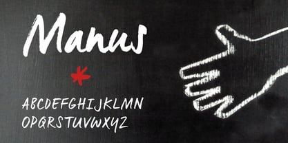
- Mayes by Sabrcreative,
$15.00 Mayes is a soft, geometric sans serif font family. It consists of 6 weights ranging from Thin to Black, combining elements of Bauhaus and modern styles with its distinctive softness. Its design is minimalist, elegant, and warm, offering a unique yet versatile and easily readable impression. Mayes was created with the purpose of providing text displays that are easy to read, strong, and make a standout impression. It is compatible with both text and display purposes, making it perfect for headers, titles, posters, websites, branding, apps, and various other creative designs or projects. Mayes features several OpenType functionalities, including standard ligatures and number variations such as old-style figures, fractions, numerators, and denominators. It also offers extensive support for the Latin language. With Mayes, you can effortlessly create text displays that stand out with a touch of specialty. Its soft yet strong design makes it an ideal choice for creating remarkable and captivating designs.
 - Manye by Craft Supply Co,
$20.00 Introducing Manye – Blackletter Font A Unique Display Typeface Manye stands out as a captivating Blackletter Font, adding a touch of distinctiveness to your display and design requirements. Distinctive Elegance Manye’s design exudes a distinctive elegance, making it the perfect choice for attention-grabbing displays. Versatile for Creative Projects Beyond its elegant design, Manye’s versatility shines, allowing it to seamlessly complement a wide range of creative endeavors. Captivating and Memorable Manye ensures that your content is not only captivating but also memorable, leaving a lasting and distinctive impression. In Conclusion To sum it up, Manye – Blackletter Font is the ideal choice for display and unique design needs in the world of typography. Its distinctive elegance and versatility make it a great fit for a variety of creative projects. Manye captivates your audience, leaving them with a memorable and distinctive experience, ensuring accessibility to a broad readership.
 - Manas by Fontuma,
$20.00 Manas is the name of the epic of the Kyrgyz Turks. The font family is also designed with serifs to reflect the characteristics of the epic from which it is named. This typeface, which is a serif, consists of three families: ▪ Manas: Font family containing Latin letters ▪ Manas Pro: Font family including Latin, Arabic and Hebrew alphabets ▪ Manas World: A family of typefaces including Latin, Cyrillic, Greek, Arabic and Hebrew alphabets
 - Maine by Fenotype,
$25.00 Maine is a modernized book antiqua consisting of six styles and matching italics. Maine's cuts are from Light to Extrabold, of which Regular and Slightly Bolder Book are especially suitable for longer texts. Thanks to its clear features and high x-height, Maine creates a beautiful and legible body text. Maine gives a professional, no-nonsense impression and it’s best used in editorial, books, magazines and everywhere where you can use many different styles and sizes of the same typeface. Go dignified with Maine.


