10,000 search results
(0.035 seconds)
- Librum Sans by Hackberry Font Foundry,
$24.95 This is the companion sans family to make the Librum serif families work as well as they do. By companion, I do mean stylistically compatible. But mainly, they have the same vertical metrics. So they work very well for run-in heads, inline character styles, and all the rest of the needs in large books with complex formatting. They are designed for use in InDesign, and they work very well in that environment. The fonts use the same OpenType feature files as the rest of the Librum families. The feature files for the italic and bold are more limited—as I have rarely used things like that [over the past 20+ years]. The character shapes are a bit whimsical. The original ancestor of this book design sans was a very playful font I released as Aerle. It’s been calmed down a lot but is still loose and friendly. For a great deal, see Librum Book Design Group , for a package containing all fifteen fonts!
 - Alfrere Sans by Greater Albion Typefounders,
$12.50 Alfrere Sans is a clean Sans Serif display family inspired by a well-known 1950s television caption. The family of seven faces have been designed for independent use, but they also have an extra feature. All faces have identical metrics and can be overlaid with each other, to yield an unending range of multi-colored lettering effects. Bring a touch of the 50's to your next poster design. Better yet, explore the world of multi-colored overlaid typefaces....
 - Vivala Sans by Johannes Hoffmann,
$15.00 The character of Vivala Sans Round is modern and stylish with elegant squarish shapes. The family includes five weights. A large x-height is ideal for titles and body text. The extended character set supports languages like Western, Central European, and Eastern European.
 - Gabara Sans by Arodora Type,
$50.00 Gabara is a modern, fun and dynamic sans serif family. Thanks to its flexible appearance, it is suitable for paragraphs and headings of any length. Also includes Gabara, multilingual support, ligatures, and more. In this way, you can handle many of your needs with a single font family.
 - Katoria Sans by Dora Typefoundry,
$15.00 Introducing Katoria is a luxury font duo with elegant combinations. You can use it as an addition or main. In this font, all letters are Uppercase, you will find various ligatures and alternatives that will help you create a unique design for your project, try changing the ligatures and alternatives and you will see how many options you can choose which are perfect for logos, magazines, social media, and more. This font is easy to use and has OpenType features. This type of family has become the work of true love, making it as easy and fun as possible. I really hope you enjoy it!
 - Column Sans by Campotype,
$25.00 Column Sans, talking about space efficiency. The character set that condensed can maximize the use of limited space without losing good legibility aspects. The typeface is very appropriate to be used as a text in a small column widths, display text, caption, title, author credit on the film, etc. Column Sans is available in OpenType format in the three weights Light, Regular, and Bold, whereby there are corresponding italics for all variants. In the same narrow italic versions, the "a" has a closed form while the "f" has a descender. Besides of standard ligature, this typeface is also equipped with some additional ligature and deligature like "fr", "tt", "cb", "ch", "ck" and so on as well as three "stylistic ligature": "the", "Mr" and "Mrs". Please find more information about the OpenType Manual of this typeface on the gallery page (pdf) if possible.
 - Redeye Sans by Aboutype,
$24.99 - Stano Sans by Letterhend,
$17.00 Stano is a strong and bold sans serif with a touch of vintage look and feel. This type of font perfectly made to be applied especially in logo, headline, signage and the other various formal forms such as invitations, labels, logos, magazines, books, greeting / wedding cards, packaging, fashion, make up, stationery, novels, labels or any type of advertising purpose. Features : uppercase & lowercase numbers and punctuation multilingual alternates / swashes and ligatures PUA encoded We highly recommend using a program that supports OpenType features and Glyphs panels like many of Adobe apps and Corel Draw, so you can see and access all Glyph variations. How to access opentype feature : letterhend.com/tutorials/using-opentype-feature-in-any-software/
 - Ainslie Sans by insigne,
$- Say g'day to Ainslie Sans, insigne Design’s new typeface. Like its big brother, the new face incorporates a mix of influences from Oz, although Sans is pared down from the original semi-serif. The original Ainslie was inspired by Mt. Ainslie and the city of Canberra’s inner suburb of the same name. Canberra is Australia’s capital--a planned city designed by American architect Walter Burley Griffin. Griffin’s style and geometric design for the city, which include Mt. Ainslie, are now also the same structure that make up the foundation of Ainslie Sans. Unlike the original Ainslie family member, though, Ainslie Sans does away with much of the aboriginal-inspired touches by eliminating the semi-serifs, forcing the font to borrow more heavily than its predecessor from Canberra’s distinct, geometric design and style. The result’s a spiffy Australian font that’s usable within a wide array of applications. The trendy typeface incorporates a multitude of alternates. You can access these in any OpenType-enabled application. Alternates, swashes and alternate titling caps allow you to customize the look and feel. Also incorporated are capital swash alternates, old style figures, and compact caps. Check out the PDF brochure to view these options in action. OpenType enabled applications can take complete benefit of your automatic replacing ligatures and alternates. This font also presents the glyphs to help a wide array of languages. Try it for copy. Try it for a headline. Try it alongside the original Ainslie. Whichever way suits you best, give it a burl. You won't be sad you did.
 - Cira Sans by Huerta Tipográfica,
$45.00 Cira is a superfamily with 7 weights and italics under two main styles: sans and serif. The original concept was created for Katachi Media as a corporate font for text and experimentation in an iPad magazine. It has a diversity of outlines with straight angles which create unusual shapes and counterforms. Its middle weights are suitable for text and can be combined with extreme weights at display sizes. Cira is a versatile superfamily with an original and modern feeling and it’s a great option for giving identity to your designs.
 - Nimbus Sans by URW Type Foundry,
$35.00 The first versions of Nimbus Sans have been designed and digitized in the 1980s for the URW SIGNUS sign-making system. Highest precision of all characters (1/100 mm accuracy) as well as spacing and kerning were required because the fonts should be cut in any size in vinyl or other material used for sign-making. During this period three size ranges were created for text (T), the display (D) and poster (P) for small, medium and very large font sizes. In addition, we produced a so-called L-version that was compatible to Adobe’s PostScript version of Helvetica. Nimbus was also the product name of a URW-proprietary renderer for high quality and fast rasterization of outline fonts, a software provided to the developers of PostScript clone RIPs (Hyphen, Harlequin, etc.) back then. Also in the 80s, a new, improved version of the Nimbus Sans, namely Nimbus Sans Novus was designed. Nimbus Sans Novus was conceptually developed entirely with URW’s IKARUS system, i.e. all styles harmonize perfectly with each other in terms of line width, weight, proportions, etc. On top of that, Nimbus Sans Novus contains more styles than Nimbus Sans. Now, Nimbus Sans is also available as Round (like the popular URW fonts Futura Round and Eurostile Round). The Round versions are intended to facilitate the work of designers and typographers. The fonts can be used directly, without further preparatory work in graphic programs as finished, high-quality Rounds.
 - Mike Sans by Factory738,
$10.00 Mike Sans is a modern sans serif with a square style. It comes in 8 weights, clean and modern glyphs, thereby creating more variability. Designed with powerful opentype features in mind. Each weight includes extended language support, currency, and more. Perfectly suited for graphic design and any display use. It could easily work for web, signage, corporate as well as for editorial design. Thanks for looking, and I hope you enjoy it.
 - Gilman Sans by Miller Type Foundry,
$29.00 Gilman Sans is the family member of Gilman, the serif that it was derived from. The idea for Gilman started simple enough, a serif typeface that works well for large amounts of text. However, after many struggles creating a quality typeface digitally, I decided to first draw the complete alphabet by hand on paper, and then trace that digitally. The result is a unique workhorse typeface with a subtle “human touch” that is very rare in this modern technological age. Gilman Sans has extensive language support and comes with many opentype features like true small caps, tabular lining figures, stylistic alternates, ligatures and more. Gilman Sans and Gilman are excellent compliments and work together harmoniously on the page.
 - Arundel Sans by Rocket 88 Foundry,
$35.00 The design of Arundel Sans was inspired by Arundel Castle in West Sussex, England. It has a strong vertical emphasis, with a solid, geometric feel. It is a quirky mix of medieval and modern. Arundel Sans is ideal for use as a distinctive headline or display font.
 - Applied Sans by Monotype,
$57.99 The Applied Sans™ family is a reinterpretation of the first sans serif typefaces used in what was then called, “jobbing or trade” work – typefaces like Venus and Ideal Grotesk. While built on the foundation of these late 19th and early 20th century designs, Applied Sans adds to it all the required features for modern typographic communication. The design benefits from a large x-height, open counters, generous apertures and a subtle modulation in stroke weight. These ensure character legibility and make for a design that is inviting and easy to read. Applied Sans family’s wide range, precise gradation of weights and extensive language support guarantees the design’s effectiveness in a wide and varied range of uses.
 - Keedy Sans by Emigre,
$39.00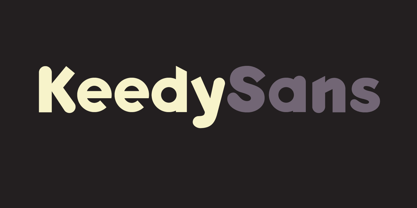
- Giane Sans by XdCreative,
$25.00 Description Giane sans. is contemporary and stylish sans serif with large x-height, low/minimal stroke contrast and large chunky sans with closed apertures. Giane san is matching pair with Giane Serif (https://www.myfonts.com/fonts/xdcreative/giane/) Giane sans Perfectly suited for graphic design and any display use ( for the logos, t-shirts, the web as well as for print, and also great for headings), Thank You _xd
 - Smart Sans by Monotype,
$29.99 Smart Sans is a personal tribute to Leslie (Sam) Smart, the first type director to be hired by a major typesetting house in Canada. Smart was a twentieth century design pioneer who raised the standards of Canadian typography. Together with three of his peers, he established the first Type Directors Club in Toronto. After Smart's death in 1998, type designer Rod McDonald decided that something should be done to commemorate Smart's life and achievements. I had first thought of establishing a scholarship in Sam's name, but a typeface design soon replaced this idea," says McDonald. "Once I decided to design a typeface, however, it became a foregone conclusion that it would be a sans serif - for no other reason than that I loved the name Smart Sans." Two typefaces served as inspiration for McDonald's work. "Like thousands of designers, I'm keen on Matthew Carter's Helvetica Compressed series. And, when I was younger, I also loved Fred Lambert's Compacta," says McDonald. "I thought there might be a place for a small range that could take over from these 'old workhorses' and, in the process, bring a fresher look to the genre." McDonald drew three weights for the Smart Sans family, all ideally suited for setting attention-getting headlines and powerful display copy. The two-storied 'g' contributes to the design's lively personality, and the short 'r' helps maintain tight, even spacing. Smart Sans is the perfect homage to a great typographer, because it raises the bar on what to expect from condensed sans serif typefaces. Sam Smart would be pleased."
 - Altum Sans by Erik Seitz,
$9.99 Altum Sans is a new clean and contemporary typeface. The geometric and condensed letterforms are designed for use in larger texts and display applications. With over 500 glyphs Altum Sans supports many languages as well as two different figure styles, interpolation breakpoints, subscript, superscript, contextual alternatives, ordinal indicators, fractions,...
 - Nonantza Sans by Ixipcalli,
$26.00 Nonantza Sans is a sans serif style. It comes in four weights and features an extended character set with open type support for European languages. Use Nonantza Sans for your graphic design projects, advertising, banners and signs.
 - San Marco by Linotype,
$29.99San Marco is a part of the 1990 program Type before Gutenberg, which included the work of twelve contemporary font designers and represented styles from across the ages. Linotype offers a package including all these fonts on its web page, www.fonts.de. San Marco was designed by Karlgeorg Hoefer and brings to mind the style of the Italian Gothic found on the cathedrals of Milan and Florence as well as on the facade of St. Mark’s Cathedral in Venice. Its highly stylized characters make San Marco a good choice for extravagant typography. - Vivo Sans by Björn Berglund Creative Studio,
$25.00 Vivo sans is heavily inspired by modern technology, the nordic climate & classic video games. Perfect use for game studios or tech brands that aspire to be modern and futuristic. The font is currently available in 2 weights, Light and Regular, and comes with over 200 glyphs.
 - Private Sans by ParaType,
$30.00 Private Sans is a three styles family of humanistic sans serif based on broad pen calligraphy. Its noticeable distinctions -- a vivid irregular nature which is not typical for usual Cyrillic text faces. Characters of the font have visible “inthasis”, soft terminals and slanted axis in internal ovals. The name of the font reflects an intention to design a typeface for personal messages. It can be used in blogs, e-mails, personal Web pages -- the places where author wants to show his personal attitude and invite visitors to enter his intimate space. It also usable for memoirs, autobiographies, interviews, and for those kind of literature that deals with feelings and emotional experience. The font family was designed by Olga Karpushina on the base of her graduate work of Type and Typography course in British Higher School of Art and Design. Released by ParaType in 2010.
 - Univerza Sans by Type Salon,
$44.90 Univerza Sans was developed to mark the hundredth anniversery of University of Ljubljana. The style is influenced by the combination of Slovenian avantgarde with some recognizable forms that are known for Slovenian typography. Multifunctional use for identity system, formal communication, wayfinding, academic and scientific articles in order to share the institution’s spirit of knowledge, creativity, diversity and belonging. It speaks Central European languages, feels official but looks attractive and recognizable.
 - Monoron Sans by Fontron,
$30.00MonoronSans is the first family of fonts produced by Fontron. The weights are lighter than conventional fonts. - Astoria Sans by Alan Meeks,
$45.00 The Sans serif companion to Astoria. Based heavily on Gill especially in the mid weights and with a consistant series of condensed weights. Designed specifically as a text face it still works very well as a headline font. There are 6 weights with accompanying Italics.
 - Leto Sans by Glen Jan,
$20.00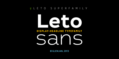
- Illiad Sans by Scannerlicker,
$44.00 Illiad Sans is an adventurous type family, brave and charismatic, built for editorial contexts. The proportions are reduced in order to supress the need of small caps, avoiding editing hassles.
 - Asimov Sans by Fonthead Design,
$12.00 - MC Maxes by Maulana Creative,
$16.00 Maxes is a modern Bold sans Display font. Bold stroke, fun character with a bit of ligatures and alternates. To give you an extra creative work. Maxes font support multilingual more than 100+ language. This font is good for logo design, Social media, Movie Titles, Books Titles, a short text even a long text letter and good for your secondary text font with script or serif. Make a stunning work with Maxes font. Cheers, Maulana Creative
 - Spanish Main by FontMesa,
$19.95 Spanish Main is a revival of an old MacKeller Smiths & Jordan font named Sloping Black. Like most foundries MacKeller Smiths & Jordan doesn't display all the letters of the fonts in their specimen books so it took a little more time to find the complete character set for this old beautiful classic font. New in this version is the addition of a Greek character set which is experimental as you normally don't see Old English style fonts include a Greek alphabet.
 - Mellow Sans by ParaType,
$30.00 Mellow Sans is a soft and friendly rounded sans serif. Its bold styles are great for packages of something tasty, while light and regular ones work well in rather long texts, from a children's book to a reading app, or a family restaurant menu. The typeface was created by Natalya Vasilyeva, an expert in designing text and calligraphic typefaces. Mellow Sans’s forms are based on humanist sans serifs. The nobility and liveliness of Renaissance calligraphy reads beneath its curves and makes the typeface even friendlier, while helping the eye to move along the line. The typeface supports extended Latin, extended Cyrillic (all major languages of the Russia’s peoples) and Greek. It also has old style figures, arrows and non-alphabetic signs. With Mellow Sans as a heading typeface (in that case bold styles fit the best), calm open sans serifs, f.e. Vast or Fact, are its optimal text companions on the screen. Calm serifs, f. e., Octava, Scientia or Aelita, will work as its companions on paper. And to create expressive typography, for example, in packaging, you can match Mellow Sans with quirky rounded serifs — Cooper or Epice.
 - Koya Sans by JAM Type Design,
$15.00 Koya Sans is a contemporary, humanist sans with a friendly yet clear and distinct personality. It is designed for excellent legibility, particularly for long continuous reading. The sharp terminals add liveliness and variety to the carefully crafted letterforms. Koya Sans, a highly versatile type family consisting 12 styles that are designed to work equally well on paper and on screen. The family ranges from Thin to Black variations, with complimenting italics. Inspired by a trip to the Buddhist temple of Kōyasan south of Osaka, Japan, this carefully crafted sans serif typeface with its sharp terminals loosely emulating the sharp corners of the temple’s pagoda roof.
 - Uncut Madness by Mirco Zett,
$15.00 Uncut Madness is a another horror genre font, inspired by vintage movie posters, books and vinyl covers. Including some bloody extras... ;) Made for logos, headlines, apparel design etc.
 - Barnet Sans by The Northern Block,
$29.95 Barnet Sans is a humanist typeface with a grotesque-inspired personality. Lively stroke-endings of several characters give this design its distinctive style, as well as a friendly and approachable presence. Created for use in both print and screen settings, Barnet Sans delivers a hint of flavour in large sizes, while being subdued enough to work in smaller text-driven settings. Details include; seven weights ranging from thin to black with matching italics, 665 characters per font, and support for all Western and Central European languages. Barnet Sans also comes equipped with many opentype features including; small caps, case-sensitive forms, arbitrary fractions, numerators and denominators, slashed zero, stylistic alternates and ligatures.
 - Krisis Sans by ABSTRKT,
$25.00This font was originally designed for one lettering job with only one simple purpose—to be as much condensed as a font can be. Then it was developed as a font family of 4 weights with regulars and italics. - Gans Ibarra by Intellecta Design,
$22.00 The Elzeviriano Ibarra or 'Ibarra Gans' was a typography engraved by Carl Winkow in 1931 to Fundición Gans commemorating 50 years since the foundation thereof. It is designed to be used in the book-homage The Maestro Joaquín Ibarra . This type is a combination of the printers selected by Joaquín Ibarra, Spanish printer and typographer and Ezelvir family types, hence its compound classification. Gans Ibarra, designed in 2006 by Paulo W follow the concepts from the original designs from Fundicion Gans. See also other font families inspired by Gans' original typefaces: Gans Tipo Adorno , Gans Lath Modern and Gans Titular Adornada and Gans Antigua .
 - Sadi Sans by Koray Özbey,
$19.00 Sadi Slab is designed to be used on small scales like book texts, newspapers, magazines etc. Also its large counters make the font suitable for digital screens. The anatomy of the typeface gives a formal appearance which is a more fitting choice for subjects like law, finance, medical science etc. Another member of Sadi family is Sadi Slab.
 - Fancy Dan by Solotype,
$19.95We had a dozen or so letters of this of this, picked up at the flea market in Vienna. The rest came from our imagination. - Calmius Sans by NREY,
$19.00 Calmius is a sans-serif font family that represents perfectly modern and vintage aesthetics. The font includes small caps letters, stylistic alternates, old-style figures and beautiful ligatures. This family is perfect for wedding elegant invitation cards, beauty and fashion package design, very suitable for books design, magazines typography, packaging, branding and more other creative project. It has support for many languages, including: Afrikaans, Basque, Belarusian, Bosnian, Catalan, Croatian, Czech, Danish, Dutch, English, Estonian, Faroese, Filipino, Finnish, French, Galician, German, Icelandic, Indonesian, Irish, Italian, Latvian, Lithuanian, Macedonian, Malay, Norwegian Bokmål, Portuguese, Romanian, Russian, Serbian, Slovak, Slovenian, Spanish, Swahili, Swedish, Turkish, Ukrainian, Zulu To enable the OpenType Stylistic alternates, you need a program that supports OpenType features such as Adobe Illustrator, Indesign, Photoshop & CorelDraw X6-X7. More information about how to access alternate glyphs, you can see it on this link (https://goo.gl/R1n7L8) Thank you and have a great day!