10,000 search results
(0.031 seconds)
- Giacinta by Okaycat,
$29.50Giacinta is developed as a fresh alternate take on the traditional black-letter style. Rather than simply reproducing the standard uncial or Old English style, Luke William Turvey followed the tradition of Bastarda, making up his own scripted style with the Latin standards in mind. This style was conjured purely from imagination, so while it bares a resemblance to the standards, keeps its own original flavor. Giacinta is extended, containing the full West European diacritics & a full set of ligatures, making it suitable for multilingual environments & publications. Use Giacinta for medieval themed projects, certificates, awards, diplomas, anything that you want to look old fashioned and stately. - Antapani by Monoco Type,
$15.00 Antapani is a grotesk sans style with some stylistic style to some letter. Designed for readability but can also function as a display text. Come with 9 style from Thin to Black so you can choose which style you want. Designed with opentype features in mind. Each weight includes extended language support (+ Cyrillic), fractions, tabular figures, arrows, ligatures and more. Perfectly suited for graphic design and any display use. It could easily work for web, signage, corporate as well as for editorial design. Designed by Abdurrahman Hanif, a young Jakartans Graphic Designer who fell in love into type design after his graduation. Published by Monoco Type
 - Kelasik Handmade by FadeLine Studio,
$15.00 Kelasik a new handmade script with a style natural, sweet and simple. Made with great care to provide the natural and modern elements. This font will look beautiful if used single even with other pairing fonts. The great thing about this font is you can find some style when you use it, examples such as natural handwriting style, unique, simple, elegant, and bold. With a style like this, this font will be suitable in use for logo's, branding projects, homeware designs, product packaging, mugs, quotes, posters, shopping bags, logo's, t-shirts, book covers, name card, invitation cards, greeting cards, and all your other lovely projects.
 - Letterhythm by Letterhythm Studio,
$30.00 Letterhythm is a modern, contemporary handcrafted blackletter typeface made with experienced by the hand of Dhiya Roslan. The style was influenced by Old School Blackletter Calligraphy Script culture, Fraktur style, and with an extra touch of urban street attitude of Calligraffiti (Calligraphy+Graffiti). The letterform took years of practices to finally made it into digital format. Letterhythm is a very flexible font for almost anything from merchandise, logo, branding, artwork, title, sub-title, body text, tattoo arts, apparels to infinity and beyond. Letterhyhm is a timeless typeface that suits and fit perfectly in any timeframe or style you want. It comes with Multilingual Support for most Latin alphabet's languages derived with 3 unique font styles that made a total of 220 glyphs each style to complete the typeface including ligatures, alternates and all necessary symbols & punctuations.
 - Descent by Graffiti Fonts,
$69.99 The Descent family is a unique, graffiti style, layered type system consisting of a contextual style & a classic style, each with a base fill version & an outline version. Based on a signature category of wildstyles by Graffiti Fonts® lead designer Raseone, this family was designed to be rotated 90 degrees clockwise so that the text reads in a downward direction. OpenType scripting in the contextual version enables up to 12 unique variants of any word using alternating patterns of interlocking glyphs. The classic version does not include OpenType features but instead has initial glyphs as capitals and medial glyphs in the lowercase positions. The characters in the classic version are similar to the more advanced contextual version but noticeably different & a bit more irregular. Glyphs from both styles can be mixed & used interchangeably & both styles have corresponding outline fonts.
 - PODIUM Sharp by Borutta Group,
$29.00 PODIUM Sharp is Extended version of DUDU typeface designed in 2012. After many years I’ve decided to rebuild and develop this typeface by adding new masters and weights. Finally PODIUM Sharp consist of 234 styles: from ultra compressed hairline to extra expanded heavy. Main purpose of this project was idea to make hybrid between different modular and geometric woodtypes that I found in old polish specimens: Rex, Blok, Bacarat etc. Thanks to big range of different styles, PODIUM will be perfect choice for visual identities, posters and display usage. For better comfort of using PODIUM I’ve prepared new idea of styles naming based on Frutigres’s Universe and Climbing evaluation. First digit means width and the second weights of style. (So for example style 1.1 is ultra compressed hairline, 6.5 is something like regular and 9.13 is ultra expanded heavy.
 - Didonesque Stencil by Monotype,
$31.99 Less is More. This stencilled version takes away some of Didonesque’s structure while adding another level of distinguished style and supreme elegance. The Elegante fonts epitomise the style required for high-end fashion and beauty applications with their crisp curves combined with tapered serifs and terminals – instantly creating a polished and fashionable aesthetic. Didonesque Stencil was designed for large display purposes, branding, corporate identities, headlines, advertising, wedding invitations and the like. Of particular note are the minimal ball terminals which are available by activating Stylistic Set 2 – they’re perfect for adding that extra bit of magic to your typographic designs. Key Features: • 4 Stencil weights in Roman and Italic styles • 4 Stencil Elegante weights in Roman and Italic styles • 4 weights in Condensed style • Small Caps, Petite Caps, Alternates, Ligatures and Contextual Alternates • Full European character set (Latin only) • 780 glyphs per font.
 - The font named "SHARKBOY & lavagirl" crafted by SpideRaY is a captivating typeface that embodies the adventurous spirit and fantastical essence of the popular film "The Adventures of Sharkboy and Lav...
- Amour Script by Bosstypestudio,
$18.00 Amour is a calligraphy script font that comes with beautiful alternate characters. copper plate mix calligraphy with handlettering style. Designed to convey stylish elegance. Amour Script is attractive as a typeface that is smooth, clean, feminine, sensual, glamorous, simple and very easy to read. Classic style is very suitable to be applied to all types of formal items such as invitations, labels, menus, logos, fashion, make up, stationery, letterpress, romantic novels, magazines, books, greeting / wedding cards, packaging, labels, and others. . Amour Script features 1550+ glyphs and 1320 alternate characters. including multiple language support. It features OpenType with style alternatives, character binding and strokes, which allows you to mix and match letter pairs to match your designs, as well as a touch of ornament to make this font look elegant. • New Updated • Amour Script! Amour has now been updated to include 4 styles; bold/bold italic version, regular & italic version. This gives you the option to completely change your font style with the click of a mouse, whether you're looking for a smoother style, a bold version, or an italic finish.
 - Eggad by Ingrimayne Type,
$9.00 Eggad features letters on eggs. It can be a fun font to use at Easter or for any egg-related message. Some of the eggs - those on the upper-case keys - have their large end on the bottom and others - those on the lower-case keys - have their large end on the top. The font uses the contextual alternatives feature of OpenType to alternate the big-bottom and big-top eggs. If you only want eggs with big tops or with big bottoms, turn this feature off. Eggad comes in two styles, a regular style in which the eggs are outlined and a bold style in which the eggs are solid. Both are monospaced. The two styles can be layered to color the eggs. Alternatively, background color can be added (dot accent and ring characters) or the outline color can be changed (sterling and yen characters) using layers in the regular style. If you are typing numbers and you want the start to be big-bottom number, switch on OpenType style set 1.
 - Booer by Product Type,
$18.00 Introduce the Booer Font Express Your Creativity with a Powerful and Modern Gaming Style. Booer display is a font that reflects the power and style of the gaming world in a sharp, modern package. Booer is the perfect solution for a variety of projects that require a unique theme, whether it's a film, game, or streaming event. Her bold and exciting style provides room for creativity to flourish. What Makes Booer Special: Powerful Gaming Style, Booer Design exudes power, capturing the essence of the gaming world. Each letter is a statement of dominance and modernity. Two Style Families: The Booer font offers two different style families: Regular and Italic. This advantage allows you to adapt your designs to various contexts, whether requiring a strong presence or an elegant touch. Multilingual Support: Booer Font supports multiple languages, allowing you to connect with a global audience easily. Enhance your designs and make an impact with Booer Fonts. It's not just a font; it's a gateway to a bold, modern, and compelling visual world. Download Font Booer now and experience the thrill of creating unforgettable designs!
 - DT Augustina Slab by Deveze Type,
$29.00 DT Augustina Slab is an original Clarendon's style slab serif font family of 98 styles including 7 weights, 7 widths plus Italics. There is no such a big choice of Clarendons with a wide range of styles on a market. Super wide range family will satisfy almost any request. Ultra Lights and Light styles will add elegance and lightness to your headlines, especially with using Italic swashes. Regulars, Mediums and Semi Bold will make your text blocks readable and stylish. Combine with Italics and Small Caps for sub-headers and highlights to get an incredible result. And finally Bold and Extra Bold for massive and heavy text headers. Strong, stable and reliable. The whole family has been working well in almost any type of a project: Websites, Apps, E-Books, Books, Magazines, TV broadcasting, Packaging. The family has an Open Type Features like a Ligatures, Italic Swashes, Small Capitals, Case Sensitive Forms, Tabular Figures, Old Style Figures, Tabular Old Style Figures, Circled Figures, Black Circled Figures, Fractions, Superscripts, Subscripts, Stylistic Sets, Localisation forms for Moldavian / Romanian, Catalonian and Turkish.
 - Allioideae by URW Type Foundry,
$49.99 This fine lined display type face was named Allioideae because of the ascenders of the lower cases. They are rising upright with a single stroke and are ending - depending on the font style - into a spherical blossom. The name was chosen concerned to the plant allium, that forms an umbel at the top of a leafless stalk, when it is blooming. Allioideae is the name of a subfamily of monocot flowering plants in the family Amaryllidaceae. The name is derived from the generic name of the type genus, Allium. The wide and round capital letters are showing a nice contrast to the lower cases and giving the font a kind of female feeling. That provides a functional and lovely use in headlines for all beauty and cosmetics issues.The typeface appears in 4 different styles. a plain style – Allioideae, a stencil style - Allioideae Stencil, a (dotted) style for both - Allioideae Dot and Allioideae Stencil Dot. It supports multi language as it covers all the latin diacritics and a cyrillic character set. Lots of numbers as monospaced, lining figuers, old styles, sub- and superscript and many fractions in two different styles are giving a nice finish to that font. Also some matching ornaments are included.
 - PowerUp by Grype,
$19.00 The gaming world is loaded with so many cool logotypes that never see the full font light of day. The PowerUp family finds its origins of inspiration in the Super Mario Bros. logotype, and been expanded upon to create its two unique styles and extruded shadow typefaces. PowerUp celebrates the geometric sans serif stylings of the original logotype, both in its condensed and heavyweight forms, and gives them the full character set they deserve. It's fun and functional. Each font includes a full standard character set with expansive international support of latin based languages, and 2 weight/width styles and three shadow styles. This highly stylized family is ready to electrify design urges, both digital and beyond. Here's what's included with the PowerUp Family: 480 glyphs per style - including Capitals, Lowercase, Numerals, Punctuation and an extensive character set that covers multilingual support of latin based languages. 5 styles: Regular, Black, Shadow, Black Shadow One, & Black Shadow Two. Layered Black & Black Shadow Two can be scaled down to 62% to match inspiration logotype. Here's why the PowerUp Family is for you: You're in need of a dynamic geometric font with extruded shadow layerable fonts You're a huge Super Mario Brothers fan You're a gamer, obsessed with all gaming related things You are looking for a techno style font family with Condensed AND Uber Black styles You just like to collect quality fonts to add to your design arsenal
 - Chong Modern by Monotype,
$29.99In the tradition of Goudy Old Style and Goudy Modern, Chong Wah drew Chong Old Style™ and Chong Modern™ as visually different – but complementary – designs. According to Chong Wah, “The extended family of typefaces started as a concept rather than a preconceived design. The concept is different sans serif type styles with a common underlying structure and a clear lineage to traditional serif designs. While there are similarities between the designs, each typeface was drawn as a separate entity.” Chong Old Style has the flavor of traditional old style designs without slavishly replicating the earlier design traits. It has the heft and color of an old style design but lacks the serifs and inclined stroke axis customarily seen in these typefaces. The result is a versatile suite of typefaces that deliver a straightforward message in large or small sizes. Chong Modern is a sans serif interpretation of the classic modern, or neoclassical, designs of Bodoni and Didot. More than a Bodoni without serifs, Chong Modern also has an elegant, Art Deco demeanor. This is a design that walks the line between traditional and contemporary with grace and aplomb. Chong Wah drew his Old Style and Modern designs in Light, Regular and Bold weights, adding an Extra Bold to the Old Style. All designs benefit from harmonizing italic counterparts. Both branches of the Chong family are also available as OpenType Pro fonts, allowing graphic communicators to take advantage of OpenType’s diverse capabilities. These fonts, in addition to providing for the automatic insertion of old style figures, ligatures and small caps, also offer an extended character set supporting most Central European and many Eastern European languages - Fangs ALot by Ingrimayne Type,
$9.00 FangsALot is a bizarre typeface family that was designed to alternate two character sets. These sets are alternated automatically in applications that support the OpenType feature Contextual Alternatives (calt). The template used to design characters is a distorted triangle that resembles a curved tooth or a fang. This shape can be flipped horizontally, vertically, and both horizontally and vertically to give four orientations. Two of these orientations are used in the regular style and two in what is called the italic style. I thought the fang motif did not come through clearly in the regular and italic styles. Rather the impression they give is more like graffiti lettering. To emphasize the fang motif I added two more members to the family by filling fang outlines with unadorned sans-serif characters. Then to allow more color in lettering, I added two more styles with letters on black. I then had six styles based on triangles skewed left and right. Why not fill the family out with three more styles based on an isosceles triangle? The end result is a family of nine. All members of the family are monospaced and are hard to read. The three graffiti-like styles have some alternative letters that can be accessed with the OpenType feature Stylistic Sets. Also, for each style it is possible to use only one set of characters by adding a space after each letter and then adjusting the character spacing. The graffiti-like styles can be useful in situations where the hard-to-read property is not important but where a menacing and vicious touch is needed, such as topics of sharks, teeth, biting, and vampires.
 - Avantime by Supfonts,
$16.00 Charming 80's retro inspired typeface with wonderful versatility given it includes 30 fonts. This is a perfect for any project Inspired by magazine adverts from the 70's and 80's - this family fit right in with bringing retro back into the 21st century. Super-versatile - have a scroll through all the preview to see the very wide range of variety the Avantime back can manifest the possibilities are really quite endless :) Avantime Font Features: 30 fonts Full Set of standard alphabet and punctuation PUA Encoded - no special software needed to access extra characters Language support: All European languages Multilingual Characters
 - Hype vol 2 by Positype,
$20.00 Hype lives up to its name. An energetic attempt to blow past previous sans’ descriptive words of massive, large, extensive, super and others. Hype transcends the everyday marketing terms and rests solely atop them all with a jaw-dropping current offering of 432 fonts that spans 18 widths and 12 weights. Insert a long pause and mic drop here, because nothing compares. Hype Volume 2 includes 6 of the 18 subfamilies that comprise the full Hype Collection. Each of these subfamilies represent 1 of the 18 available widths and each width contains 12 weights and matching italics. Volume 2 contains 144 fonts. Families included in Volume 2: Hype 0200, Hype 0500, Hype 0800, Hype 1100, Hype 1400, and Hype 1700. If you would like to complete your collection be sure to view and purchase Hype vol 1 and Hype vol 3. Hype’s bombastic approach meant supplying everything it could within each typeface: including small caps, yes small caps, a full numeral set that includes inferiors and superiors, super- and subscripts, full fraction support, case-sensitive forms, stylistic alternate letterforms, and more while touting a full Western, Central and South Eastern European character support. Embracing a Univers-esque bravado and a willingness to push the envelope, Hype leaves even more room to grow. No corners were cut, no shortcuts taken with a focus on sensible, efficient letter construction and functional reliability that ignores any one classification and instead looks to form an amalgam of classic sans styles influenced by wood type, movie showcards, and urban industrial letterforms.
 - Akoodi by Product Type,
$17.00 Introducing Akoodi, the ultimate superhero font for all your design projects! This bold and stylish serif font features a superhero theme that’s perfect for creating eye-catching titles and headlines for movie posters and graphic design projects. With its strong, prominent serifs and unique character design, Akoodi is a versatile font that can be used for a wide range of projects, from branding and marketing materials to book covers and packaging designs. The font includes a full set of upper and lowercase letters, punctuation, and numerals, making it a complete solution for all your design needs. With its superhero theme and stylish serifs, Akoodi is a font that will make your projects stand out from the crowd. So why wait? Grab your copy of Akoodi today and start creating designs that are as bold and daring as a superhero! Furthermore, Akoodi is equipped with advanced features that make it easy to use and customize. The font comes with a full set of alternate characters, including a range of ligatures and swashes, which add an extra touch of style to your designs. Additionally, the font is fully compatible with a wide range of design software, making it simple to use no matter what your design process looks like. What’s Included : - File font - All glyphs Iso Latin 1 - Ligature, Alternate - We highly recommend using a program that supports OpenType features and Glyphs panels like many Adobe apps and Corel Draw, so you can see and access all Glyph variations. - PUA Encoded Characters – Fully accessible without additional design software. - Fonts include Multilingual support
 - Check Mate by Funk King,
$5.00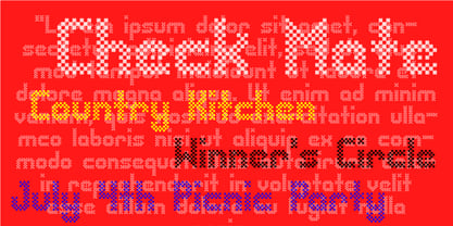 Check Mate is a modern, playful checkerboard-style font.
 - Altemus Pinwheels by Altemus Creative,
$11.00 Each style is a collection of 174 pinwheel designs.
 - KG This Is Not Goodbye by Kimberly Geswein,
$5.00 Neat, calligraphy-style handwriting using a chisel-tipped marker.
 - Procyon by Fatchair,
$6.95A dot-matrix style display font with a twist. - Gothic Handtooled Bastarda by Intellecta Design,
$18.95a grunge style font mixing carved design with blackletter - Evangeliaire Uncial by Intellecta Design,
$14.90an approach to the uncial medieval style of letters - KG Next To Me by Kimberly Geswein,
$5.00 Hand sketched lettering in a chalkboard, Pinterest inspired style.
 - Sukato by Thinkdust,
$10.00 A neue rave typeface; Pacman-style chunky, sharp, creative.
 - KG Second Chances by Kimberly Geswein,
$5.00 Hand sketched lettering in a chalkboard, Pinterest inspired style.
 - Biscuits And Gravy by Fenotype,
$19.95 Biscuits and Gravy is hand painted sign style font.
 - KG Alphabet Regurgitation by Kimberly Geswein,
$5.00 Fun, mixed, jumbled lettering in a variety of styles.
 - Love Angel by Gilar Studio,
$16.00 Love Angel is a beautiful and flowing handwritten font with love. It looks beautiful on a variety of designs requiring a personalised style, such as wedding invitations, thank you cards, weddings, greeting cards, logos and so on. This font is PUA encoded which means you can access all of the glyphs and swashes with ease! Love Angel a new fresh & modern script with a handmade calligraphy style, decorative characters and a dancing baseline! So beautiful on invitation like greeting cards, branding materials, business cards, quotes, posters, and more!! The alternative characters were divided into several Open Type features such as Swash, Stylistic Sets. The Open Type features can be accessed by using Open Type savvy programs such as Adobe Illustrator, Adobe InDesign, Adobe Photoshop Corel Draw X version, And Microsoft Word. And this Font has given PUA unicode (specially coded fonts). so that all the alternate characters can easily be accessed in full by a craftsman or designer. You can mix and match with Opentype feature: More than 306 of glyphs Alternates Titl Uppercase Stylistic sets from ss01 to ss03 Multilingual Language If you don't have a program that supports OpenType features such as Adobe Illustrator and CorelDraw X Versions, you can access all the alternate glyphs using Font Book (Mac) or Character Map (Windows). To Access Alternate Characters Click The Link Below: Adobe illustrator CS https://www.youtube.com/watch?v=geL0Ye02Ryk Adobe illustrator CC https://www.youtube.com/watch?v=V25yiUh8BcE Ms Word https://www.youtube.com/watch?v=HxkhZiCuwEw Coreldraw X7 https://www.youtube.com/watch?v=UBVsufJjons Adobe Photoshop CC https://www.youtube.com/watch?v=BYKXl58AdNY Indesign CS https://www.youtube.com/watch?v=HgZTCxKG14Q Check my other Font here : https://gilarstudio.com/
 - Cotton Club by Vincenzo Crisafulli,
$30.00 Cotton Club remembers the fonts of the thirties of the last century and the Bodoni, but it does not present graces: it is a sans serif. It has 360 glyphs and is composed of two regular and italic styles. Cotton Club is characterized by a high contrast between thick and thin strokes. The emphasized signs give the font an essential, sharp and elegant look. The Italic style of the Cotton Club refers to handwriting and this is noticeable in the ligatures obtained with kerning. The name of the font, “Cotton Club,” refers to the famous Jazz Club in New York, in Harlem, active in the twenties and thirties, during and after Prohibition. At that time the Bodoni, in its many derivations, was widely used not only in lead composition, but also in neon signs, plaques, posters, as well as in many other applications. Redesigning a new font that brings back to those years wants to be, therefore, a tribute and a reinterpretation of the graphics of that period as well as, it is understood, to the glorious Bodoni. Supported Languages Bulgaro, Bosnian, Catalan, Czech, Danish, German, English, Spanish, Estonian, Finnish, French, Irish, Croatian, Hungarian, Icelandic, Italian, Lithuanian, Latvian, Maltese, Dutch, Norwegian, Polish, Portuguese, Romanian, Slovak, Slovenian, Albanian, Serbian, Swedish, Turkish. Vincenzo Crisafulli font designer Vincenzo Crisafulli graduated from the Faculty of Architecture in Palermo and works as a graphic designer. He has been designing fonts since 1996 and has published with T26 (Type-Foundry, digital foundry in Chicago-California USA): Crisafulli, Chocolat, LST, Luminaria, and Stitching; with MyFonts: Rétrospectif, Bella Copy, Jasmin and Noahs Ark.
 - Sleepy Bear by Missy Meyer,
$12.00 I've been learning to read Cyrillic and Greek letters lately, mainly because I've been playing the game GeoGuessr. (If you haven't played it, I highly recommend! It plops you down somewhere in the world in Google Street View, and you have to figure out where you are.) Cyrillic shows up in so many more places than Russia! You can see it in Bulgaria, Mongolia, Serbia, Montenegro, Kyrgyzstan, and more. Because of that, I made sure to include a fun double-uppercase version of those alphabet sets in Sleepy Bear. They're styled the same way as the Latin characters: all uppercase height, with some lowercase-styled letters thrown in at that same height for a fun look for all ages. I've also made two weights of Sleepy Bear: a plump and smooth regular weight, and a lighter weight that's built to stack on top of the regular (though you can use it on its own). Just type out a word in Sleepy Bear, copy it, and then change the copy to Sleepy Bear Light. You'll get a great outline look in seconds! All characters are extensively cleaned up, with smooth curves and rounded ends. Sleepy Bear is great for all print projects, and also cuts out of all materials like a dream. It's a cute and quirky monoline font family that's great for all of your family's designs. Each font contains over 850 glyphs, and includes: - Latin and extended Latin characters to support over 100 languages; - Cyrillic and Greek double-uppercase alphabet sets; - 18 fractions; - Punctuation galore; - 38 double-letter ligatures for variety (including international pairs like KK and II); - And a half-dozen alternates for even more variety!
 - Aesthetikos - Personal use only

- Argillites - Personal use only

- Red Circle - Unknown license

- Taper - Unknown license

- pills are good - Unknown license

- Capital by Aboutype,
$24.99A pen stroke Roman with a medium thick to thin contrast and slightly flared stroke endings. Capital was designed for all media and works best at 30 point and above. Capital requires subjective display kerning and compensation. - Givry by TypeTogether,
$49.00 The bâtarde flamande is a style of writing used predominantly in France and present-day Belgium in the 15th century. The style shares an ancestry with other writing styles traditionally grouped as blackletter— fraktur, textura, rotunda, and schwabacher. It had evolved, however, into an æsthetic far removed from its relatives. While high-contrast in nature, the bâtarde flamande is more delicate and dynamic than the austere and condensed fraktur and textura. Quick curves lack the rigidity of the schwabacher and rotunda. Flair through swashes is thematic, as are the variations in letterforms. The flowing rhythm, achieved through a letterform axis that is overall slightly rightward, is most noticable in the hallmark f and long s. Round forms are fused together for economy of space. It is a writing hand that, with its syncopation and fluidity, produces a vibrance uncharacteristic of other blackletters. Givry has been created in the spirit of the bâtarde flamande. It melds the particular traits compiled from the works of the style’s prominent scribes—Jean Fouquet, Loyset Liédet, and Jean Bourdichon. While suitable as an elegant and energetic display face, Givry was conceived for setting continuous text. The result of many refinements and adjustments is the preservation of the style’s irregular nature, as well as a consistency that continuous-text typography requires. Carefully researched and developed in OpenType format for a wealth of typographic features and support for more than forty languages, Givry is neither derivative nor experimental, but historically accurate. Of the many blackletter digital typefaces available, fraktur and all its connotations have become representative. In contrast, the bâtarde flamande is essentially non-existent in digital form, and has until now been overlooked. Givry provides designers and anyone searching for typographic expression a lively, delicate, and striking side to blackletter.


