10,000 search results
(0.1 seconds)
- LTC Globe Gothic by Lanston Type Co.,
$24.95 This series of faces was designed initially by Morris Fuller Benton, circa 1900. The design is a refinement of Taylor Gothic from 1897. It features a sans serif thick and thin design with angular stems. Pre-dating art deco, this design feels quaint, yet it still has a touch of modernism. Frederic Goudy designed a bold version of Globe Gothic in 1905 for ATF. The Bold and Bold Italic digital versions have been added to the LTC library in early 2007.
 - Menina Graciosa Ornaments by Intellecta Design,
$17.90 Meninas are the new comprehensive collection of innovative craft alphabets and ornaments researched in rare cross-stitch booklets from 1850 to 1930. This alphabet and ornaments series was entirely designed by hand, without use of auto-tracing, by Iza W, from Intellecta Design. Keep your eyes wide-open, because we will launch more amazing alphabets in this collection. “Menina” means “Girl” in Portuguese. Menina Graciosa is a Graceful Girl. See too her sister fonts: Menina Formosa , Menina Carinhosa , Menina Poderosa Ornaments , Menina Espinhosa .
 - Menina Formosa by Intellecta Design,
$30.00 Meninas are the new comprehensive collection of innovative craft alphabets researched in rare cross-stitch booklets from 1850 to 1930. This alphabet series was entirely designed by hand, without use of auto-tracing, by Iza W, from Intellecta Design. Keep your eyes wide-open, because we will launch more amazing alphabets in this collection. "Menina" means "Girl" in Portuguese. Menina Formosa is a Beautiful Girl. See too her sister fonts: Menina Carinhosa, Menina Poderosa Ornaments, Menina Espinhosa, Menina Graciosa Ornaments.
 - Zagolovochnaya by ParaType,
$30.00 Zagolovochnaya was based on the letterforms of Zagolovochnaya gazetnaya (Newspaper Display) type family of Polygraphmash in 1962 by Iraida Chepil et al. The face was a revival of Cyrillic version of Caslon designed in the late 1930s. The artworks of Zagolovochnaya gazetnaya were redrawn by Isay Slutsker (1924-2002) in the late 1990s. In spite of its name the font is useful both for display and text matter. The digital version was developed for ParaType in 2002 by Manvel Shmavonyan.
 - Menina Carinhosa by Intellecta Design,
$25.00 Meninas are the new comprehensive collection of innovative craft alphabets researched in rare cross-stitch booklets from 1850 to 1930. This alphabet series was entirely designed by hand, without use of auto-tracing, by Iza W, from Intellecta Design. Keep your eyes wide-open, because we will launch more amazing alphabets in this collection. "Menina" means "Girl" in Portuguese. Menina Carinhosa is a Loving Girl. See too her sister fonts: Menina Formosa, Menina Poderosa Ornaments, Menina Espinhosa, Menina Graciosa Ornaments.
 - Menina Poderosa Ornaments by Intellecta Design,
$27.00 Meninas are the new comprehensive collection of innovative craft alphabets and ornaments researched in rare cross-stitch booklets from 1850 to 1930. This alphabet and ornaments series was entirely designed by hand, without use of auto-tracing, by Iza W, from Intellecta Design. Keep your eyes wide-open, because we will launch more amazing alphabets in this collection. “Menina” means “Girl” in Portuguese. Menina Poderosa is a Powerful Girl. See too her sister fonts: Menina Formosa , Menina Carinhosa , Menina Espinhosa , Menina Graciosa Ornaments .
 - Time Count JNL by Jeff Levine,
$29.00 On the 1966 movie poster for “Seconds”, Saul Bass designed a hand lettered title utilizing a ‘futuristic’ stencil style. This inspired the digital typeface Time Count JNL, which is available in both regular and oblique versions.
 - Kerosene by Bhubbiberry Studio,
$20.00 Kerosene a modern-style serif font that create chic logos, quotes, posts, blog posts, book cover, branding projects, magazine imagery, music logo, movie poster, wedding invitations and much more! Kerosene support multilingual languages, numbers,and punctuations.
 - Liebelei Variable by Wannatype,
$138.00 The typeface Liebelei has its roots back in 1932, when Vienna-based painter Rudolf Vogl created the poster for a movie called Liebelei after the popular play by Arthur Schnitzler. Now also available as Variable font!
 - Baldione by Greater Albion Typefounders,
$15.00 Baldione is a highly stylised variation upon a classic Didone typeface, incorporating a globular decorative 'ball' or 'blob' in each character's design. The result has a feel of the 1970s about it somehow and works well in poster and advertising designs with a hint of the outré' about them. Balidone includes an extensive range of ligatures and stylistic alternates. Article abstract: Baldione is a highly stylised variation upon a classic Didone typeface, incorporating a globular decorative 'ball' or 'blob' in each character's design. The result has a feel of the 1970s about it somehow and works well in poster and advertising designs with a hint of the outré' about them.
 - Retroguard by Mevstory Studio,
$15.00 Retroguard is a typeface that was inspired by classic movies and frequently makes people nostalgic for the height of cinema. This typeface is distinguished by its strong, dramatic letterforms, which frequently evoke the early 20th-century Art Deco and Art Nouveau movements. Images that enhance boldness and drama, including black-and-white photos, antique movie posters, or pictures of film reels, are frequently used in conjunction with this font.
 - Space Rocks by Wing's Art Studio,
$10.00 Space Rocks! A Retro Sci-Fi Font Inspired by 1950s Television Serials “Oh boy, oh boy, oh boy! The next episode of Space Rocks is on tonight! What’s it about? Well, it’s all to do with this family of astronauts who crash land on Mars and how they survive all sorts of alien creatures and killer storms! The science is really real too! Who needs school!!!” And so goes the story of one young fan whose imagination is captured by the latest offering in a golden-age of TV science-fiction. A brand of 1950s programming that offered a light-hearted and optimistic view of the future full of exploration, discovery and hazardous adventure! Sometimes even a cautionary tale to live on in your nightmares! With Space Rocks I want to capture this vibe with an all-caps design inspired the opening titles of these shows, fully hand-drawn with a range of discretionary ligatures that add a comic (not atomic!) touch. The package includes Regular and Outlined (all hand-drawn) versions with a complete set of alternatives to help maintain the analogue look. This font also includes unique uppercase and lowercase characters, along with numerals, punctuation, language support, underlines and symbols. It’s perfect for movie and television titles, album covers, posters or any design that needs a dramatic, spacey and fun look. Check out the visuals to see it in action.
 - Dual Line Deco JNL by Jeff Levine,
$29.00 Sheet music for the title song from the 1933 Jean Harlow-Clark Gable film "Hold Your Man" has the movie title hand lettered in a dual line sans serif with Art Deco influences. This is now available as Dual Line Deco, and is available in both regular and oblique versions. The song itself was written by Arthur Freed and Nacio Herb Brown, whose vast catalog of musical compositions was tapped for the 1952 musical classic "Singing in the Rain".
 - Aliens & Cows by Zetafonts,
$39.00 Aliens and Cows is an ultra condensed sans serif display typeface designed by Francesco Canovaro. Inspired by the title cards of 1980's science fiction movies, it features thin letterforms with a ultra wide spacing - perfect for minimal logo design and editorial display use. It features sci-fi themed alternates as well a set of lined small caps and word ligatures, and covers over forty languages using the Latin alphabet as well as Greek and Cyrillic.
 - PAG Sottoterra by Prop-a-ganda,
$19.99Prop-a-ganda offers retro-flavored fonts inspired by lettering on retro propaganda posters, retro advertising posters, retro packages all the world over. This is perfect font for your retrospective project. PAG Sottoterra is heavy and high-contrast font, and you can see triangles in some letters. This font reminds us of old posters of science fiction movie. It works best for for display or titling. - Anatole France by Ingo,
$36.00 handwritten decorative variable font A few fonts already exist which have been drawn in accordance with the exact same principles. But these are just drawn - only drawn. The ANATOLE FRANCE retains the hand script character in spite of its stringent composition. An old portfolio of script patterns from the 1920s or 1930s, which appeared in the Georg D. W. Callwey Publishing House in Munich, includes among its pages one with a handwritten poster script, as was very typical for the 1920s. To begin with, there is the emphasized decorative character, which stands out due to stressing the stems. Next, the attempt to portray the character forms with the help of a few but always recurring basic elements is driven to the limits. Theoretically speaking, that which should have led to a contrived, geometrically determined type, obtains a likeable and pleasant look through the ductus of the manually guided brush. The classic version of ANATOLE FRANCE includes 5 fonts: Light, SemiLight, Normal, SemiBold, Bold. The variable font allows seamless font weights from 300 (Light) to 700 (Bold). Alternate letterforms are available through the appropriate OpenType features: style set 1 (O Q V) style set 2 (v w)
 - Guillotine by Canada Type,
$24.95 Guillotine is inspired by an uncredited early 1970s film face called Rhythm Bold. While the original film type had plenty of round forms that were uneven and somewhat badly drawn to fit within the overwhelming pop wave of the time, this digital incarnation disposes of all curves, relies on a much sharper grid, and adheres to specific parameters of stroke widths and angles. Guillotine is a thick poster classic, mechanically constructed yet clearly exhibiting the idiosyncratic traits of hand drawing. Its forms embody the amalgamation of a multitude of influences, such as woodcut letters, punch card forms, and the unique art nouveau concepts that were popular in the 1960s and 1970s. The totality of the font is a strong display aesthetic that plays very well anywhere the eye is meant to see a strong but casual, sharp but hand crafted message. This font comes in all popular formats for all common platforms, and includes expanded language support to cover Western, Eastern and Central European Latin languages, as well as Baltic, Celtic/Welsh, Esperanto, Maltese, and Turkish. A few alternate characters are sprinkled throughout the character map.
 - Graham Cracker JF by Jukebox Collection,
$36.99 Graham Cracker is a fun, cartoony and child-like font that can't help but fill you with happiness! The font was inspired by hand-drawn lettering on an old 1960s movie poster, and contains over 175 interlocking ligatures that add a hand-lettered feel. Stylistic substitutions like this are where the OpenType technology really shines, allowing computer fonts to more closely mimic the variations of hand drawn lettering. The ligatures can be found under the Discretionary Ligatures OT feature, or applied from the glyph palette. Jukebox fonts are available in OpenType format and downloadable packages contain both .otf and .ttf versions of the font. They are compatible on both Mac and Windows. All fonts contain basic OpenType features as well as support for Latin-based and most Eastern European languages.
 - Gerson Rand by Device,
$39.00 A sharp, corporate font with a clean, modern machine-aesthetic. Suitable for forward-looking company brochure headlines, contemporary and futuristic movie posters, logos and more. Incorporates a full international character set and alternate designs for many letters.
 - China Dragon JNL by Jeff Levine,
$29.00 China Dragon JNL was inspired by a vintage letterpress logo cut on sale in an online auction. The logo for The China Dragon restaurant (presumably from the 1950s or 1960s) had a wonderfully eclectic hand-lettered look. Some of the original characters were modified slightly to conform with the ones created for the remainder of the typeface, but the original styling remains intact. The unique design of this font allows it to adapt well to Art Nouveau or Mideastern project styles. In January of 2006, Jeff Levine Fonts started with just ten designs. A little more than seven years later, in April, 2013 the release of China Dragon is the 700th font added to this ever-growing library.
 - Jadeite by TEKNIKE,
$129.00 Note: This family only contains Capital letters Jadeite is a geometric monospaced display font. The typeface has a distinct style inspired by the Mid-Century Modern era and designed to be easy to read. The Jadeite name comes from a mineral form of jade and also represents a color of green, reminiscent and popular of the 1950’s era. Jadeite is great for display work, quotes, invitations, film credits, fashion, architecture, posters and headings.
 - C-V Dashes by ARTypes,
$10.00C-V dashes are transcribed from 72-pt ornaments designed by Enric Crous-Vidal and issued by Typefoundry Amsterdam c. 1950. - Secombe by Greater Albion Typefounders,
$14.50 Secombe is a lively fun family of typefaces in the spirit of the turn of the last century. It's a boisterous fun design, named in honor of the late Harry Secombe (or if you prefer, Neddy Seagoon). Secome is a family of two 'small capitals' display faces, offered in a regular solid form and the 'Grande' form, engraved and shadowed. Ideal for posters, book covers and any other design work where a feel of the 1900s is needed.
 - PM Eckmore by Paper Moon Type & Graphic Supply,
$15.00 Eckmore is a modern psychedelic variation of the Art Nouveau font Eckmann. It is inspired by 1970s concert posters of The Filmore in the San Francisco Bay Area. Its casual vibe is perfect for everything from retro fashion marketing to toy packaging.
 - Comic Opera JNL by Jeff Levine,
$29.00 Comic Opera JNL (and its oblique version) is a wide, bold sans serif type design with an Art Deco influence based on a 1930s namesake poster from the WPA (Works Progress Administration) advertising a performance put on by the Federal Music Project.
 - National Parks JNL by Jeff Levine,
$29.00 National Parks JNL was based on a 1930s WPA (Works Progress Administration) poster where the word "National Parks" was hand lettered in an unusual and eclectic Art Deco style. Bold and non-conformist, the typeface is available in both regular and oblique versions.
 - Dancing Girl JNL by Jeff Levine,
$29.00 The poster for the 1930 film “Show Girl in Hollywood” had the title hand lettered in a squared Art Deco style with some angled cross strokes. This became the basis for Dancing Girl JNL, which is available in both regular and oblique versions.
 - Brossard by Greater Albion Typefounders,
$13.95 Brossard is a slab serif face redolent of French atmosphere and the design ethos of the 1920s. Use it for headines and posters that need that distinctive élan or where a Continental feel is called for. Regular and outline faces are offered.
 - Sutton Place JNL by Jeff Levine,
$29.00 Named for a Manhattan neighborhood, Sutton Place JNL is based on a 1930s-era poster advertising training in the “Household Arts” that was produced by the Federal Art Project in Ohio; a segment of the larger Depression Era WPA (Works Progress Administration).
 - Big Tent Players NF by Nick's Fonts,
$10.00A WPA poster announcing the latest production by—guess who?—the Big Tent Players inspired this eye-catching, if somewhat unconventional, typeface. Both versions of the font include the 1252 Latin and 1250 CE character sets (with localization for Romanian and Moldovan). - Black Mortal by Yoga Letter,
$30.00 "Black Mortal" is an elegant and unique block font. This font is perfect for logos, movie titles, business branding, stickers, book titles, banners, posters, Halloween, Black Friday, and more. Equipped with uppercase, lowercase, numerals, punctuation, and multilingual support
 - Galaxy Power by Yoga Letter,
$30.00 "Galaxy Power" is an elegant display block font that is perfect for action movie titles, graffiti, 3D works, advertisements, banners, posters, branding, stickers, mockups, and more. This font is equipped with uppercase, lowercase, numerals, punctuation, and multilingual support.
 - Hauntress by Jadatype,
$15.00 Hauntess is a Serif Font that comes with a scary sharp-display's style. suitable for posters, logotype, branding, social media, book, movie and so on. contains standard English letters, numbers, punctuation, alternates, and several accents that support multilingualism.
 - Zombie Predator by Yoga Letter,
$18.00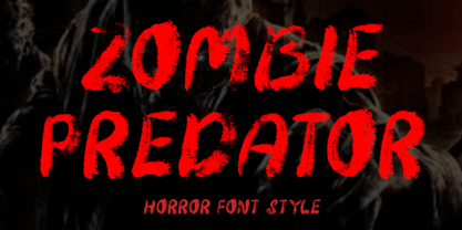 "Zombie Predator" is a scary horror display font. This font is very suitable for horror movie titles, Halloween, banners, posters, stickers, branding, book titles, and more. This font is equipped with uppercase, lowercase, numerals, punctuation, and multilingual support.
 - Gia by XO Type Co,
$40.00 Gia is 7 weights, true small caps and unicase options, designed after iconic letterforms of the 1960’s to 1980’s. In the early years of the American tech revolution, when Silicon Valley was more closely identified with Dallas, Texas, a curious type of letterform began to appear—strict in geometry, and curiously minimal in geometry and stroke, making it easier to be read by machine-readers, and people more used to reading machine-generated typography. Coders! As the years went on, this kind of sinewy, curved letterform began popping up in logotypes and music videos and upright video games: NASA, The Buggles, Atari, Pong, Sega, Namco, Stern, Devo, Apple. Gia pays homage to that letterform, and is named after Gia Carangi, the iconic face of early 1980’s pop fashion.
 - Investigator JNL by Jeff Levine,
$29.00Investigator JNL gives a serif treatment to Cold Case JNL, which was modeled from some old lettering stencils manufactured in the 1950s. - Gasping by Inumocca,
$20.00 Gasping Futuristic Font, Minimalist and unique Design ghlyphs. Inspiration from Modern Technology, Sci-fi Movie Poster, science and Space Theme. Really great font to covering your Project, like Lettering, Website Interface, Magazine, Branding, Poster, wedding invitations, Quotes Lettering, Logos, and more your project design. - Unique glyphs - Multilingual Characters - UPPERCASE - Lowercase - Numeric - Symbol - Punctuation Character - Stylistic Alternates inumocca_type
 - Art Director JNL by Jeff Levine,
$29.00 Free-form hand lettering on a 1979 poster for the Washington, D.C. exhibition of watercolors and etchings by the Elie Abrahami inspired Art Director JNL, which is available in both regular and oblique versions. This type of lettering was most popular in the late 50s through the mid-60s for movie titles, greeting cards and poster text.
 - Black Sun by Inumocca,
$19.00 BlackSun – A futuristic, eyecatching font with simple, strong characters. Inspired by modern technology, synthwave, Sci-fi movie posters, science and generally space. A really great font for many projects, like lettering, website interface, magazines, branding, posters, wedding invitations, quotes lettering, logos, and more. - Unique glyphs - Multilingual support - UPPERCASE - Lowercase - Numeric - Symbol - Punctuation - PUA encoded - Stylistic alternates
 - NINJA Japan by WAP Type,
$15.00 Ninja japan style font is a handcrafted brush font, its have an asian and oriental looks, a perfect companion for your creative project that has an asian niche. Fujimaru can be used as horror effect or even the fun title for cartoon movie, just pick your style. Ninja is doing his best at the heading title,movie poster,quotes text,and so on.. Product Content : Features : • Character Set A-Z • Numerals & Punctuations (OpenType Standard)