10,000 search results
(0.07 seconds)
- Bhatary by Anomali Creative,
$5.00 Bhatary is a Retro Vintage Serif Font. This Bhatary is suitable to use, if you want to get a more vintage and retro impression in your typography project, but still maintain a modern style in it. Bhatary with a distinct appearance of Retro, 50's era. the golden era. It works well in posters, CD Cover, T-shirt / merchandise design, magazine,the possibilities are endless! #Retro #Groovy #Vintage #Serif #70s #60s #80s #90s #Psychedelic #RetroFont #VintageFont #1970s #1960s #Bubble #Funky #Funk #ArtNouveau #ArtModern #Retrowave #RetroType #HippyFont #LogoFont #PosterMockup #TrippyFont #WavyFont #GroovyFont #60sFont #HippieFont #Wavy #BohoFont #Hippie #Retro70sFont #Retro90s #Retro80sFont #RetroModern #Modern #Nostalgia #Nostalgic #Bubbly #DisplayFont #Ligature #Ligatures #Alternates #Fonts #Sporty #Baseball #CalligraphyFont
 - Bristol by GroupType,
$19.00 Bristol and Bristol Adornado (also known as Greco) was first released by Fundición Richard Gans of Madrid, Spain, in 1925. The Richard Gans Foundry is a defunct Spanish foundry which existed from 1888-1975. Throughout its existence, types were designed by a number of people including José Ausejo Matute (d. 1998), Antonio Bilbao (who created Escorial in 1960), the son Ricardo Gans, and Carl Winkow. GroupType's versions of this font pair have been with FontHaus since the mid 1990s. Bristol is a charming and strong period design. Its structure is masculine and vertical. A great poster font and the Adornado style is an excellent choice for an eye-catching large drop cap.
 - Cartelle Inline by Stereo Type Haus,
$30.00 Cartelle is a sexy small caps bitmap design characterized by it's whimsical curls and ornate flourishes. It's inspiration came from a French poster design from the early 1900's.
 - Haboro Squared by insigne,
$25.00 Haboro Squared is a formidable typeface, created for a variety of uses. Clean and consistent, it evokes the 1950s and 1960s. Haboro Squared conveys accuracy and utility with its clean, consistent strokes. In the 1950s and 1960s, designers and the general public began to reject the austerity of the war years in favor of a new sense of American optimism. This era is reflected in Haboro Squared’s gently rounded letters, playful alternates, and multi-purpose use. Whether you are creating a logo, crafting a website, or designing a magazine article, Haboro balances modernity with a hint of nostalgia. Haboro Squared achieves a balance between fashion and practicality. Even though it has an angular, modern design, it radiates friendliness and warmth. Haboro Squared works well for headings and brief texts. This collection of fonts consists of eight weights, from Thin to Black, each with a corresponding italic. Your design will seem robust and fashionable with so many options. Haboro plenty of alternate glyphs from which you can select an alternative or adjust the appearance of each letter. You’ve found a secret weapon. The Haboro Hyperfamily features a whole array of options, from Haboro Sans, Serif, to Haboro Didone. Take a look at the entire family. Even the most serious texts have a touch of whimsy thanks to the quirky alternate terminals in this multipurpose text face. Impress clients with your next branding package, web site, or magazine spread. Let the nostalgia of America’s post WWII heyday fill you with inspiration! Supercharge your next branding package, web site, or magazine spread with Haboro Squared!
 - Krazy Kracks NF by Nick's Fonts,
$10.00This playful offering, suggestive of Cooper Black on some serious drugs, is based on the so-called “California” style of lettering used extensively in travel posters of the 30s to the 50s. This version is based on its interpretation by Carl Holmes in a Walter T. Foster artbook entitled ABC of Lettering. Both versions of this font include the complete Unicode Latin 1252 and Central European 1250 character sets. - Club - Personal use only

- Mystyline Decorative by Struvictory.art,
$14.00 Mystyline is a modern thin line condensed font inspired by hipster aesthetics. The letters are decorated with lines and dots. Mystyline is suitable for contemporary typographic posters (event design, movie posters, advertising, music production, photo overlays), hipster design etc.
 - Vagary JNL by Jeff Levine,
$29.00 For many decades, the fashion magazine “Vogue” featured superbly illustrated covers before photography became more commonplace. During the 1930s and 1940s those illustrations were accompanied by many creative styles of hand lettering for its monthly issues. The January, 1930 cover had the magazine’s name lettered in an Art Deco geometric monoline, which became the inspiration for Vagary JNL, which is available in both regular and oblique versions. A vagary [in a simple sense] is when something or someone changes in an erratic or unexpected way (as the wind’s direction or in a person’s mood or whim)… and thus seemed the fitting name for this type style.
 - Jalopy JNL by Jeff Levine,
$29.00 History, as it's said, tends to repeat itself. The round-point pen lettering used in the 1920s logo and ads for Dodge Brothers cars (pre-General Motors) is an early predecessor to the techno type styles of the 1980s. Square in shape, with unique stylization to some letters, Jalopy JNL can cross the decades and be used for a 1920s period piece and still look fresh in an ad for computer parts. Rather than round out the inside lines of the characters to fully emulate the strokes of a lettering pen, the inside lines have straight intersections for the contemporary side of this font's design.
 - Jagadita by Motokiwo,
$17.00 Jagadita is a display font that will be great for headline, posters, movie title, and more. It's a stand out typeface with eye catching characters style.
 - SPIDER GHOST by Letterafandi Studio,
$14.00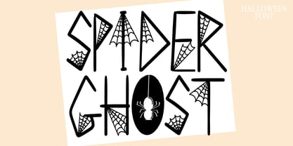 Spider Ghost is a Halloween decorative font. Add it to your Halloween crafts, horror movie posters, t-shirts and anything else that requires a spectacular look.
 - Yess by ParaType,
$25.00 Used in advertising posters for the Soviet state foreign trade company named 'Soyuzchimexort' in the early 1980s. Digital version was made for ParaType in 2007 with addition of light weight.
 - Retro Signature by Nirmana Visual,
$19.00 Retro Signature a classy, contemporary of script font, inspired by 1980’s and neon lights. Ideally suited for advertising and packaging, festive occasions, editorial and publishing, creative industries and posters .
 - Scentogram by PizzaDude.dk,
$20.00Scentogram is a deco font inspired by some 1950-60 ads. - Button by Scholtz Fonts,
$21.00Button is a solid, chunky, font, with a bold symmetry that makes it a must for products aimed at the younger set. Its unusual letter shapes all point to “NEW TREND!” It is the perfect choice for marketing companies targeting: ⁃ web-design and the creation of stylish buttons and menus ⁃ the music scene: CD covers, posters, music videos ⁃ the movie scene: posters, ads, movie titles ⁃ the theatre scene: posters, programs, ads, promotions ⁃ the fashion scene: swingtags, posters, brochures, signage, ads It has been carefully letterspaced and kerned. It contains a full character set: all upper and lower case characters, punctuation, numerals and accented characters are present. - Platinus Script Pro by Sudtipos,
$69.00 Platinus Script Pro is the latest example of what has now become a Sudtipos tradition: Adapting conventional calligraphic methods from the last two centuries to produce modern digital scripts for the current one. This time the resulting font explores the evolution of invitation scripts from the classic commercial lettering of the 1930s to the ideas clearly visible in the greeting cards of the 1980s and 1990s. Most base characters are made up of a single stroke, with some of the strokes driven from the top down, and some from the bottom up, putting the emphasis on the casual but precise fluidity of the hand, an emphasis magnified by the expert use of loops and swashes everywhere. The Platinus Script Pro family comes in two weights, each loaded with alternates and Latin-based langauge support, for more than 570 characters per font. Platinus Script Pro is great for product packaging, as well book covers, menus and greeting cards.
 - Nixon Script by Barnbrook Fonts,
$30.00 NixonScript is a display typeface inspired by the typographic emancipation given voice by 1950s and '60s north American vernacular type. NixonScript's starting point was lettering found on a 1960s camera found in a Chicago junk shop, but its development saw it transformed from a punchy sans-serif to a more thoughtful serif, with a lowered x-height and a vibe of almost priestly piousness. Rather than a simple regular italic, a bold italic is offered. During its development, the regular version seemed almost placid but with the double emphasis of bold and italic, NixonScript gained an energetic, self-congratulatory form.
 - Jeeves by Red Rooster Collection,
$79.00 The inspiration for Jeeves came from Leslie Carbarga's wonderful book LETTERHEADS, One Hundred Years of Great Design, 1850-1950. It was based on a secondary type usage for the letterhead for Sutherland in New York. The rest of the letterhead had features that were more typical of the Art Deco period, but this script added a touch of timeless elegance. And since at the time I was reading every scrap of P.G. Wodehouse I could get my hands on, the name Jeeves seemed like a perfect fit. The font is loaded with a plethora of extra glyphs, ligature characters and OpenType features.
 - Eckhardt Informal JNL by Jeff Levine,
$29.00 Eckhardt Informal JNL was found in a Dan Solo alphabets book under the name "Circus Wagon". This hand-lettered design with a playful inline is reminiscent of the show cards of the 1940s and 1950s. The Eckhardt series of typefaces is named in honor of the late Al Eckhardt, Jr. - a good friend of type designer Jeff Levine whose talents in hand-crafting attractive lettering was appreciated by many. His work, like the others before him is fast become a lost art in today's technology-driven world. Eckhardt Informal JNL is available in it's regular (inline) version and also as a solid version.
 - Number Five by Laura Worthington,
$29.00 Number Five is pure Americana, suitable for titling, display, logo, signage, and editorial work. Its bold and casual down-to-earth lettering evokes the spirit of the 1940s and 1950s in America. Number Five has 433 alternates, including a set of unconnected letters (the default set is all a connected script), and 10 ornaments. See what’s included! Rough • Smooth *NOTE* Basic versions DO NOT include swashes, alternates or ornaments These fonts have been specially coded for access of all the swashes, alternates and ornaments without the need for professional design software! Info and instructions here: http://lauraworthingtontype.com/faqs/
 - Advertiser JNL by Jeff Levine,
$29.00Advertiser JNL is a simple A-Z only font used to make retro-styled titles and names. Based on a popular style of retail signage from the 1950s and 1960s, alternating keystrokes will create a contrast of positive and negative letters. The capital letters have the alphabet in white on black boxes, the lower case have the black letters alone—with the white space conforming to the width of the black boxes. In a pinch, the boxed characters can also be used as initial caps. For a more complete character set with the same style of lettering, use DuBois Block JNL. - ITC Juanita by ITC,
$29.99 ITC Juanita is the work of Argentinian-born designer Luis Siquot and was inspired by a text set only with woodcuts which he was reading during a long international flight. ITC Juanita is a series of six distinct typefaces which Siquot sees as a personal reinterpretation of designs that originated in the 1930s and 40s and were still popular during his childhood in the 1950s. For me, Juanita is like a toy, charming, expressive, and also dramatic," says Siquot. The ITC Juanita series offers designers a range of variations based on similar structures, each variation with its own look."
 - Vermont by ITC,
$29.99Vermont is an outline semi slab serif created by British designer Freda Sack. The serifs of Vermont are typical of slab serif fonts, having the same stroke width as the base strokes and forming a right angle to them. The strong figures of this font still manage to seem light and airy and the marked shading makes them seem almost plastic or sculpted. This class of font appeared at the beginning of the 20th century as an advertisement typeface, rose in popularity through the 1950s and phototypesetting in the 1970s. Vermont should be used exclusively in headlines and displays in larger point sizes. - Shiver Me Timbers NF by Nick's Fonts,
$10.00Avast, me hearties! Here be a serious pirate font, based loosely on several of Victor Hammer’s uncial typefaces, designed between 1925 and 1953, and liberally weathered and corroded for that authentic barnacle-encrusted look. The bullet character is suitable for marking where the treasure is buried, and the section mark is a Jolly Roger. Both versions of the font include 1252 Latin, 1250 CE (with localization for Romanian and Moldovan). - Munchkin Land NF by Nick's Fonts,
$10.00This typeface bears a superficial resemblance to Belwe Extrabold, but is based on a work called Thor, issued by Frederic Wesselhoeft Ltd of London in the 1930s. The characters in this font are loosely spaced for use in attention-getting subheads, but you can tighten the tracking to get spectacular headlines, should you wish. Both versions of the font include 1252 Latin, 1250 CE (with localization for Romanian and Moldovan). - Haute Couture JNL by Jeff Levine,
$29.00A style of die-cut cardboard letters and numbers used for signs, displays and show cards was the basis for Haute Couture JNL, an Art-Deco flavored typeface from Jeff Levine. A direct cousin to Signboard JNL, this font shares some similar characteristics in letterforms. Both styles of die-cut lettering were manufactured by a number of companies, and were most popular from the 1940s through the mid-1960s. - Kifisia Antigua NF by Nick's Fonts,
$10.00This rough-and-ready display face is based on El Greco Antique, released by the Fundición Richard Gans of Madrid in the 1930s. Distressed but not distressing, rough yet charming, ragged around the edges but curiously refined. Named after a village in Greece which is the ancestral home of the forebears of the Curtii. Both versions of the font include 1252 Latin, 1250 CE (with localization for Romanian and Moldovan). - Radio Days NF by Nick's Fonts,
$10.00This Deco delight is based on logotype lettering for Crosley Radios from the 1930s. By aLtErNaTiNg upper and lowercase letters (brackets and braces, too), you can maintain the flow of the lightning bolts through the letters. Additionally, inline hyphens can be found at the ASCII circumflex and ASCII tilde positions. This font contains the complete Latin language character set (Unicode 1252) plus support for Central European (Unicode 1250) languages as well. - Calamity Jane NF by Nick's Fonts,
$10.00This typeface is an amalgam of Edwardian and Art Deco letterforms: the lowercase letters come from a turn-of-the-twentieth-century typeface named Amsterdam, and the uppercase letterforms come from a 1930s logotype for the Théâtre Moderne in Paris. Like its namesake, this typeface is not easily overlooked. This font contains the complete Latin language character set (Unicode 1252) plus support for Central European (Unicode 1250) languages as well. - Bindlestiff NF by Nick's Fonts,
$10.00Schmallfette Binder-Style, designed by Joseph Binder and released by D. Stempel AG in 1959 provided the template for this upright, set-tight display face. Its rather unconventional placement of the crossbars on the f and t is a subtle attention-grabber, and true to Binder's original design. Both versions include the complete Latin 1252, Central European 1250 and Turkish 1254 character sets, as well as localization for Moldovan and Romanian. - Fireside Chat NF by Nick's Fonts,
$10.00This unusual display face is another in a series of works based on the work of lettering artist Samuel Welo. The sinewy curves and radiant inline decoration give this typeface a cozy, warm and inviting charm. Named after the informal radio addresses popularized by Franklin Delano Roosevelt in the 1930s. Both versions of this font include the complete Latin 1252 and CE 1250 character sets, with localization for Romanian and Moldovan. - Smart Deco by Lindstrom Design,
$15.00 A nostalgic font referencing the 1920s and 1930s during the Golden Age of Hollywood, art moderne and the rise of luxury items. Highly geometric with wild variations in glyph widths that demand attention. Smart Deco is a display font with clean simple lines, tall ascenders and expressive Capitals that descend below the baseline. The intention is to create a sleek elegance that symbolizes the sophistication of a bygone era.
 - Wood Rounded JNL by Jeff Levine,
$29.00 This reinterpretation of Caslon Rounded showcases one of the early attempts of type foundries to create a novelty ‘rounded’ typeface for general use. While the lettering might easily convey a more modern look of 1960s or 1970s pop typography, its roots definitely lay in the later part of the 19th Century and the heyday of wood type design. Wood Rounded JNL is available in both regular and oblique versions.
 - Numancia NF by Nick's Fonts,
$10.00This elegant and somewhat edgy typeface is a faithful revival of Numantina, designed by Carl Winkow amd released by Madrid's Fundición Tipográfica Nacional in the 1940s. The lowercase letters take their design cues from medieval Spanish uncial lettering, making this face a natural choice for intriguing headlines and subheads. Both versions feature the complete Latin 1252, Central European 1250 and Turskish 1254 character sets, with localization for Lithuanian, Moldovan and Romanian. - Fredericksburg by Nick's Fonts,
$10.00In his book of 100 Wood Type Alphabets, Rob Roy Kelly called this face "Teutonic". This version adds lowercase letters, missing in the original, plus a few woodcut dingbats in the brackets, bar, section and florin positions. Named for a charming town in the Texas Hill Country, founded by German settlers in the mid-1850s. Both versions of the font include 1252 Latin, 1250 CE (with localization for Romanian and Moldovan). - Orion Radio NF by Nick's Fonts,
$10.00A 1930s ad for—believe it or not—Orion radios provided the inspiration for this ultrabold and slightly sassy face. The radio brand didn't make it into the twenty-first century, but its signature typeface has, ready and willing to add a little pizazz to your next project. This font contains the complete Latin language character set (Unicode 1252) plus support for Central European (Unicode 1250) languages as well. - Gatlinburg Gossamer NF by Nick's Fonts,
$10.00 The original characters, and now-rarely-seen alternate characters, for Memphis, designed by Emil Rudolf Weiss for American Type Founders in 1930, provided the pattern for this wispy, ultralight typeface. Although intended primarily for headlines, this typeface can also be used for brief blocks of text, if set 18 pt. or larger. Both versions of the font include 1252 Latin, 1250 CE (with localization for Romanian and Moldovan).
 - Two Reeler JNL by Jeff Levine,
$29.00While watching a 1920s Charlie Chaplin short film, Jeff Levine was taken with the unusually modern looking lettering of the title cards in that silent movie. The lettering was not only right for its time, but could also be adapted to both Art Deco and Techno applications. From this classic film comes the font Two Reeler JNL, a bit of yesterday with an eye toward the future. - Robot Monster NF by Nick's Fonts,
$10.00A design experiment run amok! To some, the upper case A of this font resembles a diving helmet. If you put same on a guy in a gorilla suit, you have the really cheesy 50s sci-fi movie that gives the font its name. Both versions of this font contain the Unicode 1252 (Latin) and Unicode 1250 (Central European) character sets, with localization for Romanian and Moldovan. - Cartage Stencil JNL by Jeff Levine,
$29.00 The sheet music for the title song of the 1960 movie "Exodus" had the name hand lettered in a block stencil style with rounded corners and narrow "rails" [the breaks between the stencil parts]. Loosely based on this design and working from just the six letters of the title, Cartage Stencil JNL is available as a digital font in both regular and oblique versions.
