10,000 search results
(0.05 seconds)
- Hammock by One Fonty Day,
$10.00 Hammock is a chilled and simple handwritten typeface. Having the combination of the large capital letters and the small lowercase enable you to play with the font uniquely and flexibly. Also, its left-slanted letters give a bit of special look to the typeface. Most of the european languages are supported.
 - Dusty Rose NF by Nick's Fonts,
$10.00Based on the logotype lettering for the Dutch magazine Geillustreerd Schildersblad in 1940, this devilishy different Deco font will add a bit of naive charm to any project it graces. This font contains the complete Latin language character set (Unicode 1252) plus support for Central European (Unicode 1250) languages as well. - Through Brush by Realtype,
$16.00 Through Brush consists of sophisticated handwriting, elegant, classy and modern. With a little bit of dirty curves it is made from the new trend typefaces now to look as close as possible to the natural brush writing, Through Brush is perfect for adding a modern and classy touch to your project.
 - Alpineo by Soneri Type,
$32.00 Alpineo is a display type family, optical mono linear and a bit squarish in nature. It has a distinct stroke-joint style, which is a prominent feature of its design. It has been designed to be a little eye-catching yet legible. It has clear and distinguishable letterforms, which helps to elaborate and emphasis the message. It is graphically strong and command viewer’s attention. The overall appearance of type is suitable in setting it as logotype, punchline, title, headline, etc. The type family consists of six weights viz. Thin, ExLight, Light, Regular, Medium and Bold. Alpineo is designed by Aakash Soneri, founder Soneritype in the year 2017.
 - Pikelet by Aah Yes,
$14.00Pikelet is a misprinted grunge font ideally suited to headlines, poster and display. As well as irregularities of printing in the actual letters, the ordinary versions contain "print errors" around some of the letters, whereas the Clean versions are identical but without those extra bits of overprint. The All Caps version has 2 sets of capitals which are different to the capitals in the Regular version (and to each other). And the jumbled versions have varying amounts of mis-alignment, but not variations in size. There's also an extensive selection of accented characters for both Western & Eastern European languages, and punctuation and fractions. - Mulla by YuliusParyadi,
$11.00 Mulla (Handwritten/Script) is a strong font that exudes beauty. Smooth and beautiful character but with amazing high artistic taste. This font is readable, catchy, and easy to use. This font is suitable for quotes, logo designs, magazines, business cards, and many other design projects. Mulla is includes: - full set uppercase and lowercase letter; - numerals; - multilingual support; - large number of punctuations; - ligatures, and swash. Please add this font as your favorite, hit like button, or follow me. I'll very happy for that and appreciated it.
 - Highman by Eko Bimantara,
$19.00 Highman is a modern condensed bold font. Its contain all caps letter yet its have a different height between the uppercase and lowercase. Its fit for brand, titling, stacking or grid layout and all kind of display usage.
 - Happy Dinosaur by Sipanji21,
$10.00 Happy Dinosaur is a sweet and chunky lettered display font. Its friendly feel makes this font incredibly versatile, fitting a wide range of contexts. Add it to your creative ideas and notice how it makes them stand out!
 - Dream Island by Epiclinez,
$14.00 Dream Island is a simple, relaxed, and fine handwritten font. Its simple style makes it fitting to a wide range of designs, so add it confidently to your informal or casual ideas, and you will love the results.
 - Spooky Green by Illushvara,
$13.00 Spooky Green is an incredibly unique and quirky display font. Its friendly feel makes this font incredibly versatile, fitting a wide range of contexts. Add it to your creative ideas and notice how it makes them stand out!
 - Forberas by Forberas Club,
$16.00 Forberas Club is usable for anything. But will be better if you use it for memorable moment.
 - Shen by Lerfu,
$10.00An early design, but it has its moments. It is very narrow and spindly in the vertical strokes, so it really only makes sense to use fairly large point sizes, and for short phrases. Vowels are included, and just for variety, cantillations are also included - Eleonora by Three Islands Press,
$24.00Eleonora tends to defy standard categories. Had the typeface been designed in about 1790, it might've been called a "late transitional face" and lumped together with Bell and Bulmer. But it's a modern typeface, showing more restraint in its finer details than even Baskerville. Also noteworthy: it has no traditional, script-like italic but a more severe oblique with baseline serifs and other roman features. Has regular, italic, bold, and bold italic styles. - Stovepipe Stencil JNL by Jeff Levine,
$29.00 Stovepipe Stencil JNL was not directly designed from a vintage source, but it does draw its influences from classic sans serif lettering of the past. Even its name borrows (somewhat gratuitously) from the "stovepipe" lettering so popular with sign painters. True stovepipe letters tend to be squarer with rounded corners, but the name has also been loosely associated with some tall, condensed type styles. The typeface is available in both regular and oblique versions.
 - Jenriv by Linh Nguyen,
$25.00 Inspired by designs of the early Renaissance, Jenriv brings out a sedate atmosphere and generous inner spaces. Starting with the idea of mixing straightforward strokes and curves, it results in kind masculine figures, but calm and humble. It reminds some archaic air but a simplified one. Jenriv embraces text flows, multiple languages, and various styles with standard OpenType features. It is well adapted to various applications, from medium body text to large headlines, or logotypes.
 - Wobble - Unknown license

- Adieu by Hackberry Font Foundry,
$24.95 Adieu is an old-fashioned display font traced and modified from a group of Victorian fonts. It is very stylized, but it is very attractive to many of my clients.
 - DC Inflate by CrazyFully,
$9.99 DC Inflate is an uppercase, bold, rounded display typeface. Ideal for logo design, big, fun and impactful titles. It supports the Western European character set and it contains 215 glyphs.
 - Lemon Lies by PizzaDude.dk,
$20.00A square but fair font, or as they say in Germany "kradratisch, praktisch, gut". Because of the simpleness in this font, I decided add two styles less square to the family: funky and zit. - Brigade by Alan Meeks,
$45.00 In searching for a Roman to use, I found there were bits of Bembo, Times, Garamond, etc., that I liked and bits that I did not. So I set out to take the best bits of all my favorite Romans and tried to create the ultimate Roman Typeface.
 - Bebas Neue Semi Rounded by Dharma Type,
$4.99 Bebas Neue SemiRounded is the Bebas Neue with rounded corners. As you know, Bebas Neue is the most widely used free font recently. This semi-rounded version is the new style for more widely use. The basic theory and proportion are same as Bebas Neue but rounded shape gives a warm, soft and natural impression. A bit more rigid than Bebas Neue Rounded. Available at an affordable price.
 - Freeland by Trial by Cupcakes,
$29.00 Freeland is a casual brush typeface, with a rich, inky texture, and just a bit of a masculine, edgy vibe. It’s modern, bold, and lively, but not too whimsical. Features plenty of ligatures and stylistic alternates for a realistic, hand-lettered look. Uppercase letters can be used alone, as a cohesive group, or they can be paired with their lowercase cousins, for lettering that dances effortlessly across your design.
 - Antidote by Hanoded,
$15.00 Antidote is a grungy 3-D font. It is hand drawn and has been given a 'cracked' look. Looks great in headlines, titles and on packaging, but I wouldn't set a text in it as it is quite heavy.
 - Wiggles - Unknown license

- Wobbles - Unknown license

- Wibbles - Unknown license

- Ganymede3D - Personal use only

- Thwaites by Eyad Al-Samman,
$20.00 ‘Thwaites’ typeface is fully dedicated to one of my best Canadian friends who I do cherish and value highly. This great and industrious Canadian friend is ‘James Douglas Thwaites’ who lives along with his good-natured family in British Columbia, Canada. For me, James is like a source of inspiration and I do consider him as an ideal in my life. Our strong friendship has started since 1999 and I hope that it will endure just to the last moment of my life. Sometimes I see him as the writer and poet that I learn a lot from, sometimes I see him as a devoted religious minister that I try to understand more about his teachings, and other times I see him as the educator that I strive to imitate verbatim in my life. When I want to talk more about this Canadian friend, I will not be able to give him his due in full. Thus, I will instead mention some excerpts of his biography that he wrote himself saying that: “James D. Thwaites is a self-accomplished man. Having worked in various fields including restaurant management and cleaning, he has achieved his goals of being a full-time teacher, past-time writer, and volunteer religious minister for the Christian Congregation of Jehovah's Witnesses. His personal and academic pursuits have led him to be published in various magazines, newspapers, self-published books, and websites, including his now defunct ‘poetryofthemonth.com’ website. He continues to learn and augment the craft of writing while working primarily in early literacy and delayed literacy learners, teaching reading and literature to a wide age range of students. He views his religious endeavors as an extension of his academic ones. He teaches others both as a public speaker and in one-on-one situations, teaching about the benefits of submission to God and to His teachings. His future goals include expanding his ministry and continuing his writing.” The name ‘Thwaites’ itself comes from Great Britain and originated from the last Viking raids upon England, being an Anglicized version of a Scandinavian term meaning—depending on the source material—either "a place that is difficult to approach" or "a small thicket of trees." Another recitation mentions that ‘Thwaites’ can be described also as an English surname but one of pre 7th century Norse-Viking origins. It may be either topographical or locational, and is derived from the word "thveit", meaning a clearing or farm. As a locational surname it originates from any one of the various places called "Thwaite", found in several parts of Northern England and East Anglia to the south. The various modern spelling forms include Thwaite, Thwaites, Thwaytes, Thoytes, Twaite, Twatt, Twaites, Tweats and Twite. The name, although often appearing unique to outsiders, can often be found within other famous names like Braithwaite, Goldthwaites, or Misslethwaites. With various spellings, some families not including the ‘e’ or the ‘s’ at the end, Thwaites and its derivations—although not exceedingly common—is a name found worldwide. ‘Thwaites’ typeface is simply a sans-serif streamlined, stylish, and versatile font. It is designed using a combination of thick and thin strokes for its +585 characters. Its character set supports nearly most of the Central, Eastern, and Western European languages using Latin scripts including the Irish language. The typeface is appropriate for any type of typographic and graphic designs in web, print, and other media. It is also absolutely preferable to be used in the wide fields related to publication, press, services, and production industries. It can create a very impressive impact when used in headlines, posters, titles, products’ surfaces, logos, medical packages, product and corporate branding, and also signage. It has also both of lining and old-style numerals which makes it more suitable for any printing or designing purposes. ‘Thwaites’ typeface is really the cannot-miss choice for anyone who wants to possess unique artistic and modern designs produced using this streamlined typeface.
 - Habana by Vladislav Ivanov,
$15.00This font opens a new era of typewriting and type design. At first sight, the font seems creepy, but it has a deep connection with some urban motives in its tune. - Harmony by Solotype,
$19.95A handsome German art deco design that fits in well with other types of the 1920s and 1930s. Originally without a lowercase, so we drew one for it, extending its usefulness. - Shaimus by Larin Type Co,
$12.00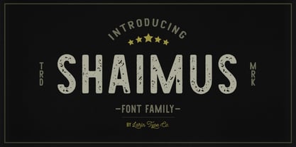 Shaimus is a multi-purpose and very legible font family. It will fit perfectly in a vintage and modern styles. It is great for creating logos, layouts, templates, advertisements and more.
 - Svelte by Eko Bimantara,
$19.00 Svelte is condensed serif family. Its consist of upright styles from Regular to ExtraBold. Fit for display, short text, and stacked typesetting. Its contain 394 glyphs with broad latin language coverage.
 - Bibliophile Script by Sudtipos,
$79.00 A friend once jokingly told me that what I really do is mine extinct arts for parts to use in modern things, like going to the scrapyard to pick up bumpers, quarter-panels and dashboards off of Datsuns and Ponies to build a shiny new Ferrari. I still kind of grin at that, but I certainly do spend a lot of time looking at old things and imagining ways they would work today. This shiny new Ferrari here is called Bibliophile, and it contains scrap heap parts from various pages by Louis Prang, the Prussian-American printer and publisher who inspired my Prangs fonts. This is my second engagement with the late 19th century man, and it’s quite a bit more intricate than just an italic Didone with a connected lowercase. Bibliophile marries Round Hand calligraphy with Italian capitals, two styles not often relayed in the same alphabet, but work together beautifully when combined well. When you combine them well with a few long-practised tricks of the trade, then mix in a few trusted features from my previous work over the years, you get my usual crazy exuberance, like 17 different shapes for the d, 21 different forms for the y, endings, beginnings, swashes, ornaments, and so on. It’s no secret that I can get carried away when I’m so consumed by an idea. — Bibliophile comes in 2 weights, each of them with over 900 glyphs covering all the latin languages. Bibliophile also comes with a bold weight, something I’m always reluctant to do with something as adventurous and complex as the structure of this historical mashup. But I couldn’t chase away the idea of increasing the contrast while maintaining the hairlines in a lowercase this narrow. Part of it was the curiosity about the outcome, and part was the sheer challenge of it. I think it turned out OK. Words set in either weight will show delicateness and elegance, and the more time you spend inside the font and micro-manage the setting, the more ways you will find to magnify either. Bibliophile can be as muted or luxurious as you want it to be. This is the kind of alphabet that fits well in fashion marketing and high-end packaging, from the very subdued to the super-exquisite. Enjoy the gleaming new vehicle made with freshly polished old parts.
 - Faltura Alien, crafted by the talented Måns Grebäck, stands as a testament to the limitless creativity and innovation in the realm of type design. Grebäck, known for his meticulous attention to detai...
- Truly Happy by Olivetype,
$18.00 Truly Happy is an ideal font choice for anyone looking to add a bit of fun and playfulness to their projects. This handwritten font has a light and airy feel, making it ideal for any creative project. With its cute and whimsical details, Truly Happy will surely bring a smile to everyone who sees it. So what’s included : Basic Latin Uppercase and Lowercase Numbers, symbols, and punctuations Multilingual Support. PUA Encoded and fully accessible without additional design software Simple Installations Works on PC & Mac Cheers.
 - KG One Thing by Kimberly Geswein,
$5.00 This font is super bubbly and round. It is neat enough to be legible but still has personality.
 - St Lorie by Stereotypes,
$29.00 St Lorie is inspired by handmade lettering in logos, but it was drawn completely by the digital method.
 - Miso, created by Mårten Nettelbladt, is a minimalist geometric sans-serif typeface that stands out for its clean and crisp aesthetic. Designed with a focus on simplicity and functionality, Miso is ve...
- ComixHeavy is a font that truly captures the essence of fun, vibrancy, and dynamism, making it an exceptional choice for projects that demand a touch of playfulness and originality. Its design is rem...
- Querencia Army DEMO VERSION is a bold, striking font that captures attention at first glance. Its design is robust and assertive, embodying a sense of strength and determination that is both inspirin...


