10,000 search results
(0.029 seconds)
- Al Seg23 by Nihar Mazumdar,
$0.50 - Walto Neue - Personal use only
- Wintery Christmas by Seemly Fonts,
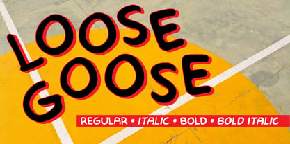
$12.00 - LF Loose Goose by Lo-Fi Fonts,
$5.00 - Quinine - Unknown license
- Sargoo - Unknown license
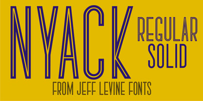
- Nyack JNL by Jeff Levine,
$29.00 - Overexposed by Cool Fonts,
$24.00 - WellrockSlab - 100% free
- Charleston - Unknown license
- Geiger by WyldType,
$14.99 - BigDots - Unknown license
- Assimilate - Unknown license
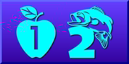
- Number Ornaments by Gerald Gallo,
$20.00 - AmarilloUSAF - Unknown license
- NT Brick Sans by Nurrontype,
$17.00 - Hyundai - Personal use only
- Cardiff - Unknown license
- Andes - Unknown license
- Daze - Unknown license
- BellBottom.Laser - Unknown license
- Disclaimer JNL by Jeff Levine,
$29.00 - Brimborion - 100% free
- Espresso - Unknown license
- Renaiss-Italic - 100% free
- Passeul - Unknown license
- Phaedrus - Unknown license
- DLSantaCaps - Unknown license
- Dna - Unknown license
- SuperHawg - Unknown license
- Nostra 2003 J - Unknown license
- Count Floyd by Elemeno,
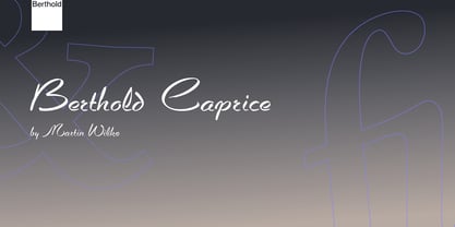
$10.00 - Caprice by Berthold,
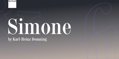
$57.99 - Simone by Berthold,
$67.99 - AZ - Unknown license
- Recognition - Unknown license
- Planks - Unknown license
- Beatsville - Unknown license
- Industria - Unknown license
- Oxnard - Unknown license


