10,000 search results
(0.033 seconds)
- Morning by Monotype,
$15.99 Morning’s spirited, bouncy cursive letterforms feel like a painter’s signature; it’s a familiar style but with something of a twinkle in its eye. The style of Morning looks to imitate wet brush and ink lettering, and dances between seriousness and play. You’ll find a mix of letter connections here, and some ligatures, too.
 - Soon by Fathom Collection,
$8.00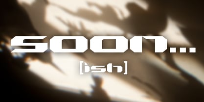
- Koons by SAMUEL DESIGN,
$19.00 The name of this font is KOONS, which is inspired by an artist we respect very much. The font style is optimistic and positive, with pop art features. The lines of the font are highly geometric, preserving the original combination of strokes. In terms of details, on the basis of sans serif fonts, it is equipped with detailed and fun serif details. All treatments are done to ensure that this typeface remains highly recognizable, but also has attractive details and taste.
 - Moony by Brave Lion Fonts,
$9.99 Moony combines edgyness with softness and was made to look elegantly strong. The typeface is great for big headlines and impressive titles. Yet a reduced sans serif font, Moony brings it own character with it. With eight styles in different weights you can easily combine it with other typefaces, like scripts. Use Moony to bring a statement in neutral designs.
 - Mohn by Ryan Keightley,
$19.00 Mohn is a sans serif font that draws inspiration from the Bauhaus movement, characterized by its geometric shapes and neo-grotesque elements. With its clear and legible forms, Mohn works as a body copy font, or blow it up larger for headlines to really see its gently rounded corner details which bring a personal and contemporary touch to any design project. Available in 7 weights with italics for each, a variety of accented glyphs, ligatures, and extra stylistic alts on select letters.
 - Morn by Wahyu and Sani Co.,
$20.00 Morn is a sharp geometric sans font with roman proportion. Every characters are essence from a rectangle (square), a circle and a triangle with require little adjustment to make them appear optically equivalent. This font is equipped with some OpenType Layout Features such as fraction and ligature and the default layout for numbers is proportional lining, but can be changed as tabular lining. So the space between numbers looks more even. Morn has total 20 fonts which are upright and oblique. Each font has 460+ characters, and it supports many Latin languages such as Western Europe, Central/ Eastern Europe, Baltic, Turkish, Romanian.
 - Toons by Bohloul Arabic Type Design,
$30.00 A very cheerful font. This font is very thick and suitable for use in children's games or animations. With this font, write very attractive, happy and comic titles and use it easily in graphic works. The design of this font looks sloppy and messy, but when you write your own text or title, while each letter is messed up, the text is completely connected.
 - Mood by Device,
$39.00 A sleek and elegant high-contrast sans with a hint of high fashion and a touch of tomorrow. Available in two versions that can be freely mixed for effect, each with alternatives for the M, P, Q, R and W that are available via the Stylistic Alternates feature in Adobe Illustrator, as a Stylistic Set in Indesign, or direct from the Glyphs palette
 - Moron by Barnbrook Fonts,
$30.00 Moron is a distinctive and idiosyncratic display typeface: a winsome-but-nasty, old-and-yet-new drawing of Victorian sans-serif letterforms (with some 1970s sausage fonts thrown in). Moron started life as a sans-serif redrawing of Nylon but developed into a unique typeface with a character all its own. It is based, very loosely, upon Victorian Tuscan and Grotesque type found in the churches and cemeteries of the city of Glasgow. These letterforms originated before the dawn of modernism and at a time when the Arts and Crafts Movement was flourishing. In this age of early mass production and mechanisation, the Victorian ability to balance functionality with ornamentation had fascinating results. The typography of that period displays a unique combination of industrial heft and romantic decoration.
 - Scary Movie Gallery - Personal use only

- KR Movie Time - Unknown license

- Movie Drama JNL by Jeff Levine,
$29.00 The Nov. 26, 1921 issue of “The Moving Picture World” carried an ad for the dramatic film “For Your Daughter’s Sake” (originally tilted “The Common Sin” and produced in 1920). Hand lettered in an Art Nouveau sans serif style, the ad copy inspired Movie Drama JNL, which is available in both regular and oblique versions.
 - Silent Movies JNL by Jeff Levine,
$29.00 An ad in the Oct. 27, 1919 issue of the trade magazine “The Moving Picture World” promoted “Princess Virtue” from Bluebird Pictures starring Mae Murray – The Adorable [as noted by the movie studio in the ad]. The Art Nouveau hand lettering emulated the style usually drawn with a round nib pen, but was given a specialized treatment for the ad. It was re-drawn in a more traditional ‘pen nib’ look for digital revival. The end result is Silent Movies JNL, which is available in both regular and oblique versions.
 - Movie Usher JNL by Jeff Levine,
$29.00 Decorative, Display, Headline, Serif, 1920s, Hand Lettered, Engraved, Incised, Bold, Extra Bold, Retro, Vintage, Nostalgic An ad in the July 27, 1928 issue of The Film Daily for FBO Pictures was an encouragement to all theaters to accept the emergence of 'talking pictures' and "Don't be Panicked by Sound". The headline text was hand lettered in an extra bold serif type face with engraved [incised] lines. The lettering has been redrawn as the digital type face Movie Usher JNL, and is available in both regular and oblique versions.
 - Movie Musical JNL by Jeff Levine,
$29.00 A lobby card for the 1929 movie musical “Broadway Melody” features the bulk of the film’s title hand lettered in a playful sans serif style. This design is now available as Movie Musical JNL, which is available in both regular and oblique versions.
 - Movie Classic JNL by Jeff Levine,
$29.00 The hand lettered title card from the 1935 melodrama “Magnificent Obsession” inspired the digital revival Movie Classic JNL; available in both regular and oblique versions.
 - Movie Night JNL by Jeff Levine,
$29.00 Movie Night JNL was modeled from one of a number of ceramic home movie titling kits on the market that were popular during the 1950s and 1960s. The camera buff would set up the letters against a colored background and photograph clever titles to describe their 8mm home movies of vacations, sightseeing or their darling children (or grandchildren).
 - Movie Screen JNL by Jeff Levine,
$29.00 The hand lettered opening titles from the 1944 Laurel and Hardy comedy “The Big Noise” served as the inspiration for Movie Screen JNL, which is available in both regular and oblique versions.
 - LD Horror Movie by Illustration Ink,
$3.00 - Movie Matinee JNL by Jeff Levine,
$29.00 A 1926 trade ad for the silent comedy “The Nut-Cracker” starring Edward Everett Horton has the film’s title hand lettered in a decorative bold sans serif design complete with highlight lines and accent dots. This festive type face is now available digitally as Movie Matinee JNL in both regular and oblique versions.
 - Movie Arts JNL by Jeff Levine,
$29.00 In the June 18, 1929 issue of “The Film Daily”, the curvy and casual hand lettering found within the ad for the movie “Such Men are Dangerous” belies that this was actually a pre-code drama. Digitally redrawn as Movie Arts JNL, it is available in both regular and oblique versions.
 - Movie Producer JNL by Jeff Levine,
$29.00 The Nov. 13, 1915 and Nov. 27, 1915 issues of Moving Picture World carried ads for Jesse L. Lasky Productions in which the titles of the upcoming films were hand lettered in an elegant Art Nouveau spurred serif style. This stylish alphabet is now available digitally as Movie Producer JNL in both regular and oblique versions.
 - Home Movies JNL by Jeff Levine,
$29.00 A set of cling vinyl letters and numbers for titling home movies or slides is the basis for Home Movies JNL. The set was made by the Clingtite Letters Company of Chicago and retailed for $2.95. It was advertised in many photographic publications of the 1950s.
 - Movie Set JNL by Jeff Levine,
$29.00 The hand lettered title on the poster for the 1929 film comedy “Why Leave Home?” inspired Movie Set JNL, which is available in both regular and oblique versions. A classic “thick-and-thin” design with early Art Deco influences, this condensed typeface is perfect for any period projects.
 - Movie House JNL by Jeff Levine,
$29.00 Double Feature JNL reworks the classic Huxley Vertical into an elegant trilinear Art Deco display face.
 - B-Movie Splatter by Die Typonauten,
$19.00
- The Love Movies by Putracetol,
$18.00 The Love Movies is a quirky love font with 7 different versions of the font, the difference between each version is in the shape of the heart decoration. This font is basically soft and fun, and coupled with heart decorations of various shapes and choices, will make this font suitable for the projects you are working on, especially those themed on love, valentine, children, babies, weddings, etc. In addition, this font is also suitable for invitation cards, greeting cards, logos, branding, posters, crafting, stickers, social media, packaging, headers, merchandise and others. This font is also support multi language.
 - Movie Nouveau JNL by Jeff Levine,
$29.00 A 1920s magazine featuring behind-the-scenes stories about the motion picture industry had its name [“Shadowland”] lettered in an Art Nouveau sans serif style. This has been recreated digitally as Movie Nouveau JNL, and is available in both regular and oblique versions.
 - Movie Show JNL by Jeff Levine,
$29.00 A 1911 movie poster for a film called “How Bella Was Won” from the Edison studios had the name “Edison” hand lettered in a bold, spurred sans serif design. These few letters became the basis for Movie Show JNL, which is available in both regular and oblique versions.
 - B-Movie Retro by Die Typonauten,
$19.00
- Movie Palace JNL by Jeff Levine,
$29.10 Decorative, Display, Headline, Sans Serif, 1930s, Hand Lettered, Monoline, Retro, Vintage, Nostalgic, Stylized, Elegant Some beautiful and stylized Art Deco hand lettering found in the Jan. 6, 1934 issue of the British movie fan publication Picturegoer Weekly inspired Movie Palace JNL, which is now available in both regular and oblique versions. This monoline design adds a touch of elegance to any retro projects.
 - Midnite Movie JNL by Jeff Levine,
$29.00 Midnite Movie JNL was inspired by the hand lettered title credits from the 1961 Hammer Pictures film "Curse of the Werewolf" and is available in both regular and oblique versions.
 - Movie Production JNL by Jeff Levine,
$29.00 Inside the pages of the August, 1930 issue of “The New Movie Magazine” is an ad for Warner Brothers-First National Pictures – hand lettered in a bold Art Deco sans. This was the basis for Movie Production JNL, which is available in both regular and oblique versions.
 - Monster Movies JNL by Jeff Levine,
$29.00 A 1967 ad for Aurora “Monster Scenes Custom Builder Kits” featured the drippy, gooey hand lettering long associated with science fiction and horror movies. The letters in the ad were auto-scanned and additional characters were completed with the end result being a horror-themed font with sharper angles and lines instead of drips. This is now available as Monster Movies JNL, which is available in both regular and oblique versions.
 - New Wishes - Personal use only

- News Cycle - 100% free

- New Alphabet - Unknown license

- New Cicle - Unknown license

- New Day - Unknown license

- New Venice - Unknown license


