1,400 search results
(0.015 seconds)
- TV Nord by Elsner+Flake,
$39.00The typeface family TV Nord is based on the corporate typeface NDR Sans which was developed by Elsner+Flake for the Norddeutsche Rundfunk (www.ndr.de) between 1999 and 2001. This new design came into being as part of a complete overhaul of the visual image of the NDR. This became necessary because the NDR, founded in 1954, incorporated the stations of the East German states Mecklenburg-Vorpommern (1992) and Brandenburg (1997) after the re-unification of Germany. The Hamburg advertising agency DMCGroup developed a new and unified image for the NDR which is in existence to this day. The typeface TV Nord relates to the design of the Trade Gothic and similar American sans serif typefaces of the early part of the last century. Its development concerns itself as much with good legibility for print, as it does for the reproduction on TV screens, which among others, is achieved through its high x-height. The logotype for the NDR as well was developed from the capitals of the NDR Sans. In 2014, the TV Nord was revised stylistically and expanded to incorporate all European-Latin languages. As part of this effort, further complementary cuts were added. - Hi TV by Yebhu,
$15.00 Hi TV is an good-humored and energetic display font. Although being an all caps alphabet, it counts two versions for a letter, easily accessed choose uppercase or lowercase. These slightly different letterforms will bring spontaneity and vitality to your designs. Crunching noises guaranteed!
 - Segoe TV by Microsoft Corporation,
$39.00The Segoe™ TV font family was originally developed for MSNTV. Segoe TV italic was designed with attributes for improved legibility on TV screens. Segoe TV italic includes the Latin-1 character set. - Bomber TV by Kustomtype,
$25.00 I was asked by a good friend of mine to design his tattoo lettering. This fellow prefered an easy stencil with no ornament, such as swirls or loops. After some preliminary design I finally accepted the challenge and while completing the whole alphabet, the idea of creating a cool font of it occured to me. Only a few months later this new font family already contained 4 weights, every weight has a companion Italic style, punctuation, numerals and mathematical operators, as well as all accented characters. Bomber TV is a brand-new font and all glyphs have been contemplated very carefully so that all characters match in a well-balanced and streaming way. In both shaped weights, the font suits extraordinary well for headings, slogans etc. The cleanly cut and powerful Bomber TV font can easily be used for logotype, games, prints, magazines, web, apps, packaging, posters, T-shirts, signage & design projects. The font is original and custom made by Kustomtype.
 - Static Charge - Unknown license

- XXII STATIC - Unknown license

- Static Cling - Unknown license

- ITC Static by ITC,
$29.99Static looks almost like it was stamped on paper: the black color is not evenly distributed and the background comes through the letters and consciously irregular forms reinforce the effect. The characters do not all have the same height, nor do they stand straight and regularly on the base line. Static is a robust font with bold, rounded serifs and is best used for headlines and short texts in point sizes of 12 and larger. - TV Western JNL by Jeff Levine,
$29.00 In the 1889 Franklin Type Foundry specimen book is a type face called “Armenian”. With lighter weight horizontal slab serifs than more traditional Western fonts, it could be pictured as being used as copy on wanted posters or town notices. This is now available as TV Western JNL in both regular and oblique versions.
 - Vega TV SH by Scangraphic Digital Type Collection,
$26.00 Since the release of these fonts most typefaces in the Scangraphic Type Collection appear in two versions. One is designed specifically for headline typesetting (SH: Scangraphic Headline Types) and one specifically for text typesetting (SB Scangraphic Bodytypes). The most obvious differentiation can be found in the spacing. That of the Bodytypes is adjusted for readability. That of the Headline Types is decidedly more narrow in order to do justice to the requirements of headline typesetting. The kerning tables, as well, have been individualized for each of these type varieties. In addition to the adjustment of spacing, there are also adjustments in the design. For the Bodytypes, fine spaces were created which prevented the smear effect on acute angles in small typesizes. For a number of Bodytypes, hairlines and serifs were thickened or the whole typeface was adjusted to meet the optical requirements for setting type in small sizes. For the German lower-case diacritical marks, all Headline Types complements contain alternative integrated accents which allow the compact setting of lower-case headlines.
 - Vega TV SB by Scangraphic Digital Type Collection,
$26.00 Since the release of these fonts most typefaces in the Scangraphic Type Collection appear in two versions. One is designed specifically for headline typesetting (SH: Scangraphic Headline Types) and one specifically for text typesetting (SB Scangraphic Bodytypes). The most obvious differentiation can be found in the spacing. That of the Bodytypes is adjusted for readability. That of the Headline Types is decidedly more narrow in order to do justice to the requirements of headline typesetting. The kerning tables, as well, have been individualized for each of these type varieties. In addition to the adjustment of spacing, there are also adjustments in the design. For the Bodytypes, fine spaces were created which prevented the smear effect on acute angles in small typesizes. For a number of Bodytypes, hairlines and serifs were thickened or the whole typeface was adjusted to meet the optical requirements for setting type in small sizes. For the German lower-case diacritical marks, all Headline Types complements contain alternative integrated accents which allow the compact setting of lower-case headlines.
 - Stasmic - Unknown license

- Stadia by Device,
$29.00 Stadia is designed around a series of modular units: quartercircles, teardrop shapes, squares, circles and variations thereon. The versatility of these basic shapes is such that a teardrop, for example, can represent a looped bowl, as in the lower part of the a, while also representing a curved arc at the top of the same character. The strict grid is broken for the T and the Y, and the placement of accents. The alternative – basing a T, for example, across three units – though rational, is far less aesthetically pleasing. As always with type design, one has to know when the internal structural rules should be bent for a more beautiful result. The horizontal lines appear to travel through the letters, bursting into stars in the counters of lower-case characters such as the o and p. The outline version is weighted to the same width as the gaps between the units.
 - Styptic by Sensatype Studio,
$15.00 A Classy Elegant Luxury font that we created special for elegant branding needs, with unique shape will be ready to add value of your brand. And specially for Manyfit font, We prepared any characters to help you create unlimited variations for your creative needs. Syptic Classy Elegant Luxury Font ready with: Unique Classy Characters Preview as a inspirations that you can do with Syptic font Ready with Lowercase and Uppercase characters Wish you enjoy our font. :)
 - Stazin by Fo Da,
$50.00 Stazin is a display high-contrasted font comes with single-weight. Stazin supports many Latin based languages and Arabic language with almost 900 glyphs that covers many OpenType features.
 - Stature by Gerald Gallo,
$20.00 Stature is an original, clean and crisp, sans serif compressed font, which can be used for text or as an effective display font. The font includes upper and lowercase alphabets, numbers, punctuation, accented characters, symbols, and miscellaneous characters.
 - Sattin by Khaiuns,
$15.00 Introducing Sattin Font Duo - Two types of fonts with a modern serif style and Script which has an elegant style flow with two fonts having textures Sattin is a very versatile font, covering a wide range project types, from bold magazine imagery , to wedding invitations, to branding, poster design and so much more. Please message me if you want your language included or If there are any features or glyph requests, feel free to send me a message, I would like to update it. I hope you have a blast using Sattin Font Duo!
 - Tactical by Positype,
$25.00 Tactical is nothing more than a testosterone-laced typeface. Rigid, mechanical and unforgiving. Originally conceived in 2007 while I was working through the early sketches of Ginza, Tactical features hard 45-degree angles and the presence of a curve for curve’s sake is just not there. Complimenting the original is a Stencil variant (inspired by the military, marathon video game, explosion-influenced name) and matching Obliques—altogether creating a sharply coordinating family.
 - Stabile by PintassilgoPrints,
$26.00 Stabile is a rather stylish casual font with loads of good vibes and alternates: there are four glyphs for each letter, two for each numeral plus swashes to this side and the other. Two for each side, in fact. It's a flexible font that looks unique and quite distinctive, with its charming uneven look that gets even more uneven when Contextual Alternates are turned on. Stabile family brings a delish accompanying font, Stabile Toys, packed with organic shapes inspired by the breathtaking work of the american artist Alexander Calder. These play together deliciously well, you can bet. Are you prepared to balance them? Enough reading, then, just go ahead! A couple quick notes on usage: . Go with Contextual Alternates to instantly cycle glyphs. Eye-catching results guaranteed! . Swash feature turns on (guess what...) swashes. But there's always alternative swashes, like to this side going up or to this side going down, that side up or down, so it's cool to pick your choices through a glyphs palette.
 - Slabic by Tour De Force,
$30.00 Slabic is modern slab serif font family available in 12 styles. It’s main characteristics are gently rounded edges, unique serifs and ink traps. Looks and feels compact, harmonized and visually balanced, so readers flow don’t get interrupted during reading. Slabic recommends itself for editorial use or main body webfont, for logos, package design and posters. Slabic contains Small Caps, Fractions, Tabular and Old Style Numerals as Open Type features. Supports extended Latin character map.
 - Stanix by ActiveSphere,
$30.00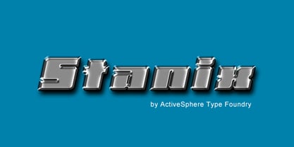
- Station by Kimmy Design,
$15.00 Station is a bold headline typeface inspired by old Train Station type and graphics. It can be used in a modern and retro way, and its different patterns and styles give a unique look to any design.
 - Glatic by Yukita Creative,
$14.00 Introducing Glatic Typeface, a fancy bold font. Its unique construction is inspired by nature and all things beautiful. It's meant for graphic designers and typography professionals to get more done with style in mind! This font will go well with logos, headlines, titles, and minimal layouts. Features. - Fonts can be read from a much larger distance than regular fonts - Elegant letters give the impression of luxury - Smooth curves for elegant typography - Supports all languages in the world (37) - Versatile Single Font. - One font for all needs. Recommended use Play with your letter spacing to add more class to your designs.
 - Scatio by Wahyu and Sani Co.,
$16.00 Scatio is squarish with vertical terminal cut, a multi-purpose sans serif which can be use for many kind of graphic design projects. The Light, Regular and Medium weight have good legibility for text, the bolder and lighter weights can be used for headlines, display, posters, and more. Each members of the Scatio family contains 400+ glyphs which covers Western and Eastern Latin based languages. Each font is also equipped with some useful OpenType Features, such as: Fraction (frac) Numerator (numr) Denominator(dnom) Standard Ligatures (liga) Localized Forms (locl) Ordinals (ordn) Proportional and Tabular Lining (pnum & tnum) Superscript and Subscript (sups & subs) Scientific Inferior (sinf)
 - Stgotic by Latinotype,
$10.00 Stgotic, designed in 2006, was the first digital font designed by Daniel Hernández. It is a blackletter typeface designed for low resolution screen devices. Stgotic was designed to be seen at 8 pts (and multiples of 8). In the year 2006, it was recognized as the best screen font by the TipoGráfica magazine in the context of the Bienal de Letras Latinas.
 - Stabia by Eurotypo,
$29.00 Stabia is a multi-purpose typeface with large wedge-angular serifs. It is delicate and highly readable at very small sizes but reveals all its strength and personality when used at big sizes. The contrast of the sharped serifs provides a fresh and very contemporary look. The family has 5 weights, ranging from Light to Black (including italics) and is ideally suited for advertising and packaging, book text, editorial and publishing, logo and branding, small text as well as web and epub. Stabia provides advanced typographical support with features such as ligatures, small capitals, alternate characters, case-sensitive forms, fractions, and super- and subscript characters. It comes with a complete range of figure set options – oldstyle and lining figures, each in tabular and proportional widths. As well as Latin-based, the typeface family also supports Central European languages. Stabiae was an ancient Roman town, located close to the modern town of Castellammare di Stabia approximately 4.5 km southwest of Pompeii. According to the account written by his nephew, Pliny the Elder was at the other side of the bay in Misenum when the Mount Vesuvius eruption started. He travelled by galley ship across the bay, partly to observe the eruption more closely, and partly to rescue people from the coast near the volcano. Pliny died at Stabiae the following day, probably during the arrival of the sixth and largest pyroclastic surge of the eruption caused by the collapse of the eruption plume.
 - Stratic Script by Nootype,
$35.00Stratic Script is an elegant family of seven fonts, all based on handwriting. The main idea was to create a script font with almost no contrast, easy to use and quite legible. The design is flawless, every letter is carefuly connected to another, in all fonts. The 6 weights, which are very close to each other, allow the designer to choose precisely the weight he needs. It’s an ideal font for fashion magazines, posters, book covers, etc… This family contains OpenType features, such as Proportional Figure, Tabular Figures, Standard & Discretional ligatures. - As seen on TV - Unknown license

- State by Device,
$29.00 A futurist inspired geometric stencil in clean and rough versions. This design approach was distilled into a more regular typeface in Futura Black; State takes its inspiration from the more eccentric designs that predated that font.
 - Stoic by Up Up Creative,
$29.00 Introducing Stoic, a bold, full-featured script font with tons of OpenType features. With its smooth connections and considerable charm, Stoic is perfect for logos, wedding invitations, stationery design, branding projects, photo overlays, editorial features, and more. Stoic comes with more than 550 glyphs! Specific OpenType features include contextual alternates, stylistic alternates, initial and final forms, multiple alternate glyphs for many letters (accessed through the glyphs panel), multilingual support (including multiple currency symbols), three ampersands, 101 standard and discretionary ligatures, and standard numbers. The OpenType features can be very easily accessed by using OpenType-savvy programs such as Adobe Illustrator and Adobe InDesign. (To access these awesome features in Microsoft Word, you'll need to get comfortable with the advanced tab of Word's font menu.)
 - Satin by Lizzy Hartley Design,
$32.00 This simple design keeps its elegance through slight curves like satin draped over skin. Satin is tall and sleek. The curves are not completely symmetrical. The curves are perfectly balanced with long curves on the bottom half and shorter more dramatic curves in the ascenders.
 - Status by SoftMaker,
$9.99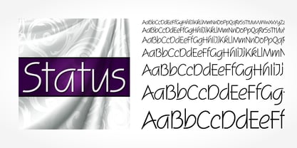 Status is a script typeface published by SoftMaker.
 - Status by FaceType,
$18.00 Status is a hybrid of a super fat alphabet and ultra light figures and other special glyphs.
 - As seen on TV Skew - Unknown license

- Station 232 - Unknown license

- Spastic BRK - 100% free

- Tube Station - Unknown license

- Railway Station by Jeff Levine,
$29.00 The hand lettered title on the 1911 sheet music for “That Railroad Rag” was designed in a block style letter with spurred serifs. This simple typographic layout evokes the imagery of early rail transportation although the song itself is was a ‘modern’ composition of then-popular ragtime music. Railway Station JNL is available in both regular and oblique versions.
 - Union Station by Matteson Typographics,
$19.95 Union Station is based on the transit scroll lettering displayed in Denver’s Union Station. The letter shapes are reminiscent of grotesque sans serif typefaces of the same era with quirky details left by the artist’s brush. The typeface gives a sense of rugged Americana and a handcrafted spirit.
 - Pirate Station by Oleg Stepanov,
$16.00 Pirate Station is the hand-drawn font made with brush. It is good for games, cartoons, posters, children's books, and whenever you want to see grimy and funny but yet readable typeface.


Page 1 of 35Next page