10,000 search results
(0.032 seconds)
- Wicked Sick by Forberas Club,
$16.00 Wicked Sick is handwritten font. Will be nice if you application this font for book cover, tees, movie, poster and many more.
 - MAWNS rock - Personal use only

- Mawns Rock by Mans Greback,
$59.00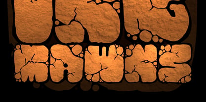
- Scrapt Script by Brainware Graphic,
$12.00 ScraptScript is a classic casual script typeface inspired by signpainter and autotechno typography, developed with a little bit bold and contrast on horizontal stroke. Comes with a lot of opentype features, ScraptScript also supports multilingual covering Latin based language (Latin Extended-A & Latin Extended Additional), including Celtic, Sami, Maltese, Turkish, England, USA, Germany, France, Italy, Poland & etc. ScraptScript would be nice on logo design, posters, etc. with any design characteristic.
 - Rick Veitch by Comicraft,
$39.00 For our latest Master of Comic Book Art, Roarin' Rick Veitch, we've created a Brat Pack of fonts worthy of a Maximortal! This is The One! This will make your Heartburst! If you Can't Get No Rick Veitch between 1941 and 1963, wipe that Swamp Thing off America's Best Greyshirt, because this font is nothing short of A Miracle, Man! It's Epic! Abraxas and the Earthman and your Army @ Love recommend it.
 - TT Ricks by TypeType,
$19.00 Attention! Important information! There is no Cyrillic support in TT Ricks! TT Ricks useful links: Specimen | Graphic presentation | Customization options About TT Ricks: We are glad to present you the new font TT Ricks, which continues the line of trendy and yet affordable TypeType Starter Kit fonts. TT Ricks is a flamboyant elzevir-type serif, for which the words “cute” or “calm” are not a fitting definition. TT Ricks can be classified as a display title typeface that works especially well at large and medium sizes in packaging design, book graphics and posters. The typeface is inspired by the pre-digital font “De Vinne”, which was designed in 1892 by the designer Gustav F. Schroeder. We liked certain aspects of the historical prototype, but at the same time, when creating TT Ricks, we did not want to limit ourselves—on the contrary, we were eager to discover a completely new spirit and bring bright details to the font. The TT Ricks typeface stands out for its strong contrast, noticeable sharp serifs, narrow letterforms with a pronounced displacement of flows in the arches. The typeface has very dense spacing, and in the bold style, the text set begins to resemble Gothic by its richness and tension. Important visual features of TT Ricks are the dashing shapes of ascenders and descenders, the thin and sharp stroke endings, and the “elzevier legs” of the letters R K k. In the lowercase round characters c e s, you can notice the pronounced slope of the oval, which contrasts with the general set of the font. These "slanted" signs and ascenders and descenders of the letters f and y are designed to cut the monotony of a set and to entertain the reader's eyes. The TT Ricks typeface consists of three weights (Regular, Medium, Bold) and one variable font. Each style consists of 553 glyphs and contains 18 OpenType features. The most interesting features are stylistic alternates for the letters R K k with alternative short leg shapes, two sets of figures for working with upper and lower case characters, and a set of original icons that further reveal the spirit of the family. Please note! If you need OTF versions of the fonts, just email us at commercial@typetype.org Attention! Important information! There is no Cyrillic support in TT Ricks! TT Ricks OpenType features: aalt, ccmp, locl, numr, ordn, tnum, onum, lnum, pnum, case, liga, calt, ss01, ss02, ss03, ss04, ss05, ss06 TT Ricks language support: Acehnese, Afar, Albanian+, Aleut (lat), Alsatian, Aragonese, Arumanian+, Asu, Aymara, Azerbaijani +, Banjar, Basque +, Belarusian (lat), Bemba, Bena, Betawi, Bislama+, Boholano+, Bosnian (lat), Breton +, Catalan+, Cebuano+, Chamorro+, Chichewa, Chiga, Colognian+, Cornish, Corsican +, Cree, Croatian, Czech+, Danish, Dutch+, Embu, English+, Esperanto, Estonian+, Faroese+, Fijian, Filipino+, Finnish, French, Frisian, Friulian+, Gaelic, Gagauz (lat), Galician+, Ganda, German+, Gikuyu, Guarani, Gusii, Haitian Creole, Hawaiian, Hiri Motu, Hungarian+, Icelandic+, Ilocano, Indonesian+, Innu-aimun, Interlingua, Irish,
 - Rick Griffin by K-Type,
$20.00 The Rick Griffin fonts are based on the 1960s psychedelic poster lettering of the Californian artist. Rick Griffin is the regular font without outlines. The Rick Griffin Contour font has the additional outline characteristic of many Griffin posters, and the matching Rick Griffin Contour Ground font can be overlapped to create bicolor artwork.
 - Fan Script by Sudtipos,
$99.00 A friend of mine says that sports are the ultimate popular drug. One of his favorite things to say is, “The sun’s always shining on a game somewhere.” It’s hard to argue with that. But that perspective is now the privilege of a society where technology is so high and mighty that it all but shapes such perspectives. These days I can, if I so choose, subscribe to nothing but sports on over a hundred TV channels and a thousand browser bookmarks. But it wasn't always like that. When I was growing up, long before the super-commercialization of the sport, I and other kids spent more than every spare minute of our time memorizing the names and positions of players, collecting team shirts and paraphernalia, making up game scenarios, and just being our generation’s entirely devoted fans. Argentina is one of the nations most obsessed with sports, especially "fútbol" (or soccer to North Americans). The running American joke was that we're all born with a football. When the national team is playing a game, stores actually close their doors, and Buenos Aires looks like a ghost town. Even on the local level, River Plate, my favorite team where I grew up, didn't normally have to worry about empty seats in its home stadium, even though attendance is charged at a high premium. There are things our senses absorb when we are children, yet we don't notice them until much later on in life. A sport’s collage of aesthetics is one of those things. When I was a kid I loved the teams and players that I loved, but I never really stopped to think what solidified them in my memory and made them instantly recognizable to me. Now, thirty-some years later, and after having had the fortune to experience many cultures other than my own, I can safely deduce that a sport’s aesthetic depends on the local or national culture as much as it depends on the sport itself. And the way all that gets molded in a single team’s identity becomes so intricate it is difficult to see where each part comes from to shape the whole. Although “futbol” is still in my blood as an Argentinean, I'm old enough to afford a little cynicism about how extremely corporate most popular sports are. Of course, nothing can now take away the joy I got from football in my childhood and early teens. But over the past few years I've been trying to perceive the sport itself in a global context, even alongside other popular sports in different areas of the world. Being a type designer, I naturally focus in my comparisons on the alphabets used in designing different sports experiences. And from that I've come to a few conclusions about my own taste in sports aesthetic, some of which surprised me. I think I like the baseball and basketball aesthetic better than football, hockey, volleyball, tennis, golf, cricket, rugby, and other sports. This of course is a biased opinion. I'm a lettering guy, and hand lettering is seen much more in baseball and basketball. But there’s a bit more to it than that. Even though all sports can be reduced to a bare-bones series of purposes and goals to reach, the rules and arrangements of baseball and basketball, in spite of their obvious tempo differences, are more suited for overall artistic motion than other sports. So when an application of swashed handlettering is used as part of a team’s identity in baseball or basketball, it becomes a natural fit. The swashes can almost be visual representation of a basketball curving in the air on its way to the hoop, or a baseball on its way out of the park. This expression is invariably backed by and connected to bold, sleak lettering, representing the driving force and precision (arms, bat) behind the artistic motion. It’s a simple and natural connective analysis to a designer, but the normal naked eye still marvels inexplicably at the beauty of such logos and wordmarks. That analytical simplicity was the divining rod behind Fan Script. My own ambitious brief was to build a readable yet very artistic sports script that can be a perfect fit for baseball or basketball identities, but which can also be implemented for other sports. The result turned out to be quite beautiful to my eyes, and I hope you find it satisfactory in your own work. Sports scripts like this one are rooted in showcard lettering models from the late 19th and early 20th century, like Detroit’s lettering teacher C. Strong’s — the same models that continue to influence book designers and sign painters for more than a century now. So as you can see, American turn-of-the-century calligraphy and its long-term influences still remain a subject of fascination to me. This fascination has been the engine of most of my work, and it shows clearly in Fan Script. Fan Script is a lively heavy brush face suitable for sports identities. It includes a variety of swashes of different shapes, both connective and non-connective, and contains a whole range of letter alternates. Users of this font will find a lot of casual freedom in playing with different combinations - a freedom backed by a solid technological undercurrent, where OpenType features provide immediate and logical solutions to problems common to this kind of script. One final thing bears mentioning: After the font design and production were completed, it was surprisingly delightful for me to notice, in the testing stage, that my background as a packaging designer seems to have left a mark on the way the font works overall. The modern improvements I applied to the letter forms have managed to induce a somewhat retro packaging appearance to the totality of the typeface. So I expect Fan Script will be just as useful in packaging as it would be in sports identity, logotype and merchandizing. Ale Paul
 - NT Brick Sans by Nurrontype,
$17.00 Back to the future! NT Brick Sans is a pixelated sans serif. Inspired by the Pixel Art phenomenon and Lego bricks, bringing back the good old 16-bit era with open-type features. It's bold, soft rounded, supports multi-language, featuring low caps option. Brick Sans will make your project special. Grab it now.
 - Rickles - Personal use only

- Rock - Unknown license

- Prick - Unknown license

- KICK!!!!! - Unknown license

- [.sickness.] - Unknown license

- Sickness - Unknown license

- risk - Unknown license

- Rijk by Wilton Foundry,
$39.00 The font name comes from the Dutch word "Rijk" meaning "rich". I'd like you to consider Rijk as a good Pinot Noir: medium bodied, offering succulent juicy berry flavors, accentuated by delicate aromas of coffee and vanilla oak. Ruby red in color, it boasts of velvety tannins and a long fulfilling fruity aftertaste. Rijk has a structure that is delicate and fresh. The aromatics are very fruity like cherry, strawberry, and plum, often with notes of tea-leaf, damp earth, or worn leather… My intent was to create a script that is rich, while not overbearing. It will serve many noble and useful purposes because of its fresh and lively texture. It is also very legible because it has a slightly more upright angle. Use Rijk for headlines, packaging, identities, advertising and online. Available in OpenType, it includes a range of ligatures as well as a full range of class kerning.
 - Bricked by Cristian Mielu,
$9.00 Bricked is a font family, containing 3 weights: Bolt, Regular and Light, plus their Italic versions, results in a total of 6 styles, 375 glyphs each one of them. The shapes of Bricked font, are borowed from the straight lines of the bricks, as the name says. Bricked is created to suit perfectly as a logo font for a construction company, ingineering company, auto garage, and many other activities with a relative profile, but not only, Bricked can be versatile and can be a perfect choice for other type of businesses to. Bricked supports a wide variety of Latin from Latin0 to Latin10, Windows Latin and Macintosh Latin.
 - Prick by Burghal Design,
$29.00Sharper than a cactus patch, the thorny Prick is perfect for the Goth or Heavy Metal fan that lies dormant in us all. - Hicked by Craft Supply Co,
$20.00 Introduction to Hicked – Slab Serif Font Hicked is a bold, slab serif font, ideal for impactful design work. Its masculine appearance gives it a strong presence. This font stands out in headings, logos, and posters. It’s perfect for anyone seeking a robust typeface. Design Features Hicked features thick, block-like serifs that command attention. Its balanced letterforms ensure readability at various sizes. The font has a uniform stroke width, offering a cohesive look. Each character is carefully crafted for visual harmony. Usability and Versatility Hicked excels in both print and digital media. Its clarity makes it readable even in smaller sizes. This font is versatile, suitable for branding, advertising, and editorial design. It can adapt to a wide range of design projects effortlessly.
 - Rilke by Pelavin Fonts,
$20.00 Rilke, is the lettering used by Gustav Klimt on the 1st Vienna Secession poster in 1898 and is named for Klimt’s contemporary the poet Rainer Maria Rilke. The Vienna Secession was a group of artists whose motto was "to every age its art and to art its freedom." Their goal was to create a new style not based upon any historical influence. Its subtle curving strokes and the idiosyncratic set of the various characters create an elegant lightness which lends itself well to poetry, inscription
 - Rockness by MlkWsn,
$19.00 Rockness is a brush script that is written casually and quickly. Letters are made with brushes on paper. Then scanned and carefully drawn into vector format. That is why Rockness has charming, authentic and relaxed characteristics. It has 2 styles, regular and slant variations, with a more natural look to your text. You can activate Ligature and Alternates in the OpenType panel to make these two styles. It also has many alternatives and underlines that make your text and design more interesting. Rockness perfect for homeware designs, branding projects, logo design, quotes, product packaging - or simply as a stylish text overlay to any background image
 - Kicks by Adriprints,
$5.00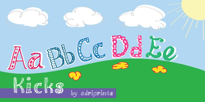
- Mick by Oleg Stepanov,
$12.00 Mick is a hand-drawn typeface inspired by graffiti works of old style. The family contains Regular and Light styles. Cyrillic and extented latin character sets.
 - Rice by Font Kitchen,
$9.99 Everything is better with Rice! Stylized inktraps, square-ish curves, and a strong, savory flavor make this superfamily an easy-to-use treat in your kitchen. Versatile enough for whatever you'll be cooking up next, Rice is available in a whopping 130 styles, each locally grown and harvested. Raised with stylistic alternates, fractions, tabular and lining figures, hand-kerned pairs, ligatures, and arrow figures that are great for signage, Rice is a strong, welcome addition to your typographic menu that will bring structure and body to anything it's served with.
 - Krick by FoxType,
$30.00 Introducing Krick Display new generation Typeface with 4 Weights. Krick Typeface created with the vision of to attract the audience to your brand . The finest details of this typeface are methodically and mathematically created. Krick is created with all the tasks of a corporate font and also for the usage in a variety of projects, including branding, logos, titles, headlines, servers, posters, screens, display, digital ads, and everything else. We are putting a lot of effort on this font as a long-term project. The Typeface includes four Weights. Regular, Medium, SemiBold, and Bold.
 - Pea Amy*Rica Script - Unknown license

- Sans Skript by Felitasari Rekso,
$25.00 Sans-Skript is a display typeface that is inspired by Javanese Script (or Sanskerta in Bahasa Indonesia). Javanese script is one of Indonesia’s many traditional scripts that were commonly used by Javanese people from mid-15th CE to mid-20th CE. Though not commonly used anymore, it is still taught and used in cities across East and Central Java. Sans-Skript translates the high-contrast, modular and organic features of the Javanese Script into the Latin alphabet. (Hence the not-script naming) The typeface is aimed to be used for large format prints, above 100 pt, and can be used alongside Javanese script. Typefaces that pair nicely mimic features of Javanese script, and Hatton by Pangram Pangram Foundry is an example.
 - Mac Sans by Jolicia Type,
$15.00 Introducing Mac Sans: The Perfect Blend of Firmness and Uniqueness Elevate your design projects with Mac Sans, a modern sans serif font that effortlessly combines a strong, authoritative presence with a distinctive character that sets it apart from the crowd. Key Features: Firm Yet Friendly: Mac Sans strikes the perfect balance between a bold, assertive statement and an inviting, approachable style. Its sturdy letterforms convey confidence without sacrificing approachability. Unique Personality: While many sans serif fonts may seem interchangeable, Mac Sans stands out with its one-of-a-kind personality. Each character has been meticulously crafted to ensure that your designs are memorable and captivating. Versatile Design: Whether you're working on a professional presentation, branding materials, web design, or a creative project, Mac Sans adapts effortlessly to various contexts. Its clarity and readability make it suitable for both headlines and body text. Extensive Character Set: Mac Sans includes a comprehensive set of characters, including uppercase and lowercase letters, numerals, punctuation marks, and special symbols. It also supports multiple languages, making it a truly global typeface. 4 Weights: Choose from a range of weights to suit your design needs, from the bold and commanding "Mac Sans Bold" to the sleek and sophisticated "Mac Sans Regular." Mix and match to create dynamic typographic processes. Easy to Use: With a user-friendly design, Mac Sans is a breeze to work with in various design software and applications. It ensures a smooth workflow and consistently outstanding results. Endless Possibilities: Whether you're designing logos, posters, websites, or print materials, Mac Sans empowers you to explore a world of creative possibilities. Its unique character injects personality into your projects, making them truly stand out. Elevate your typography game and leave a lasting impression with Mac Sans. Its firm yet unique character is sure to make your designs shine. Discover the versatility and distinctiveness of Mac Sans today, and let your creativity soar.
 - Strikt Sans by Nootype,
$40.00 The idea behind Strikt Sans was to made a grotesque family with exaggerated curves combined with low contrasted aspect. Letters such as G, S or C are completely closed in any styles. The italic has a very accentuated angle at 30°, which gives a stressed and interesting appearance. This family contains many OpenType features, such as Alternates, Proportional Figure, Tabular Figures, Old Styles Figures, Numerators, Superscript, Denominators, Scientific Inferiors, Subscript, Ordinals and Fractions, which make that typeface useful in various projects. Strikt Sans family supports Latin and Cyrillic, all these languages are covered: Latin language support: Afar, Afrikaans, Albanian, Asturian, Azeri, Basque, Bosnian, Breton, Bulgarian, Catalan, Cornish, Corsican, Croatian, Czech, Danish, Dutch, English, Esperanto, Estonian, Faroese, Filipino, Finnish, Flemish, French, Frisian, Friulian, Gaelic, Galician, German, Greenlandic, Hungarian, Icelandic, Indonesian, Irish, Italian, Kurdish, Latin, Latvian, Lithuanian, Luxembourgish, Malagasy, Malay, Maltese, Maori, Moldavian, Norwegian, Occitan, Polish, Portuguese, Provençal, Romanian, Romansch, Saami, Samoan, Scots, Scottish, Serbian, Slovak, Slovenian, Spanish, Swahili, Swedish, Tagalog, Turkish, Walloon, Welsh, Wolof Cyrillic language support: Adyghe, Avar, Belarusian, Bulgarian, Buryat, Chechen, Erzya, Ingush, Kabardian, Kalmyk, Karachay-Balkar, Karakalpak, Kazakh, Komi, Kyrgyz, Lak, Macedonian, Moldovan, Mongol, Permyak, Russian, Rusyn, Serbian, Tatar, Tofa, Tuvan, Ukrainian, Uzbek
 - 84 Rock! - Personal use only

- Kicking Limos - Unknown license

- Rice Cracker - Unknown license

- Alcohol Licks - Unknown license

- Glagol Rock - Unknown license

- ROCK MODUS - 100% free

- Hau Ruck - Unknown license

- Kick Assinger - Unknown license

- MW BRICK - Personal use only

- BN-Rock - Unknown license


Page 1 of 250Next page