10,000 search results
(0.012 seconds)
- Post Human - Personal use only

- Post Industrial by TypeArt Foundry,
$45.00
- Helmswald Post by Sharkshock,
$125.00 Helmswald Post is a handsome Blackletter that's been years in the making. There's a mix of wispy terminals, flamboyant caps, and the use of negative space to create contrast. Elements from High German, Old English, and many other styles make their way into this gorgeous display font. The result is a medieval looking script with cleaner, more modern feel. In addition to European accents Helmswald Post is equipped with Cyrillic, alternates and ligatures. Old world numerals are present by default but may be substituted by accessing the stylistic sets. Use it for a book cover, web headings, or a restaurant logo.
 - Post Box by Great Scott,
$16.00 Written in a ballpoint pen style POST BOX is a neighborly sans serif is slightly condensed and slanted. Scribbled quickly but readable. Exact but still human. Perfect for print, package and display use. You can also use it in shorter paragraph text.
 - Pigeon Post by Hanoded,
$15.00 I have no particular love for pigeons, but I read an interesting article about war pigeons being used to send messages to an fro. One pigeon (called William of Orange) even saved more than 2000 soldiers during the Battle of Arnhem. Pigeon Post is a lovely cartoon and kids font. It comes in a sans and a serif style, so there’s really no excuse for not using it!
 - Postre by Fenotype,
$25.00 Tasty and sweet, Postre is a sleek high contrast serif type with certain Art Nouveau influence. Postre is excellent for headlines, packaging, posters and any other display use conveying an elegant impression. Postre is equipped with a selection of 50 alternate characters set in Swash, Stylistic and Titling Alternates, as well as standard ligatures.
 - Ponte by SilkType,
$47.50 Ponte is a high-contrast display typeface with smooth serifs, designed for impactful headlines. The ten-style typeface features over 80 decorative ligatures, with roman and italics available in five weights, ranging from extra light to bold. This offers a variety of options for sophisticated design applications. Elevate your compositions with Ponte's timeless elegance and aesthetic precision.
 - Positively by Hatftype,
$15.00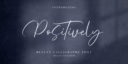 Positively - Beauty Calligraphy Font is a font with distinctive handwritten characters perfect for branding projects, logos, wedding designs, media posts, advertisements, product packaging, product designs, labels, photography, watermarks, invitations, stationery, and any project who need handwritten dishes. Features : • Character Set A-Z • Numerals & Punctuations (OpenType Standard) • Accents (Multilingual characters) • Ligature Multilingual Support : Afrikaans, Albanian, Asu, Basque, Bemba, Bena, Catalan, Chiga, Cornish, Danish, English, Estonian, Faroese, Filipino, Finnish, French, Friulian, Galician, German, Gusii, Icelandic, Indonesian, Irish, Italian, Kabuverdianu, Kalenjin, Kinyarwanda, Low German, Luo, Luxembourgish, Luyia, Machame, Makhuwa-Meetto, Makonde, Malagasy, Malay, Manx, Morisyen, North Ndebele, Norwegian Bokmål, Norwegian Nynorsk, Nyankole, Oromo, Portuguese, Romansh, Rombo, Rundi, Rwa, Samburu, Sango, Sangu, Scottish Gaelic, Sena, Shambala, Shona, Soga, Somali, Spanish, Swahili, Swedish, Swiss German, Taita, Teso, Vunjo, Zulu. There it is! I really hope you enjoy it.
 - Port by Onrepeat,
$25.00 Detailed guided tour available here. Port is an experimental Didone typeface with a modern twist, inspired in the well known forms of typography masters such as Bodoni and Didot and the exuberance and elegance of calligraphy typefaces. Port melds the straight lines and strong contrasts of the Didone typefaces with the elegant lines of calligraphy in a geometric way, resulting in exuberant characters with geometric swashes that can be combined in countless ways. The result of this experiment is Port, an unique and rich display typeface meant to be used on big sizes and it’s main perk is the amount of alternative characters it features. Port is Open-Type programmed and includes hundreds of alternates, from swashes to titling alternates, ligatures and stylistic sets with each character having a thin version of itself, giving complete freedom to all your creative needs. Port is available in several flavours: Port Regular, being the base version and featuring the whole base character set; Port Regular Decorated, featuring richer forms and containing more ornamentated and more extravagant characters; Port Medium and Port Medium Regular, designed for the occasions you need a bit more thickness and the decoration variants: Port Ornaments, containing a wide set of elements meant for the creation of fillets, vignettes and fleurons, resulting in an almost infinite number of possible combinations to embellish your designs and Port Words, a set of some of the most common words used in English, Spanish, French, German, Italian and Portuguese. It’s strongly recommended that you use it on big sizes, for better performance you can also set the Photoshop text anti aliasing settings to Strong when you type, for a better understanding of all the uses of Port and the full character list I recommend the reading of the manual.
 - Porte by Groteskly Yours,
$18.00 - Unique Modernist Look - 590+ characters per font - Standard & Discretionary Ligatures - Multiple Stylistic Sets - Old Style Figures - Case-Sensitive Punctuation - Multilingual - Cyrillic Included - Uppercase + Lowercase Porte is an elegant sans serif font inspired by stone carving and modernist typefaces of early 20th century. While at its core Porte is a display font, it can also be used for larger bodies of text and in a variety of projects. Thanks to its unique proportions and feel Porte is reminiscent of early 20th century type, wherein aesthetic qualities often overweighed matters of practicality and applicability. Porte is at once delicate and sturdy, subtle and unyielding. Porte is very OpenType friendly, boasting an awesome selection of useful OpenType features, precise and exhaustive kerning (around 1000 pairs) and lots of discretionary ligatures to make your designs look amazing. A selection of wider and narrower alternate glyphs allow the designer to modify the rhythm of the typeface, extending its application and impact. With 590+ characters on board, Porte supports all major Latin based languages as well as a number of Cyrillic languages. Porte received its first major update in fall 2022. Not only was the character set expanded considerably, but also some glyphs were re-drawn to fix visual inconsistencies, and a large number of stylistic alternates was added. The kerning, too, was re-done to accommodate new letterforms. Trials available upon request.
 - Posy by kapitza,
$49.00 Posy is a flower font inspired by the plant Sison Amomum or Stone Parsley. We find its structure utterly beautiful, and it inspired us to create the 52 cute graphic illustrations which make up this font. The various sizes of illustrations in this font make it easy to create stunning compositions.
 - Posh by Lián Types,
$49.00 I've always been in love with fat didones. That’s the reason of Posh. In search of something unique, I started this family back in 2013 with the aim of creating the fattest yet readable bodonian typeface in the market: It was a challenge, because roman fonts need generous counters (or what some call white spaces) and taking them to the extreme of inexistence attempted against the construction of many glyphs. Ears, dots, terminals and serifs always need some extra space so I had to find the exact point of boldness to make characters which have those attributes work well in the middle of those which haven't. (1) After a while, I felt I was again ‘in my element’: Big contrasted letters, sexy and elegant curves, and that Lubalinesque feeling that characterise my fonts. (2) Words written with Posh are a explosion of elegance and sensuality due to the fact that its didone attributes were exaggerated. Since it’s full of alternate glyphs, one can change and choose them until a nice block of ‘‘black’’ is achieved. (3) To accompany the regular style, I designed Posh Inline, a font with the same quantity of glyphs than the regular one; an all caps style called Posh Capitals, and also a really playful Italic version. I hope you find this one delicious like I do! This font is dedicated to all who understand letters are not just meant to be read, but also to be appreciated in group and individually. Enjoy it. NOTES (1) In example, it can be easy to design a fat letter ‘n’ with almost no counter, but really tough to make a satisfactory letter ‘s’ with serifs to match that ‘n’. (2) Also, it wasn't my first attempt in fat didones. Take a look at my font Reina, made in 2012. (3) Posters above show many words with ball terminals that seem to dance above and below the words in order to fill those “undesired” blank spaces.
 - Posie by Great Lakes Lettering,
$30.00 Posie is a hand made font created in Procreate by MJ herself. It's a fun and whimsical font that would be perfect for greeting cards, toys, picture books or anything that requires a naive sensibility
 - Movie Poster - Unknown license

- Movie Star - Unknown license

- Movie Poster - Unknown license

- Movie Poster - Unknown license

- Movie Times - Unknown license

- Movie Poster - Unknown license

- Movie Script by Wiescher Design,
$39.50 Movie Script is the script that was used in German movie-brochures. Those were small four page leaflets with a lot of sepia-colored pictures about the movie one was about to see. Today those things are collectors items. The script was also used on those hand-painted posters above the cinema entrance. I cleaned up the old script and made it just a little bit more readable, but overall I left it as it was. Of course I added the necessary glyphs for today's world, like Euro and so on. When I was a kid, my grandfather gave me 1 German Mark and I could go to the movies matinee, that was around 10:30 in the morning, the entrance cost something like 60 Pfennig and the rest was for peanuts and a drink. Still today I love my grandfather for that, movies introduced the world to me (no TV then). Your grandfather-loving designer Gert Wiescher
 - B-Movie by T-26,
$29.00 - Moby - Unknown license

- Moby - Unknown license

- Mories by MlkWsn,
$15.00 Mories is an elegant display serif with unique letter shapes to complete any designs, especially in fashion, branding, and for logos.
 - Moby by Beware of the moose,
$15.99 Moby is based on a grid of squares and has four different variations – from sharp corners to rounded with two steps in between. The letter is playful despite its grid and has the most common punctuation marks making the moby usable in most western european languages ... and even usable for Icelandic texts. The letter is named after my dog, the cutest Barbet (French water dog) in the world.
 - Moris by Katatrad,
$29.00 Moris™ is a family of modern sans serif typeface with simple and condensed proportions. Moris is recommended for publication, screen and Corporate use. This new font family includes nine weights with true italics, numeric tabular function and Opentype features.
 - Moki by FaceType,
$25.00 The seven ways of Moki. Moki comes in seven different styles: Base, Cut, Dust, Lean, Mono, Soft and Uni. Moki is a display expert – with a wide range of languages covered, the family offers a style for every purpose. You are a SciFi movie director and are looking for an alternative to the inevitable Eurostile? Now you have!
 - Post Production JNL by Jeff Levine,
$29.00 A title card listing the supporting cast of the 1950 Humphrey Bogart and Gloria Grahame drama “In a Lonely Place” provided the hand lettered slab serif type design that served as the model for Post Production JNL – available in both regular and oblique versions.
 - Lamp Post JNL by Jeff Levine,
$29.00 Lamp Post JNL is a digital interpretation of a design popular in the early 1900s called Post Old Style; no doubt inspired by a certain Saturday periodical with a similar name. There is an intrinsic charm to lettering that evokes a hand-made look, and this design is a perfect example of the genre. Available in both regular and oblique versions, it will add the nostalgia of simpler times to any print or web project.
 - Fence Post JNL by Jeff Levine,
$29.00 The inspiration for Fence Post JNL comes out of an early 1900s manual for sign writing. A number of changes were made to make the design more aesthetically pleasing, but it retains its novelty effect of evoking the look of wooden fence posts or Western-themed typography.
 - DB Post Master by Illustration Ink,
$3.00DB Post Master combines the vintage feel of history with a unique style. This DoodleBat makes great adornments to cards, letters, or just a fun scrapbook page. - DB Post Stamp by Illustration Ink,
$3.00DB Post Stamp is a fun DoodleBat designed after a post office stamp and the distressed look gives it a unique style. - Port Credit - Unknown license

- Lost Forever - Unknown license

- Positive Nhilism - Unknown license

- Lost World - Unknown license

- SCSI Port - Personal use only

- Poft Sarade - Unknown license

- Quoted Positivity - Unknown license

- Lane - Posh - Personal use only


Page 1 of 250Next page