6,425 search results
(0.04 seconds)
- london 2012 - Personal use only

- Olympukes 2012 by Barnbrook Fonts,
$30.00 Released on the occasion of the 2012 London Olympics, Olympukes 2012 was a new set of pictograms telling the ‘real’ story of the Olympics and extending the unofficial project that began in 2004. The occasion of the London games provided an opportunity to revisit the complex contradictions of the modern Olympics and to acknowledge the geopolitical shifts of the intervening eight years. The 2012 games arrived at a time of great economic and political uncertainty for the nation and Europe. Greece – the host of the 2004 games – was now located at Ground Zero of a disintegrating Eurozone and the United Kingdom was two years into a programme of austerity enacted by the coalition government of Conservatives and Liberal Democrats. Given that the previous London Olympics had been held in 1948, in a climate of recovery and austerity after a devastating World War (1948’s Olympiad was dubbed the ‘Austerity Games’) there was a sick irony to the 2012 games' arrival. The suppression of human rights in order to deliver the perfect games for PRoC’s Beijing games shocked no-one and yet, in London, the security measures seemed grossly excessive. Then again, in a country with an estimated 1.8 million cctv cameras, perhaps we shouldn’t have been so surprised. Another aspect of the Olympics that returned for 2012 was the unfettered commercialism – if you think the Games are about pure sport, about noble human endeavour, think again. Please note that Barnbrook Fonts is in no way affiliated with, or has received any endorsement from, the International Olympic Committee, the organising committees of the Olympic Games, or any national Olympic committee.
 - Puls 2012 by Jovan Ivanov,
$20.00
- Commando 2011 - 100% free

- 2011 Slimtype by GLC,
$42.00 This light manual font, with two styles, is a looking like slab serif or typewriter pattern. It is containing Western and Northern European, Icelandic, Baltic, Eastern, Central European and Turquish specific characters, plus old style numerals, ct, st and f standard ligatures. The two styles are both legible from 10-11 pts.
 - Megaflakes 2011 by Baseline Fonts,
$20.00 Megaflakes™ 2011 is a geometric set. Looks like this might become a tradition for Baseline Fonts. They are terribly fun for the holidays as well as Christmas in July.
 - SlabFace 2010 - 100% free

- Megaflakes 2010 by Baseline Fonts,
$20.00 Snowflakes and doodles to complement any design on the fly.
 - BDRmono 2021 by Typedifferent,
$15.00 Büro Destruct’s «BDR mono» typeface has a long tradition in the font library of typedifferent. Initially designed by Lopetz as a single weight, monospaced Mac PostScript Type 1 font way back in 1999, it got a first update as a little family with light, regular and bold weights, plus an extended glyphs set in Opentype format during 2006. With this 2021 update the typeface received a second rounded family and a complete glyphs set with all needed characters used in the north, east, south and west of Europe. The «BDR mono 2021» serves great in signage, routing people, architecture, technical plans, manuals, or even science and fiction related communications.
 - DIN 2014 by ParaType,
$47.00 A contemporary interpretation of the famous DIN typeface. Regular style suits for long texts, while Light and Bold variations work well in large sizes. The typeface includes 24 styles: 6 upright and 6 normal-width italics, as well as 6 Narrow and 6 Condensed styles. The typeface was designed by Vasily Biryukov and released by Paratype in 2015. The set of Condensed styles was added by Alexander Lubovenko and Isabella Chaeva in 2022.
 - Impact 2010 by Microsoft Corporation,
$89.00 - Basica v.2012 - Personal use only

- 2011 Slimtype Sans by GLC,
$42.00 This light manual font, with two styles, is the sans serif version of our slab serif "2011 Slimtype". It is containing Western and Northern European, Icelandic, Baltic, Eastern, Central European and Turquish specific characters, plus old style numerals, ct, st and f standard ligatures. The two styles are both legible from 10-11 pts.
 - Mexico by Struvictory.art,
$16.00 We want to introduce Mexico Font Family. The letters of the display font are decorated with floral ornaments based on Mexican landscapes. The typeface is presented in two styles: decorative and blank, сombine them to get your unique design. Mexico font is suitable for lettering posters and cards, tourist brochures, photo overlays, book covers and article titles. The font also works great for printing clothes, products branding and packaging. Also use individual letters and symbols to create logos and monograms.
 - R-2014 Eroded - Personal use only

- Walbaum 2010 Pro by Storm Type Foundry,
$54.00 Upon numerous demands of highly esteemed users of our fonts I decided to supplement the Walbaum type family by display and poster cuts. Because I obviously cannot compete with world’s renowned type foundries which already offer a number of renderings of forenamed typeface, I thought proper to decline a bit from the original Walbaum’s design, strictly speaking, from the apprehension we commonly keep about this typeface. Therefore I didn’t set forth the way of modernizing (shame!), but rather the opposite direction: towards an analysis of the original neo-classical intention. I took the 10-point character, magnified it enormously and cut off progressively all the optically thickened bobbles which raised by small-size correction. I ended up at the size of about 120 points, where it became obvious that any further thinning would lead to an undesired manneristic fragility. Resulting 8-member family Walbaum 120 is naturally usable in variety of sizes, as well as cuts marked “10” you can use, say, from 6 to 30 points. I only hope that mister Justus Erich won’t pull me by the ear when we’ll meet on the other side...
 - DIN 2014 Rounded by ParaType,
$40.00 DIN 2014 Rounded is an extension of the industrial sans serif DIN 2014. It combines the softness and friendliness of the rounded endings with the seriousness and stability of the original typeface. Not a typical childish rounded font. DIN 2014 Rounded works well for medical or architectural topics, headings on the web or in periodicals, brand identity, packaging, and, thanks to the DIN proportions, for signage. DIN 2014 Rounded includes six styles ranging from extra light to extra bold, corresponding to the upright styles of DIN 2014, as well as a variable version. The typeface supports all European languages based on Latin, Cyrillic, and Asian Cyrillic (Tatar, Kazakh, Kyrgyz and other languages). Isabella Chaeva and Alexander Lubovenko worked on the rounded version. The typeface was released by Paratype in 2021.
 - 2010 Cancellaresca Recens by GLC,
$38.00 This font was inspired by the Cancellaresca pattern (look at our 1491 Cancellaresca and 1610 Cancellaresca), in particular Spanish one, from Francisco Lucas, who was working in the late 1500s. It is a modern variation, including West European accented characters and a lot of initial and final alternates (not in the Mac TT version for technical reasons).
 - 2010 Outta Space by Morganismi,
$10.00 2010 OuttaSpace is a late space age font with geometric yet organic characters. Ideal for use in posters, cards, invitations etc. 2010 OuttaSpace Icons show you what it's all about in the universe. 2010 OuttaSpace supports West European languages.
 - DIN 2014 Stencil by ParaType,
$30.00DIN 2014 Stencil is a stencil version of DIN 2014 typeface inspired by signage, data plates and stencilled building inscriptions. The typeface has a pronounced industrial spirit and can be used in the most rigorous conditions. DIN 2014 Stencil family consists of 18 styles which include six weights (corresponding to DIN 2014) with three grades of 'stencilness' for each weight. The typeface was designed by Vasily Biryukov and released by Paratype in 2017. - Architype AD 2014 by DePlictis Types,
$31.00 Inspired from archaic slavonic calligraphy, with a modern, fresh and spontaneous look, Architype AD-2014 is a display font designed for impactful and original headlines that has somehow to do with historical or religious content.
 - Skaryna 2017 Title by Koval TF,
$9.98 Skaryna 2017 Title is a revival of the original typeface designed and cut by Francisk Skaryna in 1517–1519. Skaryna 2017 Title is designed to celebrate the 500th anniversary of the original work by Francisk Skaryna (lat. Franciscus Scorina de Poloczko) — scientist and educator from Polotsk (current Belarus). The original designs contain only Cyrillic characters. So Latin and additional characters were added to make the legacy of Francisk available for the World. The revival was designed to stay close to the original and remain a little bit inaccurate as early Renaissance printing technologies were. This project was sponsored by Anton Bryl.
 - Pexico by Setup,
$- Pexico is a pixel typeface that uses 10 by 14 grid (capital letter) in 8 styles: 4 basic styles for text setting — Regular, Bold, Narrow, and Mono and 4 stylistic variations of the Regular style for display setting — Outline, Dots, Round, and Inverse. It fits the display's pixel grid when used at 20pt size or its multiples. Pexico supports Latin, Cyrillic, and Greek Monotonic scripts, all with thoroughly designed diacritics. Moreover, Pexico makes use of advanced OpenType features, just as any other modern text typeface. Each style also has 9 sets of numbers, small capitals and is properly kerned. For more information go to Urtd.
 - Mexica by Sudtipos,
$39.00 Mexica is a typographic tribute to Nahuatl, the tongue of the Aztecs, but also the lingua franca of ancient Mexico. ‘Mexica’ is not only the feminized, latinized form of the word ‘Mexico’, but also the name of the inhabitants of this place: the Me-xic-cah. Nahuatl, when composed in the Latin alphabet, abounds in diagonal letter shapes: XYZ are ubiquitous in its classic orthography, just as KW are in its modern one. This visual feature is further enhanced by the absence of some rounded letters such as BDG that depict inexistent sounds in this millenarian tongue. Besides, Nahuatl is language with a tendency to form very long words that give the text quite a distinct appearance, unlike English, for instance, with its abundance of short words. Mexica was designed to look well in all these contexts, and to perform as well as a contemporary, daring, stylish serif type family, with several weights for text and display composition. Further, its terminals and general structure —devoid almost completely of straight lines—are inspired by the angled architecture and ornamentation of the ancient city of Mexico- Tenochtitlan. Mexica received an Award of Excellence at the Type Directors Club of New York annual competition.
 - 2010 Dance Of Death by GLC,
$30.00 This font was inspired from the medieval Dances of Death patterns, as a modest tribute to the famous engraver Hans Holbein's Alphabet of Death. We have tried to keep the spirit of the time -- its sarcastic humor mixed with its objective and frozen realism. The font, consisting in two complete capital alphabets: Initials and caps, and a lot of separate figures added, is especially improved by strong enlargements, 72 pts and more, and has very good results when printed.
 - Old Jersey by Alphabet Agency,
$15.00 Old Jersey is a cool, vintage styled and rough textured display font. This adaptable font will look great on a variety of design ideas. It will add a distinct touch to each of your projects
 - Soccer Dance - Personal use only

- Soccer SS by Sensatype Studio,
$15.00 Soccer is a Modern Sport Logo font that created special for Logo, Title and more stand out typography for sport and action. It's so perfect to add your style and headline overview for sport, technology, actions, and fighting theme. And specially for this font, we crafted for bold action style and modern feels so enjoy to create any project that will show your main idea out. Soccer Modern Sport Logo font ready with: Creative characters prepared to get best results Preview as a inspirations that you can do with Soccer font Ready with All Uppercase characters Wish you enjoy our font. :)
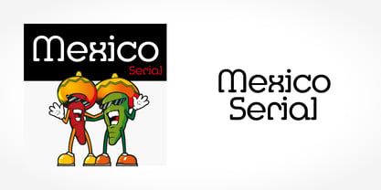
 - Mexico Serial by SoftMaker,
$-
- 2031 by Noir Typo,
$15.00 The 2031 typeface is a toolbox made of fonts from the 2030 typeface. 3d, outlines, shadows and other graphic effects remix each style into a new postmodern typeface.
 - 2041 by Kevin Thrasher,
$10.00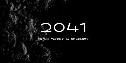
- heresy - Unknown license

- Jorgey by Gatype,
$12.00 Jorgey's casual brush script has a nice texture and flow. Jorgey has many alternatives to make it look like real handwriting; four sets of lowercase and two sets of uppercase. suitable for design projects; logos, branding, posters, quotes, beautiful wedding invitations, beautiful stationery art, eye-catching social media posts, and cute greeting cards and other designs. It is unique, very natural and attractive
 - Berdey by Maulana Creative,
$13.00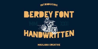 Berdey is a rough handwritten display font. With rough bold stroke, fun character with a bit of ligatures and alternates. To give you an extra creative work. Berdey font support multilingual more than 100+ language. This font is good for logo design, Social media, Movie Titles, Books Titles, a short text even a long text letter and good for your secondary text font with sans or serif. Make a stunning work with Berdey font. Cheers, Maulana Creative
 - Harsey by Letterhend,
$16.00 Introducing, Harsey Type Toolbox. One of our best-designed product that we ever created. This product consist of many styles such as script, sans, serif, and also includes dingbats, catchwords and badges all comes in font format. What makes this product even more special is you can use and combine all these fonts perfectly matched altogether.
 - Jeremy by GRIN3 (Nowak),
$22.00 Jeremy is a handwritten, brush script with ligatures and contextual alternates to help with flow and readability. Every lowercase letter has three variations. When the font is used in OpenType-savvy applications, the 3 variants of glyphs are automatically alternated to achieve a random-like effect. Language support includes Western, Central and Eastern European character sets, as well as Baltic and Turkish languages.
 - Nocker - Unknown license

- Rocher by Harbor Type,
$29.00 🏆 Selected for Tipos Latinos 8. 🏆 Hiii Typography 2018 Merit Award. Rocher was designed while looking for an answer to a simple question: what would a typeface look like if it was made of stone? It certainly would look solid, but did we have to add cracks and rubble so it would resemble rocks? We didn’t think so. We decided to tackle the problem a different way. We added corners where there usually aren’t any and threw some unusual letterforms into the mix. The result is a typeface that feels like stone, but if you look closely there is nothing inherently stony about it. Unexpected corners provide just the right amount of roughness, while unusual letterforms give the text an informal aesthetic, traces of something naive and handmade. A family was born when the sturdy letterforms were turned into a series of playful layers. With 9 fonts in total, Rocher can be mixed and matched to create unique layered compositions that add depth to the layout. We designed Rocher to be used in logotypes, packaging, mobile apps and headlines. We are confident you will find another handful of scenarios where it can shine.
 - Stockers by Azzam Ridhamalik,
$14.00 Stockers is a high contrast serif font. It's long serifs make it looks mixed between classic and modern. Stockers support multilingual language, numbers, punctuation, alternative, standard and discretionary ligatures. A must have for any modern graphic designer as an elegant solution for your next magazine layout or any graphics design that require an elegant flair! FEATURES : Uppercase Lowercase Number Punctuation Multilingual PUA Encode Opentype
 - Sonder by Fenotype,
$30.00 Sonder is a smooth brush Script and condensed Sans family of three weights on both. Both Script and Sans work as standalone fonts but they’re designed to go nicely together. Combine with Sonder Extras for smooth brush strokes for ambitious headlines, logos & posters. Sonder comes with a clean version and a “Print” version of each cut. Print versions have delicately rugged outlines and print texture inside. Sonder Script is packed with several OpenType features: Contextual Alternates and Standard Ligatures are automatically on to keep the text vibrant. If you need even more sparkly letters try Swash, Stylistic or Titling Alternates. The Scripts are PUA encoded and you can access extras from character map in most design softwares. For the best price Sonder can be purchased as “clean” Family - or as Print Family that has all cuts as printed versions. For the absolutely best price get the whole Complete Family pack that has all fourteen fonts and go wild with it!


Page 1 of 161Next page