5,300 search results
(0.038 seconds)
- Juvenile by DimitriAna,
$19.00 Juvenile is a hand drawn fresh and playful font family, offered in a variety of weights and special characters, which matches perfectly with 52 decorative elements. It is suitable for different applications such as logos, stationery design, invitations, labels, merchandise products, and much more. Juvenile contains OpenType features such as ligatures, stylistic alternates and swashes. It supports Central, Eastern, Western European, Baltic, Turkish and Greek languages. The fonts are fully unicode-mapped (PUA encoded).
 - Old Jersey by Alphabet Agency,
$15.00 Old Jersey is a cool, vintage styled and rough textured display font. This adaptable font will look great on a variety of design ideas. It will add a distinct touch to each of your projects
 - Soccer Dance - Personal use only

- Soccer SS by Sensatype Studio,
$15.00 Soccer is a Modern Sport Logo font that created special for Logo, Title and more stand out typography for sport and action. It's so perfect to add your style and headline overview for sport, technology, actions, and fighting theme. And specially for this font, we crafted for bold action style and modern feels so enjoy to create any project that will show your main idea out. Soccer Modern Sport Logo font ready with: Creative characters prepared to get best results Preview as a inspirations that you can do with Soccer font Ready with All Uppercase characters Wish you enjoy our font. :)
 - Commando 2011 - 100% free

- 2011 Slimtype by GLC,
$42.00 This light manual font, with two styles, is a looking like slab serif or typewriter pattern. It is containing Western and Northern European, Icelandic, Baltic, Eastern, Central European and Turquish specific characters, plus old style numerals, ct, st and f standard ligatures. The two styles are both legible from 10-11 pts.
 - Megaflakes 2011 by Baseline Fonts,
$20.00 Megaflakes™ 2011 is a geometric set. Looks like this might become a tradition for Baseline Fonts. They are terribly fun for the holidays as well as Christmas in July.
 - Eventually by Bogstav,
$17.00 My crunchy version of my own handwriting!
 - Juvenis by Storm Type Foundry,
$32.00Designs of characters that are almost forty years old can be already restored like a historical alphabet – by transferring them exactly into the computer with all their details. But, of course, it would not be Josef Tyfa, if he did not redesign the entire alphabet, and to such an extent that all that has remained from the original was practically the name. Tyfa published a sans-serif alphabet under the title Juvenis already in the second half of the past century. The type face had a large x-height of lower-case letters, a rather economizing design and one-sided serifs which were very daring for their time. In 1979 Tyfa returned to the idea of Juvenis, modified the letter “g” into a one-storey form, narrowed the design of the characters even further and added a bold and an inclined variant. This type face also shows the influence of Jaroslav Benda, evident in the open forms of the crotches of the diagonal strokes. Towards the end of 2001 the author presented a pile of tracing paper with dozens of variants of letter forms, but mainly with a new, more contemporary approach: the design is more open, the details softer, the figures and non-alphabetical characters in the entire set are more integral. The original intention to create a type face for printing children’s books thus became even more emphasized. Nevertheless, Juvenis with its new proportions far exceeds its original purpose. In the summer of 2002 we inserted all of this “into the machine” and designed new italics. The final computer form was completed in November 2002. All the twelve designs are divided into six variants of differing boldness with the corresponding italics. The darkness of the individual sizes does not increase linearly, but follows a curve which rises more steeply towards the boldest extreme. The human eye, on the contrary, perceives the darkening as a more fluent process, and the neighbouring designs are better graded. The x-height of lower-case letters is extraordinarily large, so that the printed type face in the size of nine points is perceived rather as “ten points” and at the same time the line spacing is not too dense. A further ingenious optical trick of Josef Tyfa is the figures, which are designed as moderately non-aligning ones. Thus an imaginary third horizontal is created in the proportional scheme of the entire type face family, which supports legibility and suitably supplements the original intention to create a children’s type face with elements of playfulness. The same applies to the overall soft expression of the alphabet. The serifs are varied; their balancing, however, is well-considered: the ascender of the lower-case “d” has no serif and the letter appears poor, while, for example, the letter “y”, or “x”, looks complicated. The only serif to be found in upper-case letters is in “J”, where it is used exclusively for the purpose of balancing the rounded descender. These anomalies, however, fit perfectly into the structure of any smoothly running text and shift Juvenis towards an original, contemporary expression. Tyfa also offers three alternative lower-case letters *. In the case of the letter “g” the designer follows the one-storey form he had contemplated in the eighties, while in “k” he returns to the Benda inspiration and in “u” adds a lower serif as a reminder of the calligraphic principle. It is above all the italics that are faithful to the tradition of handwritten lettering. The fairly complicated “k” is probably the strongest characteristic feature of Juvenis; all the diagonals in “z”, “v”, “w”, “y” are slightly flamboyant, and this also applies to the upper-case letters A, V, W, Y. Juvenis blends excellently with drawn illustrations, for it itself is modelled in a very creative way. Due to its unmistakable optical effect, however, it will find application not only in children’s literature, but also in orientation systems, on posters, in magazines and long short-stories. - 2031 by Noir Typo,
$15.00 The 2031 typeface is a toolbox made of fonts from the 2030 typeface. 3d, outlines, shadows and other graphic effects remix each style into a new postmodern typeface.
 - 2041 by Kevin Thrasher,
$10.00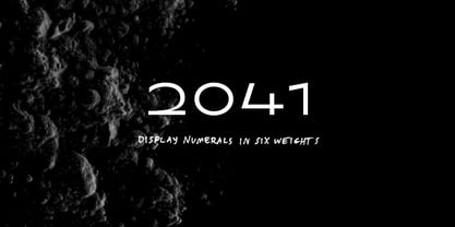
- heresy - Unknown license

- Jorgey by Gatype,
$12.00 Jorgey's casual brush script has a nice texture and flow. Jorgey has many alternatives to make it look like real handwriting; four sets of lowercase and two sets of uppercase. suitable for design projects; logos, branding, posters, quotes, beautiful wedding invitations, beautiful stationery art, eye-catching social media posts, and cute greeting cards and other designs. It is unique, very natural and attractive
 - Berdey by Maulana Creative,
$13.00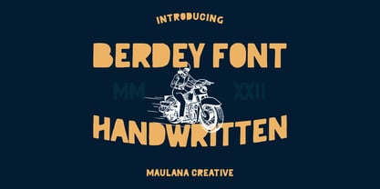 Berdey is a rough handwritten display font. With rough bold stroke, fun character with a bit of ligatures and alternates. To give you an extra creative work. Berdey font support multilingual more than 100+ language. This font is good for logo design, Social media, Movie Titles, Books Titles, a short text even a long text letter and good for your secondary text font with sans or serif. Make a stunning work with Berdey font. Cheers, Maulana Creative
 - Harsey by Letterhend,
$16.00 Introducing, Harsey Type Toolbox. One of our best-designed product that we ever created. This product consist of many styles such as script, sans, serif, and also includes dingbats, catchwords and badges all comes in font format. What makes this product even more special is you can use and combine all these fonts perfectly matched altogether.
 - Jeremy by GRIN3 (Nowak),
$22.00 Jeremy is a handwritten, brush script with ligatures and contextual alternates to help with flow and readability. Every lowercase letter has three variations. When the font is used in OpenType-savvy applications, the 3 variants of glyphs are automatically alternated to achieve a random-like effect. Language support includes Western, Central and Eastern European character sets, as well as Baltic and Turkish languages.
 - Nocker - Unknown license

- Rocher by Harbor Type,
$29.00 🏆 Selected for Tipos Latinos 8. 🏆 Hiii Typography 2018 Merit Award. Rocher was designed while looking for an answer to a simple question: what would a typeface look like if it was made of stone? It certainly would look solid, but did we have to add cracks and rubble so it would resemble rocks? We didn’t think so. We decided to tackle the problem a different way. We added corners where there usually aren’t any and threw some unusual letterforms into the mix. The result is a typeface that feels like stone, but if you look closely there is nothing inherently stony about it. Unexpected corners provide just the right amount of roughness, while unusual letterforms give the text an informal aesthetic, traces of something naive and handmade. A family was born when the sturdy letterforms were turned into a series of playful layers. With 9 fonts in total, Rocher can be mixed and matched to create unique layered compositions that add depth to the layout. We designed Rocher to be used in logotypes, packaging, mobile apps and headlines. We are confident you will find another handful of scenarios where it can shine.
 - Stockers by Azzam Ridhamalik,
$14.00 Stockers is a high contrast serif font. It's long serifs make it looks mixed between classic and modern. Stockers support multilingual language, numbers, punctuation, alternative, standard and discretionary ligatures. A must have for any modern graphic designer as an elegant solution for your next magazine layout or any graphics design that require an elegant flair! FEATURES : Uppercase Lowercase Number Punctuation Multilingual PUA Encode Opentype
 - Sonder by Fenotype,
$30.00 Sonder is a smooth brush Script and condensed Sans family of three weights on both. Both Script and Sans work as standalone fonts but they’re designed to go nicely together. Combine with Sonder Extras for smooth brush strokes for ambitious headlines, logos & posters. Sonder comes with a clean version and a “Print” version of each cut. Print versions have delicately rugged outlines and print texture inside. Sonder Script is packed with several OpenType features: Contextual Alternates and Standard Ligatures are automatically on to keep the text vibrant. If you need even more sparkly letters try Swash, Stylistic or Titling Alternates. The Scripts are PUA encoded and you can access extras from character map in most design softwares. For the best price Sonder can be purchased as “clean” Family - or as Print Family that has all cuts as printed versions. For the absolutely best price get the whole Complete Family pack that has all fourteen fonts and go wild with it!
 - Sincerely by Canada Type,
$24.95Whether with pen on paper, or in digital, realistically connecting vertical handwriting is never an easy task to accomplish. After working with many handwriting fonts, and after intently dissecting so many different handwritings, one tends to expect such things to be quirky, disconnected, and almost never upright. In fact, in spite of vertical handwriting’s academically-sung virtues of rationality, efficiency, clarity and logic, very few people manage to deviate from the natural slant when writing. Even fewer manage to make the vertical handwriting connect and keep its natural flow. Calligraphy and upright cursive aside, it is almost impossible to make a vertical letters connect and maintain a real handwriting appearance. This is where the genius of this design comes in to bridge the gap between upright handwriting and calligraphy. Sincerely is based on one of the most fascinating handwriting designs to ever come out of Germany: Karlgeorg Hoefer’s 1968 Elegance for the Ludwig & Mayer foundry. It is a handwriting with the full meaning of the word, yet it possesses the rare, very commanding and appealing trait of being both vertical and connected while managing to remain realistic. It is the ultimate branding iron of handwriting fonts. When set and printed, Sincerely simply cannot be ignored. Ideal for humanity-asserting poster designs, lettering of short wording with plenty of space, poetry, notes, greeting cards, craft literature, book covers, history-related designs, and a whole range of other applications. - Shocker by Vozzy,
$10.00 Introducing original label font named Shocker. This font has a multilungual characters support (check out all available characters on previews). The font family has three styles: Regular, Rough and Lightning. This font will look good on any designs like a poster, T-shirt, label, logo, etc.
 - Sincerity by Océane Moutot,
$32.90 Sincerity is an elegant and strong typeface identified by its high contrast, its sharp shapes and triangular serifs. Inspired by the Didone style, Sincerity adds modernity and some unique features to it. It offers a large choice of uses, from titles of magazines to newspapers, logotypes and so on. Sincerity is available in 16 styles, from thin to black in roman and italic.
 - Bocfer by Brenners Template,
$19.00 Designed by Ryul Davidson, this typeface is a special style for designers who prefer a sense of space and differentiation in the layout system. It applies a design concept that continues the modern and contemporary grotesque lineage. And, It adopts a somewhat low x-height system and has a classic and sophisticated balance. As the height of lowercase letters is lowered, more differentiated and rhythmic typography can be realized, and it showcases a wide range of coverage from offline publishing to display areas. The elaborately optimized kerning system is a good choice for designers who prefer more professional logos and editorial designs.
 - The Socker by Mozatype,
$11.00 THE SHOCKER a natural brush font. THE SHOCKER would be perfect for sports, music festivals, quotes, special events, or anything. What’s Included : - Works on PC & Mac - Easy to use ( Installations ) - Compatibility Windows, Apple, Linux, Cricut, Silhouette, and Other cutting machines Thank you for purchasing this font. Please appreciate, if you like this. ENJOY it :)
 - Old Jersey Distressed by Alphabet Agency,
$15.00 Old Jersey Distressed is a cool, vintage styled and rough textured display font. This adaptable font will look great on a variety of design ideas. It will add a distinct touch to each of your projects.
 - DB Girly Soccer by Illustration Ink,
$3.00Whoever said that girls can't play sports was wrong! DoodleBat Girly Soccer highlights the fun in soccer. - LD Soccer Mom by Illustration Ink,
$3.00LD Soccer Mom is a font made after the many moms supporting their kids in sports and other extracurricular activities. - Juvenile Handwriting by Create Big Supply,
$15.00 Darling Moods is a sleek and elegant script font. It has a beautiful, natural handwriting style that will leave an authentic impression on your designs! Features: Uppercase Lawercase Numbers and punctuation Multilingual PUA Encoding
 - 2011 Slimtype Sans by GLC,
$42.00 This light manual font, with two styles, is the sans serif version of our slab serif "2011 Slimtype". It is containing Western and Northern European, Icelandic, Baltic, Eastern, Central European and Turquish specific characters, plus old style numerals, ct, st and f standard ligatures. The two styles are both legible from 10-11 pts.
 - JESSIE - Unknown license

- Jessie by Turtle Arts,
$20.00Jessie's Letter is based on an old typed letter by Kerrie's great step grandmother. This letter was undated, but we think it must have been from the 1920s or so. Jessie wasn't much for punctuation, so there aren't any of those pesky question marks and exclamation points. But, she did make mistakes in her typing, so we've included cross outs and strange resulting characters to make up for the lack of everyday punctuation. Maybe Jessie wanted to visit Paris, or maybe she secretly made paintings in her back yard, or maybe she dreamed of painting her house bright pink. Well, maybe not, but it's fun to dream... - Gersy by Maulana Creative,
$13.00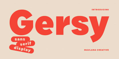 Gersy is a fancy sans serif display font. With bold stroke, fun character. To give you an extra creative work. Gersy font support multilingual more than 100+ language. This font is good for logo design, Social media, Movie Titles, Books Titles, a short text even a long text letter and good for your secondary text font with script or serif. Make a stunning work with Gersy font. Cheers, Maulana Creative
 - Jerky by Noir Typo,
$15.00 Jerky is a strange and vibrant titling typeface.Drawn with a ruling pen, this typeface work with capital and small capital only by default. Inspired by calligraphy it emanates an Rock&Roll visual atmosphere or an horror movie ambiance.
 - Mocer by Logofonts,
$10.00 Mocer is Modern Serif fonts great for product logo, poster, headline, card logo, web, magazine, packaging, stationery and much more. Easily creates your own logo type with fonts. Mocer has an Open Type feature to access a large selection of unique alternative letters and many ligatures to make it easier for you to create. Mocer can be accessed perfectly on design applications such as Adobe Illustrator, Adobe Photoshop, Corel Draw, Affinity Designer but does not rule out the possibility that it can also be accessed using web-based applications such as kittl, canva, artboard studio and others.
 - SlabFace 2010 - 100% free

- london 2012 - Personal use only

- Megaflakes 2010 by Baseline Fonts,
$20.00 Snowflakes and doodles to complement any design on the fly.
 - BDRmono 2021 by Typedifferent,
$15.00 Büro Destruct’s «BDR mono» typeface has a long tradition in the font library of typedifferent. Initially designed by Lopetz as a single weight, monospaced Mac PostScript Type 1 font way back in 1999, it got a first update as a little family with light, regular and bold weights, plus an extended glyphs set in Opentype format during 2006. With this 2021 update the typeface received a second rounded family and a complete glyphs set with all needed characters used in the north, east, south and west of Europe. The «BDR mono 2021» serves great in signage, routing people, architecture, technical plans, manuals, or even science and fiction related communications.
 - Olympukes 2012 by Barnbrook Fonts,
$30.00 Released on the occasion of the 2012 London Olympics, Olympukes 2012 was a new set of pictograms telling the ‘real’ story of the Olympics and extending the unofficial project that began in 2004. The occasion of the London games provided an opportunity to revisit the complex contradictions of the modern Olympics and to acknowledge the geopolitical shifts of the intervening eight years. The 2012 games arrived at a time of great economic and political uncertainty for the nation and Europe. Greece – the host of the 2004 games – was now located at Ground Zero of a disintegrating Eurozone and the United Kingdom was two years into a programme of austerity enacted by the coalition government of Conservatives and Liberal Democrats. Given that the previous London Olympics had been held in 1948, in a climate of recovery and austerity after a devastating World War (1948’s Olympiad was dubbed the ‘Austerity Games’) there was a sick irony to the 2012 games' arrival. The suppression of human rights in order to deliver the perfect games for PRoC’s Beijing games shocked no-one and yet, in London, the security measures seemed grossly excessive. Then again, in a country with an estimated 1.8 million cctv cameras, perhaps we shouldn’t have been so surprised. Another aspect of the Olympics that returned for 2012 was the unfettered commercialism – if you think the Games are about pure sport, about noble human endeavour, think again. Please note that Barnbrook Fonts is in no way affiliated with, or has received any endorsement from, the International Olympic Committee, the organising committees of the Olympic Games, or any national Olympic committee.


Page 1 of 133Next page