4,794 search results
(0.028 seconds)
- Juvenile by DimitriAna,
$19.00 Juvenile is a hand drawn fresh and playful font family, offered in a variety of weights and special characters, which matches perfectly with 52 decorative elements. It is suitable for different applications such as logos, stationery design, invitations, labels, merchandise products, and much more. Juvenile contains OpenType features such as ligatures, stylistic alternates and swashes. It supports Central, Eastern, Western European, Baltic, Turkish and Greek languages. The fonts are fully unicode-mapped (PUA encoded).
 - Old Jersey by Alphabet Agency,
$15.00 Old Jersey is a cool, vintage styled and rough textured display font. This adaptable font will look great on a variety of design ideas. It will add a distinct touch to each of your projects
 - Commando 2011 - 100% free

- 2011 Slimtype by GLC,
$42.00 This light manual font, with two styles, is a looking like slab serif or typewriter pattern. It is containing Western and Northern European, Icelandic, Baltic, Eastern, Central European and Turquish specific characters, plus old style numerals, ct, st and f standard ligatures. The two styles are both legible from 10-11 pts.
 - Megaflakes 2011 by Baseline Fonts,
$20.00 Megaflakes™ 2011 is a geometric set. Looks like this might become a tradition for Baseline Fonts. They are terribly fun for the holidays as well as Christmas in July.
 - Eventually by Bogstav,
$17.00 My crunchy version of my own handwriting!
 - Juvenis by Storm Type Foundry,
$32.00Designs of characters that are almost forty years old can be already restored like a historical alphabet – by transferring them exactly into the computer with all their details. But, of course, it would not be Josef Tyfa, if he did not redesign the entire alphabet, and to such an extent that all that has remained from the original was practically the name. Tyfa published a sans-serif alphabet under the title Juvenis already in the second half of the past century. The type face had a large x-height of lower-case letters, a rather economizing design and one-sided serifs which were very daring for their time. In 1979 Tyfa returned to the idea of Juvenis, modified the letter “g” into a one-storey form, narrowed the design of the characters even further and added a bold and an inclined variant. This type face also shows the influence of Jaroslav Benda, evident in the open forms of the crotches of the diagonal strokes. Towards the end of 2001 the author presented a pile of tracing paper with dozens of variants of letter forms, but mainly with a new, more contemporary approach: the design is more open, the details softer, the figures and non-alphabetical characters in the entire set are more integral. The original intention to create a type face for printing children’s books thus became even more emphasized. Nevertheless, Juvenis with its new proportions far exceeds its original purpose. In the summer of 2002 we inserted all of this “into the machine” and designed new italics. The final computer form was completed in November 2002. All the twelve designs are divided into six variants of differing boldness with the corresponding italics. The darkness of the individual sizes does not increase linearly, but follows a curve which rises more steeply towards the boldest extreme. The human eye, on the contrary, perceives the darkening as a more fluent process, and the neighbouring designs are better graded. The x-height of lower-case letters is extraordinarily large, so that the printed type face in the size of nine points is perceived rather as “ten points” and at the same time the line spacing is not too dense. A further ingenious optical trick of Josef Tyfa is the figures, which are designed as moderately non-aligning ones. Thus an imaginary third horizontal is created in the proportional scheme of the entire type face family, which supports legibility and suitably supplements the original intention to create a children’s type face with elements of playfulness. The same applies to the overall soft expression of the alphabet. The serifs are varied; their balancing, however, is well-considered: the ascender of the lower-case “d” has no serif and the letter appears poor, while, for example, the letter “y”, or “x”, looks complicated. The only serif to be found in upper-case letters is in “J”, where it is used exclusively for the purpose of balancing the rounded descender. These anomalies, however, fit perfectly into the structure of any smoothly running text and shift Juvenis towards an original, contemporary expression. Tyfa also offers three alternative lower-case letters *. In the case of the letter “g” the designer follows the one-storey form he had contemplated in the eighties, while in “k” he returns to the Benda inspiration and in “u” adds a lower serif as a reminder of the calligraphic principle. It is above all the italics that are faithful to the tradition of handwritten lettering. The fairly complicated “k” is probably the strongest characteristic feature of Juvenis; all the diagonals in “z”, “v”, “w”, “y” are slightly flamboyant, and this also applies to the upper-case letters A, V, W, Y. Juvenis blends excellently with drawn illustrations, for it itself is modelled in a very creative way. Due to its unmistakable optical effect, however, it will find application not only in children’s literature, but also in orientation systems, on posters, in magazines and long short-stories. - 2031 by Noir Typo,
$15.00 The 2031 typeface is a toolbox made of fonts from the 2030 typeface. 3d, outlines, shadows and other graphic effects remix each style into a new postmodern typeface.
 - 2041 by Kevin Thrasher,
$10.00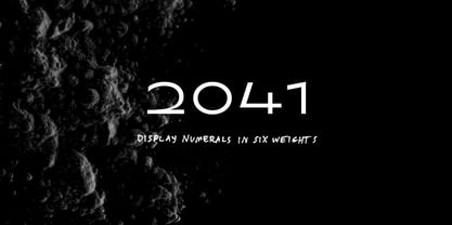
- heresy - Unknown license

- Jorgey by Gatype,
$12.00 Jorgey's casual brush script has a nice texture and flow. Jorgey has many alternatives to make it look like real handwriting; four sets of lowercase and two sets of uppercase. suitable for design projects; logos, branding, posters, quotes, beautiful wedding invitations, beautiful stationery art, eye-catching social media posts, and cute greeting cards and other designs. It is unique, very natural and attractive
 - Berdey by Maulana Creative,
$13.00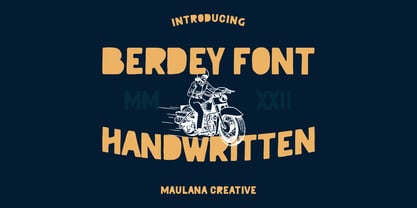 Berdey is a rough handwritten display font. With rough bold stroke, fun character with a bit of ligatures and alternates. To give you an extra creative work. Berdey font support multilingual more than 100+ language. This font is good for logo design, Social media, Movie Titles, Books Titles, a short text even a long text letter and good for your secondary text font with sans or serif. Make a stunning work with Berdey font. Cheers, Maulana Creative
 - Harsey by Letterhend,
$16.00 Introducing, Harsey Type Toolbox. One of our best-designed product that we ever created. This product consist of many styles such as script, sans, serif, and also includes dingbats, catchwords and badges all comes in font format. What makes this product even more special is you can use and combine all these fonts perfectly matched altogether.
 - Jeremy by GRIN3 (Nowak),
$22.00 Jeremy is a handwritten, brush script with ligatures and contextual alternates to help with flow and readability. Every lowercase letter has three variations. When the font is used in OpenType-savvy applications, the 3 variants of glyphs are automatically alternated to achieve a random-like effect. Language support includes Western, Central and Eastern European character sets, as well as Baltic and Turkish languages.
 - Old Jersey Distressed by Alphabet Agency,
$15.00 Old Jersey Distressed is a cool, vintage styled and rough textured display font. This adaptable font will look great on a variety of design ideas. It will add a distinct touch to each of your projects.
 - Juvenile Handwriting by Create Big Supply,
$15.00 Darling Moods is a sleek and elegant script font. It has a beautiful, natural handwriting style that will leave an authentic impression on your designs! Features: Uppercase Lawercase Numbers and punctuation Multilingual PUA Encoding
 - 2011 Slimtype Sans by GLC,
$42.00 This light manual font, with two styles, is the sans serif version of our slab serif "2011 Slimtype". It is containing Western and Northern European, Icelandic, Baltic, Eastern, Central European and Turquish specific characters, plus old style numerals, ct, st and f standard ligatures. The two styles are both legible from 10-11 pts.
 - JESSIE - Unknown license

- Jessie by Turtle Arts,
$20.00Jessie's Letter is based on an old typed letter by Kerrie's great step grandmother. This letter was undated, but we think it must have been from the 1920s or so. Jessie wasn't much for punctuation, so there aren't any of those pesky question marks and exclamation points. But, she did make mistakes in her typing, so we've included cross outs and strange resulting characters to make up for the lack of everyday punctuation. Maybe Jessie wanted to visit Paris, or maybe she secretly made paintings in her back yard, or maybe she dreamed of painting her house bright pink. Well, maybe not, but it's fun to dream... - Gersy by Maulana Creative,
$13.00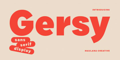 Gersy is a fancy sans serif display font. With bold stroke, fun character. To give you an extra creative work. Gersy font support multilingual more than 100+ language. This font is good for logo design, Social media, Movie Titles, Books Titles, a short text even a long text letter and good for your secondary text font with script or serif. Make a stunning work with Gersy font. Cheers, Maulana Creative
 - Jerky by Noir Typo,
$15.00 Jerky is a strange and vibrant titling typeface.Drawn with a ruling pen, this typeface work with capital and small capital only by default. Inspired by calligraphy it emanates an Rock&Roll visual atmosphere or an horror movie ambiance.
 - SlabFace 2010 - 100% free

- london 2012 - Personal use only

- Megaflakes 2010 by Baseline Fonts,
$20.00 Snowflakes and doodles to complement any design on the fly.
 - BDRmono 2021 by Typedifferent,
$15.00 Büro Destruct’s «BDR mono» typeface has a long tradition in the font library of typedifferent. Initially designed by Lopetz as a single weight, monospaced Mac PostScript Type 1 font way back in 1999, it got a first update as a little family with light, regular and bold weights, plus an extended glyphs set in Opentype format during 2006. With this 2021 update the typeface received a second rounded family and a complete glyphs set with all needed characters used in the north, east, south and west of Europe. The «BDR mono 2021» serves great in signage, routing people, architecture, technical plans, manuals, or even science and fiction related communications.
 - Olympukes 2012 by Barnbrook Fonts,
$30.00 Released on the occasion of the 2012 London Olympics, Olympukes 2012 was a new set of pictograms telling the ‘real’ story of the Olympics and extending the unofficial project that began in 2004. The occasion of the London games provided an opportunity to revisit the complex contradictions of the modern Olympics and to acknowledge the geopolitical shifts of the intervening eight years. The 2012 games arrived at a time of great economic and political uncertainty for the nation and Europe. Greece – the host of the 2004 games – was now located at Ground Zero of a disintegrating Eurozone and the United Kingdom was two years into a programme of austerity enacted by the coalition government of Conservatives and Liberal Democrats. Given that the previous London Olympics had been held in 1948, in a climate of recovery and austerity after a devastating World War (1948’s Olympiad was dubbed the ‘Austerity Games’) there was a sick irony to the 2012 games' arrival. The suppression of human rights in order to deliver the perfect games for PRoC’s Beijing games shocked no-one and yet, in London, the security measures seemed grossly excessive. Then again, in a country with an estimated 1.8 million cctv cameras, perhaps we shouldn’t have been so surprised. Another aspect of the Olympics that returned for 2012 was the unfettered commercialism – if you think the Games are about pure sport, about noble human endeavour, think again. Please note that Barnbrook Fonts is in no way affiliated with, or has received any endorsement from, the International Olympic Committee, the organising committees of the Olympic Games, or any national Olympic committee.
 - DIN 2014 by ParaType,
$47.00 A contemporary interpretation of the famous DIN typeface. Regular style suits for long texts, while Light and Bold variations work well in large sizes. The typeface includes 24 styles: 6 upright and 6 normal-width italics, as well as 6 Narrow and 6 Condensed styles. The typeface was designed by Vasily Biryukov and released by Paratype in 2015. The set of Condensed styles was added by Alexander Lubovenko and Isabella Chaeva in 2022.
 - Puls 2012 by Jovan Ivanov,
$20.00
- Impact 2010 by Microsoft Corporation,
$89.00 - Heisei Mincho by Adobe,
$39.00 - Jensen Arabique by CastleType,
$39.00 This elegant typeface was suggested to me by type critic Daniel Will-Harris. Jensen Arabique is based on a set of capital letters drawn by Gustav Jensen that included the word "ARABIQUE" at the top of the first page, therefore the name. Daniel Will-Harris has this to say about Jensen Arabique: "I found an example of this unexecuted Gustav Jensen typeface in a type sample book from 1933, and Jason Castle lovingly digitized it with all its rare and unusual curves intact." Uppercase with alternates, numerals and some punctuation.
 - Jessen-Schrift by profonts,
$41.99 The original Jessen typeface, named in reminiscence of the great supporter of the printing art at the end of the 19th century, Peter Jessen, was designed in the years of 1924 until 1930. Bible Gothic was created by the famous German designer Rudolf Koch. Ralph M. Unger digitized this font exclusively for profonts in 2005, keeping his digitization as close as possible to the original design of Koch in order to preserve the distinguished character and the partly unconventional, original forms. The concept of a Bible Gothic was developing for years in Koch's mind and drove the direction of his work, but only after the experience with his Neuland design could he start the creation of his Peter Jessen typeface. Produced quite like Neuland, Jessen, however, is much more refined and more accurate in detail than Neuland. At first glance, it seems to look plain and simple, but if you look closer, the richness of its distinguished upper case forms unfold to a perfectly clear flow of text
 - Kelsey Script by Tebaltipis Studio,
$15.00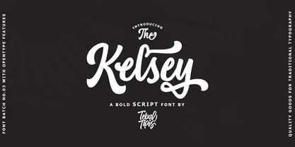 Introducing new latest from TebTipsudio, Kelsey is a script typeface with personality. You can use it as a logo, badge, insignia, packaging, headline, poster, etc The alternative characters in this font were divided into several OpenType features such as Stylistic Alternates, Stylistic Sets, and Ligature. The OpenType features can be accessed by using OpenType program such as Adobe Illustrator, Adobe Photoshop, and Adobe InDesign.
 - Mandalaz Sensei by Allouse Studio,
$14.00 Mandalaz Sensei is a Brush Font Family. These font come with Multi-Lingual Support and swash separated to make it easier to play with. Mandalaz Sensei is perfect for any tittles, logo, product packaging, branding project, megazine, social media, wedding, or just used to express words above the background. Enjoy the font, feel free to comment or feedback, send me PM or email. Thank You!
 - Kerney Script by Mans Greback,
$59.00 Kerney Script is a cool baseball typeface. A sporty calligraphy, this retro lettering will be your go-to style for a fresh team logotype or a vintage headline. Drawn and created by Mans Greback in 2022, it has a competitive style and a bold personality. The Kerney Script family consists of three professional styles: Regular, Bold and Rounded, complimenting each other for greater design opportunities. Use underscore _ to make a swash. Example: Letter_ Use multiple underscores to make longer swashes. Example: Football____ The font is built with advanced OpenType functionality and has a guaranteed top-notch quality, containing stylistic and contextual alternates, ligatures and more features; all to give you full control and customizability. It has extensive lingual support, covering all Latin-based languages, from Northern Europe to South Africa, from America to South-East Asia. It contains all characters and symbols you'll ever need, including all punctuation and numbers.
 - Fourt Carsey by Reyrey Blue Std,
$16.00 Introducing, Fourt Carsey Typeface. Fourt Carsey is an elegant and modern font that take classy and fashionable touch family typeface. Fourt Carsey Typeface is perfectly suitable for layout design for quotes or body copy, best used as a display for headings, logos, branding, magazines, product packaging, invitations. logotypes, and much more. Don't wait to add this luxury font family to your collection and explore the uniqueness of this typeface! Features : · All Uppercase and Lowercase · Number & Symbol · Supported Languages · Alternates and Ligatures · PUA Encoded Hope you enjoy with our font!
 - Informal 011 by Bitstream,
$29.99 - Informal 011 by Tilde,
$39.75 - Basica v.2012 - Personal use only

- R-2014 Eroded - Personal use only


Page 1 of 120Next page