10,000 search results
(0.016 seconds)
- Futurex LX - Unknown license

- Nouveau LX by Vanarchiv,
$27.00 The original design came from Berthold Herold typeface, designed by Hermann Hoffmann during 1913 (Art Nouveau style) in Germany. This project started from flyer printed during 1947 with movable type, the specimen was scanned as a source to development some of the uppercase letterforms. However the most unusual and tricky element from this sample is the leg from the uppercase (R) which is different from the original Herold design, until now I didn’t found where this version originally came from. This font family only contain the bold weight, but there are also a stencil and expanded versions available.
 - Museo 300 - 100% free

- lelim 300 - Personal use only

- Zoo 300 by Green Type,
$37.00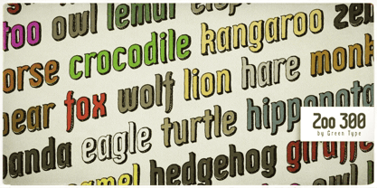
- Craft by Alfareaniy,
$200.00 Craft is a unique and cool kids font model. The horror and sharp shape makes your design very stunning
 - Draft Hand by Fonthead Design,
$15.00 - Andre Drafting by André Design,
$19.95 Developed for use in our design drawings by the renowned museum exhibit design firm André & Associates Interpretation & Design, the André Drafting font is being made available publicly for the first time. Based on the hand drafting lettering of our Senior Designer Andrew Farrell, this neat and tidy font will add a personal touch to CAD drawings, concept sketches and more. This font contains a full character set and is available in regular weight. Visit our website at www.aaid.ca for examples of our exhibit design work.
 - Handwriting Draft by Fontscafe,
$39.00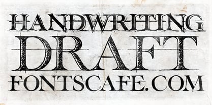
- Draft Beer by FontMesa,
$25.00Draft Beer is a bold script suitable for logos, letterheads & headlines and was inspired by the lettering used by Miller Brewing Co. - Encercle Draft by Typodermic,
$11.95 With Encercle Draft, you can create circles and other shapes containing numbers up to 999999. Here's how it works: hold shift and type the number of digits, followed by a number. If you want the number 25, hold shift, type 2 followed by 25. If you want the number 250, hold shift, type 3 followed by 250. You can also type letters, periods, slashes, hyphens, question marks and exclamation points. Create an inverse white-on-black effect using your application's Bold feature. Easily change shapes by selecting a different font style from your application's font menu. Encercle Draft is available in the following shapes. Circle Square Box (wide rectangle) Box with rounded ends (tab) Diamond Circle inside a diamond Hexagon Hexagon rotated Octagon Triangle up Triangle down Triangle right Triangle left Quote bubble with left tail Quote bubble with right tail Quote bubble with no no tail Cloud (thought bubble) Encercle Draft uses OpenType technology. Most current graphic design applications support basic OpenType features but there are a few exceptions including AutoCAD, SketchUp, Solidworks and Canva. Encercle Draft will work in Affinity, Inkscape, GIMP, Adobe apps (not Photoshop Elements), Microsoft apps (not Powerpoint), Sibelius and more. Encercle Draft includes a PDF manual with examples. There's also an advanced feature which allows you to create solid-colored backgrounds. For a thicker, sans-serif style, check out Encercle Sans. For more complex layered effects with a different selection of typefaces and shapes, check out Numbers with Rings. Encercle PDF user manual.
 - Rafting by Gatra Std,
$10.00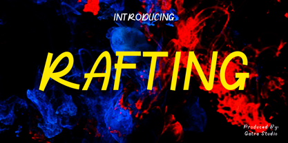 Introducing a cute handwriting "RAFTING" Handwritten Display Font! If you are needing a touch of casual modern display for your designs, this font was created for you! What's Included: Uppercase and Lowercase Number and Punctuation Support Language This font works best in a program that supports OpenType features such as Adobe Indesign, Adobe Illustrator CC and CS, or Adobe Photoshop CC and CS also CorelDraw More Questions? Here are some (potential) answers! Do not to resell this font in any way. Multilingual Support is included for Western European Languages Have a Wonderful Day, Gatra Std
 - Nouveau LX Expanded by Vanarchiv,
$31.00 The original design came from Berthold Herold typeface, designed by Hermann Hoffmann during 1913 (Art Nouveau style) in Germany. This project started from flyer printed during 1947 with movable type, the specimen was scanned as a source to development some of the uppercase letterforms. However the most unusual and tricky element from this sample is the leg from the uppercase (R) which is different from the original Herold design, until now I didn’t found where this version originally came from. This expanded version only contain the bold weight, however there are also stencil (Nouveau LX Stencil) and condensed version (Nouveau LX) available.
 - Nouveau LX Stencil by Vanarchiv,
$31.00 The original design came from Berthold Herold typeface, designed by Hermann Hoffmann during 1913 (Art Nouveau style) in Germany. This project started from flyer printed during 1947 with movable type, the specimen was scanned as a source to development some of the uppercase letterforms. However the most unusual and tricky element from this sample is the leg from the uppercase (R) which is different from the original Herold design, until now I didn’t found where this version originally came from. This stencil typeface only contain the bold weight, but there are also available other versions without stencil cuts, like Nouveau LX and Nouveau LX Expanded.
 - 309 - Unknown license

- 3000 - Unknown license

- 309 - Unknown license

- 360 by Wilton Foundry,
$29.00Distorted fonts are great but are mostly not very practical - 360 is an attempt to create a simple distorted font that can be used far beyond a few logos or headlines. Each 360 character averages roughly half the number of sharp angles of a regular sans serif. This gives it an unusually fresh and timeless appeal and creates a dynamic presence across body text that is very legible and compact without looking overly condensed. 360 was chosen as a name because it can be used as an everyday font, all year round, and because 360 has so many unusual angles that don't conform to normal font conventions. 360 also happens to be a cool number: 360 makes a highly composite number. 360 is also a superior highly composite number and a colossally abundant number. A circle is divided into 360 degrees for the purpose of angular measurement. 360° is also called round angle. 360 is a convenient standard since, 360 being highly composite, it allows a circle to be divided into equal segments with each segment measured in integer degrees rather than fractional degrees. 360 is the sum of a twin prime (179 + 181). A year is roughly calculated as 360 days. - ozzy II - Personal use only

- Requiem II - Unknown license

- Greghor II - Unknown license

- Eutemia II - 100% free

- Fontovision II - Unknown license

- Pamelor II - Unknown license

- Miltown II - Unknown license

- Thundergod II - Unknown license

- Fontcop II - Unknown license

- Fedyral II - Unknown license

- Zamolxis II - Unknown license

- Tawattype II - Unknown license

- vinceHand II by JOEBOB graphics,
$19.00 This is what my good friend and painter Vincent’s handwriting looks like. I have put in a couple of ligatures and I hope you like it.
 - Cruisader II by ARToni,
$14.00 Cruisader II is a cool, fresh and bold display font. This font reads as strong, confident, and dynamic and can add tons of nostalgic character to your designs.
 - Hemera II by Konstantine Studio,
$18.00 To celebrate the milestone of our all time bestseller font called Hemera, After four years now we're ready to the next level of it. Please welcome Hemera II. A sophisticated vintage victorian era fonts, inspired from the old advertising and classic sign back in circa 1800 - 1900s. Perfectly fit for your vintage vibes and classic touch on any branding works. Logo, badges, label, headline, retro decoration, you name it.
 - Wallflowers II by Laura Worthington,
$19.00 Create borders, wallpaper, or repeating patterns using Wallflower II’s unique hand drawn wallpaper tiles and accompanying icons. Wallflowers II are easy to use for borders or wallpaper: simply type the same letter consecutively (i.e., aaa) and the pattern will emerge. See what’s included! http://bit.ly/2bGXbnC
 - II Vorkurs by Increments,
$19.00 A functional, constructive sans-serif with universal, geometric forms. Dedicated to the life and work of Bauhaus pioneer Josef Albers, the typeface follows a disciplined approach to composition using a limited palette of modular blocks. II Vorkurs has 3 weights and 6 styles with extensive latin language support and squared, stylistic alternates.
 - Magma II by Stone Type Foundry,
$49.00 Magma is a rare sans serif typeface family designed explicitly for use in both text and display applications. Starting with this design foundation, Sumner Stone refined the design and added a large suite of international characters to create Magma II, a type family with even more depth and versatility.
 - Forum II by ARTypes,
$35.00Forum II is transcribed from the Forum II initials designed by Prof. Georg Trump and issued by C. E. Weber in 1952. - II Balfron by Increments,
$19.00 Inspired by Ernö Goldfinger's east London tower block of the same name, II Balfron is an imposing, all caps, one-weight typeface. Brutalist in form, the characters embody the principles of the distinctive 27-storey concrete profile with unexpected angles set within a rigid, structural grid. Much like Goldfinger's humanist, utopian housing ideals, the font is best viewed at large scale.
 - Tectura II by Greater Albion Typefounders,
$14.50 Tectura II is Greater Albion's answer to the infamous Comic Sans. It's a family of four 'hand printed' typefaces that provides our very own answer to the infamous 'Comic Sans', and follows on from one of our early release 'Tectura'. Tectura II offers a distinctive blend of hand written character with legibility.
 - Ingleby II by David Engelby Foundry,
$25.00 Ingleby II is a typeface with firm roots in the classic stroke of the pen. The digital design of Ingleby II is legible and distinct in small sizes as well as expressive when used for larger display design. It contains small caps, an innovative range of subtle ligatures, dingbats and adjusted variations of numerals. The glyphs have many detailed designs for better legibility and precise kerning. Also, the italic glyphs are designed with optical accuracy in relation to the skewing of stem width and height. I hope you will welcome the Ingleby II family as a part of your personal font toolbox.


Page 1 of 250Next page