230 search results
(0.01 seconds)
- Byron - Personal use only

- Byron by Red Rooster Collection,
$45.00Based on a turn of the century design. - Byronic by Alan Meeks,
$30.00 Byronic is soft modern sans-serif but with an antique style lower-case. The rounded end soft look gives Byronic a friendly soft look whilst still retaining a classical typographic appearance. A very clean style and slightly condensed it is excellent for text setting and headline with an unusual loser case that compliments the caps perfectly. Available in a range of 5 weights and 5 italics and a Latin Pro character set of 430 characters including ranging numerals and small caps.
 - Boron - Unknown license

- Bygone by Hanoded,
$20.00 Bygone is an elegant brush font - well, insofar a brush font can actually be elegant that is… It is an all caps typeface, completely handmade using Chinese ink and a rather expensive brush. Use it for posters, book covers and packaging. Comes with an old-fashioned amount of diacritics.
 - Beron by Muksal Creatives,
$18.00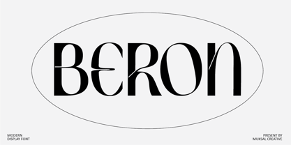 Beron Modern Display Vintage Font, special glyphs, ornament and multilingual support. It's a very versatile font that works great in large and small sizes. Perfect for editorial projects, Logo design, Clothing Branding, product packaging, magazine headers, or simply as a stylish text overlay to any background image.
 - Baron by Juraj Chrastina,
$39.00 After Baronessa - funny but not crazy cartoon style font, Baron is an other handmade typeface, warm and friendly but not excessively childish. If Baronessa is a little feminine, Baron is neutral and it's funny and serious at the same time. Baron can tell jokes without smiling. Because a joke can be funny even if the teller doesn't smile.
 - CYRON by Tadiar,
$27.00 CYRON Tech Serif is unique serif font combines hi-tech cyberpunk and futuristic atmosphere and classic serif's style. There are Uppercase and Lowercase letters done the way they ideally connect with each other. Multilingual support (Latin extended). It is designed for header and text both. Use it in your projects in such areas as robots & androids, cyberpunk, hi-tech, future, virtual reality, space, army, games and many others.
 - Bron by Jeremia Adatte,
$49.00 Bron is based on Zelek, designed in the 70s by Polish type designer Bronisław Zelek. This typeface was originally made for dry transfer lettering sheets. It has been drawn following the principles of impossible geometry and is derived from simple geometric forms (perfect circles, triangles and squares). It has been carefully redrawn and updated and is now available for contemporary technology and design. Use Bron’s rounded and smooth optical shapes in your headlines, logos, packagings, posters to instantly attract attention. This style offers two separate layered fonts to make your own awesome two color compositions. These can be used separately to create even more subtle effects. Bron is packed with an extended character set, supporting Central, Western and Eastern European languages. Check its semi-outline version here!
 - Baron Kuffner - 100% free

- Roland Bryon by Luhop Creative,
$16.00 Roland Bryon Display Ligature Fashion Serif There's beauty in the plain version Roland Bryon, even without all the extras, for a clean and elegant minimal serif. Any version Roland Bryon brings a touch of luxury and bespoke custom typography to modern logos, websites, social media quotes, wedding branding, and more. Thank you so much for checking out my shop, and please get in touch if you have any questions! Roland Bryon Features Full Set of standard alphabet and punctuation Serif Ligatures alternates PUA Encoded Glyph Chart for easy access Multilingual Characters Luhop creative
 - Byrning Bridgez by Cyberian Khatru,
$20.00 This font is created specifically for the purpose of creating logos for Progressive Rock bands. Such bands oftentimes have their logos designed by Fantasy artists such as Roger Dean and Rodney Matthews. The capitals and lower case are distinct enough from each other to be completely separate fonts. I decided, however, to combined them as one font. http://homepage.mac.com/baronvoncruzer/cyberiankhatru/byrningbridgez.htm
 - Bron Shadline by Jeremia Adatte,
$49.00 Bron Shadline is the semi-outline and lighter variation of the original Bron typeface. The outline adds an extra vibrancy, more contrast and bring a special shading effect out. The Shadline version has also two separate layered fonts to make your own multi-color compositions. Possibilities of editing the font are infinite : even use Bron Black Two Color One to add an extra third layer. These can be used separately to create even more subtle effects. Bron Shadline is packed with an extended character set, supporting Central, Western and Eastern European languages.
 - Nouveau Arts JNL by Jeff Levine,
$29.00 The hand lettered title on sheet music for 1915's novelty song "Gasoline Gus and His Jitney Bus" by Byron Gay and Charley Brown offered up the lettering style which is now Nouveau Arts JNL.
 - EB Futuretro by Erik Bertell,
$9.95 Futuretro is a font that transfers you to a bygone age that never was.
 - Girl Next Door2 - Unknown license

- Feverish by Veil of Perception,
$66.00 “Feverish” was a font borne out of perceived need in the marketplace. Hallmark retired font designer and master letter designer Myron McVay first approached Bill LaFever to collaborate on a project to design a semiformal calligraphic script that could be set as text copy with a large variety of swash and alternative characters and small caps. Bill penned the initial forms and Myron did the digital conversions and initial technical work. After Myron passed away, Terry Lee, a protégé of Myron’s at Hallmark, also retired, took over and the project was completed. “Feverish” is a semi-formal italic which can be used in a wide variety of commercial and advertising applications. The font family is large which can accommodate a variety of unique applications.
 - Goth Chic by Comicraft,
$19.00 This pale face -- a Byronic offering from the disaffected youth section of our library -- will provide that slightly sad, sunken eyed feeling most closely associated with Doc Martins, heavy crosses and clothes as black as the blaquest heart... so if you're looking for tragic tramp stamp typography, we think our tattoo parlor maid to wear font will provide just the right amount of Goth Chic.
 - Public Transportation JNL by Jeff Levine,
$29.00On the sides of freight cars, passenger trains, trolleys, buses and cable cars was once found identifying letters and numbers with a bold, yet quaint hand-painted look. Public Transportation JNL emulates the old-style look of those bygone years. - Alphabit by Ben Buysse,
$19.99 Alphabit is a grid-based bitmap typeface that celebrates the blocky and jagged letterforms of early digital typography. Designed with technology as the central theme, it simultaneously references a bygone era of computing and yet feels relevant for modern applications.
 - P22 Kingsclere by IHOF,
$29.95 The Kingsclere font was desigend by Ted Staunton after finding inspiration in the town of Remedios, Cuba on a 17th century Spanish tombstone inscription. These historic letterforms lend themselves to many uses where vernacular lettering from a bygone era is desired.
 - Semarang by Hanoded,
$15.00 Semarang is a stylish, all caps Art Deco font. It is not a recreation of a particular typeface; merely my salute to a bygone era and to the birthplace of my father in law, who recently passed away. Semarang comes with all diacritics.
 - Mixbox by Sabrcreative,
$20.00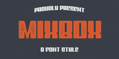 Evoke the spirit of a bygone era in your designs with the enchanting Mixbox Vintage Retro Display Font. This typeface seamlessly merges vintage charm with modern versatility, making it an ideal choice for designers seeking to infuse their projects with a touch of nostalgia and sophistication.
 - Semarang Kolonial by Hanoded,
$15.00 Semarang Kolonial is a stylish, all caps Art Deco font. It is not a recreation of a particular typeface; merely my salute to a bygone era and to the birthplace of my father in law, who recently passed away. Semarang Kolonial goes well with the original Semarang font.
 - Umpire Serif by Mans Greback,
$59.00 Umpire Serif is a heavy sans-serif immersed in Victorian grandeur, exuding a kingly confidence that commands respect. Every letter carved is a testament to its solid and heavy foundation, echoing the decorative prowess of a bygone era. With its bold demeanor, the typeface effortlessly portrays nobility and pride. It's not merely decorative; it's regal.
 - Statendam by Hanoded,
$15.00 Statendam is an all caps Art Deco font. It reminds me of the bold lettering used for cruise ship posters from the interbellum, especially those used for the Holland America Line (HAL) ads. It is not a recreation of a particular typeface; merely my salute to a bygone era. Statendam comes with all diacritics.
 - Five And Dime NF by Nick's Fonts,
$10.00A font with a strong architectural feel, inspired by those great commercial emporiums of a bygone era. To cap the crossbars, use [brackets] to enclose uppercase letters, {braces} to enclose lowercase letters, and the upright bar | between upper- and lowercase letters. Both versions of the font include 1252 Latin, 1250 CE (with localization for Romanian and Moldovan). - American Sensation by Megami Studios,
$12.50 This font is styled after artwork from the cola signs of old. Signs that talked about "America's Sensation", with "Cool, Refreshing Taste" and other words of a bygone era, one with cane sugar and not corn syrup. Filled with a retro feeling of sophistication and playfulness, this font can be used in a variety of fashions.
 - Bali Bliss by Four Lines Std,
$15.00 Step into the world of vintage charm and timeless grace with our "Bali Bliss" font! "Bali Bliss" is a script font that effortlessly channels the retro vibe, oozing with an irresistible charm that takes you back to a bygone era. Its retro-inspired design taps into the collective memory, making your designs not just beautiful but also deeply relatable.
 - Archer Display by SilverStag,
$19.00 Introducing Archer Display – a serif font that bridges the realms of tradition and modernity with effortless finesse. This font carries the weight of a bygone era in its high-contrast design and substantial serifs, but it also boasts a captivating contemporary edge with select letters that have been thoughtfully reimagined for a touch of avant-garde charm.
 - Bardon by Sabrcreative,
$20.00 Immerse yourself in the allure of a bygone era with the Bardon Vintage Retro Sans Serif Font Collection. This captivating font collection boasts 10 distinct styles, each meticulously crafted to capture the essence of vintage charm while maintaining a modern edge. From refined elegance to rugged authenticity, Bardon offers a versatile range of options to infuse your designs with a touch of nostalgia.
 - Bronzino by Greater Albion Typefounders,
$8.95 Bronzino’s roots lie in the Arts and Crafts movement, and in the traditions of letterpress printed fine quality books. It’s ideal for legible headings which have just that hint of charm and difference outside of the normal and mundane. It’s formal enough to go anywhere yet it has a spirit of fun, it brings a world of bygone care and quality to the modern age.
 - Slatterine by Greater Albion Typefounders,
$11.95 Slatterine is a retro-futuristic family, inspired by the second streamline era of the 1950s It's ideal for any design work that needs to suggest bygone visions of the future, or to have a retro-space-age effect. Slatterine's horizontally shaded glyphs give a strong sense of motion, whether coupled with the regular form's sharply leaning oblique angle, the perpendicular form, or the reverse leaning 'Lefty'.
 - Black Stage by RagamKata,
$16.00 Black Stage - Retro Serif Font Black Stage is a charming and eye-catching retro serif font. With a combination of an elegant serif style and a classic vintage touch, this font conveys a feel reminiscent of a bygone era but retains a timeless elegance. Features : - Ligatures & Alternates - Letters, numbers, symbols, and punctuation - No special software is required to use this typeface even work in Canva - Multilingual Support
 - Smart Deco by Lindstrom Design,
$15.00 A nostalgic font referencing the 1920s and 1930s during the Golden Age of Hollywood, art moderne and the rise of luxury items. Highly geometric with wild variations in glyph widths that demand attention. Smart Deco is a display font with clean simple lines, tall ascenders and expressive Capitals that descend below the baseline. The intention is to create a sleek elegance that symbolizes the sophistication of a bygone era.
 - Risley by Craft Supply Co,
$15.00 Risley: A timeless classic in editorial typography, Risley embodies the essence of a bygone era with its retro 90s serif font. Perfectly suited for editorial projects, Risley infuses a touch of nostalgia and sophistication into your designs. This typeface is ideal for greeting card, packaging, brand identity, poster, or any purpose to make your design project look eye catching and trendy. Feel free to play with this typeface!
 - Wigwam NF by Nick's Fonts,
$10.00One in the series of fonts celebrating the Halcyon Days of Handlettering. Wigwam evokes, among other things, memories of summer camps and trailer parks of a bygone day. Based on a font presented in the 1933 book Lettering of Today by W. Ben and Ed C. Hunt. Both versions of this font contain the Unicode 1252 (Latin) and Unicode 1250 (Central European) character sets, with localization for Romanian and Moldovan. - Kfontz by 066.FONT,
$9.99 Kfontz is a display font that simulates the appearance of typewritten text. Each letter in Kfontz has been carefully designed to resemble the effect you get with a typewriter. This effect adds a sense of nostalgia to the text, as if it were from a bygone era, adding an authentic charm to the designs. Kfontz retains its varied and extravagant style, giving the text a lightness and a certain nonchalance. Remastered in 2023.
 - Pioneer Boulevard by Hipfonts,
$9.00 Introducing Pioneer Boulevard, an elegant and vintage font that will transport you to a bygone era of sophistication and style. With 9 distinct weights to choose from, Pioneer Boulevard offers versatility and flexibility for any project, whether you're designing a logo, creating a print advertisement, or crafting an elegant website. The font also comes with beautiful additional ligatures that add character and charm to your designs, elevating them from ordinary to extraordinary.
 - Asthetic by Craft Supply Co,
$15.00 Introducing Asthetic: A nostalgic serif font that channels the essence of bygone eras. With its timeless lines and vintage charm, Asthetic evokes a sense of nostalgia in your projects. Infuse your designs with the allure of the past using Asthetic's classic and enduring style. This typeface is ideal for greeting card, packaging, brand identity, poster, or any purpose to make your design project look eye catching and trendy. Feel free to play with this typeface!


Page 1 of 6Next page