10,000 search results
(0.016 seconds)
- Ben by Motokiwo,
$20.00
- 10 Minutes - Unknown license

- Quercus 10 by Storm Type Foundry,
$69.00
- Logx 10 by Fontsphere,
$12.00
- Orator 10 by Tilde,
$39.75 - Ben Pioneer - Unknown license

- Ben Krush - Unknown license

- BENS ALIENS - Personal use only

- Ben-Zion - Personal use only

- Ben Brown - Unknown license

- Bat Ben - Unknown license

- Ben Kidoz by Sipanji21,
$5.00
- 10 Cent Soviet - Personal use only

- PR Swirlies 10 by PR Fonts,
$10.11
- Pica 10 Pitch by Bitstream,
$29.99 - Courier 10 Pitch by Bitstream,
$29.99 - Trivia Serif 10 by Storm Type Foundry,
$41.00
- OCR-B-10 by Tilde,
$39.75 - Font - Unknown license

- Bern Bern by Daylight Fonts,
$50.00
- Ten - Unknown license

- Beg by sugargliderz,
$12.00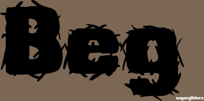
- Bea by Autographis,
$39.50
- Bee by URW Type Foundry,
$35.00
- Benz by Bogusky 2,
$34.50 - Bean by Eotype,
$14.00
- Bonning by Greater Albion Typefounders,
$8.95
- Benn by Factory738,
$5.00
- Bend by Juri Zaech,
$30.00
- Beni by Nois,
$18.00
- Courier 10 Pitch WGL by Bitstream,
$49.00 - Ben Cat Normal - Unknown license

- Ben Hard Life - Unknown license

- Ben Gurion MF by Masterfont,
$59.00
- VLNL Bon Bon by VetteLetters,
$35.00
- Lifetime Font - Personal use only

- Sucker Font - Personal use only

- Charming Font - Unknown license

- HEX Font - Personal use only

- Glitter Font - Unknown license


Page 1 of 250Next page