10,000 search results
(0.012 seconds)
- Old Hero - Unknown license
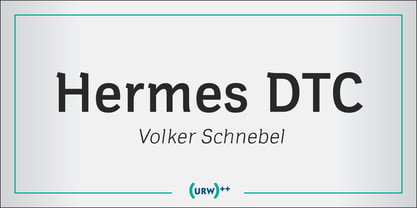
- Hermes by URW Type Foundry,
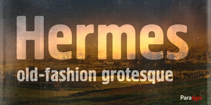
$35.99 - Hermes by ParaType,
$30.00 - Bolded by We Make Font,
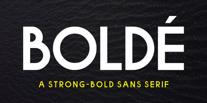
$16.00 - Bolde by Figuree Studio,
$18.00 - Electric Hermes - Unknown license
- HEROES - Personal use only
- Term - Unknown license
- Germs - Unknown license
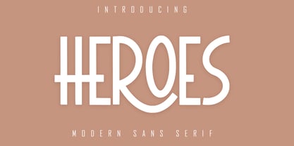
- Heroes by Skiiller Studio,
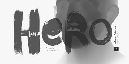
$16.00 - Hero by Roman Polishchuk,
$20.00 - Heroe by Lián Types,
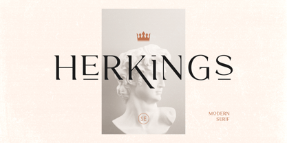
$37.00 - Herkings by Sarid Ezra,
$17.00 - Electric Hermes AOE - Unknown license
- Electric Hermes AOE - Unknown license
- Karvwood bold - Personal use only
- White Bold - Unknown license
- Goulong Bold - Unknown license
- Chopin-Bold - Unknown license
- Belta Bold - Personal use only
- Writers bold - Unknown license
- Helena-Bold - Unknown license
- TypoLatinserif-Bold - 100% free
- Pullchain Bold - Personal use only
- Boneribbon Bold - Unknown license
- Charlemagne Bold - Unknown license
- Bamf Bold - Unknown license
- Lein Bold - Unknown license
- Prescript Bold - Unknown license
- Present Bold - Unknown license
- Chizzler Bold - Unknown license
- Zado Bold - Unknown license
- Alako-Bold - Unknown license
- XPED Bold - Unknown license
- Spylord Bold - Unknown license
- andre bold - Unknown license
- IrishUncialfabeta-Bold - Unknown license
- Vecker Bold - Unknown license
- Jerry Bold - Unknown license
- Obtunde Bold - Unknown license
Page 1 of 250Next page

