7,462 search results
(0.012 seconds)
- Museo 300 - 100% free

- lelim 300 - Personal use only

- Zoo 300 by Green Type,
$37.00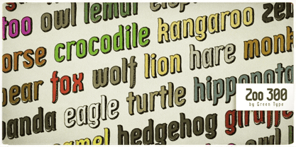
- Tall Films - Personal use only

- Bad Films - Unknown license

- Sad Films - Unknown license

- Sad Films - Unknown license

- Le Film - Unknown license

- Film P3 by Fontsphere,
$16.00 Film P3 - Ultra Condensed sans-serif typeface. It refers to characteristic typefaces such as Film Poster or Film P2 (which were inspired by futuristic movie posters). Film P3 is deliberately more versatile and designed to be used successfully in a huge variety of projects. In addition, the letters retain their unique and distinctive style, which allows them to stand out from the crowd. The Film P3 family has 9 members that are complementary and allow the expression of the projects to be very varied and adapted for appropriate use. They look good in many sizes, single words, slogans, titles, sentences as well as longer texts. Fonts include multilingual support, numerals, and a large range of special characters. Film P3 typeface offers many creative possibilities in graphic design and digital art. For print, brand identity, web design, and much more.
 - Film P2 by Fontsphere,
$12.00 Film-P2 is an Ultra Condensed sans serif display typeface designed by Bartosz Panek. It is the follower of the geometric 'Film Poster' (https://www.myfonts.com/fonts/fontsphere/film-poster/) which was inspired by futuristic movie posters. In Film-P2, the letter design is more neutral, the font is more versatile, but no less expressive, which was one of the assumptions of the project. This allows many different application possibilities. In titles, headings, longer text compositions, bold and custom juxtapositions, and in many different formats. The differences in the width of the letters in the narrow, regular, wide versions are not significant, they are fairly balanced, but they give a lot of variation depending on the method of application and design characteristics, e.g. text size, background type, etc. The entire Film-P2 family offers many creative possibilities in graphic design, branding, printing and website design. Each font include multilingual support, numerals and a large range of special characters.
 - Film Poster by Fontsphere,
$12.00 Film Poster is an ultra condensed sans serif display typeface with geometric forms. It can be used in many creative ways, all kinds of graphics, posters, advertising materials, text composition. It fits perfectly for the film industry as well as many other fields. Font include multilingual support (Latin-1), uppercase and lowercase letters, numerals and a large range of punctuation.
 - Short Films by Dharma Type,
$19.99 Short Films is an all-new-styled family, which kind of looks like Art Deco Style. Wide opened counters and softly rounded bowls create a new feeling – Retro but futuristic, geometric but humanistic. Exquisite contrast between thin and bold parts of glyphs make mixed feeling – Pop and feminine, formal and casual, strong and soft. The most distinctive feature is a coexistence of decorativeness and Readability. This coexistence expands the range of font usage. You can use this font for not only titling but also body-text. Short Films consists of 6 weights and their matching Italics for a wide range of usages. Further, Short Films supports international Latin languages and basic Cyrillic languages including Basic Latin, Western Europe, Central and South-Eastern Europe. Also, Short Films covers Mac Roman, Windows1252, Adobe1 to 3. This wide range of international characters expands the capability of your works.
 - 309 - Unknown license

- 3000 - Unknown license

- 309 - Unknown license

- 360 by Wilton Foundry,
$29.00Distorted fonts are great but are mostly not very practical - 360 is an attempt to create a simple distorted font that can be used far beyond a few logos or headlines. Each 360 character averages roughly half the number of sharp angles of a regular sans serif. This gives it an unusually fresh and timeless appeal and creates a dynamic presence across body text that is very legible and compact without looking overly condensed. 360 was chosen as a name because it can be used as an everyday font, all year round, and because 360 has so many unusual angles that don't conform to normal font conventions. 360 also happens to be a cool number: 360 makes a highly composite number. 360 is also a superior highly composite number and a colossally abundant number. A circle is divided into 360 degrees for the purpose of angular measurement. 360° is also called round angle. 360 is a convenient standard since, 360 being highly composite, it allows a circle to be divided into equal segments with each segment measured in integer degrees rather than fractional degrees. 360 is the sum of a twin prime (179 + 181). A year is roughly calculated as 360 days. - Filk by Up Up Creative,
$16.00 Filk is a super bold, all-lowercase script font with gorgeous curves and thick downstrokes. Filk is perfect for branding and editorial projects and dreams of being used on billboards, in magazines, and in movie titles. Filk includes approximately 540 glyphs, including 39 standard and discretionary ligatures. OpenType features include a a stylistic set, a bunch of character variants, initial and final forms for letters that need them, and multilingual support (including multiple currency symbols). The OpenType features can be very easily accessed by using OpenType-savvy programs such as Adobe Illustrator and Adobe InDesign.
 - Firm by Larin Type Co,
$14.00 Firm is a black sans serif display font. Perfectly attracts attention due to its shapes. With it, you can highlight important information in your text, and it is also perfect for creating a logo.This font contains alternates lowercase, ampersand and ligatures, math symbols, arrows, fractions, and multilingual support.
 - Firme by DSType,
$40.00 Firme is a very personal take on the geometric typefaces, and it’s specially suited for corporate and editorial projects, with several stylistic alternates and discretionary ligatures, for improved typographic flexibility.
 - Fiume by Eurotypo,
$36.00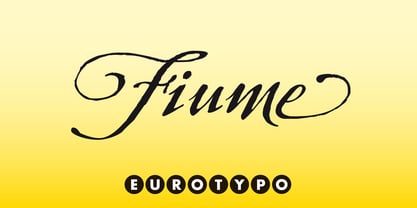
- Film Noir JNL by Jeff Levine,
$29.00Film Noir JNL is a classic Art Deco Alphabet from the brush of the late master sign painter Alf R. Becker, and appeared in Signs of the Times Magazine. Thanks to Tod Swormstedt of ST Media and the American Sign Museum for providing the reference material to make this font. - Film Event JNL by Jeff Levine,
$29.00 The August 11, 1929 issue of “The Film Daily” carried an ad for Tiffany-Stahl Productions’ presentation of a special film release featuring a wrestling match between “Strangler” Lewis and Gus Sonnenburg. The hand lettering for the ad was rendered in an Art Deco sans serif style, and is now available digitally as Film Event JNL in both regular and oblique versions.
 - Silent Film JNL by Jeff Levine,
$29.00 Built in 1928 in Wichita, Kansas, the Uptown Theater started out as a movie house, but today still exists as a dinner theater. Online images of this vintage venue’s perpendicular wall sign show the theater’s name in an Art Nouveau influenced angular style with rounded terminals – similar to that of pen drawn sign lettering of the era. Adapted as a digital type font, Silent Film JNL is available in both regular and oblique versions.
 - Film Title JNL by Jeff Levine,
$29.00 A World War II training film had its opening title card “First Aid” hand lettered in a casual, Art Deco sans serif design. This is now available digitally as Film Title JNL, in both regular and oblique versions.
 - Film Reel JNL by Jeff Levine,
$29.00 In a World War II training film from the U.S. Signal Corps, the opening title card saying “First Aid” was hand lettered in an extra bold, Art Deco inline style. Those two words (with seven available letters) used as a work model has inspired Film Reel JNL, which is available in both regular and oblique versions.
 - Training Film JNL by Jeff Levine,
$29.00 The title card “Airplane Hydraulic Brakes” in the beginning of a WWII armed services training film had the words "hydraulic brakes" hand lettered in an Art Deco slab serif style. This served as the model for Training Film JNL, which is available in both regular and oblique versions.
 - Film Crew JNL by Jeff Levine,
$29.00It's not a new idea, but it's always a fun one... a typeface comprised of 35mm film frames. Film Crew JNL is Jeff Levine's version, utilizing his Koehler Sans JNL as the lettering inside the frames. The lesser and greater keys have solid black frames for end caps or word spacing, and there's an alternate pair of frames with clear centers on the brace keys. - Foreign Film JNL by Jeff Levine,
$29.00 The Art Deco hand lettered opening credits for the 1936 French drama “La Belle Équipe” [English title: “They Were Five”] provided the inspiration for Foreign Film JNL, which is available in both regular and oblique versions. According to Wikipedia, the film “…tells the story of five unemployed workers who win the jackpot in the national lottery but their solidarity then proves fragile.”
 - French Film JNL by Jeff Levine,
$29.00 Hand lettering found in the September, 1936 issue of the French film publication “La Cinématographie Française” is rendered in a lovely Art Nouveau serif type style. This is now available digitally as French Film JNL, in both regular and oblique versions.
 - Adventure Film JNL by Jeff Levine,
$29.00 In most cases, motion pictures with a Western theme have their titles and credits lettered in type styles that reflect the period of the Old West. In 1966, the titles and credits for “Texas Across the River” used casual sans serif lettering more suited to the 1960s than a Western taking place in the 1800s. Nonetheless, the lettering inspired a digital font entitled Adventure Film JNL and it is available in both regular and oblique versions.
 - Film Preview JNL by Jeff Levine,
$29.00 An Oct. 7, 1931 advertisement in a British trade paper for the film industry carried the unusual title “The Bioscope Peaks of National Approval”. Just as unusual was the hand lettering for this ad – a quirky, casual bit of novelty typography that inspired Film Preview JNL; available in both regular and oblique versions.
 - Film Critic JNL by Jeff Levine,
$29.00 An ongoing movie review column known as the "Critic's Forum" (such as was found in the May 23, 1936 issue of The Film Daily) had a simple Art Deco monoline hand lettering of the column's name. Redrawn digitally as Film Critic JNL, this typeface is now available in both regular and oblique versions.
 - lelim 200 - Personal use only

- Gilke 3000 - Unknown license

- Impossible - 500 - Unknown license

- Skylab 600 - Personal use only

- Venetian 301 by ParaType,
$30.00 Venetian 301 is the Bitstream version of the Centaur type family. Centaur was designed by the American book designer Bruce Rogers on the basis of Venetian typefaces of 1470 of Nicolas Jenson. Beautiful Italic based on a face by Ludovico degli Arrighi was developed by Frederic Warde who was an American calligrapher and typography researcher was added as Italic to Centaur. Adapted for mechanical composition by English Monotype in 1929. Its lettershapes owe much to pen-drawn letters of Italian humanist minuscule and cursive. This elegant humanist face is useful for the finest typography both for book text and display matter. Cyrillic version included small caps was developed for ParaType in 2003 by Dmitry Kirsanov.
 - Venetian 301 by Bitstream,
$29.99 - Byte 305 by Talbot Type,
$15.00 Byte 305 is a modular font, resulting from experiments in creating a practical, legible font from a minimum set of geometric components on a uniform grid. It has full upper and lower case character sets and includes all accented characters for Western and Central European languages. It's available in three styles – 105, 205 and 305. Each style has different corners, 105 is square, 205 is bevelled and 305 is round. Each style is available in three weights, Light, Medium and Bold.
 - 500 Guitars by Rocket Type,
$14.00 A chunky, whimsical number that strikes just the right chord for modern and retro projects. Loaded with stylistic alternatives, ligatures and Vietnamese support.


Page 1 of 187Next page