4,270 search results
(0.016 seconds)
- Old Jersey by Alphabet Agency,
$15.00 Old Jersey is a cool, vintage styled and rough textured display font. This adaptable font will look great on a variety of design ideas. It will add a distinct touch to each of your projects
 - Baroniene ML by HiH,
$12.00 Genovaite Baroniene is former school teacher and a native of Lithuania who loves fancy letters. When she writes, she likes to add extra flourishes to her handwriting and printing. It simply appeals to her to do so. While living in the United States a few years ago and working in the health care field, she put pen to paper to provide a specimen of her writing from which a font could be developed. The process has taken longer than either of us expected. Now we are finally able to present Baroniene ML, a stylishly unique example of what we call Lithuanian Folk Baroque. Baroniene ML has a total of 362 glyphs, including the Unicode Latin Extended-A glyphs (0100 to 017F), covering the more widely-used Central European languages. To resolve the cedilla/undercomma conundrum, we have chosen to design a hybrid disconnected accent for use with C, G, K, L, N, R, S & T. We hope this solution is acceptable to users of Albanian, Catalan, French, Latvian, Portuguese, Romanian and Turkish. Baroniene ML also comes with four ligatures: gh, Th, th and Ch (167, 172, 177 and 181). Baroniene ML is certainly not the polished script of a professional calligrapher. It is very personal. The human source is still visible in its form. The letter spacing is uneven. Some of the curves are not quite perfect. In sum, the individuality has not been refined out of it. That is why it is so charming. If you want for a font that has a very different look, perhaps Baroniene ML is what you need.
 - Cruickshank ML by HiH,
$12.00 Cruickshank is a decorative typeface from the late Victorian period. The upper case includes several letters with swash strokes, extending well below the baseline, as found in the original design. Alternatives to the swash caps are provided. The lower case contains small caps of simpler design. The face was designed by William W. Jackson and released by MacKellar, Smiths and Jordan Type Foundry of Samson Street, Philadelphia, Pennsylvania in 1886. MS&J was founded originally as Binny & Ronaldson in 1796 and later known as The Johnson Type Foundry. Cruickshank has a strong late Victorian flavor without the extravagance of so many fonts of the period. In its simplicity and clarity, it may be seen as a precursor to the Art Nouveau style that would develop a decade later.
 - Gundrada ML by HiH,
$12.00 Gundrada ML was inspired by the lettering on the tomb of Gundrada de Warenne. She was buried at Southover Church at Lewes, Sussex, in the south of England in 1085. The Latin inscription on her tomb, STIRPS GUNDRADA DUCUM, meaning “Gundrada, descendant of the Duke” may have led to the speculation that she was the daughter of William, Duke of Normandy and bastard son of Robert the Devil of Normandy and Arletta, daughter of a tanner in Falaise. In 1066 William defeated Harold at the Battle of Hastings and was crowned William I of England. More commonly known as William the Conquerer, he commissioned a string of forts around the kingdom and charged trusted Norman Barons to control the contentious Anglo-Saxon population. William de Warenne, husband of Gundrada, was one of these Barons. There has also been the suggestion that Gundrada may have been the daughter of William’s wife, Matilda of Flanders, by a previous marriage. According to the Dictionary of National Biography (Oxford University Press, Oxford, England 1921-22), both of these contentions are in dispute. Searching the past of a thousand years ago is like wandering in a heavy fog: facts are only dimly in view. Regardless, I know that I found these letterforms immediately engaging in their simplicity. Unadorned and unsophisticated, they have a direct honesty that rests well in the company of humanistic sans serifs like Franklin Gothic or Gill Sans, appealing to a contemporary sensibility. The lettering on the tomb is in upper case only. Although Gundrada does not sound Norman French to me, her husband certainly and her father probably were Norman French. Nonetheless, the man that carved her tombstone was probably Anglo-Saxon, like most of the people. For that reason, we are quite comfortable with a fairly generic lower case from an Anglo-Saxon document of the time. The time was a time of transition, of contending language influences. This font reflects some of that tension. Features 1. Multi-Lingual Font with 389 glyphs and 698 Kerning Pairs. 2. OpenType GSUB layout features: onum, dlig, liga, salt & hist. 3. Tabular Figures and Alternate Old-Style Figures. 4. Alternate Ruled Caps (line above and below, matching to brackets). 5. Central Europe, Western Europe, Turkish and Baltic Code Pages. 6. Additional accents for Cornish and Old Gaelic. 7. Stylistic alternates A, E, y and #. 8. Ligatures ST, Th, fi and fl. 9. Historic alternate longs. The zip package includes two versions of the font at no extra charge. There is an OTF version which is in Open PS (Post Script Type 1) format and a TTF version which is in Open TT (True Type)format. Use whichever works best for your applications.
 - Fantastic ML by HiH,
$12.00 Fantastic ML is an exuberant Art Nouveau font. It was originally released as “Modern Style” by Fonderie G. Peignot & Fils, Paris, France sometime before 1903. Since “Le style moderne” was the generic French name for Art Nouveau, it is possible that someone decided a less generic name was needed. The typeface became known as Fantastic. Compared to conventional text letters, it is just that. Fantastic has a whimsical, architectural feel. The typeface reminds me of a cross between Hoffmann’s Palais Stoclet in Brussels and Gaudi’s Sagrada Familia church in Barcelona. The letterforms themselves are similar to those by Ludwig von Zumbusch on the cover of “Jugend” in March, 1896, but with the addition of serifs. Fantastic ML is a decorative, all-cap font intended for display use and functions best at 18 points or larger. There are a total of 306 glyphs. In addition to the standard 1252 Western Europe Code Page with character slots up to decimal position 255, there are glyphs for the 1250 Central Europe, the 1252 Turkish and the 1257 Baltic Code Pages. However, some older applications may only be able to access the Western Europe character set (1252). The zip package includes two versions of the font at no extra charge. There is an OTF version which is in Open PS format and a TTF version which is in Open TT format. Use whichever works best for your applications.
 - london 2012 - Personal use only

- Olympukes 2012 by Barnbrook Fonts,
$30.00 Released on the occasion of the 2012 London Olympics, Olympukes 2012 was a new set of pictograms telling the ‘real’ story of the Olympics and extending the unofficial project that began in 2004. The occasion of the London games provided an opportunity to revisit the complex contradictions of the modern Olympics and to acknowledge the geopolitical shifts of the intervening eight years. The 2012 games arrived at a time of great economic and political uncertainty for the nation and Europe. Greece – the host of the 2004 games – was now located at Ground Zero of a disintegrating Eurozone and the United Kingdom was two years into a programme of austerity enacted by the coalition government of Conservatives and Liberal Democrats. Given that the previous London Olympics had been held in 1948, in a climate of recovery and austerity after a devastating World War (1948’s Olympiad was dubbed the ‘Austerity Games’) there was a sick irony to the 2012 games' arrival. The suppression of human rights in order to deliver the perfect games for PRoC’s Beijing games shocked no-one and yet, in London, the security measures seemed grossly excessive. Then again, in a country with an estimated 1.8 million cctv cameras, perhaps we shouldn’t have been so surprised. Another aspect of the Olympics that returned for 2012 was the unfettered commercialism – if you think the Games are about pure sport, about noble human endeavour, think again. Please note that Barnbrook Fonts is in no way affiliated with, or has received any endorsement from, the International Olympic Committee, the organising committees of the Olympic Games, or any national Olympic committee.
 - Puls 2012 by Jovan Ivanov,
$20.00
- heresy - Unknown license

- Jorgey by Gatype,
$12.00 Jorgey's casual brush script has a nice texture and flow. Jorgey has many alternatives to make it look like real handwriting; four sets of lowercase and two sets of uppercase. suitable for design projects; logos, branding, posters, quotes, beautiful wedding invitations, beautiful stationery art, eye-catching social media posts, and cute greeting cards and other designs. It is unique, very natural and attractive
 - Berdey by Maulana Creative,
$13.00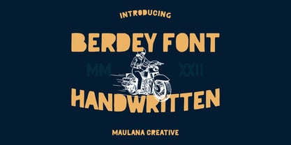 Berdey is a rough handwritten display font. With rough bold stroke, fun character with a bit of ligatures and alternates. To give you an extra creative work. Berdey font support multilingual more than 100+ language. This font is good for logo design, Social media, Movie Titles, Books Titles, a short text even a long text letter and good for your secondary text font with sans or serif. Make a stunning work with Berdey font. Cheers, Maulana Creative
 - Harsey by Letterhend,
$16.00 Introducing, Harsey Type Toolbox. One of our best-designed product that we ever created. This product consist of many styles such as script, sans, serif, and also includes dingbats, catchwords and badges all comes in font format. What makes this product even more special is you can use and combine all these fonts perfectly matched altogether.
 - Jeremy by GRIN3 (Nowak),
$22.00 Jeremy is a handwritten, brush script with ligatures and contextual alternates to help with flow and readability. Every lowercase letter has three variations. When the font is used in OpenType-savvy applications, the 3 variants of glyphs are automatically alternated to achieve a random-like effect. Language support includes Western, Central and Eastern European character sets, as well as Baltic and Turkish languages.
 - Old Jersey Distressed by Alphabet Agency,
$15.00 Old Jersey Distressed is a cool, vintage styled and rough textured display font. This adaptable font will look great on a variety of design ideas. It will add a distinct touch to each of your projects.
 - Zig Zag ML - Personal use only

- Gradl Initialen ML by HiH,
$12.00 Max Joseph Gradl designed Art Nouveau jewelry in Germany. At least some of his designs were produced by Theodor Fahrner of Pforzheim, Germany -- one of the leading manufacturers of fine art jewelry on the Continent from 1855 to 1979. I don't know if he designed for Fahrner exclusively, but every example I found was produced by that firm. I assume it was also the same M.J, who edited a book, Authentic Art Nouveau Stained Glass which was reissued by Dover and is still available. For an artist as accomplished as Gradl was, he is very tough to research. There just does not seem to have been much written about him. The jeweler is visible in most of his typeface designs. They exhibit a sculptural quality as if they were modeled in clay (or gold) rather than drawn on paper. His monograms, especially, reflect that quality. Those shown in plates 112 through 116 in Petzendorfer actually appear to have been designed specifically for fabricating in the form of gold or silver pendents. Of the initial letters that came out of Germany during this period, these by Gradl seem unusually open and lyrical. They seem to be dancing on the page, rather than sitting. Please note that Gradl designed only the decorated initials. All other characters supplied were extrapolated by HiH, including the accented initials. Orn.1 (unicode E004) is based on a jeweled gold clasp designed by Gradl (please check out Gallery Image on Myfonts.com). Also included are an art nouveau girl’s face, a swan and the face from Munch’s “Scream”, from scans of old printer’s ornaments. Gradl Initialen M represents a major extension of the original release, with the following changes: 1. Added glyphs for the 1250 Central Europe, the 1252 Turkish and the 1257 Baltic Code Pages. Added glyphs to complete standard 1252 Western Europe Code Page. Special glyphs relocated and assigned Unicode codepoints, some in Private Use area. Total of 341 glyphs. Both upper & lower case provided with appropriate accents. 2. 558 Kerning Pairs. 3. Added OpenType GSUB layout features: salt, dlig, ornm and kern. 4. Revised vertical metrics for improved cross-platform line spacing. 5. Refined various glyph outlines. 6. Alternative characters: 16 upper case letters (with gaps in surrounding decorations for accents above letter). 8. Four Ornaments: face1, face2, swan and orn1 (silhouette of Gradl clasp) The zip package includes two versions of the font at no extra charge. There is an OTF version which is in Open PS (Post Script Type 1) format and a TTF version which is in Open TT (True Type)format. Use whichever works best for your applications.
 - ML Tokyo Aurora by Supfonts,
$18.00 Hi ! I just now launch my new font Family called "Tokyo Aurora". The Tokyo Aurora font is a simple font, comes with alternate symbols and some ligatures. I wanted this font looks elegant, readable, stylish, and catchy. You can use this font for watermark on photography, signature or signature logo design, quotes, album cover, business card, and many other design project.
 - Norwich Aldine ML by HiH,
$12.00 Norwich Aldine ML is a all-cap typeface with enlarged serifs, designed and produced in wood by William Hamilton Page of Norwich, Connecticut in 1872. Norwich Aldine ML is a fine example of the strength of decorative wood types: large, simple type forms that provide the visual boldness sought by advertisers of the Victorian period. While our marketing has gotten so very sophisticated, there is always a place for a simple, visually strong typeface. Although about 14 miles inland, Norwich, Connecticut lies at the head of the Thames River. The river is both wide and deep, and therefore was not bridged in the early 20th century. Until then, if you wanted to get from Groton on the west bank to the whaling port of New London on the east bank by land, you had to go by way of Norwich. Because of its size, the Thames is navigable all the way from Norwich to New London. Docks were built in Norwich around 1685 and the city became Connecticut’s 2nd largest port by 1800. With the construction of the Norwich & Worcester Railroad in 1835, Page could easily ship his wood type north by rail or south by coastal schooner. Included with our font, Norwich Aldine ML, are two 19th century printer’s ornaments of sailing ships similar to those that sailed up the Thames to Norwich. Reference: Moon’s Handbooks, Connecticut 2nd Edition (Emeryville CA 2004) The family has expanded from one to four fonts: 1. Norwich Aldine ML: the concept font, computer-sharp corners and smooth curves, as we imagine it was designed. 336 Glyphs including some reduced-width alternatives for better letter spacing. 2. Norwich Aldine Worn ML: the way actual wooden type would look after have been used for a while. 332 Glyphs 3. Norwich Aldine Distressed ML: the way the wooden type would look after it had really been used, perhaps abused. Alternatives to the more popular letters reflect the damage that typically occurs on a well-wormn font, with nicks, cuts and scratches and the overall wear that reduces the overall height and leads to uneven inking due to varying heights in the chase. A couple of bullets look like bullet holes. 345 glyphs. 4. Norwich Aldine Cyrillic: Cyrillic includes alll English and Cyrillic letters for MS Windows Code Page 1251, ISO 8859-5 and MacOS Cyrillic. 235 glyphs. We did Cyrillic because is was fun and we felt the basic design cried out for Cyrillic. While obviously subjective, we hope you will agree.
 - Habana Deco ML by HiH,
$12.00 Habana Deco ML was inspired by a hand-lettered sign on the stucco exterior of a small pharmacy in modern-day city of Havana, Cuba. It, in turn, was based on the fat-faced Art Deco lettering of the late 20s and early 30s, especially the Futurismo posters out of Italy, as well as alphabets designed in The Netherlands, France, USA and even the Soviet Union. There are 24 stylistic alternate glyphs (SALT), many inspired by a variety of these sources, including a couple from the sign in the front of the Congress Hotel in South Beach, Miami. The others features of the Habana Deco include 363 glyphs, 184 kerning pairs (KERN), 14 ornaments and shapes (ORNM) and 15 discretionary ligatures (DLIG). This is a font with which you can have fun. The zip package includes two versions of the font at no extra charge. There is an OTF version which is in Open PS (Post Script Type 1) format and a TTF version which is in Open TT (True Type)format. Use whichever works best for your applications.
 - JESSIE - Unknown license

- Jessie by Turtle Arts,
$20.00Jessie's Letter is based on an old typed letter by Kerrie's great step grandmother. This letter was undated, but we think it must have been from the 1920s or so. Jessie wasn't much for punctuation, so there aren't any of those pesky question marks and exclamation points. But, she did make mistakes in her typing, so we've included cross outs and strange resulting characters to make up for the lack of everyday punctuation. Maybe Jessie wanted to visit Paris, or maybe she secretly made paintings in her back yard, or maybe she dreamed of painting her house bright pink. Well, maybe not, but it's fun to dream... - Gersy by Maulana Creative,
$13.00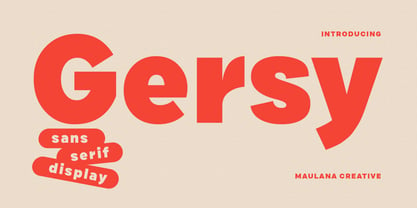 Gersy is a fancy sans serif display font. With bold stroke, fun character. To give you an extra creative work. Gersy font support multilingual more than 100+ language. This font is good for logo design, Social media, Movie Titles, Books Titles, a short text even a long text letter and good for your secondary text font with script or serif. Make a stunning work with Gersy font. Cheers, Maulana Creative
 - Jerky by Noir Typo,
$15.00 Jerky is a strange and vibrant titling typeface.Drawn with a ruling pen, this typeface work with capital and small capital only by default. Inspired by calligraphy it emanates an Rock&Roll visual atmosphere or an horror movie ambiance.
 - Basica v.2012 - Personal use only

- Heisei Mincho by Adobe,
$39.00 - Jensen Arabique by CastleType,
$39.00 This elegant typeface was suggested to me by type critic Daniel Will-Harris. Jensen Arabique is based on a set of capital letters drawn by Gustav Jensen that included the word "ARABIQUE" at the top of the first page, therefore the name. Daniel Will-Harris has this to say about Jensen Arabique: "I found an example of this unexecuted Gustav Jensen typeface in a type sample book from 1933, and Jason Castle lovingly digitized it with all its rare and unusual curves intact." Uppercase with alternates, numerals and some punctuation.
 - Jessen-Schrift by profonts,
$41.99 The original Jessen typeface, named in reminiscence of the great supporter of the printing art at the end of the 19th century, Peter Jessen, was designed in the years of 1924 until 1930. Bible Gothic was created by the famous German designer Rudolf Koch. Ralph M. Unger digitized this font exclusively for profonts in 2005, keeping his digitization as close as possible to the original design of Koch in order to preserve the distinguished character and the partly unconventional, original forms. The concept of a Bible Gothic was developing for years in Koch's mind and drove the direction of his work, but only after the experience with his Neuland design could he start the creation of his Peter Jessen typeface. Produced quite like Neuland, Jessen, however, is much more refined and more accurate in detail than Neuland. At first glance, it seems to look plain and simple, but if you look closer, the richness of its distinguished upper case forms unfold to a perfectly clear flow of text
 - Kelsey Script by Tebaltipis Studio,
$15.00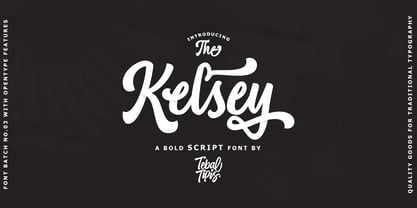 Introducing new latest from TebTipsudio, Kelsey is a script typeface with personality. You can use it as a logo, badge, insignia, packaging, headline, poster, etc The alternative characters in this font were divided into several OpenType features such as Stylistic Alternates, Stylistic Sets, and Ligature. The OpenType features can be accessed by using OpenType program such as Adobe Illustrator, Adobe Photoshop, and Adobe InDesign.
 - Mandalaz Sensei by Allouse Studio,
$14.00 Mandalaz Sensei is a Brush Font Family. These font come with Multi-Lingual Support and swash separated to make it easier to play with. Mandalaz Sensei is perfect for any tittles, logo, product packaging, branding project, megazine, social media, wedding, or just used to express words above the background. Enjoy the font, feel free to comment or feedback, send me PM or email. Thank You!
 - Kerney Script by Mans Greback,
$59.00 Kerney Script is a cool baseball typeface. A sporty calligraphy, this retro lettering will be your go-to style for a fresh team logotype or a vintage headline. Drawn and created by Mans Greback in 2022, it has a competitive style and a bold personality. The Kerney Script family consists of three professional styles: Regular, Bold and Rounded, complimenting each other for greater design opportunities. Use underscore _ to make a swash. Example: Letter_ Use multiple underscores to make longer swashes. Example: Football____ The font is built with advanced OpenType functionality and has a guaranteed top-notch quality, containing stylistic and contextual alternates, ligatures and more features; all to give you full control and customizability. It has extensive lingual support, covering all Latin-based languages, from Northern Europe to South Africa, from America to South-East Asia. It contains all characters and symbols you'll ever need, including all punctuation and numbers.
 - Fourt Carsey by Reyrey Blue Std,
$16.00 Introducing, Fourt Carsey Typeface. Fourt Carsey is an elegant and modern font that take classy and fashionable touch family typeface. Fourt Carsey Typeface is perfectly suitable for layout design for quotes or body copy, best used as a display for headings, logos, branding, magazines, product packaging, invitations. logotypes, and much more. Don't wait to add this luxury font family to your collection and explore the uniqueness of this typeface! Features : · All Uppercase and Lowercase · Number & Symbol · Supported Languages · Alternates and Ligatures · PUA Encoded Hope you enjoy with our font!
 - SlabFace 2010 - 100% free

- Commando 2011 - 100% free

- 2011 Slimtype by GLC,
$42.00 This light manual font, with two styles, is a looking like slab serif or typewriter pattern. It is containing Western and Northern European, Icelandic, Baltic, Eastern, Central European and Turquish specific characters, plus old style numerals, ct, st and f standard ligatures. The two styles are both legible from 10-11 pts.
 - Megaflakes 2010 by Baseline Fonts,
$20.00 Snowflakes and doodles to complement any design on the fly.
 - BDRmono 2021 by Typedifferent,
$15.00 Büro Destruct’s «BDR mono» typeface has a long tradition in the font library of typedifferent. Initially designed by Lopetz as a single weight, monospaced Mac PostScript Type 1 font way back in 1999, it got a first update as a little family with light, regular and bold weights, plus an extended glyphs set in Opentype format during 2006. With this 2021 update the typeface received a second rounded family and a complete glyphs set with all needed characters used in the north, east, south and west of Europe. The «BDR mono 2021» serves great in signage, routing people, architecture, technical plans, manuals, or even science and fiction related communications.
 - Megaflakes 2011 by Baseline Fonts,
$20.00 Megaflakes™ 2011 is a geometric set. Looks like this might become a tradition for Baseline Fonts. They are terribly fun for the holidays as well as Christmas in July.
 - DIN 2014 by ParaType,
$47.00 A contemporary interpretation of the famous DIN typeface. Regular style suits for long texts, while Light and Bold variations work well in large sizes. The typeface includes 24 styles: 6 upright and 6 normal-width italics, as well as 6 Narrow and 6 Condensed styles. The typeface was designed by Vasily Biryukov and released by Paratype in 2015. The set of Condensed styles was added by Alexander Lubovenko and Isabella Chaeva in 2022.
 - Impact 2010 by Microsoft Corporation,
$89.00 - Kedem ML v1 AAA by AlefAlefAlef,
$105.00 Kedem is a multilingual serif font inspired by heritage posters from the time of Israel’s national founding. The font is characterized by wide letters set at unusual angles, distinctive negative spaces, an upbeat cadence and a free and nostalgic spirit. Kedem spans five weights, including “Ultralight” – a monoline inline style. As the weight of Kedem increases, the contrast between its serifs and the shape of its letters is magnified. Kedem supports Hebrew, English and Russian (designed by Anna Khorash), as well as 181 additional Latin and Cyrillic languages.


Page 1 of 107Next page